Foundation · 2 min
Introduction
Designing an online grocery store means building a shopping experience that lets customers refill a familiar basket quickly and trust what arrives at the door. Start with clear departments and reliable search, then make it possible to add items without opening a product page, show pack size and price per unit on every product, and be explicit about what is in stock. Delivery slots, pickup and minimum order should be visible before the basket is full, and freshness and expiry information should be written as plain text. The design should remove effort from a routine task rather than encourage browsing.
Foundation · 2 min
What this guide covers
- What makes a grocery store different from other ecommerce?
- Decisions to make before you design
- The grocery store, page by page
- How to design a grocery store around fast product discovery and quick add
- How should you organise grocery categories and search?
- How should you show weight, quantity and price per unit?
- How should you handle availability and substitutions?
- How should you present delivery slots, pickup and minimum order?
- How should you communicate expiry and freshness?
- Do and don’t
- Mobile first
- Accessibility for grocery stores
- Performance
- SEO, structured data and answer engines
- Choosing a ZenBasket theme for your grocery store
- Building it in ZenBasket
- Learn from the Essneed and Dailfresh storefronts
- How to test whether it works
- Frequently asked questions
Foundation · 2 min
1. What Makes a Grocery Store Different From Other Ecommerce?
Grocery is a routine, repeated task rather than a considered purchase. Shoppers already know most of what they want, they buy dozens of items at a time, they buy much the same list every week, and they are usually doing it on a phone. They also cannot check the one thing that matters most — how fresh the product is — until it arrives. Your store has to make the repeat shop fast and make the freshness promise credible.
| Grocery challenge | Design response |
|---|---|
| Baskets contain dozens of items | Allow adding and changing quantity without leaving the list |
| Customers buy the same products repeatedly | Make past purchases and saved lists easy to reorder |
| Products are sold in different sizes and weights | Show pack size and price per unit clearly |
| Stock changes constantly | Show availability early and offer alternatives |
| Items may be unavailable when picked | Let customers set substitution preferences simply |
| Delivery timing is part of the purchase | Show slots, pickup and minimum order before checkout |
| Freshness cannot be judged on screen | Publish clear expiry, storage and handling information |
A point worth challenging: a grocery store does not need elaborate product pages to perform well. Most grocery shoppers already know what they are buying and add items straight from lists and search results, so effort spent on listing tiles, search and the cart usually does more than effort spent on richer product pages.
Foundation · 2 min
2. Decisions to Make Before You Design
What will your customers shop by?
Decide whether your primary navigation is built around departments such as Fruits & Vegetables, Dairy & Eggs, Staples, Snacks and Household, or around use cases such as daily essentials, monthly stock-up and ready to cook. The best structure is the one that matches how your customers describe their shopping.
How will you sell by weight and quantity?
Decide which products are sold by pack, which are sold by weight, and which are sold by piece. Keep the units consistent across the catalogue, and decide early whether the final price of a by-weight item can change after picking.
Which product attributes matter?
Identify the attributes customers actually use to choose: brand, pack size, price, and dietary marks such as vegetarian, vegan, gluten-free, halal or jain. These attributes later become your filters, so they need to be entered consistently rather than typed into descriptions.
How will you fulfil orders?
Decide whether you offer delivery, pickup or both, which areas you serve, whether you use time slots, and whether there is a minimum order value. These answers change the homepage, the header, the cart and the checkout, so settle them before any design work starts.
What freshness promise can you keep?
Decide the commitment you can make on every order — minimum shelf life at delivery, same-day packing, or next-day harvest — and check it against the food rules in the markets you serve. A promise you cannot keep every week is worse than a modest one you always keep.
Foundation · 2 min
3. The Grocery Store, Page by Page
| Page | What matters for grocery |
|---|---|
| Home page | Show past purchases, departments, offers and the delivery or pickup promise. |
| Product List page | Carry the whole buying decision on the tile: name with pack size, price, price per unit, stock and an add control. |
| Search results page | Handle brand names, regional names and misspellings, and never return an empty page. |
| Product Details page | Keep it factual: ingredients, allergens, storage, shelf life, pack photograph. |
| Cart page | Stay readable at sixty items, and carry substitution preference, slot and minimum order. |
| Checkout page | Confirm slot, address, contact and payment without reopening decisions already made. |
| About Us page | Explain sourcing, storage and standards — the grocery equivalent of a brand story. |
| Contact Us page | Make it easy to ask about a missing item, a substitution or a delivery. |
| Login / Account page | Give returning customers their order history, saved lists and addresses. |
Keep the detailed configuration of each page in the relevant store-page guide rather than repeating those instructions here.
Foundation · 2 min
4. How to Design a Grocery Store Around Fast Product Discovery and Quick Add
Speed is the grocery equivalent of fit in fashion: it is the thing the store is judged on. A shopper filling a forty-item basket feels every extra tap forty times.
Start with the shopper’s own history. Returning customers look for their previous items first, so a “Buy it again” row in the first screenful of the homepage, showing product images rather than text links, does more for them than any promotional banner. Keep it above the offers.
Then take the product page out of the journey. Adding to the basket should be possible from any list — search results, department pages, the reorder row — and the add control should become a quantity control as soon as it is used, so the shopper can see what is already in the basket and change it without navigating anywhere. Include a typed quantity field alongside plus and minus, so six of something takes one action rather than six taps.
 ┌──────────────────────┐   ┌──────────────────────┐
 │      [ image ]       │   │      [ image ]       │
 │ Toor Dal 1 kg        │   │ Basmati Rice 5 kg    │
 │ ₹149   ₹149/kg       │   │ ₹549   ₹110/kg       │
 │ In stock             │   │ In stock             │
 │  ┌────────────────┐  │   │  ┌───┬──────┬─────┐  │
 │  │    + Add       │  │   │  │ − │  2   │  +  │  │
 │  └────────────────┘  │   │  └───┴──────┴─────┘  │
 └──────────────────────┘   └──────────────────────┘
       before adding              after adding
The grocery list tile before and after adding: pack size and unit price on the tile, and an add button that becomes a typed quantity control.
Saved lists extend the same idea. A weekly shop, a monthly stock-up or a festival list that can be added to the basket in one action turns a twenty-minute task into a two-minute one. Show departments rather than an empty personalised row to first-time visitors, who need the store to look navigable before it can look familiar.
In ZenBasket: data driven box for a buy-it-again row · list element for saved lists · add and quantity controls on listing tiles · the account entry point.
Foundation · 2 min
5. How Should You Organise Grocery Categories and Search?
A grocery catalogue is wide and shallow — thousands of items across a few dozen departments, most of which shoppers can name. That makes search the primary tool and categories the safety net, the reverse of a fashion store.
Departments should mirror the shop rather than the warehouse: Fruits & Vegetables, Dairy & Eggs, Staples, Snacks, Household, Personal Care. Two levels are usually enough — department, then aisle — with brand, pack size, price and diet handled as filters. A third menu level is where grocery navigation stops working on a phone.
Search has to cope with real language. “Atta”, “wheat flour” and “chakki fresh” describe the same product; so do “brinjal”, “eggplant” and “baingan”, and “curd” and “yoghurt”. Build a synonym list from your own zero-result searches and keep adding to it, because every empty result is a basket that did not get filled. A search that finds nothing should still show the nearest department, suggested spellings and a way to tell you what was missing.
Keep department URLs permanent — /fruits-vegetables/ rather than a seasonal name — and treat festive ranges and campaign edits as collections that get refreshed each year rather than deleted.
Listing mechanics are in the product listing page guide; taxonomy is in the category and collection page guide.
In ZenBasket: department mega menu · search variants · search bar customisation · filters and sorting
Foundation · 2 min
6. How Should You Show Weight, Quantity and Price Per Unit?
Grocery products are bought by size as much as by name, so every product needs to answer two questions immediately: how much am I getting, and what does it cost per unit?
Put the pack size in the product name rather than hiding it in a dropdown, so products can be compared without opening anything. Show the unit price beside the selling price, because shoppers weigh a small pack against a large one constantly and should not have to do the arithmetic themselves.
Products sold loose need a quantity control that matches how they are actually sold — by weight for some items, by piece for others — because a plain item counter cannot express either. Where the final price depends on the weight packed, say so on the product, in the cart and on the order confirmation, so a different total is never a surprise.
Keep the units themselves consistent across the catalogue. A single agreed list of units, used by everyone who loads products, is what keeps filters, search and unit pricing working; free text lets the same size appear several times under different spellings.
In ZenBasket: what a listing tile shows · variant and pack-size area · tag element for pack-size and diet marks
Foundation · 2 min
7. How Should You Handle Availability and Substitutions?
In most categories, out of stock is a disappointment. In grocery it is a planning problem: the shopper needs to know now so they can put something else in the basket, rather than finding a hole in the order at the door.
State availability on the listing tile, not only on the product page, and never let an unavailable item be added silently. Be specific about the reason — back on Tuesday, not available in your area, in store only — and offer an in-stock filter, which grocery shoppers use more than any other filter. If you serve several areas or stores, ask for the pincode or postcode early and keep it visible, because a catalogue that changes silently mid-shop is worse than one that asks up front.
Substitution is the decision only grocery has to ask about, and it is easy to ask badly. Asking item by item turns a shopping trip into dozens of hypothetical decisions about products that may well be in stock, and most shoppers give up on it.
Ask once, for the whole order, with a visible control at the top of the cart: substitute anything similar, ask me first, or do not substitute. Allow per-item overrides for the two or three products people care about, but never require them, and raise a specific item only when it is genuinely at risk. Show the substitute and any price difference before charging, and make refusing it easy at the door.
Cart-stage decisions in general are covered in the cart page guide.
In ZenBasket: out-of-stock and back-soon tags · capture the substitution preference · group the control at the top of the cart · announce a supply or service-area issue
Foundation · 2 min
8. How Should You Present Pickup and Minimum Order?
A grocery order is a promise about a time as much as a list of goods, and all three of these — delivery slot, pickup and minimum order — belong at the start of the journey rather than the end. A shopper who fills a basket and then finds that delivery does not work the way they assumed usually abandons it.
Pickup
Ask delivery or pickup before shopping begins, because the catalogue, prices and availability all depend on the answer, and flag any item the chosen method cannot serve now it is added. Add the pickup location and operating hours to help customers know where and when they can collect their orders. Use the Map element to display your store location and customise the footer to provide additional store information and links.
Minimum order
Set the minimum order value under Order Settings in the admin panel. The Checkout button will be enabled once the cart value reaches the specified minimum.
In ZenBasket: stepper for a slot-selection flow · map element for the collection point · announce cut-offs and thresholds · counter element for a progress figure
Foundation · 2 min
9. How Should You Communicate Expiry and Freshness?
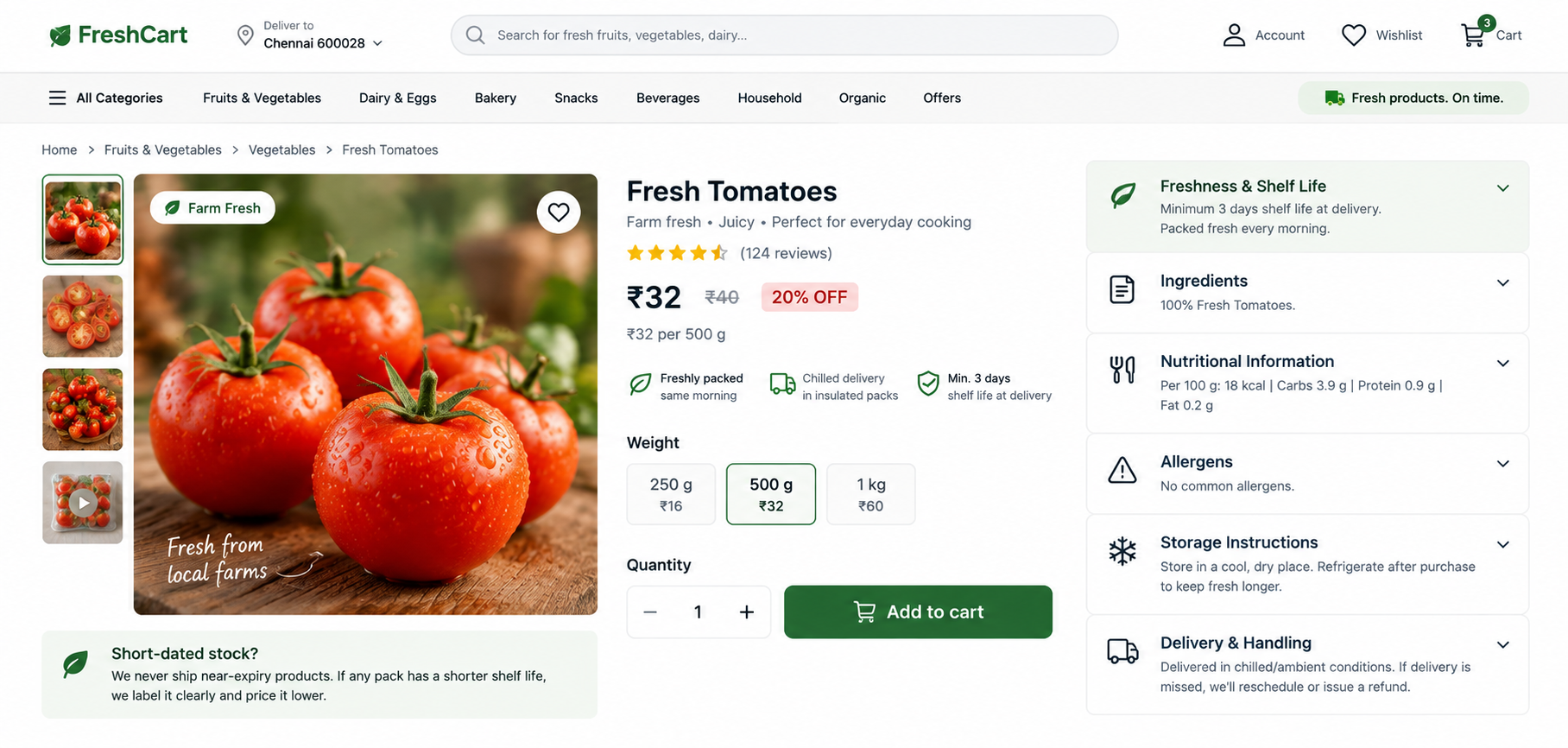
Freshness is the thing a shopper cannot check through a screen, which makes it the trust question of the category. Answer it as text on the page, where customers, search engines and assistants can all read it.
Publish the rule rather than the date. Individual packs vary, so commit to something you can keep on every order: a minimum shelf life at delivery, same-morning packing, or harvest within a stated window. In India this is not only good practice — FSSAI’s advisory for e-commerce food businesses requires products to be delivered with a minimum remaining shelf life of 30% or 45 days, requires online claims to match the physical label, and requires seller licence details and labelling compliance. Confirm the current requirements for every market you serve before publishing.
Ingredients, allergens and storage instructions should exist as readable text, never only as a photograph of the back of the pack. An image of a label cannot be searched, translated, read aloud or quoted, and allergen information locked inside a picture is a safety problem as well as a discoverability one. Show the pack photograph as well, so customers can match what arrives against what they ordered.
Say how the product travels — chilled, frozen or ambient — and what happens if a delivery is missed. If you sell short-dated stock, label it clearly and price it accordingly; a visible “use soon” section builds trust, while quietly shipping short-dated items destroys it.
In ZenBasket: ingredients, storage and date rules in expandable panels · or switchable panels beside nutrition · keep label content as real text · add the pack photograph
Foundation · 2 min
10. Do and Don’t
| Don’t | Do instead | Why |
|---|---|---|
| Force shoppers onto the product page to add an item | Allow quick add from any list | Keeps a forty-item basket quick to fill |
| Leave the add button unchanged after adding | Turn it into a quantity control | Shows what is already in the basket |
| Hide pack size in a variant dropdown | Put it in the product name | Makes products comparable at a glance |
| Show price without price per unit | Show both | Removes arithmetic from the decision |
| Bury past purchases in the account area | Put buy-it-again on the homepage | Reordering is the main journey |
| Let unavailable items be added silently | Label them and offer alternatives | Prevents gaps discovered at delivery |
| Ask for substitution preferences item by item | Ask once for the whole order | Removes dozens of hypothetical decisions |
| Reveal the minimum order at checkout | State it up front and show the gap | Prevents abandoned baskets |
| Confirm the pickup slot only at the end | Show slot availability from the start | Fulfilment is part of the purchase |
| Publish ingredients as a photo of the label | Write them as text | Improves safety, accessibility and discoverability |
Foundation · 2 min
11. Mobile First
Grocery shopping happens on a phone, often on mobile data and often in short bursts, so design the phone experience first and let desktop inherit from it.
Add and quantity controls need comfortable touch targets with space between them, because plus and minus sitting shoulder to shoulder produce wrong quantities that the shopper only discovers at delivery. A two-column product grid works better than one, filters belong in a drawer with an apply button, and the cart has to stay readable when it holds sixty lines — which usually means a compact list with the total always visible rather than large product cards.
Keep the fulfilment information in the header where it survives scrolling, and preview the finished store on a real phone before publishing.
In ZenBasket: responsive layouts · sizing and spacing per breakpoint · what stays in the header
Foundation · 2 min
12. Accessibility for Grocery Stores
Grocery stores are dense with small controls, repeated tiles and status information, so accessibility needs attention in specific places rather than as a final check.
| Problem | Better approach |
|---|---|
| Quantity controls are tiny and crowded | Give them comfortable touch targets and spacing |
| Stock status is shown only by colour | Add a text label such as “Out of stock” |
| Product images have no useful alt text | Describe the product and pack size |
| Allergen information exists only in an image | Repeat it as readable page text |
| Adding an item gives no announced feedback | Make the change perceivable to assistive technology |
| Offer text sits over busy banner imagery | Provide sufficient contrast |
Foundation · 2 min
13. Performance
Grocery pages are long. A department page can hold two hundred tiles, each with an image, which makes image handling the main performance decision in the store.
Export thumbnails at the size they are displayed rather than shipping full-size originals, set width and height so the grid does not shift as images arrive, lazy-load everything below the fold, and cap how many products load before the shopper asks for more. Google’s thresholds — under 2.5 seconds to the largest paint and under 0.1 for layout shift — are usually decided by those settings alone. Test on a mid-range phone on mobile data rather than on office wifi.
Foundation · 2 min
14. SEO, Structured Data and Answer Engines
Grocery SEO rests on a stable department structure and product pages that state their facts plainly. Use descriptive, permanent URLs:
/fruits-vegetables/
/staples/rice-and-grains/
/products/basmati-rice-5kg/
Product pages should carry the product name with pack size, brand, price, price per unit, availability, ingredients and storage. Product markup suits individual items, and pack-size variants of the same product can be grouped where appropriate. Availability in the markup must match the page, and nothing should be marked up that a shopper cannot see.
For answer engines and AI assistants, keep the facts in plain text: ingredients, allergens, storage, shelf life, unit price, delivery areas and minimum order. This matters more in grocery than in most categories, because so much of the information traditionally lives on packaging photographs or inside a cart that a crawler never reaches. A short, honest delivery and freshness page that makes sense on its own is one of the most quotable pages a grocery store can publish.
Foundation · 2 min
15. Choosing a ZenBasket Theme for Your Grocery Store
ZenBasket maps Essneed as the free theme and Dailfresh as the premium theme for the Grocery category, with Sipplio, Tasteeva, Biteova and Dripbru covering food and beverage. Explore ZenBasket store themes.
Essneed
Essneed suits daily-essentials stores that want a straightforward, department-led storefront. It works well when the catalogue is still settling and the priority is getting a real shop online with clear departments, featured products and offers.
Dailfresh
Dailfresh is the premium grocery option, built for grocery, fresh produce, organic food and daily essentials. Its structure carries the merchandising this guide asks for: a mega menu for departments, featured categories and products, countdown deals, a “how it works” explainer for first-time shoppers, split view, image hotspots, FAQ panels and a blog row.
Cafés, bakeries and prepared food
Sipplio, Tasteeva and Biteova are built around appetite-led imagery and shorter menus rather than large weekly baskets, and Dripbru suits coffee and speciality drinks where the story of the roast does the selling.
The important point is not choosing the best-looking theme. Open the demo on a phone and check the two things grocery lives on: can you add to the basket from a listing tile, and does that control become a quantity control once used? A theme that fails those two will cost more in workarounds than any premium theme costs to buy.
In ZenBasket: switch and customise your theme · upload your logo and brand assets
Foundation · 2 min
16. Building It in ZenBasket
The recommendations in this guide are implemented through the ZenBasket Builder and the product catalogue. Pack sizes, units, prices and stock live in the catalogue, and the storefront tiles, filters and search all read from it, so fix your unit vocabulary there first.
| Grocery requirement | ZenBasket approach |
|---|---|
| Reorder row and saved lists | Data driven box and list element |
| Department navigation | Navigation menu, mega menu layout |
| Search that copes with regional names | Search variants and search bar customisation |
| Quick add, quantity and stock on tiles | Product list page settings |
| Pack size, unit price and diet marks | Product details page and the tag element |
| Ingredients, storage and date rules | Expandable panels or switchable panels |
| Slot selection and delivery instructions | Stepper and forms |
| Pickup location and hours | Map element and footer customisation |
| Minimum order, cut-offs and offers | Attention banners, timer and counter |
| Building and arranging the page | Adding a new section and customising sections |
New to the builder? Start with Getting started and the tour of the builder menus. The industry guide should say what a grocery store needs; the detailed implementation belongs in those help articles.
Foundation · 2 min
17. Learn From the Essneed and Dailfresh Storefronts
View the Essneed storefront · View the Dailfresh storefront
Use these as references for how a grocery store can combine everyday navigation with merchandising. Notice the sequence a shopper is moved through: offer or delivery promise → departments → featured products → deals → reassurance content → browsing.
The lesson is not to copy the layout but to ask what job each section performs:
- An announcement strip should carry the delivery promise, the minimum order or the cut-off.
- A department section should get a shopper into an aisle in one tap.
- A featured-products row should surface staples rather than novelties.
- A “how it works” section should answer a first-time shopper’s questions about slots and substitutions before they have to ask.
That keeps the homepage useful for both audiences a grocery store serves at once: the regular who wants their list back, and the newcomer who needs to understand how you deliver.
Foundation · 2 min
18. How to Test Whether It Works
- Test the reorder journey. Ask someone who has ordered before to rebuild last week’s shop. Time it. If it takes longer than a few minutes, your reorder path is the problem, not the catalogue.
- Test the basket build. Ask someone to add ten specific items. Watch how many times they open a product page, and how often they lose track of what they have added.
- Test search with real words. Use regional names, plurals, brand names and common misspellings. Note every search that returns nothing, and fix those first.
- Test the fulfilment story. Ask someone to find out whether you deliver to their area, when the next slot is, and what the minimum order is — without using the checkout.
- Test the freshness answer. Show someone a product page and ask how fresh the item will be when it arrives. If they cannot tell you, the promise is not on the page.
- Test on a phone, on mobile data. Complete the journey from homepage to basket to checkout, paying attention to quantity controls, filters and a long cart.
Foundation · 5 min
19. Frequently Asked Questions
How do I design an online grocery store?
Design for speed and repetition. Put past purchases on the homepage, allow adding from any list without opening a product page, show pack size and price per unit, mark what is out of stock, take one substitution decision for the whole order, and show delivery, pickup and minimum order before the basket is full.
Why do grocery shoppers skip product pages?
Because they already know the product. Most add items straight from lists and search results, which means the listing tile has to carry enough information to buy on: name with pack size, price, price per unit, stock and an add control.
Where should past purchases appear?
In the first screenful of the homepage for returning customers, with product images and an add control, rather than hidden inside the account area.
What is quick add?
Adding an item to the basket directly from a list, search result or reorder row without opening the product page. It matters in grocery because a basket holds dozens of items.
Should the add button become a quantity selector?
Yes. It confirms the item was added and lets the shopper adjust quantity in place. Include a typed field as well as plus and minus so larger quantities take one action.
Should I show price per unit?
Yes. Shoppers compare pack sizes constantly, and unit pricing removes the arithmetic. It is also a legal requirement for goods sold by weight or volume in several markets.
How do I sell products by weight?
Give them a quantity control that matches how they are sold, such as 250 g, 500 g or about six pieces. If the final price depends on the weight packed, state that before checkout.
How should I organise grocery categories?
Use departments that mirror a physical shop, two levels deep, and handle brand, pack size, price and diet as filters rather than menu items.
How important is search for a grocery store?
Very important — it is the primary way people shop a wide catalogue. Support regional names, brand names and misspellings, and never return an empty results page.
Should out-of-stock items be hidden?
No. Label them on the listing tile, disable the add control and offer an alternative, so shoppers can plan around what is unavailable.
What is the best way to ask about substitutions?
Once, for the whole order, with a clear control at the top of the cart, and optional per-item overrides. Item-by-item prompts create dozens of hypothetical decisions.
When should customers choose a pickup slot?
Before the basket is full. Show the next available slot in the header, allow a slot to be reserved while shopping, and repeat the chosen slot through to the confirmation email.
How should I handle click and collect?
Ask delivery or pickup before shopping, flag items the chosen method cannot serve as they are added, and give the collection point an address, a window and arrival instructions.
How should I communicate a minimum order value?
State it before shopping starts and in the cart, and show it as a gap to close rather than a rule, updating live as items are added.
What freshness information should a product page show?
The rule rather than the individual date: shelf life at delivery, packing or harvest timing, storage, and whether the item travels chilled, frozen or ambient.
What are the shelf-life rules for selling food online in India?
FSSAI’s advisory for e-commerce food businesses requires delivery with at least 30% of shelf life remaining or 45 days before expiry, and requires online claims to match the physical label. Confirm current requirements before publishing.
Can I use Essneed for a grocery store?
Yes. Essneed is mapped to the Grocery category and suits daily-essentials stores that need clear departments and offers.
When is Dailfresh the better choice?
When the store has many departments, regular offers and first-time shoppers to explain delivery to. Dailfresh ships with a department mega menu, countdown deals, a how-it-works explainer, hotspots and FAQ panels.