Foundation · 2 min
What a cart page is actually for
People use carts for more than buying
If you design the cart purely as a transaction step, you will misread most of the behaviour you see in your analytics. Shoppers routinely use carts as:
a shortlist, holding several options while they decide between them;
a price calculator, to find out what delivery actually costs;
a wishlist, especially where a store has no wishlist feature;
a bookmark, keeping items visible until payday or a sale.
This is why cart abandonment figures look alarming and are widely misread.
Design the page against four jobs:
Job 1: Confirm what is in the cart
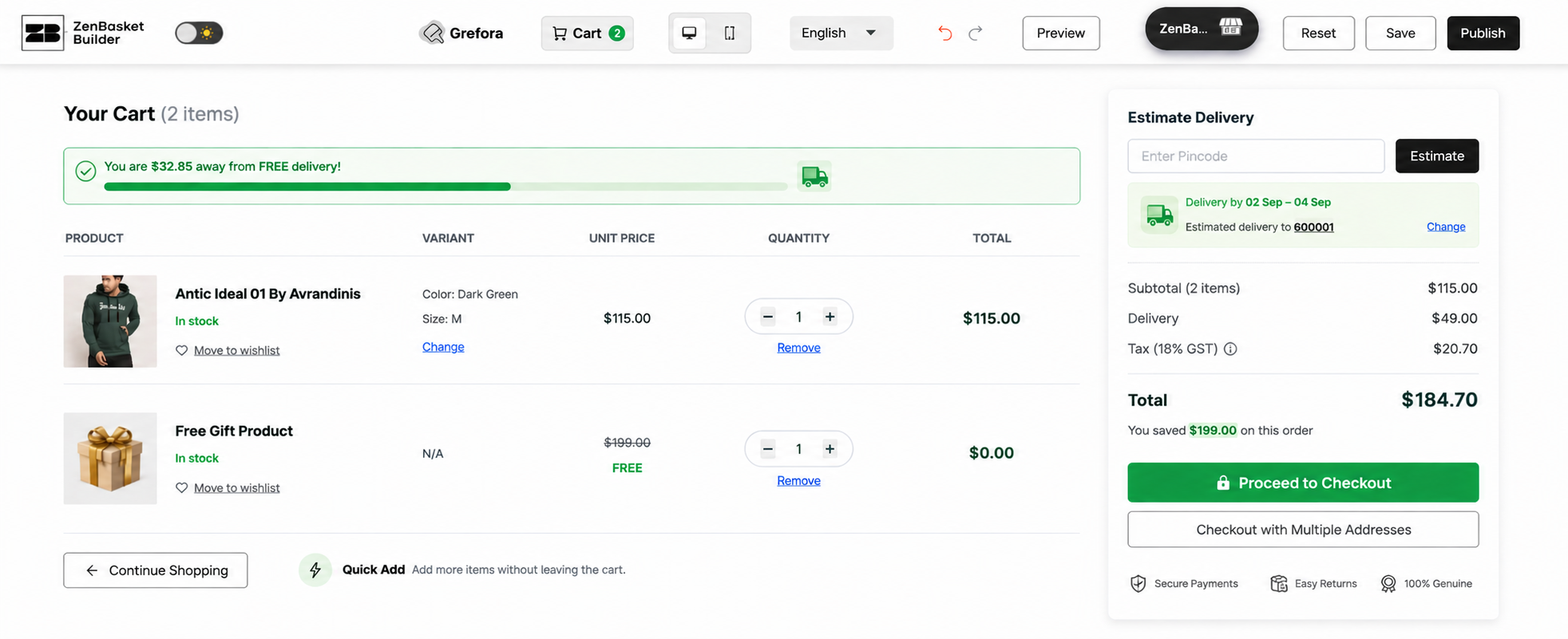
Every line needs enough detail that a shopper recognises it without clicking: a thumbnail, the product name, the variant they chose, the unit price and the line total.
A cart showing “Cotton T-Shirt × 2” without a size, colour or picture forces people back to the product page to check, and that round trip is where carts get abandoned.
Job 2: Let people change their mind cheaply
Changing a quantity, removing an item, or switching a size should take one interaction and show its effect immediately.
Job 3: Show the real cost
Subtotal, delivery, tax and total, before the shopper commits to checkout. If delivery depends on an address, offer an estimate from a pincode or postcode. Unexpected extra costs are the most-cited reason people abandon purchases, and the cart is the last comfortable place to prevent that surprise.
Job 4: Offer two clear routes
Forward to checkout, and back to shopping. Stores obsess over the first and neglect the second, which is a mistake: a shopper who came to the cart to check delivery cost and now wants to add one more thing should not have to use the browser’s back button.
Foundation · 2 min
Six decisions to make before you start designing
Decision 1: Drawer, page, or both?
A cart drawer slides in over the current page and keeps the shopper where they were. A cart page is a full URL with room for detail. Most mature stores have both: a drawer for quick checks after adding something, and a page for the considered review before checkout.
Decision 2: What happens when someone adds to cart?
Four options: open a drawer, show an overlay confirmation, redirect to the cart page, or confirm inline on the product page. The wrong answer for almost everyone is a silent add with only a small number changing in the header, because a meaningful share of shoppers do not notice and add the item again.
Decision 3: How long does a cart last?
Carts should survive a closed tab, and for signed-in customers or guest customers they should survive a change of device. Decide the retention period, decide what happens to guest carts, and decide how you handle an item that has since gone out of stock or changed price.
Decision 4: Can you show a delivery estimate here?
If delivery cost or timing varies by location, a pincode-based or postcode- based estimate in the cart is one of the highest-value additions available.
Decision 5: Do you need “save for later”?
It is genuinely useful for stores where people build large carts over time and where budget forces a choice between items. It matters less for single-item, high-consideration purchases. If you have a wishlist already, decide how the two relate, because two similar features confuse people more than one good one helps.
Decision 6: What does an empty cart do?
Every store has this state and almost nobody designs it. A blank page saying “Your cart is empty” is a dead end at the exact moment someone is looking for a reason to stay. Decide what it offers: recently viewed items, popular categories, a link to saved items, and a route back into browsing.
Once those six decisions are made, here is what the page itself contains, zone by zone.
Foundation · 2 min
The anatomy of a cart page, zone by zone
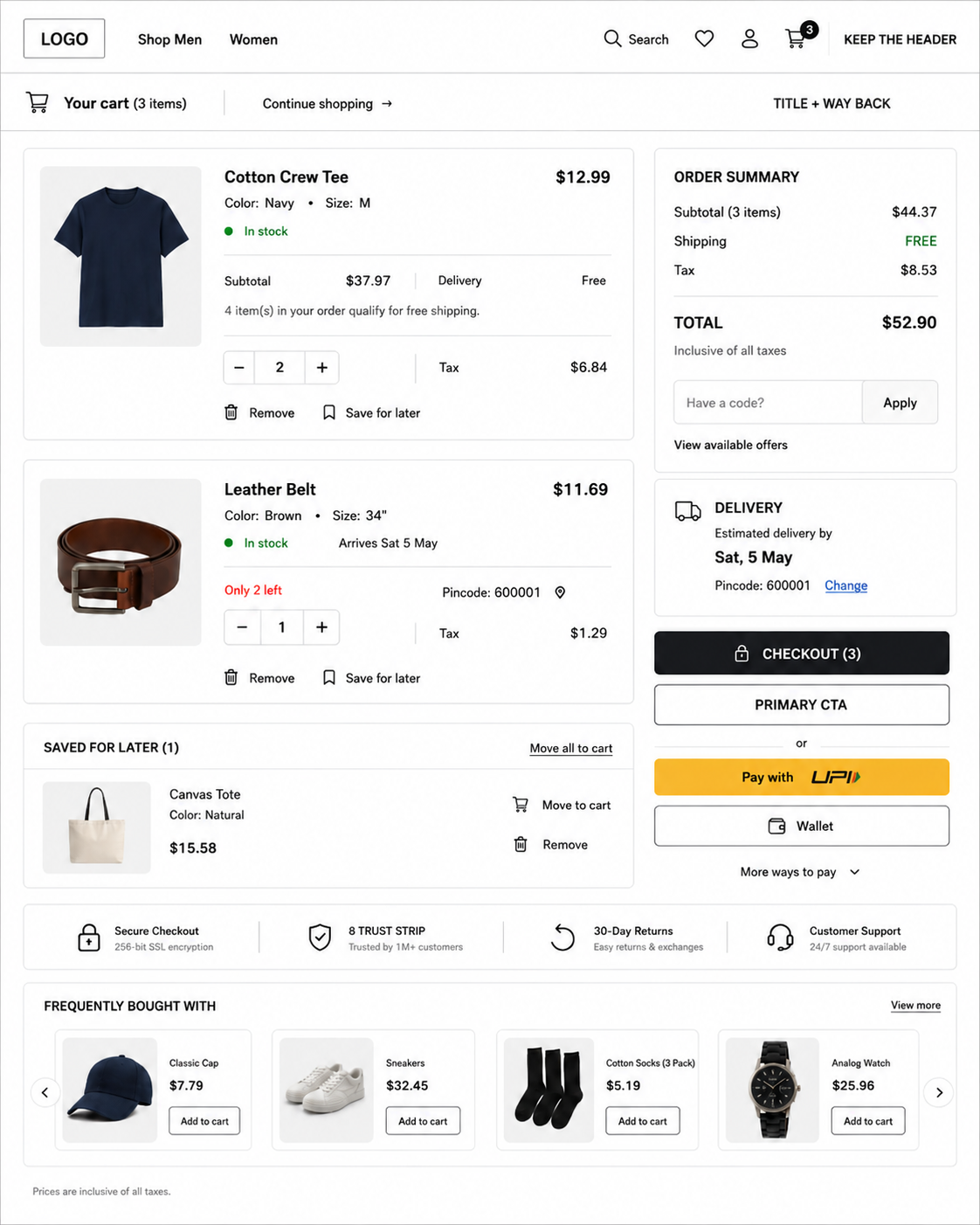
| Zone | What it does |
|---|---|
| Header | Kept in full (unlike checkout) shopper hasn’t committed and may still browse. |
| Title + way back | Item count plus a visible “Continue shopping” link. |
| Line items | Variant-correct thumbnail, name, variant details, unit price, line total. |
| Quantity & removal | Stepper buttons, instant totals update, always-undoable remove. |
| Order summary | Subtotal, delivery, tax, total, named plainly, total visually dominant. |
| Delivery estimate | Pincode/postcode field returning a cost and an arrival date. |
| Discount code | Small expanding link, not a prominent box. |
| Checkout & express pay | One dominant CTA; UPI/wallet options directly beneath it. |
| Trust strip | Returns window, secure payment, support near the CTA. |
| Cross-sells | Genuinely related complements only; fewer is better than padded. |
| Empty state | Deliberate design with a route back into browsing. |
Foundation · 2 min
Design decisions with real trade-offs
-
Auto-update, not a button: Always update totals immediately, a separate “Update cart” step is routinely missed, and shoppers reach checkout with the wrong quantity.
-
Quantity control: Plus/minus stepper buttons beat dropdowns and bare text fields for speed, error rate, and touch usability.
-
Cross-sells: cart vs. Checkout : Unlike checkout, cross-sells belong in the cart because the shopper is still deciding but one irrelevant suggestion makes shoppers dismiss all future ones.
-
Free-delivery progress bar: Fine only when the threshold is real and stated factually; manipulative when paired with a moving target or countdown.
-
Out-of-stock / price changes: Flag on the line immediately, keep it visible, explain it, and offer alternatives, never surface it silently or first at checkout.
Foundation · 2 min
Designing for mobile first
The cart is a dense page, squeezed onto a narrow screen. The goal is to keep the total and the checkout button always visible while the line items scroll.
Foundation · 2 min
SEO, indexing and analytics
The cart should not be indexed. Add a noindex tag, or block the URL through robots.txt. There are three reasons. The contents change with every shopper and every session, so there is no stable page for a search engine to rank. It should simply never be the page someone lands on from a search result.
With the strategy and page anatomy settled, here is how to build it.
Apply This in ZenBasket
Once the strategy is clear, ZenBasket Builder turns it into an actual page: pick the cart layout that fits your store, lay out product information the way this guide describes, add the trust elements that matter to your customers, and fine-tune how it all looks on mobile.
Need step-by-step help? Visit the ZenBasket Help Center for Builder instructions.
Prefer to watch it built? The ZenBasket Builder video playlist walks through customizing these page sections step by step.
Foundation · 2 min
Frequently asked questions
What is a cart page in ecommerce?
A cart page lists the items a shopper has selected and lets them review and adjust the order before checkout.
Should the cart page keep the site navigation?
Yes and this is the key difference from checkout. Checkout strips navigation because the shopper has committed and every link is an exit. The cart shopper is still deciding and may legitimately want to add one more item, so keep the header, search and a visible “Continue shopping” link.
Should I show shipping costs on the cart page?
Yes, wherever possible. Unexpected extra costs are the most-cited reason people abandon purchases, and the cart is the last comfortable place to prevent that surprise.
Where should the discount code field go on a cart page?
Keep it quiet: a small “Have a discount code?” link that expands a field, rather than a large prominent box.
Should I show cross-sells on the cart page?
Yes, unlike at checkout. In the cart the shopper is still deciding and can still browse, so a relevant complement is helpful.
How do I know if my cart page is working?
Track cart-to-checkout rate as the cart’s own conversion metric, and keep checkout-to-order rate separate so a checkout problem is not blamed on the cart. Watch quantity changes and removals, which show where prices or delivery costs cause second thoughts, how often the delivery estimator is used, and how many shoppers return to a persisted cart that last number tells you how many “abandoners” were always coming back.