Foundation · 3 min
What Makes Ecommerce Website Design Different?
A store isn’t a brochure with a buy button. Six or seven pages have to work in sequence, on a phone, for someone who has never heard of you, and a page that does its own job beautifully can still lose the sale.
On a marketing website, success is a visit. Someone reads the page, understands what you do, and forms an impression. One page can carry that on its own.
In a store, success is an order. That means a chain: someone lands, works out whether you sell what they want, finds it, decides it’s the right one, trusts you enough to pay, and completes a form. Break any link and the rest of the chain doesn’t matter. A beautiful product photograph cannot rescue a checkout that demands an account before it asks for an address. A well-written homepage cannot fix a category page where nothing is where a shopper expected it.
This is why store design is a sequencing problem rather than a styling one, and it’s why the numbers look the way they do. Across a decade of industry research the share of shoppers who add something to a cart and then leave has held at roughly seven in ten. Some of those were never going to buy — a good half of people add items to compare prices or save them for later. But among the ones who genuinely intended to purchase, the reasons they give are remarkably consistent and remarkably fixable: costs that appeared only at the last step, a forced account, and a checkout that asked too much. Studies of large stores put the average checkout at more than twenty form elements and find that most could cut that substantially without losing a thing they need.
None of those are visual problems. They are decisions about what a page is for, made before anyone opened a design tool.
Three things a store has to carry that a brochure site doesn’t
| Brochure site | Store | |
|---|---|---|
| What counts as success | They read it and remember you | They complete an order |
| How many pages are involved | Usually one | Six or seven, in a fixed order |
| What failure looks like | Someone leaves | An abandoned cart you can count, on a specific step |
There’s a fourth difference the table can’t hold, and it’s the one that catches people out. Most of your visitors are on a phone. Depending on whose data you read, mobile accounts for somewhere between two-thirds and four-fifths of store traffic, and in most datasets it still converts at close to half the desktop rate, though that gap has been narrowing as one-tap payments spread. Whatever your exact split, the device sending you the most people is the one converting them least well. Designing for the large screen first and shrinking it afterwards makes that gap wider, not smaller.
So this path starts with the shopper rather than the canvas. Every section after this one asks the same question at a different point in the journey: what does this person need to know, right now, to keep going?
Foundation · 3 min
The Ecommerce Shopper Journey: From Discovery to Reorder
Six stages, and almost nobody moves through them in order. Your store has to work for someone arriving at any point in the loop, on any device, with no memory of what came before.
A shopper’s journey with your store starts before they reach it and continues long after they pay. It begins with a search, a video, a friend’s recommendation or a marketplace listing. It ends, if it ends at all, somewhere past delivery, in the decision to come back.
How people actually shop
The six stages
| Stage | What the shopper needs | Where it happens |
|---|---|---|
| Discovery | Tell me what this is, who it’s for, and why I should trust you | Homepage, landing pages, product pages |
| Exploration | Show me what’s available without making me open everything | Navigation, search, filters, collection pages |
| Evaluation | Help me decide if this specific one is right | Product page — images, variants, sizing, delivery, reviews |
| Purchase | Let me finish without surprises or unnecessary effort | Cart and checkout |
| Fulfilment | Confirm it worked and tell me what happens next | Thank-you page, order confirmation, tracking |
| Retention | Make coming back easier than starting over | Account, order history, reorder |
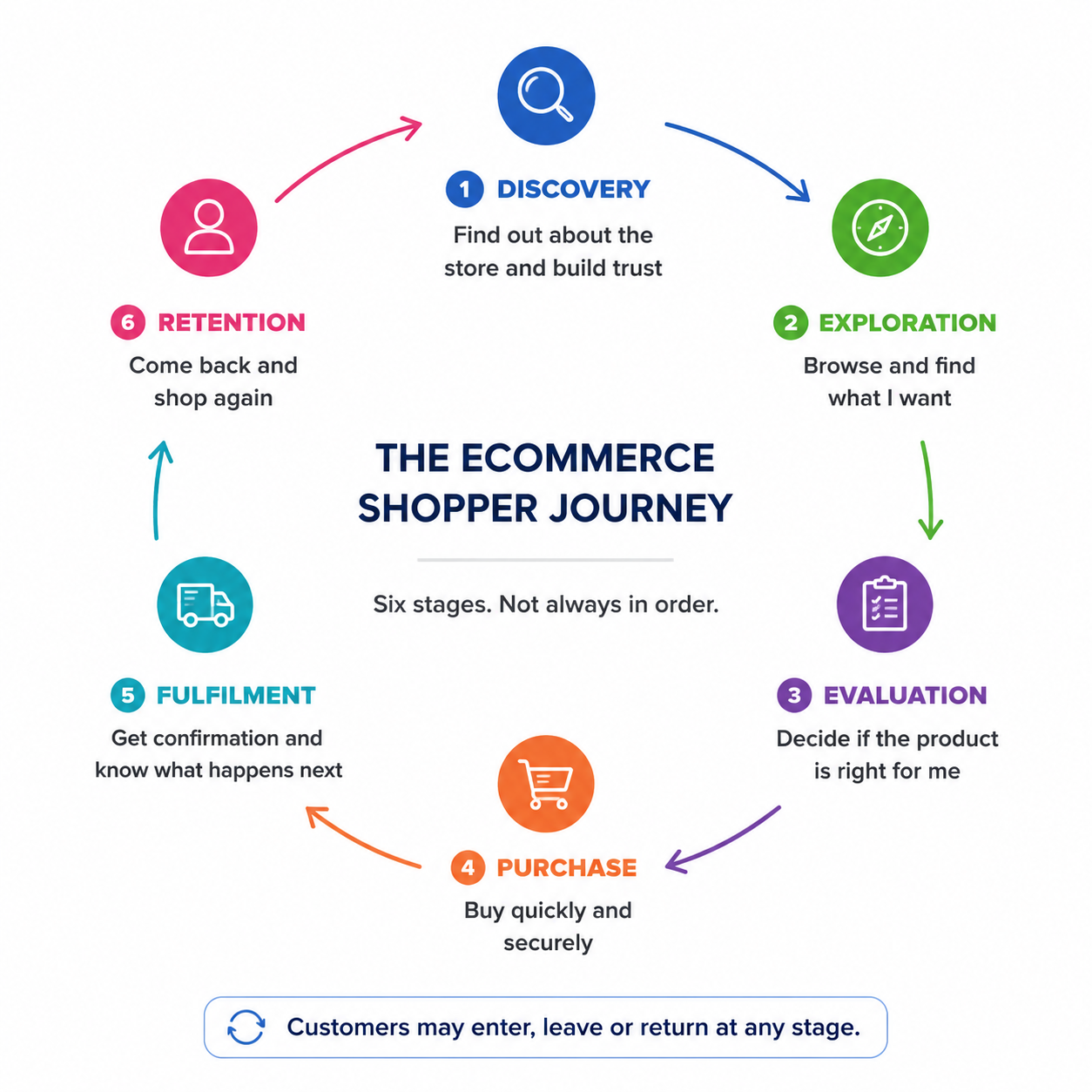
Notice that four of the six happen after the shopper has decided to buy or is already committed. Fulfilment and retention are ecommerce design, not administration — a confirmation page that leaves someone wondering whether their payment went through costs you the reorder as surely as a broken checkout costs you the order.
The journey is a loop, not a line. Someone sees a bag in an Instagram video, opens the product page on their phone, leaves. Two days later they search your brand name on a laptop, land on a category page, compare two designs, message you a question on WhatsApp, and check out that evening. One customer, three entry points, two devices, four days.
The practical consequence: every important page has to orient a stranger who arrived there directly. Search engines, ads and shared links deliver people to category and product pages far more often than to your homepage. A product page that assumes you already browsed the category to get there will fail most of the people who see it.
Goals are not tasks, and the difference shapes your pages. A goal is what the shopper wants — an outfit for a wedding. Tasks are the steps that get them there: open the category, filter by size, check the size guide, compare two, read the delivery date, add to cart.
Sort those tasks into three tiers. Primary tasks find and buy things. Secondary tasks build confidence — reviews, specifications, returns policy. Support tasks handle what comes after — track an order, request a return, reorder.
Give the primary tasks the most prominence at each stage and let the tier decide the placement rather than the visual appeal. This is also why store types differ: a grocery store needs fast add-to-cart and quantity controls where a jewelry store needs photography and reassurance. Same six stages, different weighting.
Where this usually goes wrong: designing only for people ready to buy, when many visitors are still learning; assuming the homepage controls the journey, when most arrivals skip it; and treating checkout as the finish line, when poor confirmation and tracking undo the trust that got you there.
Foundation · 3 min
How to Plan an Ecommerce Website Before Designing It
Every page exists to answer one customer question. If you can’t state the question, the page has no brief, and no amount of visual polish will give it one.
Most first stores get built in the wrong order: pick a theme because it looks good, load in products, then discover that the categories don’t fit the menu, the homepage is doing a job the listing page should be doing, and the thing you sell most of is three clicks deep.
The order that works runs the other way.
- Audience. Who is buying, and what do they already know? Someone shopping for a familiar product needs speed. Someone shopping for an unfamiliar one needs orientation first.
- Catalogue. What are you selling, and how does it group the way customers think about it? This is the step that constrains everything after it, and the hardest to change later.
- Page inventory. Which pages do you actually need? Not every store needs a category layer above its product lists.
- Structure. How do the pages connect, what leads where, and what’s reachable in one click from anywhere?
- Design. Only now. Theme, layout, color, imagery.
Skip to step five and you will build a beautiful version of the wrong structure.
The middle steps come from one exercise: write down the question each page exists to answer.
The seven pages and their jobs
| Page | The customer’s question | It fails when |
|---|---|---|
| Homepage | Why shop here, and what do you sell? | Your range isn’t clear |
| Category page | What kinds of things do you have? | It adds a click without adding information |
| Product listing | Which of these fits what I need? | Items can’t be compared or filtered |
| Product detail | Should I buy this one? | A key deciding fact is missing |
| Cart | Is this right, and what will it cost? | Costs appear later than expected |
| Checkout | How do I finish, safely? | It asks for more than it needs |
| Post-purchase | Where’s my order, and what if it’s wrong? | The trail goes cold after payment |
Two of those seven are optional. A category page earns its place only when your catalogue is large or your products unfamiliar; on a small store it becomes a click between the shopper and the thing they came for. Decide that one deliberately.
Notice what the right-hand column has in common. Almost none of it is about taste. Stores lose orders because a page didn’t say something it needed to say, and that is a decision you make on paper, before anyone opens a design tool.
Before you go further: write the seven questions out for your own store, and next to each, the two or three facts that answer it. That list is your brief. Each of the store page guides then tells you how to build it.
Foundation · 2 min
Ecommerce Information Hierarchy: What Shoppers Need to See First
Order beats volume. The question is never how much to put on a page, it’s what comes first, and what can wait until someone has decided to keep reading.
Every page opens with the same silent question from the shopper: am I in the right place? Everything that answers it belongs above everything that supports it.
That ordering matters more than it looks, because attention drops off a cliff. Eye-tracking studies put roughly 57% of viewing time on the first screen and about three-quarters within the first two. People do scroll — the old worry that nobody does is long dead — but they scroll when the first screen has given them a reason to. Content placed below something that failed to earn the scroll may as well not exist.
So sort what goes on a page into three tiers and place them in that order.
| Tier | It answers | Example on a product page |
|---|---|---|
| Identify | Am I in the right place? | Product name, main image, price, whether your size is in stock |
| Decide | Is this specific one right for me? | Other angles, variants, dimensions, delivery estimate, returns window |
| Reassure | Can I trust you with this? | Reviews, care instructions, brand story, related products |
The mistake is not putting too much on a page. It’s putting a tier-three thing in a tier-one position — a brand video where the price should be, a lifestyle photograph where the range should be.
Watch for the section that looks finished. If a block of content ends on a tidy line at the bottom of the screen, people read it as the end of the page and stop. A row of product cards cut cleanly at the fold tells a shopper there are four products; a row deliberately cut mid-card tells them there are more. Let something be visibly incomplete at the fold.
On a phone, hierarchy stops being a layout and becomes a sequence. Two columns collapse into one, so the order you chose is the order everyone gets, with no way to glance sideways. Decide the priority on the small screen first and the large screen mostly takes care of itself.
One thing this is not: how your catalogue is organized. That’s structuring your catalogue, two sections down. This section is about the order of what appears on a single screen.
Foundation · 3 min
Trust and Clarity in Ecommerce Design
Trust isn’t a badge you add. It’s the absence of unanswered questions, and it accumulates from dozens of small signals a shopper never consciously registers.
Nobody arrives at your store and evaluates its trustworthiness against a checklist. They form an impression continuously: does this look like a real business, is the information straightforward, does anything here feel slightly off?
There’s a striking piece of evidence for how shallow that judgement is. When researchers tested trust seals against each other, a homemade seal outperformed the certified ones issued by established security vendors. Shoppers weren’t recognizing certification authorities. They were reading the page for signs that someone was paying attention, and a seal was one such sign, no more authoritative than a real phone number or a photograph that was clearly taken in your own workshop.
The practical conclusion is that trust comes from the page looking handled, and that isn’t a task you finish. It runs through every page, and it fails at the weakest one. A store that looks professional on the homepage and sloppy at checkout raises doubt exactly where it costs most.
What stops a purchase is usually a question you didn’t answer. Shoppers arrive with a standing list: will it fit, what does it really cost, when will it come, can I send it back, who do I contact. Four kinds of thing get in the way:
| Barrier | What it looks like |
|---|---|
| Information | The fact they need to decide isn’t on the page; dimensions, delivery date, whether it’s in stock |
| Interaction | The task is harder than it should be; a fiddly size selector, a form that loses their input |
| Trust | They’re unsure about the business, the payment, or whether they can return it |
| Operational | You genuinely can’t do the thing; deliver to their area, take their payment method |
Only the last needs a business decision. The first three are answered with information you already have, placed where the question gets asked. Put the delivery estimate next to the add-to-cart button, not on a policy page two clicks away.
And these rarely cause an immediate exit. Small doubts accumulate until someone quietly decides the purchase isn’t worth the effort, which is why abandonment so often has no obvious cause.
Clarity is itself a trust signal. A confusing page reads as untrustworthy even when nothing on it is dishonest. If a shopper can’t tell what a button does, whether a price includes tax, or what happens after they click Buy, they attribute that uncertainty to the business rather than the interface. Plain language and obvious next steps do more work than any badge.
The six-question check. Run your store through this before adding a single decorative trust element:
- Is a real contact method visible without searching?
- Is the total price, including shipping and tax, shown before checkout rather than at the last step?
- Are shipping and return policies linked from the product page, not just the footer?
- Do your photos show the real item?
- Are your reviews unfiltered, negative ones included?
- Does every page look like it belongs to the same store?
Six “yes” covers most of what actually moves the needle.
There is also a set of techniques that appear to build urgency and in fact corrode trust faster than anything on this list. Persuasion without dark patterns covers those.
Foundation · 2 min
Ethical Conversion Design: Persuasion Without Dark Patterns
A countdown that resets when you refresh the page doesn’t create urgency. It creates a shopper who stops believing anything else you’ve written.
Persuasion is a normal part of selling. Telling someone a sale ends on Sunday, that only four are left, or that most buyers choose the larger size — all fine, and all useful to the person deciding.
The line isn’t between persuasion and restraint. It’s between information that’s true and information that’s staged. And there’s a simple way to find it: if the shopper could inspect the mechanism, would they feel informed or tricked? A timer counting to a real dispatch cut-off survives inspection. A timer that starts over on every visit does not.
| The technique | Honest version | Dark pattern |
|---|---|---|
| Urgency | A real deadline with a real consequence, order by 2pm for same-day dispatch. | A countdown that resets on refresh, or has no consequence when it ends. |
| Scarcity | The actual stock number, when it’s genuinely low. | “Only 2 left” displayed permanently, regardless of stock. |
| Social proof | Real recent orders, real review counts. | Invented “14 people are viewing this” figures. |
| Defaults | Add-ons unticked, chosen deliberately. | Pre-ticked extras, insurance, or newsletter opt-ins. |
| Cost | The full price including shipping and tax, shown early. | Fees that first appear at the payment step. |
| Leaving | Unsubscribing and cancelling as easy as signing up. | A cancellation buried behind a phone call or five screens. |
The cost is asymmetric. A fake countdown might buy you one order. What it actually costs is every subsequent claim on the page, because the moment a shopper spots one staged element, the delivery estimate, the review scores and the returns policy all become suspect too. You cannot undo that with a trust badge.
And shoppers do spot them. A European Commission sweep of nearly 400 online shops found manipulative practices on more than a third. People have seen these techniques enough to recognize them.
Regulators have caught up, too. Practices that were treated as aggressive marketing a few years ago — invented scarcity, hidden fees, pre-ticked boxes, cancellation flows harder than sign-up flows — are now treated in both the US and EU as deceptive rather than merely pushy, with more specific rules on the way. If you sell across borders, design to the stricter standard rather than the one where you’re incorporated.
So can you use a countdown timer at all? Yes, when three things hold: the deadline is real, something actually changes when it passes, and the same visitor sees the same time remaining. Under those conditions a timer is just a fact presented usefully. Outside them, it’s the fastest way to lose a customer you already had.
Primer · 2 min · full version in Grow Your Skills
How to Structure an Ecommerce Product Catalogue
Your store is organized twice; once for your warehouse, once for your customer. Only one of those belongs on the website.
Internally you think in suppliers, ranges and stock groups, and you should: that structure runs the business. But when it leaks onto the storefront, a shopper meets a category called “Range B” and has no idea what’s behind it.
The cost of getting this wrong is bigger than a wasted click. Shoppers don’t study your menu; they guess once, on instinct, and act on the result. Researchers watched people look for a baby car seat check the automotive section first, find nothing, and leave. The product was on the site the whole time. They didn’t conclude the menu was confusing; they concluded the store didn’t stock it, and that belief travelled with them.
Three questions decide where anything goes. Hold the word — “Cotton”, “Sale”, “Sneakers” — and ask:
| Ask | If yes | Example |
|---|---|---|
| Would a shopper finish “I’m looking for a ___” with it? | Category | Jacket, sofa, saree |
| Would they want to combine it with something else? | Attribute — make it a filter | Blue, cotton, under $20 |
| Does it have an end date behind it? | Collection — keep it out of permanent navigation | Holiday Edit, Clearance |
Over-categorizing is the commonest structural mistake in ecommerce. Splitting T-shirts into Cotton T-Shirts, Linen T-Shirts and Polyester T-Shirts silos your own stock: a shopper who wants blue and cotton and under $20 can’t get there, because a hierarchy can’t combine and a filter can.
Depth and width. Two to four levels, then stop; every extra level is another click between a shopper and a purchase. If a category holds fewer than about five products it isn’t a category, it’s a filter value — merge it upward. And the more common failure runs the other way: hundreds of products in one category with no filters built.
Decide this before you build, because it’s the one thing you’ll only change once. You’ll redesign your homepage several times. You’ll restructure your catalogue once, painfully, and then live with it for years; URLs move, redirects pile up, ad feeds break, and search rankings reset. Design outlives nothing; structure outlives everything.
Two cheap ways to check before committing: your zero-result site searches, which show the words shoppers actually use, and a card sort with eight or ten customers. Both are covered in detail in Grow your skills.
Primer · 2 min · full version in Grow Your Skills
How to Name and Organize Product Categories
A category name has one job: let someone predict what’s behind it before they click.
Five rules cover most of it.
- Use your customers’ words, not your industry’s. If shoppers search “nighty” and your category says “Loungewear”, your search log has already told you which one is right. It’s the cheapest naming research you have.
- Never use a vague verb. Explore, Discover, Shop the Edit. These name an action, not a destination.
- Never use an invented brand word. The Essentials, Curated, The Collection. They have no scent; they could contain anything.
- Never use internal vocabulary. Supplier names, stock groups, range codes. If you haven’t heard a customer say it out loud, it isn’t a category name.
- Make siblings mutually exclusive. If a shopper could reasonably expect the same product in two neighboring categories, one of those two names is wrong.
Keep your category names and product names in the same register. A category called Loungewear holding products titled “Cotton Pyjama Set” creates a small break every time someone scans the list; they arrived expecting one vocabulary and met another. Individually trivial, but across a catalogue it reads as a store nobody has thought through. If your products are pyjama sets, the category is Pyjamas.
And when you’re unsure whether to add a level or a filter, there’s a clean test. Add a level when the new group is a different kind of thing — shirts and skirts. Add a filter when it’s the same kind of thing with a different property; cotton shirts and silk shirts are both shirts, and a shopper may well want to compare across them.
Foundation · 2 min
Ecommerce Header Anatomy
Four things, in the places shoppers already expect them. Every deviation costs you a moment of hesitation and buys you nothing.
A store has four separate navigation systems, and only two of them live in the header. Getting that boundary right is most of the job.
Primary navigation is your category tree. Utility navigation is the set of secondary tools — search, cart, account, wishlist, help. Those two share the header.
Local navigation (pages within the section someone is already in) belongs down the left side of that section, and footer navigation takes secondary categories, policies and company information. Anything you’re tempted to squeeze into the header usually belongs in one of those two instead.
| Header slot | What goes there | Where it goes wrong |
|---|---|---|
| Logo | Your name or mark, always linking home | It isn’t a link, and people get stranded |
| Primary navigation | Top-level categories, left-aligned and scannable | Hidden behind a hamburger on desktop, or buried under a vague “Shop” |
| Utility | Search, cart, account; top right by convention | Icons with no text label beside them |
| Announcement bar | A single, current message, if you truly need one | It pushes the products below the fold |
Two of those need saying plainly.
The cart and search box live in the top right because that’s where a decade of shopping has taught people to look. They’re core ecommerce features sitting in the utility slot for reasons of convention rather than logic, and following the convention is one of the cheapest usability wins available to you.
Label icons with words. Shoppers recognize icons inconsistently from site to site, and an icon alone forces them to guess or hover, which doesn’t work at all on a touchscreen. Cart, Search and Account beside their symbols costs a few pixels and removes the guessing.
Keep filtering out of the header. “Browse by material” or “by size” isn’t navigation to a different kind of product, it’s filtering, and it belongs in the filter panel. Attributes in a top-level menu make the menu longer without making anything easier to find.
And keep the list short. Above roughly seven top-level items, a menu stops being scannable and becomes something people read, which they won’t.