Foundation · 2 min
The short answer
A home and living store is designed around one question a shopper cannot answer alone: will this work in my room? Let people shop by room as well as by product, show every piece in enough photographs to judge it, and put the measurements and materials where they cannot be missed. Make it easy to compare two similar pieces, and be honest about when the item will arrive and what putting it together involves. Recommendations should complete the room rather than fill space, and inspiration photography should lead straight to the products in it.
Foundation · 2 min
1. What Makes a Home and Living Store Different From Other Ecommerce?
Furniture and home products are expensive, large and slow to arrive, and they have to live alongside things the customer already owns. Shoppers take their time, compare a few options, often talk to someone else in the household, and come back several times before buying. They are trying to picture something in a room the website has never seen, and they worry about two practical things as much as about the design: whether it will fit, and whether it will actually turn up when promised.
| Home and living challenge | Design response |
|---|---|
| Shoppers think in rooms, not categories | Let people browse by room as well as by product type |
| Size is the main reason for returns | Put measurements and materials where they cannot be missed |
| People compare a few options before buying | Make comparing two similar pieces easy |
| Delivery is slow and the item is bulky | Give a realistic delivery estimate before checkout |
| Many products arrive flat-packed | Say what assembly involves, with instructions and video |
| The same piece comes in several finishes | Keep finishes as options with their own photographs |
| Buying decisions are made over days | Support saving, sharing and returning to a product |
One claim worth arguing with: most home stores lose more sales to unclear delivery and assembly information than to price. A long but honest lead time, stated up front, converts better than a vague promise, because the customer can plan around it. Vagueness makes people wait and compare instead of buying.
Foundation · 2 min
2. Decisions to Make Before You Design
Will customers shop by room or by product?
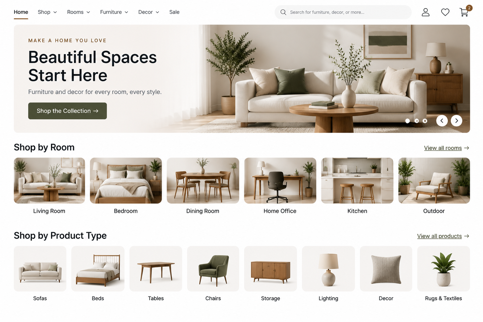
Decide whether your menu leads with rooms — living room, bedroom, dining, outdoor — or with product types such as sofas, beds, tables and lighting. Most home stores need both, and the decision is which one comes first and which becomes a filter.
How much of your range is made to order?
Stocked items, made-to-order pieces and imported items behave differently. Each needs its own delivery message, and the store has to show the difference clearly rather than giving every product the same vague line.
What do you deliver, and how far?
Settle the delivery areas, charges and service level early: kerbside drop-off, room of choice, or delivery with assembly. This changes the product page, the cart and the checkout, so it is not a policy detail to decide later.
How will you handle finishes and sizes?
A sofa in four fabrics and three sizes can be one product with options, or twelve separate products. One is far easier to shop and to maintain. Decide before the catalogue is loaded.
How much styling photography can you sustain?
Room photography sells home products, but it is expensive and it dates. Agree a shot list you can repeat for every new piece rather than one you can only afford for the launch collection.
Foundation · 2 min
3. Room and Collection Organisation
Customers picture a room before they picture a product. Someone furnishing a first flat thinks “living room”, not “two-seater sofa”, so a home store needs both ways in.
Use product types as the permanent structure — sofas, beds, dining tables, lighting, rugs — because they never need renaming and they bring in search traffic all year. Then add rooms as a second route: living room, bedroom, dining room, workspace, outdoor. Rooms are easy to understand and easy to photograph, which makes them the natural home for your best imagery.
Collections sit on top of both. A matching range, a seasonal edit or a designer collaboration is temporary by nature, so give it its own page and a plan for what happens when it ends: refresh it next year, or point it at the parent category rather than deleting it. Keep room and category pages permanent so they keep the authority they build up, and let style, material, colour and price live in filters rather than in the menu.
In ZenBasket: set up the room and product menu · add a page for a room or collection · point sections at those pages · filters and sorting
Foundation · 2 min
4. Large Image Galleries
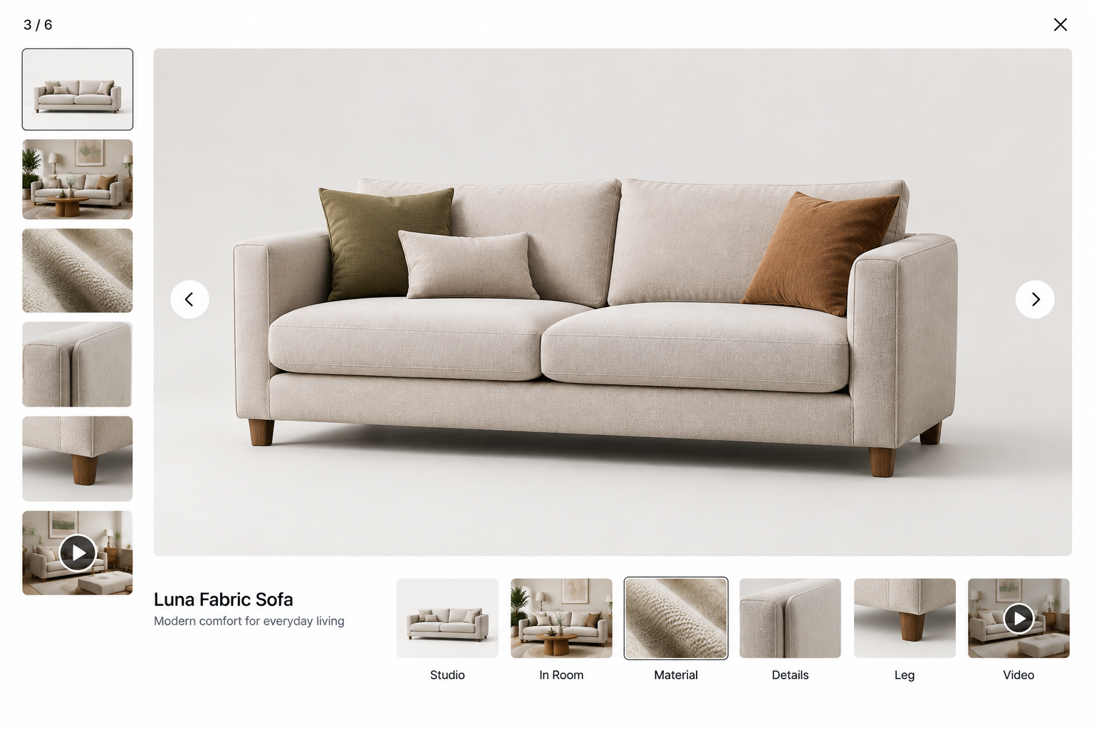
Furniture is judged by eye, so the gallery does most of the selling. It has to answer what the piece looks like, what it is made of, and how big it feels in a real room.
Every product needs:
- a clean shot on a plain background so the shape and colour are honest,
- at least one photograph in a styled room so the scale reads,
- a close-up of the material, and
- a view of the parts people worry about — the back of a sofa, the underside of a table, the joint, the handle.
Where a piece opens, folds or extends, show it in both states.
Give the images room to breathe. Home shoppers zoom, so supply photographs large enough to survive it, and let the gallery open full screen. Keep the first image the same type across the catalogue, or listing pages look chaotic. Room shots should also carry a note of the size of the piece shown, because a sofa photographed in a large room looks smaller than it is — which is exactly the misunderstanding the dimensions section exists to prevent.
In ZenBasket: image element · gallery slider · rotate several room shots · a room image as a section background
Foundation · 2 min
5. Dimensions and Material
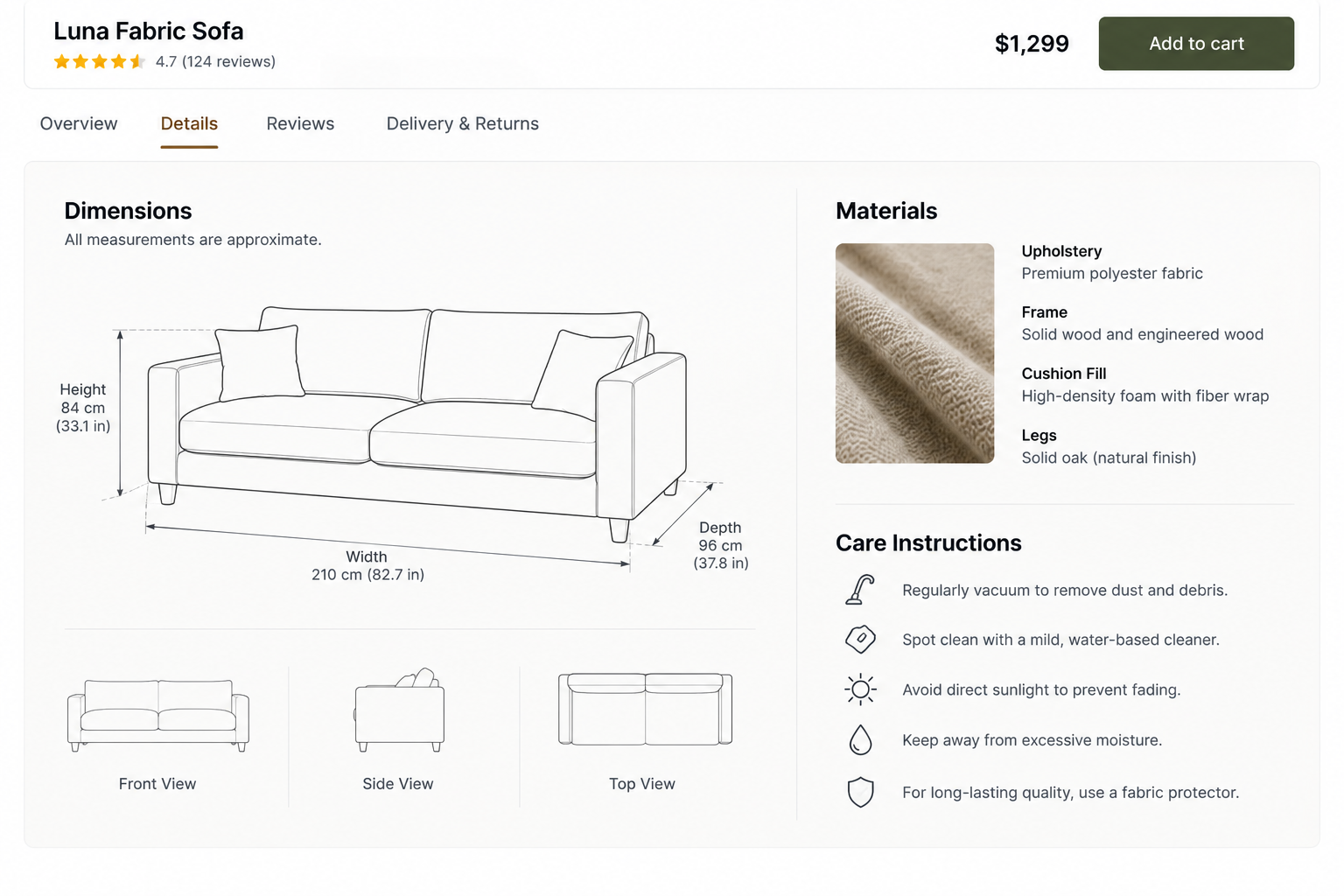
Size is the single biggest cause of returns in this category, and returning a wardrobe is expensive for everyone. Measurements are not a specification detail here; they are part of the sale.
Give the overall width, depth and height for every product, in centimetres and inches, and add the measurements people actually need: seat height and depth for chairs and sofas, clearance under a table, the internal size of storage, and the space a door or drawer needs to open. A simple line drawing with the measurements marked does this better than a list, and it is worth producing once for each product family.
Two other numbers save arguments later. Publish the boxed size and weight, because a piece that fits the room may not fit the lift or the staircase, and say whether the item can be carried up stairs by one person or needs two.
Materials deserve the same plainness: what the frame, filling, surface and legs are made of, what the finish is, how to clean it, and whether the colour will shift in sunlight. Where a material varies naturally, such as wood grain, marble or leather, say so — it prevents a disappointed customer from thinking they received the wrong thing.
In ZenBasket: dimensions and materials in expandable panels · or as tabs beside care and delivery · add the measurement drawing · keep the details as real text
Foundation · 2 min
6. Product Comparison
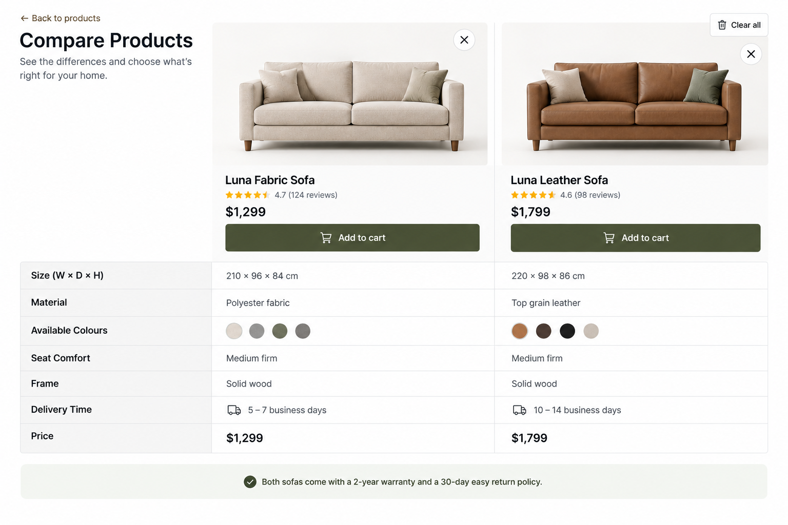
Home shoppers rarely buy the first thing they like. They narrow to two or three pieces and then weigh them against each other, usually in several browser tabs. A store that helps with that keeps the decision on its own site.
Comparison works best when it is limited and honest. Let people compare products of the same type on the things that actually differ — size, material, seat height, weight, finish options, delivery time and price — rather than every field in the catalogue. Four or five rows that matter beat twenty that do not.
Even without a comparison tool, the same job can be done in writing. A short line on the product page saying how a piece differs from its nearest sibling — deeper seat, smaller footprint, solid wood instead of veneer — answers the question at the moment it is asked. That only works if your product information is entered consistently, which is the same discipline variants depend on.
In ZenBasket: put two pieces side by side · pull product details into a comparison block · list the differences · tabs for specification and care
Foundation · 2 min
7. Delivery Estimates
Delivery is part of the product in this category. A customer buying a bed needs to know whether it arrives this week or in two months, because they may have to sleep somewhere in between.
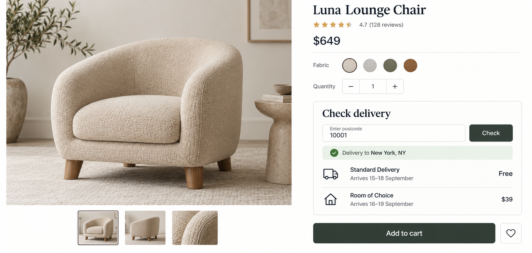
Give a real estimate on the product page, not only at checkout, and give it as a range with a unit people understand — “delivered in 2 to 3 weeks” rather than “ships soon”. Say what the estimate depends on: whether the item is in stock, made to order or imported. If you deliver to some areas and not others, let people check their pincode or postcode before they fall in love with something you cannot bring them.
Be equally clear about the service. Say whether delivery is to the door, to the room of choice, or includes assembly and packaging removal, and what it costs. Say what happens with stairs, lifts and narrow doorways, and ask for access notes at checkout rather than discovering the problem on the day. When an order contains one slow item and several quick ones, say whether it ships together or separately — this is the single most common complaint in furniture, and it is a design decision, not a logistics one.
In ZenBasket: announce delivery areas and cut-offs · collect access notes and delivery preferences · show the delivery area or showroom · pre-order for made-to-order pieces
Foundation · 2 min
8. Assembly
Most flat-packed furniture is bought by someone who is quietly wondering whether they can put it together. Answering that on the product page removes a real reason not to buy.
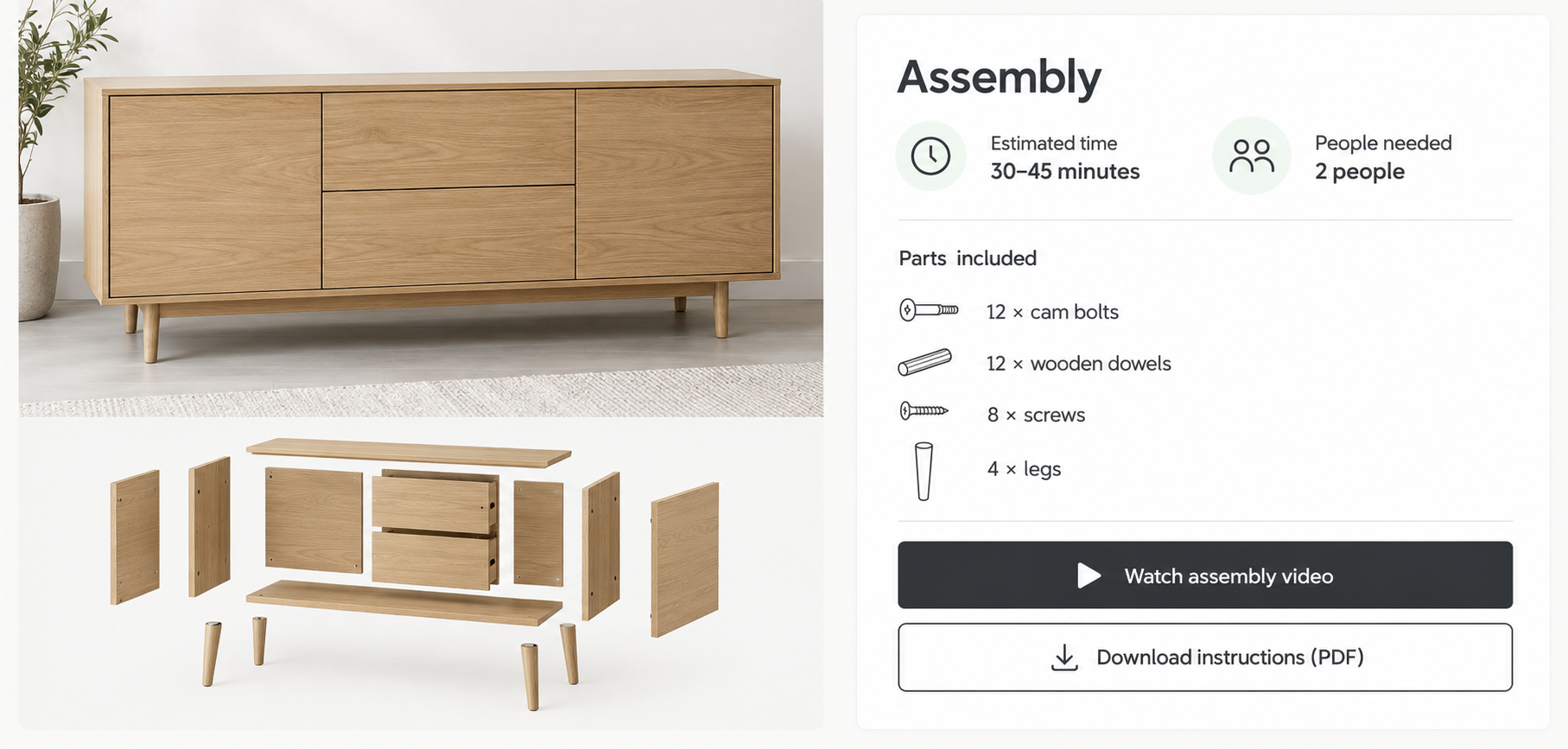
Say plainly whether assembly is required, roughly how long it takes, how many people are needed, and whether tools are included. Publish the instructions as a downloadable file before purchase, not only in the box, so anyone who wants to check can. A short assembly video does more than any amount of reassurance, and it also reduces the support calls that follow delivery.
Two details matter more than they look. List the parts and fittings included, so a customer can tell immediately whether something is missing. And offer paid assembly where you can, priced on the page rather than hidden in the checkout — for many buyers this is the difference between a considered purchase and an abandoned basket.
In ZenBasket: assembly video · advanced video options · show the steps in order · assembly details in a panel
Foundation · 2 min
9. Variants
A single sofa may come in several fabrics, two or three sizes and a choice of leg finish. Keep those as options within one product rather than as separate products, so ratings and reviews stay together and the listing page shows the piece once instead of twelve times.
Each option needs its own photograph where it changes the look. A fabric swatch is not enough on its own for a large piece, because the same colour reads differently across three metres of upholstery, so show the whole item in each finish where you can. Choosing an option should update the image, the price where it differs, the delivery estimate where that differs too, and the address of the page so the choice can be shared or bookmarked.
Keep the option names consistent across the catalogue. Oak, natural oak and light oak used on three different products will read as three different finishes, and will break your filters. Where a combination is unavailable or made to order, say so at the moment it is chosen rather than at checkout, and offer a way to be notified when it returns.
In ZenBasket: finishes and sizes as product options · the product page layout · notify me when back in stock · material and size tags on tiles
Foundation · 2 min
10. Product Recommendations
In home and living, the useful recommendation is the one that completes a room. Someone buying a dining table needs chairs, and someone buying a bed will need a mattress, a side table and a lamp before long.
Show the pieces that were photographed with this one, and say so — “shown here with” is more persuasive than “you may also like”, because the customer has already seen them working together. Alternatives are worth showing too, but keep them separate from the things that go with it, or the block becomes confusing.
Place recommendations below the buy area rather than beside it, so nothing competes with the size and finish choice. The cart is the better moment for the small additions — cushions, care kits, protection plans, delivery upgrades — because the main decision has been made. Judge the block on whether orders contain more items, not on how many people click it.
In ZenBasket: a recommendations row that pulls live products · feature one matching piece · group a set in one block · badge a matching range
Foundation · 2 min
11. Inspiration Content
People shopping for their home are looking for ideas as much as products, and inspiration content is how a store joins those two things. It only works when every idea leads somewhere.
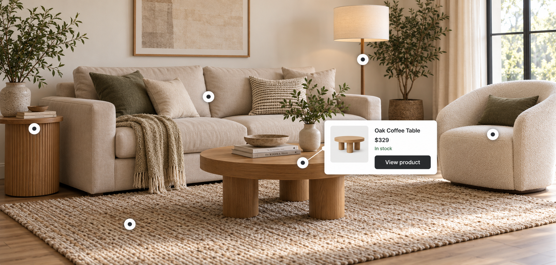
Room sets are the core of it: a photographed room with each piece named, priced and linked. An interactive version, where tapping a dot on the photograph opens the product, turns a picture into a shop without needing a separate page. Never place a dot on something you do not sell — it is the quickest way to lose the trust the photograph just earned.
Guides earn their place for the same reason. How to measure a room before buying a sofa, how to choose a rug size, how to care for solid wood: these answer questions people type into search engines, they give AI assistants something to quote, and they create links into category pages that are otherwise hard to build. Keep them linked from the relevant products rather than stranded in a blog, and give a room set the same lifecycle as the collection it belongs to, so it is refreshed rather than left showing last year’s range.
In ZenBasket: shoppable room sets with hotspots · pair a room shot with its products · bring in styled social posts · add a guide or lookbook page
Foundation · 2 min
12. Mobile First
Home shopping starts on a phone, often on a sofa, and finishes on a laptop days later. The phone version has to carry the whole decision even though the purchase may not happen there.
Give the gallery a swipe and a full-screen view with pinch to zoom, because judging a material on a small screen is the hardest thing a shopper does here. Keep the price, the finish choice, the dimensions summary and the delivery estimate reachable without a long scroll, and put the longer material, care and assembly information in panels. Make saving a product easy and obvious, since most people will come back rather than buy on the spot, and preview the finished store on a real phone before publishing.
In ZenBasket: responsive layouts · sizing and spacing per screen size · keep effects light on mobile
Foundation · 2 min
13. Performance
This is the heaviest category on the web for images: large room photography, long galleries, hotspot scenes and assembly video on the same page.
Export images at the size they are shown rather than shipping full-size originals, and set their width and height so the page does not jump as they load. Load the first gallery image immediately and the rest only as the shopper moves through them. Keep video off the critical path so the product page is usable before anything plays, and be careful with hotspot scenes on listing pages — one is a feature, five are a delay. Google’s speed thresholds, the main image within about two and a half seconds and almost no layout movement, are usually decided by the export settings alone. Test on a mid-range phone using mobile data.
Foundation · 2 min
14. SEO and Answer Engines
Home and living search splits the same way as your navigation: people searching for a product, and people searching for a room or an idea. Build for both with clear, permanent web addresses — a category path such as /furniture/sofas/, a room path such as /rooms/living-room/, and a product page named after the product.
A product page should state the name, dimensions, materials, finish options, price, availability and delivery estimate. Finish and size options of the same product should be grouped so search engines understand they are one product, and nothing should be marked up behind the scenes that a customer cannot see on the page.
For AI assistants, the content that gets quoted here is practical: what size rug suits a room, how to measure for a sofa, how solid wood differs from veneer, how long a made-to-order piece takes. Those answers have to exist as plain text on pages that stand on their own — a measuring guide, a materials explainer, a delivery page — rather than being locked inside room photography.
Foundation · 2 min
15. Choosing a ZenBasket Theme for Your Home Store
ZenBasket maps FurniRix as the free theme for furniture and interiors, and elGrandeur as the premium theme for home décor. Current pricing is on the ZenBasket theme collection page.
| If you sell | Start with | Why |
|---|---|---|
| Furniture and interiors, starting out | FurniRix (free) | A straightforward furniture layout with room for large photography, categories and product detail while the range is small. |
| Home décor and a wider styled range | elGrandeur (premium) | More section types for room sets, collections and editorial content. Documented in the elGrandeur theme guide. |
| Handmade or artisan pieces | HueKraft (free) | Built for craft ranges, where the maker’s story and the material do more of the selling than the catalogue does. |
How to judge a home theme in ten minutes
Open the demo on your phone, not your laptop, and check:
- Does the gallery hold six or more images and open full screen?
- Is there room near the price for dimensions and a delivery estimate?
- Can a product carry several finishes, each with its own photograph?
- Is there a section type for a shoppable room set?
- Do long specification and assembly details fit without swamping the page?
- Does the layout still look right with only twelve products in it?
A theme that fails the first three will cost more in workarounds than the price difference between any two themes in the collection. Read the demo stores as sequences rather than layouts: a home store has to say what kind of range this is, offer a way in by room and by product, show pieces at a size worth judging, and answer the delivery question before it is asked.
In ZenBasket: switch and customise your theme · upload your logo and brand assets
Foundation · 2 min
16. Building It in ZenBasket
A ZenBasket store is built from drag-and-drop sections, so most of the work is arranging and writing rather than development. Sizes, finishes, prices and stock are managed in the product catalogue and the storefront reads from it, so agree your option names there first.
| What this guide asks for | What to use |
|---|---|
| Room and product navigation | Navigation menu and added pages |
| Large product galleries | Slider and image element |
| Dimensions, materials and care | Expandable panels or switchable panels |
| Comparing two pieces | Split view and data driven box |
| Delivery message and access notes | Attention banners and forms |
| Assembly instructions and video | Stepper and video |
| Finishes and sizes on a product | Product options and variants |
| Made-to-order pieces | Pre-order |
| Out-of-stock pieces | Waiting list |
| Shoppable room sets | Hotspot and split view |
| Matching products and add-ons | Data driven box and single product |
New to the builder? Start with Getting started, then adding sections and customising them.
Foundation · 2 min
17. How to Test Whether It Works
- Test the fit question. Ask someone to work out whether a piece would fit in a given space, using only the product page. If they reach for a calculator or give up, the measurements are not clear enough.
- Test the room route. Ask someone to furnish a room from scratch on your site. Watch whether they use rooms, categories or search, and where they get stuck.
- Test the delivery answer. Ask someone when a specific item would arrive at their address, and what the delivery includes. Both answers should come from the product page.
- Test the assembly worry. Show someone a flat-packed product and ask what putting it together involves. If they cannot say, the page is missing the reassurance that closes the sale.
- Test a comparison. Ask someone to choose between two similar pieces and explain why. The reasons they give are the fields your comparison should carry.
- Test on a phone, on mobile data. Walk from the homepage to a product to the cart, watching how quickly the gallery loads and how far they have to scroll for the essentials.
Foundation · 4 min
18. Frequently Asked Questions
How do I design an online furniture store?
Let people shop by room as well as by product, show each piece in enough photographs to judge it, put measurements and materials near the price, make comparing two pieces easy, and give an honest delivery estimate and a clear answer about assembly.
Should customers browse by room or by product type?
Both. Product types are the permanent structure because they never need renaming; rooms are the second route in and the natural home for your best photography.
How many photographs does a furniture product need?
Enough to answer three questions: what it looks like on its own, how big it feels in a real room, and what it is made of. In practice that means a plain background shot, a room shot, a material close-up and the parts people worry about.
Where should dimensions appear on the page?
Near the price, not buried in a specification tab. Give width, depth and height in centimetres and inches, plus the measurements people actually use, such as seat height or the space a drawer needs.
Why publish the boxed size and weight?
Because a piece that fits the room may not fit the lift, the stairs or the doorway. It also tells the customer whether one person can handle the delivery.
What should a product comparison include?
Only the things that actually differ between similar pieces — size, material, seat height, weight, finish options, delivery time and price. Four or five useful rows beat twenty fields.
How should I show delivery times?
As a real range on the product page, such as delivered in two to three weeks, with a note of what it depends on: in stock, made to order or imported. Let people check their area before they choose.
What should the page say about assembly?
Whether it is needed, roughly how long it takes, how many people are required, whether tools are included, and what parts are in the box. Add the instructions as a download and a short video if you can.
Should each fabric or finish be a separate product?
No. Keep them as options of one product so reviews stay together and the listing shows the piece once, and give each option its own photograph where it changes the look.
How do I stop finish names breaking my filters?
Agree one set of names before the catalogue is loaded and use them everywhere. Oak, natural oak and light oak on three products will read as three different finishes.
What recommendations work in a home store?
The pieces photographed with the product, labelled as such. Keep alternatives separate from things that go with it, and save small add-ons for the cart.
Are shoppable room sets worth building?
Yes, when every piece in the picture can be bought. A room photograph with tappable products turns inspiration into shopping without a separate page, but a dot on something you do not sell loses trust.
What inspiration content pulls search traffic?
Practical guides: how to measure a room before buying a sofa, how to choose a rug size, how to care for solid wood. Keep them as text and link them from the relevant products.
What is the best ZenBasket theme for a furniture store?
FurniRix is the free starting point for furniture and interiors, and elGrandeur is the premium option for home décor and a wider styled range. HueKraft suits handmade pieces. Preview each on a phone.