Foundation · 5 min
Motion and Animation in Your Store
Movement is a setting, not a design skill. The work is deciding which sections deserve it and noticing when your store has quietly accumulated too much.
Who does what
| Website handles | How smoothly animations run, and honoring a shopper’s reduce-motion setting |
| Your theme decides | Which sections can animate at all, and how they move |
| You decide | Which sections you turn it on for, how fast, and how much is too much |
| Needs a developer | Only custom motion your theme doesn’t offer, and it almost never pays |
Motion has exactly four jobs
Before enabling anything, ask which of these it’s doing. If the answer is none, leave it off.
| Job | What it does | Where you’d use it |
|---|---|---|
| Feedback | Confirms something happened | Add-to-cart confirmation, a filter being applied |
| Continuity | Shows where a thing came from | A menu opening from the button you tapped |
| Attention | Points at a change | A newly added item in the cart |
| Character | Expresses your brand | A considered hero reveal, a hover that suits the product |
The first three earn their place. The fourth is legitimate and expensive, it costs loading speed and it’s the one that tires people out, so spend it on one or two moments, not everywhere.
How fast is right
If your section offers a speed control, the useful ranges are narrower than they look. Human reaction to a visual change is around a fifth of a second, and that anchors everything.
| Setting | Feels like | Right for |
|---|---|---|
| Fastest / quick | Instant | Hovers, color changes, buttons |
| Standard / medium | Noticeable but not a wait | Menus opening, panels sliding |
| Slow | Deliberate | One hero moment per page, at most |
| Slowest | A delay | Almost nothing. If a shopper notices the animation rather than the result, it’s too slow |
The test isn’t a number. Do the thing five times in a row. Anything that felt elegant the first time and annoying the fifth is too slow, and your shoppers will do it more than five times.
Movement should come from somewhere
The single rule that separates motion that helps from motion that decorates: things should appear from where they belong.
A menu should open from the button you tapped, not fade in at the center of the screen. A filter drawer should slide in from the edge it lives on. A cart confirmation should happen near the cart icon.
Each of those tells the shopper where the thing came from and where to find it again. If your theme animates things in from nowhere, that’s a theme quality signal worth noticing.
Where to turn it off
Movement stops helping and starts costing in four places:
Anything that loops forever. Marquees, auto-rotating banners, pulsing badges. These keep drawing the eye away from what a shopper is reading. If you keep one, make sure there’s a pause control.
More than one moving thing per screen. Two competing animations mean neither is noticed.
Long pages full of reveal-on-scroll. Enabled on every section, this makes the page feel like it’s loading forever. Pick two or three sections that genuinely deserve the emphasis.
Anything on the checkout path. Cart, checkout and confirmation should be as still and fast as possible. Nobody wants delight between their card details and the confirmation.
Some people need it off entirely
Every phone and computer has a setting that reduces motion, used by people who get genuinely dizzy or nauseous from movement; parallax and large sliding transitions are the worst offenders.
Test it yourself. Turn on Reduce Motion in your device settings, reload your store, and look. Animations should either stop or become a simple fade. If your hero is still sliding and your sections still flying in, that’s a fault worth raising with your theme provider, it isn’t a preference, it’s an accessibility requirement.
The five-minute audit
-
Scroll your homepage on a phone. Count the things that move. More than three, and you’re competing with yourself.
-
Is anything looping without a way to stop it?
-
Open your menu five times. Still pleasant?
-
Turn on Reduce Motion. Reload. Does anything still move?
-
Is there any animation between the cart and the confirmation page? Turn it off.
Foundation · 5 min
Making Complex Sections Work on Every Screen
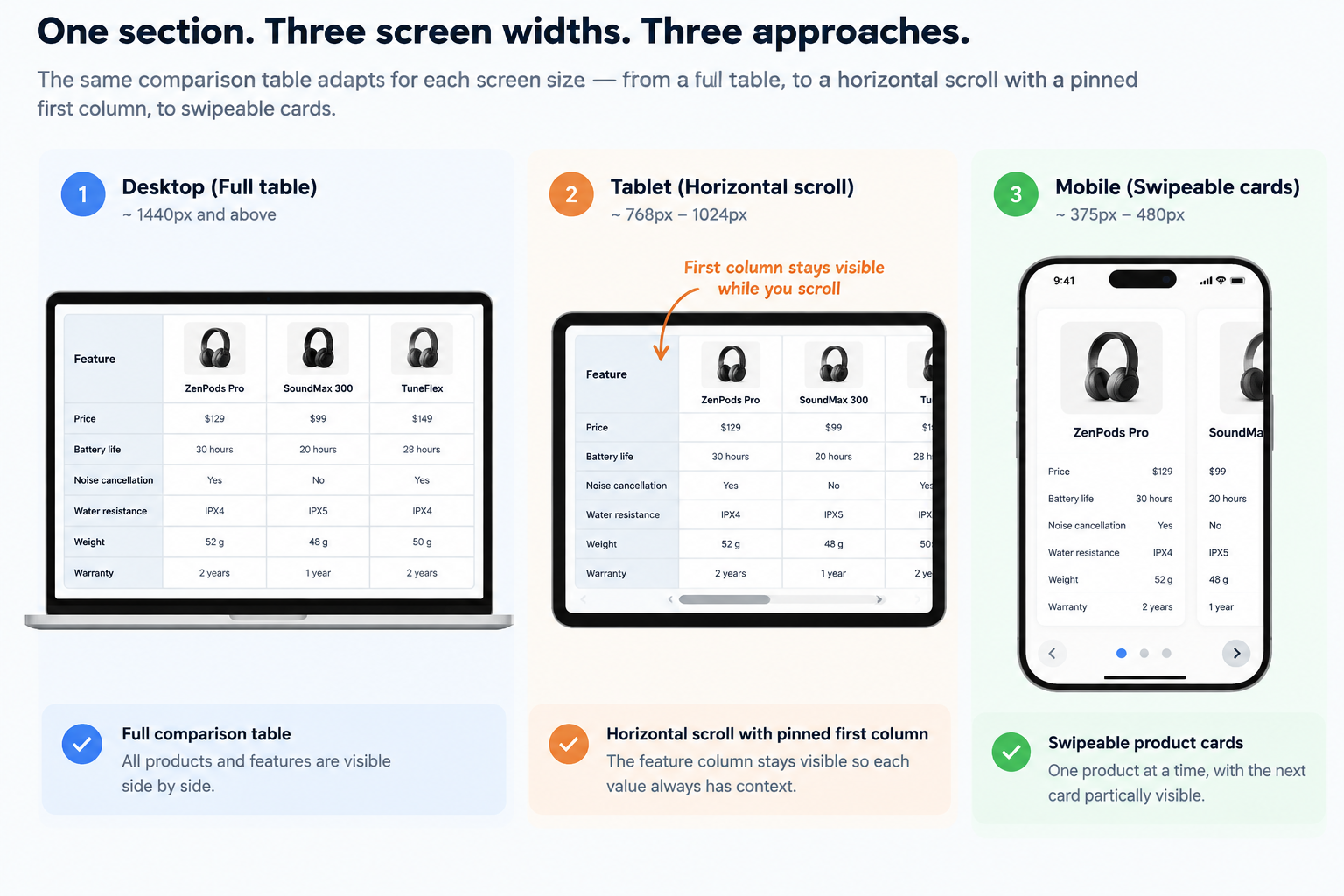
A section doesn’t become mobile-friendly by getting narrower. Some sections need to become something else entirely, and knowing which is the whole skill.
Who does what
| Website handles | Resizing sections to fit the screen |
| Your theme decides | Whether a section merely shrinks, or genuinely restructures |
| You decide | Which sections to use, how much to put in them, and whether the mobile result is acceptable |
| Needs a developer | Rebuilding a section your theme handles badly, usually cheaper to pick a different section |
The three ways a section can adapt
| What happens | Good for | Where it fails |
|---|---|---|
| It stacks | Simple grids, image-and-text blocks, card rows | Anything meant to be compared side by side |
| It changes shape | Tables becoming cards, tabs becoming an accordion | Nothing, when the theme does it properly |
| It shows less | Long tables, dense feature lists | When the removed thing was the deciding fact |
Stacking is what most sections do by default, and it’s why so many stores technically work on a phone and are useless there.
The test: what is this section for? A comparison table that stacks becomes four separate lists. Every fact is still on the page. The comparison, the only reason the section existed, is gone. That’s the difference between a section that fits and a section that works.
What each section should become on a phone
| Section | Should become |
|---|---|
| Mega menu | A tappable list you expand, never the same wide panel shrunk |
| Filters | A full-screen panel with a clear Apply, and a visible count of what’s applied |
| Product grid | Two columns. One column wastes the screen for most products |
| Comparison table | One product per card, swipeable, with the next card peeking |
| Hero with text over the image | Text below the image. Text over a tall crop is unreadable |
| Multi-column footer | Expandable groups, not forty stacked links |
| Carousel | Swipe, with the next item partly visible so people know to swipe |
| Tabs | An accordion. Tabs that scroll sideways hide their own existence |
| Sticky sidebar | Not sticky. On a phone it’s a permanent obstruction |
If your theme’s section doesn’t do the right-hand column, that’s the thing to check before you build the page around it.
Two rules when you’re filling sections in
Don’t overfill. A section with eight columns of content on desktop has to do something drastic on a phone, and drastic usually means bad. If you’re adding a seventh feature to a comparison block, ask whether the shopper will read seven.
Don’t hide something you’d want on desktop. If a specification matters enough to show on a big screen, it matters more on a small one, most of your customers are there. If your theme’s mobile version drops content, that’s not a mobile optimization, it’s a worse store for the majority.
Check it properly
On a real phone, not a resized browser window. A narrow browser window gets the width right and everything else; touch, scrolling, rendering speed, wrong.
Hold it one-handed. Anything in the top corners of a big screen is out of thumb reach.
Turn your text size up. Set your phone’s font size to its largest and reload. Text that clips, buttons that swallow their labels, and columns that overlap all show up immediately, and a real share of people browse this way permanently.
Scroll sideways on every page. If anything moves, one element is too wide, and it makes the whole store feel broken.
Foundation · 5 min
How to Review Your Homepage
What belongs in each part of a homepage is in the homepage guide. This page is a review method, how to look at a homepage you’re too close to see.
The same handful of homepage problems turn up in almost every store, and none of them are visible to the person who built it. Here’s how to find yours.
Who does what
| The website builder gives you | Every section, and the ability to reorder or remove them in seconds |
| You decide | What’s on the page, in what order, and what comes off |
| You review | Nobody else will. A homepage only grows unless someone prunes it |
| Takes ten minutes | Reordering sections. Which is why there’s no excuse for a bad one |
Review it the way a stranger arrives
You can’t see your own homepage. You know where everything is, you know what the brand means, and you know what the hero image is showing. A first-time visitor knows none of that, and every problem below is invisible from the inside.
Four conditions make the review honest:
On a phone, on mobile data. Not a browser window made narrow. Most of your visitors arrive this way and most homepage problems only appear here.
Logged out, cache cleared. Use a private window. A returning-visitor view hides slow loading and shows you personalized content nobody else sees.
Five seconds. Open the page, count to five, close it. Then write down what you sell and who it’s for. If you can’t, neither can a stranger.
With someone who isn’t you. A colleague from another team, or better a customer. Ask them to find one specific product, then say nothing while they try.
What turns up again and again
The page doesn’t say what you sell. The most common problem by a distance. A striking hero image, a brand slogan, no products and no category names. Someone arriving from an ad for one product has no way to learn you sell anything else. Fix: name your range in words, high on the page, in your customers’ vocabulary.
The hero is a slideshow nobody sees past. Rotating banners exist because several people each wanted the top slot. Slides two onwards get almost no attention, and the rotation interrupts anyone still reading slide one. Fix: if three messages compete, that’s three sections, not three slides.
There’s no way into the catalogue. Hero, featured products, testimonials, footer, with no route into your categories. A shopper who doesn’t want the featured products has nowhere to go but the menu. Fix: a visible category block, high up, with real category names.
It’s a stack of old promotions. Banner, banner, countdown, banner. Each added for a campaign, none removed afterwards. Fix: every section needs an owner and an end date. A homepage with no removal habit only ever grows.
Trust signals that aren’t checkable. Badge strips, star icons, “100% satisfaction”, while there’s no address, no phone number and no delivery information anywhere. Fix: swap claims for facts. Trust and clarity covers which ones.
Everything crammed above the fold. A hero squashed to make room for four more things, so nothing reads. Fix: let something be visibly cut off at the bottom of the screen, that’s what tells people to scroll.
Nothing has changed in a year. Out-of-season content, sold-out featured products, a finished campaign. Fix: put a review in the calendar, quarterly at least.
Write a list, then rank it
The output of a review is a short list, not a redesign. Rank by two things: how many visitors see it, and how quick it is to fix.
A missing delivery line is seen by everyone and takes ten minutes. A new hero photograph is neither. Do the quick-win, widely-seen ones first, then run the review again under the same four conditions; most homepage work fails not because the changes were wrong but because nobody checked whether they worked.
Foundation · 5 min
How Product Card Requirements Change by Industry
How your listing page is arranged is in the listing page guide. This page is about what changes between one kind of catalogue and another.
Every industry has one fact that decides the click, and it’s a different fact each time. Card design is mostly the work of finding yours.
Who does what
| The builder gives you | Control over what appears on a card, plus badges and ribbons |
| You decide | Which facts earn a place on the card and which don’t |
| You provide | Consistent product data, so the same field is filled on every product |
| The clue is already yours | Your support inbox and your return reasons name the missing fact |
Find the deciding fact
A card is a small space, and the instinct is to fill it. The better approach is to work out the single fact that decides whether someone clicks, make sure it’s on every card, and treat everything else as optional.
That fact is remarkably consistent within an industry and completely different between them.
| Industry | The deciding fact | The card must carry | Usually safe to leave off |
|---|---|---|---|
| Fashion & apparel | Does it come in my size and color | Color variants, size availability, worn shot | Detailed specs, brand logo |
| Grocery | Price per unit, and is it in stock today | Unit price, pack size, quantity control, stock | Ratings, large imagery |
| Electronics | The two or three specs that separate models | Key spec line, model number, price | Lifestyle photography |
| Jewelry | Material, stone, and true size | Metal and stone, dimensions, close crop | Long titles, badges |
| Furniture | Dimensions, and will it fit | Width and depth, material, room shot | Multiple angles |
| Beauty | Shade, skin type, volume | Shade swatch, size in ml, key ingredient | Brand story |
| Restaurants & food | What’s in it and can I eat it | Dietary marks, portion, prep time, quantity | Ratings, discounts |
| Handmade | Is it one-off, and who made it | Maker name, one-of-a-kind flag, real photography | Bulk pricing |
| B2B & wholesale | Minimum order, tiered price, lead time | Minimum quantity, price break, stock quantity | Lifestyle imagery, reviews |
The patterns underneath the table
Considered purchases need comparison; impulse purchases need speed. Electronics and furniture cards should make two products comparable side by side, the same fact in the same position on both. Grocery and food cards should let someone add to the cart without opening the product at all.
Some industries need the card to prevent a sale. Dietary marks, allergen flags, minimum order quantities, “not available in your area”. These lose you clicks and save you refunds, complaints and sometimes real harm. They belong on the card, not one page deeper.
Where products look alike, the card carries the difference. In a grid of forty rings the photographs are near-identical, so the title and one specification do the distinguishing work. In fashion it’s the opposite, the image does almost everything.
Repeat purchases need quantity, not persuasion. Grocery and consumables shoppers are re-buying something they’ve had before. A quantity control and an easy reorder route beat anything designed to convince them.
How to find yours in an afternoon
Three sources, all of which you already have:
Your product page behavior. Which fact do people scroll to before they add to cart? That’s the fact that belongs on the card.
Your support messages. Questions asked before purchase are card-level failures. Questions asked after are description failures.
Your return reasons. “Wrong size”, “smaller than expected”, “not the color shown” each name a fact the card should have carried.
See product card anatomy: cover the images on your grid and see whether the products are still tellable apart. In most catalogues they aren’t, and what’s missing is your deciding fact.
Foundation · 5 min
Where Complex Sections Break on Mobile
Choosing the right behavior for each section is making complex sections work on every screen. This page is about finding what’s already broken on the store you have.
Complex sections rarely fail in ways a desktop browser will show you. They fail on a real phone, in one hand, on a weak signal, at the text size someone actually uses.
Who does what
| You find it | Nobody reports these. Shoppers just leave |
| You can fix some yourself | Overfull sections, too many sticky things, hidden navigation |
| Your theme owns the rest | How a section rebuilds itself at small widths |
| Takes twenty minutes | The whole check below, on one phone |
Test conditions, because the defaults hide everything
A real phone, not a narrow browser window. Resizing a browser gets the width right and gets touch, scrolling and rendering speed wrong. Most of the failures below only show up on hardware.
One hand, thumb only. That’s how phones are held. Anything in the top corners of a large phone is out of reach without shifting grip.
A weak connection. Turn off wifi. Complex sections are usually the heaviest things on a page, on fast wifi a carousel appears instantly, on a weak signal it’s the reason the page looked broken.
Text size turned up. Set your phone’s font size to its largest and reload. A real share of people browse this way permanently, and this is the fastest way to find layout failures.
Landscape too, and the smallest phone you can find. Not the newest one you own.
What breaks
The page slides sideways. One element wider than the screen makes the whole page scroll horizontally, and shoppers read that as a broken site. Find it: try to scroll right on every page. Anything that moves is a fault.
Tap targets on top of each other. A card with a badge, a wishlist heart, a color swatch row and a quick-add button has four targets in a thumbprint of space. Mis-taps here don’t produce an error, they produce a shopper who added the wrong color.
Carousels that steal the scroll. A section you swipe sideways can grab a downward swipe, so someone trying to move down the page moves the carousel across instead. They usually try twice and leave.
Too many things stuck to the screen. A sticky header, a sticky add-to-cart bar, a cookie banner and a chat bubble leave about a third of the screen for content. Each was added by a different person and nobody has seen all four at once. This one is yours to fix, decide which one wins.
Anything that only appears on hover. A quick view, a second product image, a tooltip carrying a real fact. On a touchscreen these don’t exist. The information isn’t hidden, it’s absent.
Text that won’t grow. At double text size, fixed-height boxes cut off their content, buttons swallow their labels, and two columns overlap. This is where complex sections fail first and it takes thirty seconds to check.
Videos and maps escaping their box. Embedded content frequently ignores its container and becomes the cause of the sideways scroll above.
Things moving as the page loads. Images arriving without their space reserved, a banner appearing above the fold. A shopper taps a product and lands on a different one because the grid moved between the decision and the tap.
Menus and filter panels that lose you. A panel slides in but the page behind is still what responds. Common, and invisible unless you test with a keyboard or a screen reader.
Rank what you find
Sideways scroll and moving content affect every visitor and are usually cheap to fix. Hover-only content affects every phone visitor and needs a content decision. Too many sticky elements isn’t a bug at all, it’s a decision nobody has made.
Fix in that order, then re-test on the same phone under the same conditions.
Foundation · 6 min
Shoppable Video
Shoppable video puts the buy button inside the video, so someone convinced at second eleven doesn’t have to go looking. It also slows your store down, and that trade is the real decision.
Who does what
| Website handles | The video section and linking products to it |
| Your theme decides | How the video and tags look |
| You provide | The footage, and the decision about which products to tag |
| Needs a third-party app | In-frame tagging, if your theme’s video section doesn’t include it |
Three questions before you start
Does your product need to be seen moving? Fabric drape, how a mechanism opens, scale in a real room, how a bag fits a laptop. If a good photograph answers the question, video is cost without return. This is why the pattern works hard in fashion, beauty, furniture and anything with a demonstrable function, and barely at all in books, spare parts or packaged groceries.
Do you already have footage? The cheapest video is the one that exists. Most stores have more than they think, social clips, campaign offcuts, supplier footage, customer videos. Audit that before commissioning anything.
Can you take the speed cost? This is the one people skip.
⚠️ Test this before you commit
Open a product page on your phone, on mobile data, not wifi. Count how long until you can see the product. Then add the video and do it again.
If it’s noticeably slower, it isn’t worth it. Whatever the video does for people who watch it, you’re losing the ones who leave before the page finishes loading, and they’re invisible in your reports.
What makes it shoppable rather than just a video
Three things, and missing the third is the usual failure:
-
Product tags in the frame, appearing when that product is on screen
-
A way to buy without leaving the video, a panel that opens over the paused frame
-
Returning to the same moment after adding to cart, not back to the start
Where to put it
| Where | What to show | What it does |
|---|---|---|
| Product page, in the gallery | This product, in use | Answers the fit or function question at the moment of decision |
| Collection page | Several products styled together | Raises basket size, breaks up an identical grid |
| Homepage | Brand or seasonal | Directs to categories better than a static banner |
On product pages, keep it in the image gallery rather than a separate tab. Video behind a tab is watched by almost nobody.
Making the video
Thirty seconds to two minutes. Shorter loses the demonstration; longer loses the viewer.
Add captions. A large share of people watch with sound off. If your video needs sound to make sense, it needs captions or a re-cut, and you probably don’t know this is a problem because you test with sound on.
Never autoplay with sound. Silent autoplay is fine for a hero. Anything with audio needs a deliberate tap.
Shoot vertical for phones, horizontal for desktop galleries. A horizontal clip on a phone wastes most of the screen.
Show the product doing the thing. Utility beats polish. A customer showing how a bag fits a laptop outperforms a brand film at a fraction of the cost.
How to tell whether it worked
Views tell you nothing. Watch the chain: how many people played it, how many finished, how many tapped a tag, how many bought.
And compare against pages without video. A lot of “video lifted our conversion” is measuring people who were going to buy anyway.
Foundation · 5 min
Interactive Product Storytelling
Some of these are a drag-and-drop section you can add this afternoon. Others are a photography project you’ll be maintaining for years. Knowing which is which is most of the decision.
Who does what
| Website handles | The sections your theme includes |
| You provide | The content each section needs, per product |
| You maintain | Every new product needs the same treatment, forever |
| Needs a developer | Configurators and anything your theme doesn’t offer |
Start with the question, not the technique
| Technique | Answers | Worth it when |
|---|---|---|
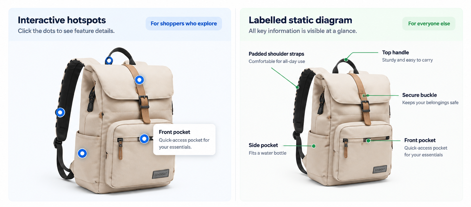
| Hotspots on an image | What are the parts and what do they do | Several distinct features in fixed positions |
| 360° spin | What does it look like from every side | Form matters and photographs miss angles, footwear, jewelry |
| Before-and-after slider | What difference does it make | The result is visual; skincare, cleaning, restoration |
| Configurator | What will mine look like | Genuinely made to order across several choices |
| Comparison switcher | Which model is right for me | Near-identical variants differing in a few ways |
If you can’t finish the sentence “a shopper can’t tell X from photographs alone”, stop. That’s the gate.
The cost that shows up later
For the drag-and-drop ones, it isn’t the build; it’s the content, every time you add a product. Placing hotspots on eight products is an afternoon. On eight hundred it’s a standing job.
That’s what creates the failure you actually see in the wild: two hundred products with hotspots and six hundred without, which reads as neglect rather than variety. A 360 spin makes this worse because each product needs around thirty-six photographs, matched for color and exposure, and again for every new colorway.
Ask before you start: who does this for next season’s products? If there’s no answer, use the section on your best-sellers only, and be deliberate about it; a consistently applied top twenty beats a half-finished catalogue.
Rules if you go ahead
Never put an important fact only inside the interaction. If the dimensions are only visible by tapping hotspot four, they’re missing for everyone who doesn’t tap, and invisible to search engines and AI shopping assistants, which can’t read what’s behind a tap. Write the hotspot labels into the description as well. It’s five minutes and it doubles who the information reaches.
Make it obviously interactive. Hotspots need a visible marker. A 360 view needs a drag hint the first time. Nobody hunts for interactivity they weren’t told about.
Don’t trap the scroll. A section that takes over scrolling for several screens strands anyone trying to reach the reviews.
Check reduced motion. Scroll-driven sequences are the exact thing that makes some people dizzy. With Reduce Motion on, it should present as plain images.
Use both, not one instead of the other
Hotspots and a labelled description aren’t alternatives, they’re the same facts reaching two different audiences. The hotspots serve the shopper who explores. The description serves everyone who doesn’t tap, plus every search engine and assistant reading your page.
Where the choice is real is at the expensive end. Before commissioning a configurator, try a good gallery with a clear scale reference and a specification table. Before a 360 shoot, try six well-chosen angles. Those answer the same question for a fraction of the cost, and you’ll know from the questions your customers still ask whether the fuller version is worth it.
Foundation · 5 min
Quick View and Pop-ups: Choosing and Testing Them
You won’t build a quick view. Your theme gives you one, and its quality varies enormously, so the useful skill is knowing how to test the one you’ve got in about five minutes.
Who does what
| Your theme builds this entirely | The overlay, how it opens, how it closes, what it contains |
| You decide | Whether to enable it, and which theme you’re using |
| You test | Whether it actually works, because nobody else will |
| Report faults to | Your theme provider support |
Why testing matters more than usual here
An overlay looks finished long before it works. Everything that makes one correct is invisible to the person looking at it, where the keyboard goes, whether the page behind scrolls, whether a shopper can get back to where they were.
Which means broken quick views ship constantly, and they break for the people least able to complain about it.
The eight-tap test
Run this on your own store, on desktop first.
1. Open one. Click quick view on the eleventh product in a grid. It should open over the page, not navigate away.
2. Press Escape. It should close. If nothing happens, that’s a fault.
3. Click outside it. It should close. Most shoppers try this before finding the X.
4. Check where you landed. After closing, are you still looking at the eleventh product? If it dumped you at the top of the grid, anyone browsing a long list has to start over, and that’s the fault that costs you the most sales.
5. Try scrolling while it’s open. The page behind shouldn’t move. If it does, closing the overlay leaves the shopper somewhere they didn’t ask to be.
6. Now use only the keyboard. Tab to a product, press Enter to open it. Can you reach the size selector and the add-to-cart button by tabbing? Can you get out with Escape? If tabbing takes you to things behind the overlay, it’s broken for anyone not using a mouse.
7. Find the close button. Visible, obvious, big enough to tap. Not only a gesture.
8. Now on a phone. Open it, then press the phone’s back button or swipe back. It should close the overlay. If it leaves your store entirely, that’s the worst version of this fault.
What should be in a quick view
Enough to decide, not enough to replace the product page.
In: the main image, title, price, size or color choice, availability, add to cart, and a link to the full page.
Out: full description, reviews, size guides, related products. If someone needs those, they need the product page.
Always check there’s a “view full details” link. A quick view with no way through to the real page traps shoppers who need more than it shows.
On phones, consider turning it off
On a small screen a full-screen overlay and an actual page are nearly identical to the shopper, except the overlay has no back button, which is exactly what they’ll reach for.
If your theme’s mobile quick view fails step 8, the better setting is often to disable quick view on phones entirely and let people open the product page. You lose nothing, and you stop losing shoppers to the back button.
Pop-ups that appear uninvited
Everything above is about content a shopper asked to see. Something that appears on load, on a timer, or when the cursor moves toward the close button is a different thing, an interruption, not a quick view. Those are covered in persuasion without dark patterns, and the short version is that they cost more trust than they gain emails.
Foundation · 6 min
Instagram and Customer Photo Galleries
Adding the gallery takes an afternoon. Getting permission properly is what decides whether it’s still there in a year.
Who does what
| Website handles | The gallery section and linking photos to products |
| You handle | Sourcing, permission, checking, and taking things down |
| You must own | The permission records. Nobody else can do this for you |
| Third-party apps help with | Pulling from social automatically and tracking permissions at scale |
Why it works, and where it stops
Customer photographs show your product in circumstances your own photography can’t: real rooms, real bodies, ordinary light, no styling. Shoppers read them as evidence rather than advertising.
Which is also the limit. Nine identically-lit flat lays from nine creators isn’t customer content, it’s a campaign, and shoppers can tell. Some unevenness is the point. Don’t grade it all to match your brand photography, you’d be removing the only advantage the format has.
Stage 1 · Find the content
Cheapest first: photos customers already sent you, photos attached to reviews, posts that tagged you, creators you approach, and last of all content you pay to make.
Most stores commission before checking what they already have.
Stage 2 · Get permission; the stage that matters
A public post is not permission. Tagging your brand is not permission.
Using someone’s photograph without asking exposes you to a copyright claim, and those arrive years later, usually after you’ve also used the photo in an ad.
Ask in writing, and keep the reply. A usable permission records six things:
| What | Why it matters |
|---|---|
| Who said yes | Their real name, not a handle that may change |
| Which photo | Save a copy. Links get deleted |
| Where you can use it | Website, email, paid ads, print, listed separately |
| For how long | Forever, or a date you’ll actually honor |
| Which countries | If your advertising is regional |
| Can you edit it | Crop, caption, adjust color |
A thumbs-up under your comment is weak. A message where you stated the terms and they agreed, screenshotted and saved, works for small creators. Anything going into paid advertising should be a signed agreement.
Keep the proof forever. A permission you can’t produce is a permission you didn’t have.
Stage 3 · Check it before it goes up
Look for: other brands visible in frame, identifiable people who didn’t agree, unsafe use of your product, and the commercial one everybody misses, a color or version you no longer sell.
Stage 4 · Link photos to products
An untagged gallery is decoration. A tagged one is merchandising. This is also the part that becomes unmanageable by hand, and the main reason to consider an app once you’re past about fifty photos.
Stage 5 · Place it
| Where | What to show | What it does |
|---|---|---|
| Product page | This product, used by customers | Answers fit and scale, the most valuable slot |
| Collection page | The category in real settings | Breaks up an identical grid |
| Homepage | A cross-section | General social proof |
Build the product page slot first. It answers the specific question in front of the shopper, rather than making a general point about popularity.
Stage 6 · Take it down on time
If a permission had an end date, you need a way to enforce it. Content still live after the rights lapsed is exactly the problem the whole process existed to prevent. Put the dates in a calendar, not a spreadsheet nobody opens.
Display rules
Credit the creator on every photo. Usually a condition of permission, and it’s what makes the gallery read as real.
Make it obviously customer content, a caption style or credit line, so nobody mistakes a UGC shot for a product photo and expects the item to arrive styled that way.
Set a minimum before it shows. A gallery with two photos looks worse than no gallery. If you’re starting out, wait until you have eight or ten.
Foundation · 5 min
Showing Different Content by Location
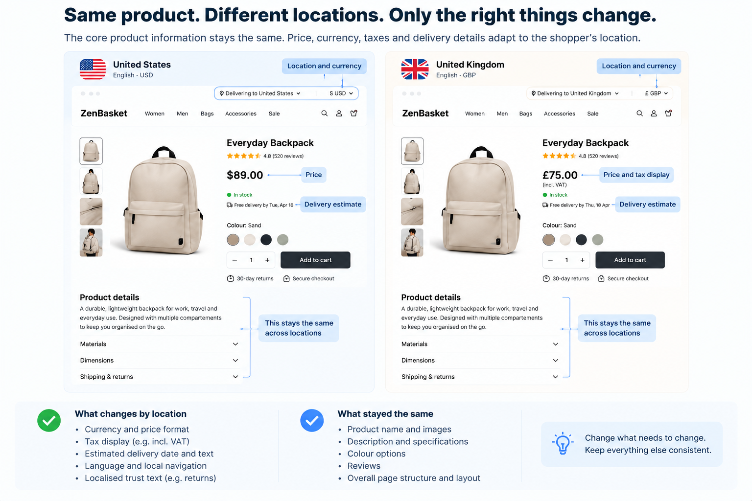
Location features are easy to switch on and easy to get wrong in ways that make your store look either broken or dishonest.
Who does what
| Website handles | Detecting an approximate location, and currency and language switching |
| You decide | What actually changes, and what stays the same |
| You must provide | Accurate delivery rules, tax settings, and stock by region |
| Nobody can fix | A wrong guess, which is why the shopper needs a way to correct it |
What a store can know about location, and how well
| How | How reliable |
|---|---|
| They told you | Exact. Always the best signal |
| Their delivery address | Exact, but you only get it at checkout |
| A pincode they typed | Exact, and worth asking for |
| Automatic detection | Country: usually right. City: often wrong |
Automatic detection is a guess. It’s wrong for people using a VPN, on an office network, travelling, or on a mobile connection routed through another city. Treat it as a starting point the shopper can correct, never as a fact.
Ranked by what it costs to get wrong
| What changes | Damage if wrong | The rule |
|---|---|---|
| Price and currency | Severe. A price they can’t pay, or a surprise conversion at checkout | Never change the price silently. Show the currency next to every figure |
| Tax shown or not | Severe. Reads as a last-minute price rise | Follow the convention where your customers are, consistently from product page to receipt |
| What’s available | High. A product shown as buyable that can’t ship there | Say so on the product page, not at checkout |
| Delivery cost and date | High. The most common reason people abandon carts | Ask for a pincode rather than guessing |
| Language | Moderate. An unreadable store | Follow their browser, always offer a switch |
| Returns terms | Moderate, higher in regulated categories | These genuinely differ by country |
| What you feature | Low. Wrong season, wrong festival | Worth doing, low risk |
Four rules
Show what you assumed, and let them change it. Something visible near the top; “Delivering to the UK · £”, that’s clickable. A store that silently decided is a store the shopper can’t correct.
Never redirect people automatically. Sending someone to a different regional site based on a guess is the most disliked pattern in this area. It strands travelers, and it breaks links people share. Suggest with a banner they can dismiss. Never move them.
Remember the choice. Once someone picks a region, that beats every automatic signal from then on. Asking again every visit is the second most disliked version.
Test from somewhere else. Every location feature works perfectly from the office where it was set up. Ask a customer or a colleague elsewhere to check. The common failure, right currency, wrong delivery estimate, is completely invisible locally.
Foundation · 6 min
Getting Your Products Found by AI Shopping Assistants
Foundation guide · 7 min
When someone asks an AI assistant to find them something, your homepage never loads. Your photography is never seen. A list of your product details is read, and if yours are thin, it recommends someone else.
Who does what
| Website handles | Sending your products to the shopping channels, in the format they need |
| You provide | Every field on every product. This is the whole job |
| You maintain | Keeping stock and prices accurate, because stale data is worse than none |
| Needs a developer | Nothing, in most cases |
Last reviewed: September 2026. This area changes fast, check the date.
What’s actually happening
Shopping assistants now sit between a lot of shoppers and the stores they buy from. Two things about how it settled during 2026 are worth knowing, and both are better news for you than the early headlines suggested.
Discovery happens in the assistant. Buying happens on your store. The experiment with buying inside the chat was tried and pulled back, shoppers researched there and then preferred to complete the purchase on the retailer’s own site. So you keep the checkout, the account, the customer relationship and the repeat purchase.
What you lose is the browsing. Nobody sees your homepage, your brand, your photography or your carefully written copy. The only thing representing you is your product data, which is why it now matters more than it used to.
Most stores on a platform with a shopping feed are already in these channels. The question isn’t whether to take part. It’s whether your products are complete enough to be picked.
The twelve fields, on every product
Missing any one of these reduces the chance of being shown. Most catalogues have ten or eleven and don’t know which two are missing.
-
Title — descriptive and specific
-
Description — plain and factual
-
Brand — even for your own products
-
Barcode / GTIN — the most common gap by a distance
-
Manufacturer part number — where there’s no barcode
-
Category — from the standard list, not your own menu names
-
Price — current
-
Sale price — with the dates it applies
-
Availability — your real stock, not roughly
-
Condition — new, used, refurbished
-
Main image — good quality
-
Product page link — one per product
Work through your ten best-selling products first. If a field is empty on those, it’s probably empty on everything.
The fields that actually decide it
The twelve get you considered. What gets you recommended is the field that answers the shopper’s real question, and their questions are rarely about the twelve.
Someone asking for “a machine-washable rug that won’t fade in a sunny room” needs machine washable and fade resistant as fields. If those facts are buried in a paragraph of description, they’re unreliable to read, and the assistant picks a store that stated them plainly.
So: take the questions your customers already ask, and make each recurring one a field. Your support messages, your reviews and your return reasons are the list. Materials, care instructions, dimensions with units, what it’s compatible with, fit notes, power requirements, allergens, warranty.
Twenty to thirty extra fields is a realistic target for a considered range.
Name them the same way every time. One product saying “Weight”, another “Item weight” and a third “Mass” can’t be compared, which is also why your own filters don’t work properly.
Write descriptions that state facts
Not different writing. Better writing, by the same standards that serve people.
Facts first. What it is, what it’s made of, what it’s for, in the first two sentences.
Say the property outright. “Machine washable at 30°C”, not “easy-care fabric”. A person fills in the gap from context. A machine doesn’t.
Don’t rely on the photos. Anything only visible in an image is invisible here. If the bag has an outside water-bottle pocket, write it down.
Never paste the manufacturer’s text. Every store selling that product has the same words, which gives nothing any reason to prefer yours.
Keeping it accurate is half the job
A product list that was right this morning and is wrong by lunchtime is worse than none. An assistant that sends someone to an out-of-stock product produces a shopper who arrives, finds nothing, and doesn’t return.
Stock, price and sale status need to be right within minutes. If your store updates stock automatically as orders come in, that’s handled. If anyone updates stock by hand, that’s the weak point.
Two honest limits
Nobody can promise you visibility. How these assistants choose is undisclosed and changes without warning. What you can do is remove every reason to be skipped. That’s a floor, not a lever, and anyone selling you a guarantee is selling you something else.
Do it anyway. Complete, accurate product data makes your own search work, your own filters work, and your own product pages better. That’s worth it regardless of what any assistant does next.
Foundation · 4 min
How Your Recommendations Should Explain Themselves
“You might also like” explains nothing, and shoppers have learned to ignore it. A recommendation that says why gets clicked. One that doesn’t gets read as an advert.
Who does what
| Website handles | Working out which products to show |
| Your theme decides | How the row looks |
| You write | The heading. This is the whole topic |
| You decide | Whether to offer a way to dismiss them |
The heading is the product
A recommendation makes a silent claim: this is relevant to you. With nothing behind it, that competes with every other promotional thing on the page and loses, because people have thirty years of practice ignoring unsupported promotional claims.
A reason turns it into an argument. It also lets the shopper judge whether your reasoning applies to them, “because you bought the frame” is checkable, and if it’s wrong they dismiss that one item rather than deciding the whole row is noise.
From weakest to strongest
| Wording | How well it works |
|---|---|
| “You might also like” | Ignored |
| “Popular in Kitchen” | Weak but honest, and fine when you know nothing about them yet |
| “Similar to what you’re viewing” | Moderate. Obvious, but at least stated |
| “Customers who bought this also bought” | Strong. The reasoning is visible and checkable |
| “Fits the frame you’re viewing” | Strongest. A specific, verifiable relationship |
| “Because you bought the 45mm lens” | Strongest, and the one to be careful with |
Rewrite your headings
| Instead of | Write |
|---|---|
| Recommended for you | Because you bought the Sage pyjama set |
| You might also like | Customers who bought this also bought |
| Trending now | Most bought in Lighting this month |
| Perfect match! | Fits the 45mm mount |
| Handpicked for you | Similar price and size to what you’ve viewed |
Every one is the same move: replace a claim about the shopper with a statement of the reason. Shorter, more specific, and checkable, which is what makes it believable.
Where it gets uncomfortable
Referring to something someone bought last week is helpful. Referring to something they looked at and didn’t buy three months ago is unsettling, and their reaction is to wonder what else you’re keeping.
Rule of thumb: refer to what they did on your store, recently, on purpose. Purchases and saved items, yes. Browsing history, sparingly. Anything you’ve guessed about the person rather than watched them do, no.
Two things worth adding
A “why am I seeing this?” link that opens two plain sentences explaining what the recommendation is based on. Not a policy page.
A “not interested” option that actually sticks. One that reappears next visit teaches the shopper that the control is decorative, which is worse than not offering it.
Both are becoming expectations rather than niceties. Rules on being upfront about automated recommendations are tightening, particularly for anyone selling into Europe, and they apply to the store using the feature, not only to whoever built it. The practical requirements are modest and all of them are things a shopper benefits from anyway: say that recommendations are automated, explain briefly what they’re based on, and let people opt out.
Two ways to get it wrong
Explaining a bad recommendation makes it worse. “Because you bought a wedding gift” on a second wedding gift proves the system has no idea who you are. Fix the recommendation before you label it.
Never invent the reason. If the row is sorted by what makes you the most margin, don’t call it “based on your browsing”. Shoppers notice the products don’t relate to anything they did, and what they learn is that your explanations are decoration, which is worse than having none.
Foundation · 5 min
How Fast Should Your Sections Be?
A speed score tells you your store is slow. It doesn’t tell you which section did it, and on a storefront, it’s nearly always a section.
Who does what
| The website builder handles | Serving your store efficiently |
| You control | How many sections you add, and how heavy their content is |
| You provide | The images and video, which are almost always the weight |
| You decide | Whether a section is worth what it costs |
Measure sections, not pages
A homepage score is an average across a hero, a category block, three product rows, a video and a testimonial slider. When it drops, the score can’t tell you which of the six caused it, so either nobody fixes anything, or everybody compresses images and the real cause survives.
Section-level thinking changes the conversation from “the homepage is slow” to “the video section adds a second and a half”, which is something a person can decide about.
How to test it without any tools
The remove-and-compare method. Duplicate your homepage. On the copy, delete one section. Load both on your phone, on mobile data, and count. If the copy is noticeably faster, you’ve found your expensive section.
Work down the page one section at a time. It’s tedious and it takes an afternoon, and it’s more useful than any score.
Two rules for the test: always on mobile data, never wifi; and always a fresh private window, because a cached page tells you nothing.
Where the weight usually is
Not a finding, just where to look first:
Hero images sized for a big screen and sent to phones unchanged. Usually the single biggest item on any homepage.
Carousels that load every slide at once. Ten slides means ten images downloaded to show one.
Video that loads its player before anyone presses play. Check whether a still image appears first, and whether the video only loads when someone actually wants it.
Too many product rows. Four rows of eight products is thirty-two images, most of which nobody scrolls to.
Chat widgets, review apps and tracking scripts. These bring their own weight, they’re easy to forget because you didn’t design them, and they’re frequently the largest thing you didn’t choose.
Set your own targets, not somebody else’s
Copied benchmarks don’t work, a jewelry store with fifteen products and a grocery store with eight thousand have nothing comparable.
Instead: measure your own best section, and make that the target for its type. If your fastest product row loads in a second, that’s the standard for product rows. If a new section is slower than your existing best, ask what it’s doing differently.
Re-check whenever you add a section, not once a quarter.
The one outside number worth knowing
Search engines do measure page speed, and there are published thresholds they use. You can check yours free, search for “PageSpeed Insights”, enter your store address, and read the mobile result.
Don’t chase a perfect score. Use it to confirm the direction: if it improves after you remove a section, that section was the problem.
Report it so something happens
A list of sections ranked by how much they cost, with a name against each. Not a score.
A score is a verdict, and nobody acts on a verdict. A ranked list is a work queue, and that difference decides whether anything changes.
Foundation · 6 min
Your Store Accessibility Checklist
Most store accessibility problems are found in four passes that take an hour, need no special tools, and can be run by whoever built the page.
Who does what
| Your theme handles | Most of the mechanics, focus, labels, structure |
| You control | Colors, text sizes, image descriptions, video captions, whether things auto-play |
| You test | The four passes below |
| Report to | Your theme provider, for anything the settings can’t fix |
A good share of what you’ll find is yours to fix, color contrast, missing image descriptions and auto-playing content are all settings and content, not code.
How to run it
Take one page of each type; homepage, category, product, cart, checkout, and run all four passes on each. An hour per page the first time, much less afterwards.
Pass 1 · Keyboard only
Put the mouse away. Press Tab repeatedly and watch.
-
Can you reach every clickable thing; links, buttons, filters, color swatches, carousel arrows, the cookie banner?
-
Can you always see where you are? There should be a visible outline on whatever is currently selected. This is the most common failure by far.
-
Does the order make sense, or does it jump around the page?
-
Can you open and close every menu, drawer and pop-up without a mouse? Escape should work.
-
Are you ever stuck, unable to Tab out of something?
Pass 2 · Screen reader
Use whatever is built into your phone or computer. You don’t need expertise, you need to hear whether the page makes sense.
-
Do images have real descriptions? Products described, decorative images marked as decorative, no filenames read aloud.
-
Do buttons say what they do? A cart icon with no label is read as nothing useful.
-
Do form fields have labels, or is the grey placeholder text doing that job? Placeholder text disappears when you start typing.
-
Is an error read out when it appears, or only shown?
-
When a filter changes the number of results, is the change announced?
Pass 3 · Visual
-
Contrast. Check the quiet places, grey placeholder text, disabled buttons, badges sitting on photographs, white text over a pale image. There are free contrast checkers online; the common failures are all in low-contrast greys.
-
Is color ever doing the job alone? Sale in red, error in red, out-of-stock greyed out. Each needs a word too.
-
Zoom your browser to 200%. Does anything overlap, get cut off, or push the page sideways?
-
Set your phone’s text size to maximum and reload. Same check.
-
Are tap targets big enough, with space between them?
-
Does the page work held sideways?
Pass 4 · Motion and timing
-
Does anything move, rotate or advance on its own? If so, can it be stopped?
-
Turn on Reduce Motion in your device settings and reload. Sliding, parallax and auto-play should stop. If they don’t, that’s a fault to report.
-
Anything flashing quickly? That’s a seizure risk, not a preference.
-
Is there a timer a shopper can’t extend, a cart that empties, a checkout that expires, a countdown that removes an option?
Rank what you find
| Priority | What |
|---|---|
| Blocking | Anything that makes buying impossible, checkout unusable by keyboard, an unlabeled required field |
| High | No visible selection outline, color used alone, missing product image descriptions, errors that aren’t announced |
| Medium | Contrast on secondary text, odd tab order |
| Low | Decorative image details, minor label wording |
Fix blocking issues before anything else, whatever else is planned. A checkout that can’t be completed with a keyboard isn’t an abstract accessibility issue, it’s a customer who cannot buy from you.
Make it a habit
Run the four passes on a new page before it goes live, not after. Keep the results as a list with names and dates, and re-run after each fix.
Accessibility problems come back quietly, because nothing visibly breaks when they do.