Foundation · 2 min
1. What a grid is actually doing
A product grid looks like a way of displaying products. It is really a way of comparing them. A shopper arriving at a grid is not reading it; they are running a fast, mostly unconscious elimination process — glance, reject, glance, reject, pause on one. Everything that makes that loop slower costs you products considered.
This reframes almost every grid decision. The question is never “does this card look good in isolation” but “does this card look good eighteen times in a row”. A card with a beautiful asymmetric layout is a liability at scale, because the shopper’s eye has to find the price in a new place on every card. A plain card where the price is always in the same spot lets them compare twenty prices without thinking about it at all.
The squint test. Blur your grid until you cannot read the text, screenshot it and apply a heavy blur, or just take your glasses off. You should still see a clean repeating rhythm: image blocks the same size, text blocks starting on the same line, prices forming a readable column down the page. If the blurred version looks chaotic, the sharp version is slowing every shopper down, however nice the typography is.
What this guide does not cover. Filters, sorting, applied-filter chips, result counts, pagination, empty states, faceted-navigation SEO and the full list of what belongs on a product card all live in the Product listing page guide. This guide is about the grid as a visual system — density, ratio, alignment, rhythm and interaction — wherever it appears: category pages, search results, homepage rows or a collection block.
Foundation · 6 min
2. The five grid patterns
Five structures cover almost every product grid worth building. They differ in what they optimise for — comparison, browsing, hierarchy or specification — and choosing wrongly is more damaging than styling any of them badly.
2.1 The uniform grid

Every card identical. Unremarkable to look at, and the fastest thing in the world to scan.
Equal cards, equal images, equal spacing, in a fixed number of columns. It is the default for good reason: it makes the comparison loop as cheap as it can possibly be, because nothing on the page competes for attention with anything else.
Wins when
Products in the list are genuine alternatives to each other and the shopper is choosing between them. Which is to say: on almost every category page and every set of search results.
Fails when
Products vary enormously in importance or price and the grid gives no signal about it — a ₹200 accessory and a ₹40,000 sofa presented with identical weight. That is a sorting and merchandising problem, but the uniform grid will not rescue you from it.
Costs you
Hierarchy. You cannot promote anything without breaking the pattern, which is what the next two patterns are for.
2.2 The mixed-weight grid
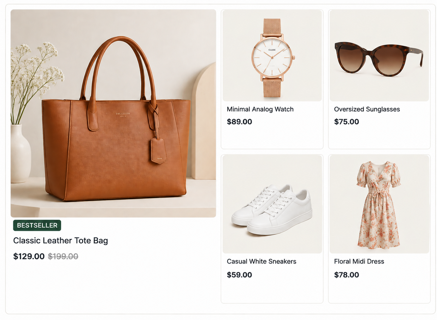
One card promoted to a larger cell. Hierarchy without abandoning the underlying grid.
A uniform grid where one or two cells are enlarged to two-by-two, carrying a hero product, a bestseller or a new arrival. The rest of the grid keeps its rhythm, so scanning still works everywhere else on the page.
Wins when
You have a genuine reason to promote a specific product and can say what it is. Also good on curated collection pages, where the page is an argument rather than an inventory.
Fails when
The large cell repeats every six products as a template rule. Once it is predictable it stops signalling importance and becomes visual noise — and it pushes ordinary products further down for no return.
Costs you
Products per screen, and a harder responsive problem: the enlarged cell has to decide what to become at two columns and at one.
In ZenBasket: a data-driven slider set to without slider mode renders as a static grid, and a separate data-driven box can carry the promoted product alongside it.
2.3 The masonry grid
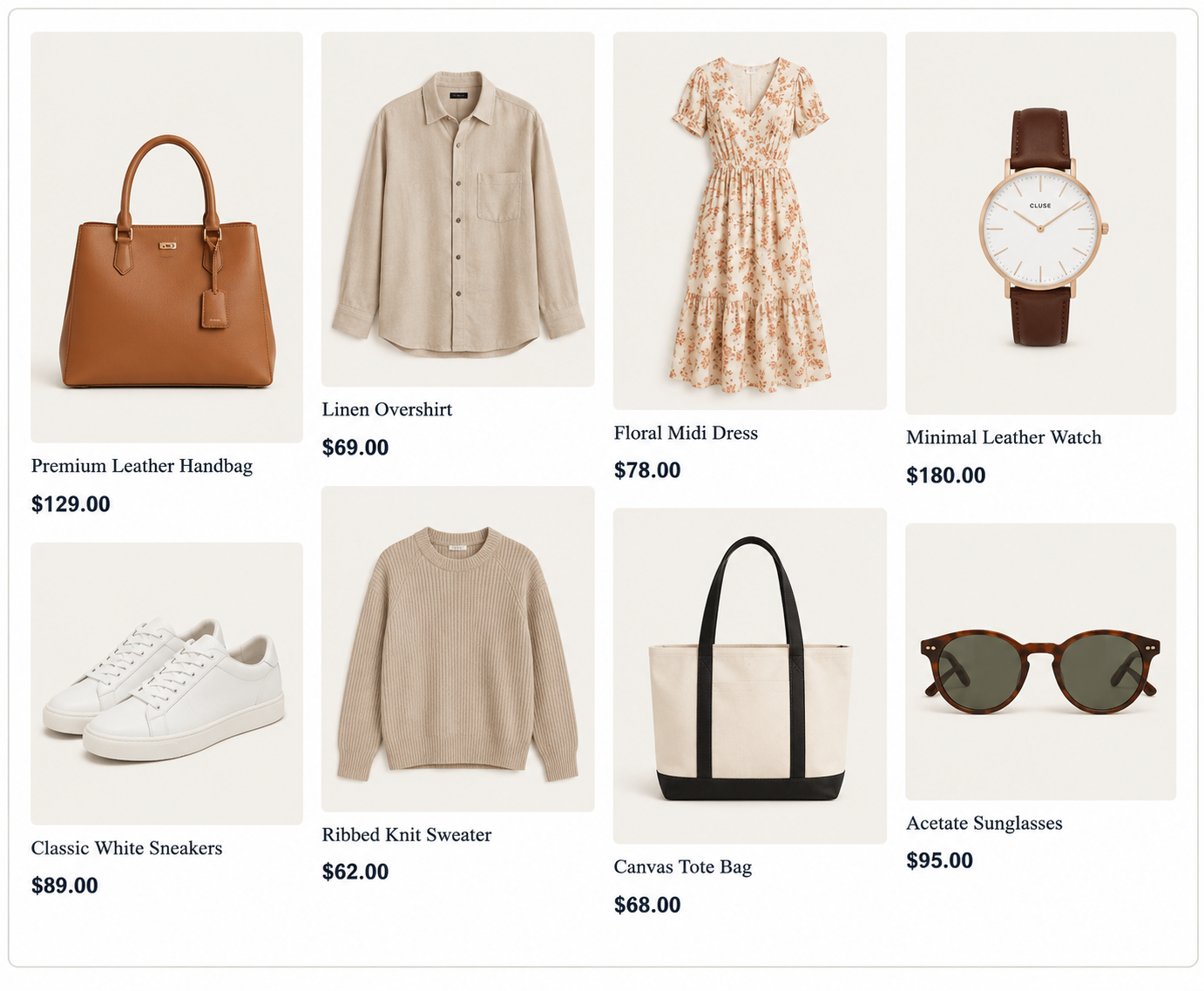
Native image proportions preserved, so nothing is cropped — but no two prices sit on the same line.
Cards keep their images’ native proportions and pack into columns, so nothing is cropped and no rows align. It is genuinely the right answer in a narrow set of cases and the wrong answer almost everywhere else.
Wins when
The product is the image and its shape carries meaning — art prints, posters, rugs, photography, original craft pieces. Cropping a landscape painting to a square destroys the thing being sold.
Fails when
Shoppers need to compare on price or specification. With no shared baseline, the eye has to hunt for the price on every card, and the comparison loop gets measurably slower. It also makes “where was I” hard after returning from a product page.
Costs you
Comparability, predictable pagination, and an easy answer to the hardest responsive question in this guide. Reserve it for catalogues where image shape is information.
2.4 The editorial-hybrid grid
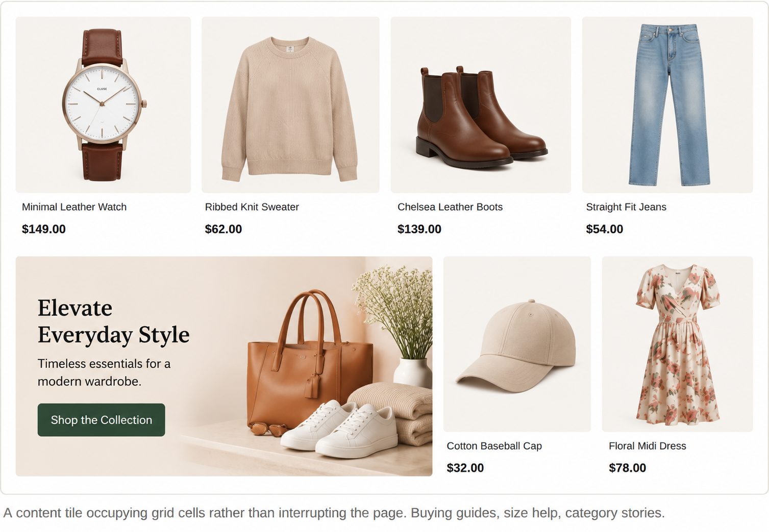
A uniform grid with occasional non-product tiles slotted into cells: a buying guide, a size-help panel, a sustainability note, a category story. Because the tile occupies grid cells rather than cutting across the page, the scanning rhythm survives.
Wins when
Shoppers need help deciding rather than more options — sizing, compatibility, care, materials. One well-placed tile answering the category’s hard question outperforms four more products.
Fails when
The tiles are promotional rather than useful. A discount banner in a grid cell reads as an advertisement and gets skipped along with anything near it. It also fails if tiles land in different positions as filters change the result count — anchor them to a position in the result set, not to a pixel.
Costs you
A grid slot per tile, and some care about pagination — a tile should not be the only thing on page four.
2.5 The compact grid
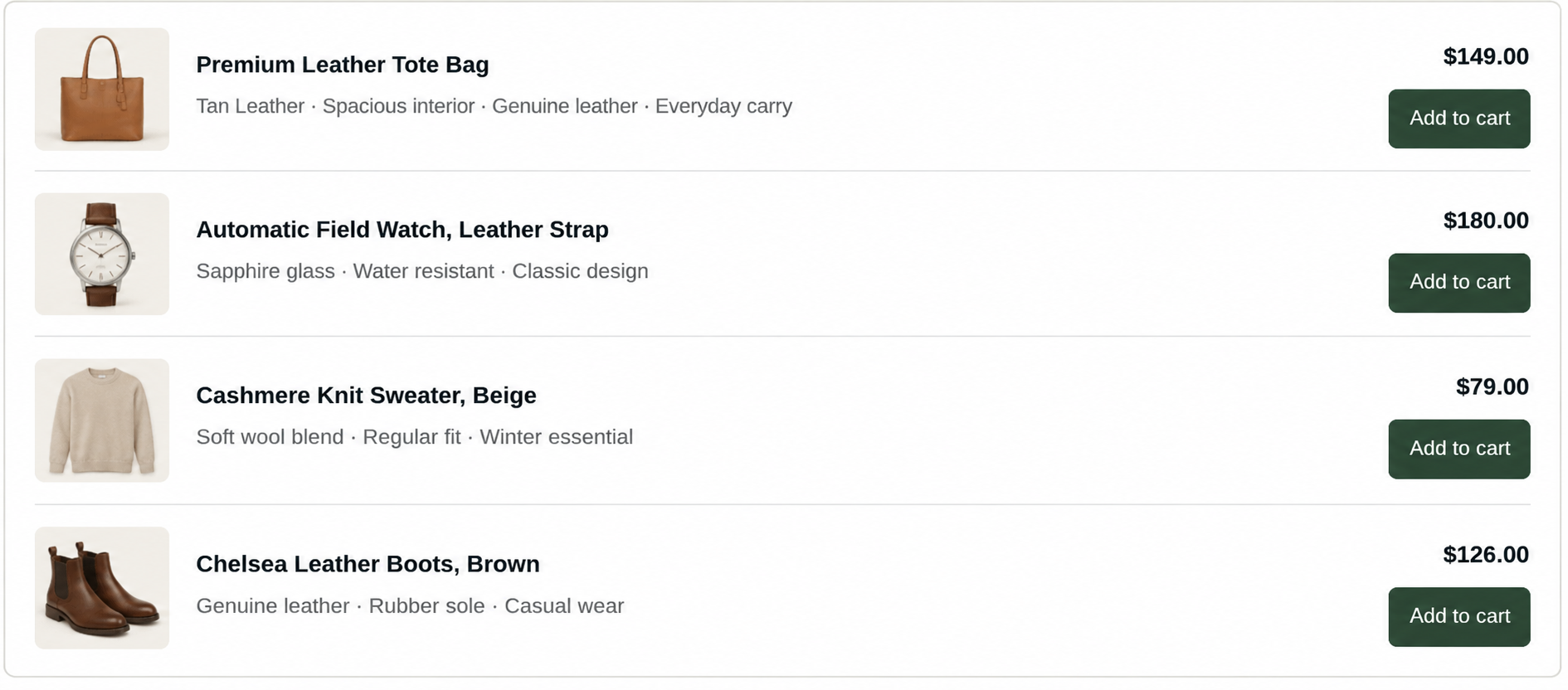
A one-column grid of wide rows. The image shrinks so specifications can be compared line by line.
Sometimes called list view, but it is still a grid — just one column wide, with the image demoted and the text promoted. Worth treating as a first-class pattern rather than a toggle nobody presses.
Wins when
Shoppers buy on numbers rather than looks: electronics, tools, components, parts, industrial supply, anything with a specification sheet. Two or three attributes per row, aligned down the page, is the fastest comparison surface there is.
Fails when
It is offered only as a toggle with the visual grid as default. Most shoppers never change the view, so for a spec-driven catalogue the toggle quietly hides the better experience. Pick the right default; the toggle is a convenience, not a decision.
Costs you
Products per screen and visual appeal. On mobile it usually needs to drop to two attributes.
Which attributes appear here is a catalogue-data decision as much as a design one — see section 4.
Foundation · 2 min
3. Density: how many columns
Column count is usually argued as a taste question and settled by whoever is most senior. It is actually determined by one thing: how much a shopper needs to see per product before they can reject it. A t-shirt can be rejected from a thumbnail. A laptop cannot be rejected without reading three specifications. The first supports four columns; the second supports one.
Starting points, not rules — adjust from the squint test
| If shoppers decide by… | Desktop | Tablet | Phone | Because |
|---|---|---|---|---|
| Looks alone (fashion, décor, art) | 4 | 3 | 2 | The image does the rejecting; more per screen means more considered |
| Looks plus one fact (food, beauty, gifts) | 3–4 | 2–3 | 2 | Room for a price or size without shrinking the image below useful |
| Looks plus several facts (furniture, appliances) | 3 | 2 | 1–2 | Dimensions and materials need line space |
| Numbers (electronics, tools, parts) | 1–2 (compact) | 1 | 1 | Specifications only compare when they align vertically |
Two things to hold on to. Five columns is almost always too many on a standard desktop width — the image drops below the size at which detail reads, and you have traded usefulness for a bigger number. And one column on a phone is usually wrong for visual products: it prevents any comparison at all and turns browsing into an endless scroll. Two is the workhorse.
Set column counts at breakpoints deliberately rather than letting cards reflow to whatever fits. Automatic wrapping produces a final row with one lonely card and a ragged bottom edge, which reads as a bug.
Foundation · 3 min
4. Consistency is the whole game
Here is the claim in this guide most worth arguing about: consistency matters more than card design, and consistency is mostly a catalogue-operations problem rather than a design one. A plain grid with rigorously consistent images and attributes will outperform a beautifully designed grid with inconsistent ones, every time. That means the highest-value work on your grid is often not done in a design tool at all — it is done in your product data.
Baymard’s product-list research puts numbers on it: 64% of sites get at least one of two basic list-information principles wrong, and around 40% fail on visual differentiation alone.
Image consistency
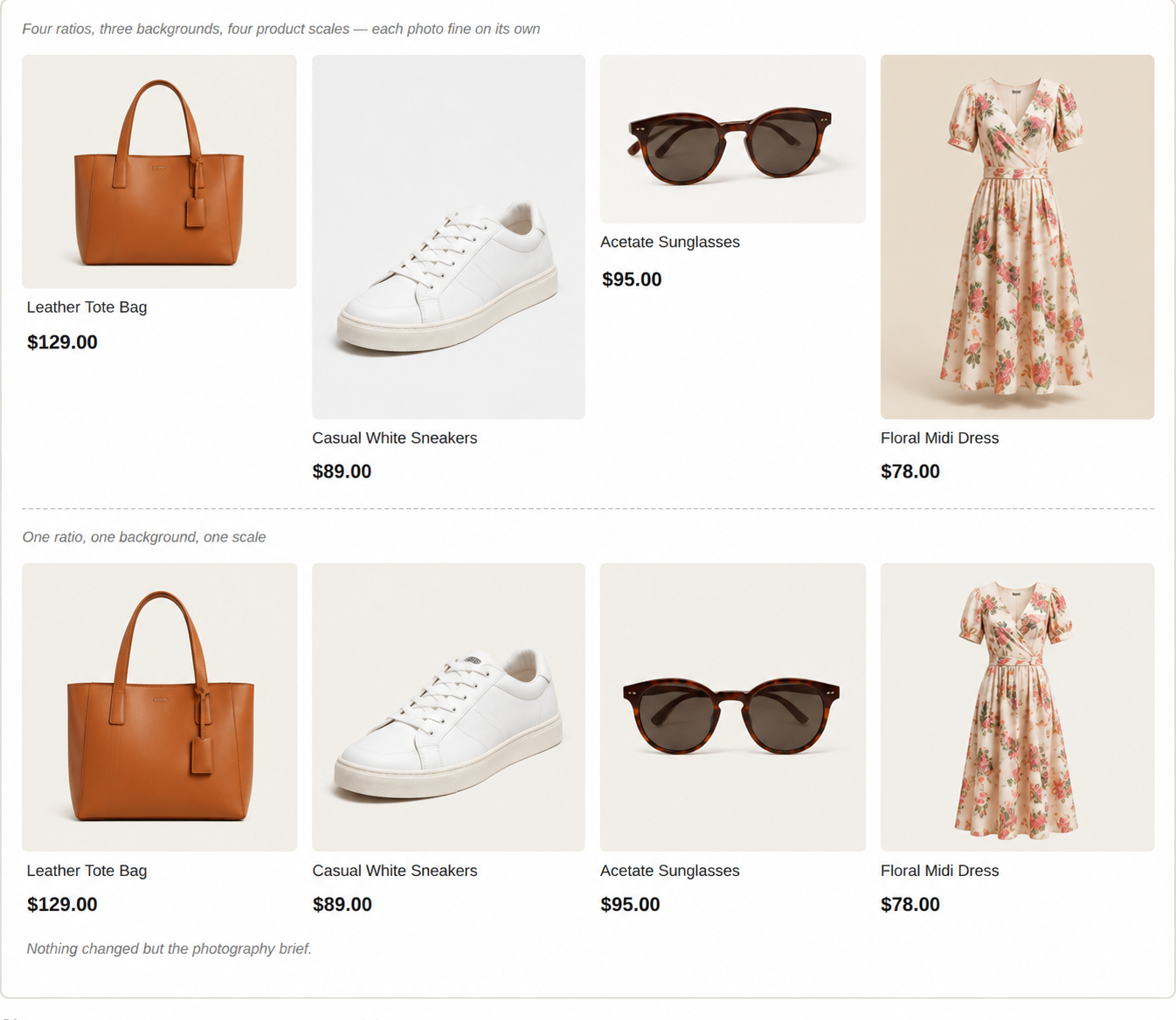
The single highest-impact fix in most grids, and it is a photography brief rather than a CSS change.
- One aspect ratio for the whole catalogue. Square (1:1) is the safest default; portrait (4:5 or 3:4) suits apparel and anything tall. Choose once and enforce it. Mixed ratios are why so many grids look untidy despite careful design.
- One background and one lighting treatment. Three products on white next to one on a wooden table breaks the rhythm harder than a font mismatch ever will.
- Consistent product scale within the frame. If one shoe fills the frame and the next sits small in the middle, shoppers read it as a size difference.
- Same angle across a category. Pick the angle that distinguishes products best, then use it everywhere in that category.
- Contain, do not crop, when ratios must vary. If legacy imagery genuinely cannot be re-shot, fit each image inside a fixed-ratio box on a consistent background rather than cropping heads and handles off.
Attribute consistency
The same rule applied to text. Every card in a category shows the same fields in the same order, or the shopper cannot compare. Where data is missing, Baymard’s guidance is either to drop the attribute from every card in that category or to state the absence explicitly — never to leave a gap that reads as “this product does not have it”.
And differentiate those fields visually: brand, title, specification and price should be distinguishable at a glance through weight, size or colour, not run together as one paragraph. This is the principle 40% of sites fail, and it costs nothing to fix.
Which fields belong on the card in the first place is covered in the Product listing page guide.
Foundation · 2 min
5. Card height and the ragged edge
Once images are consistent, the next thing that breaks a grid is text of unequal length. One three-line product title in a row of one-line titles pushes its price down, and now the prices no longer form a column.
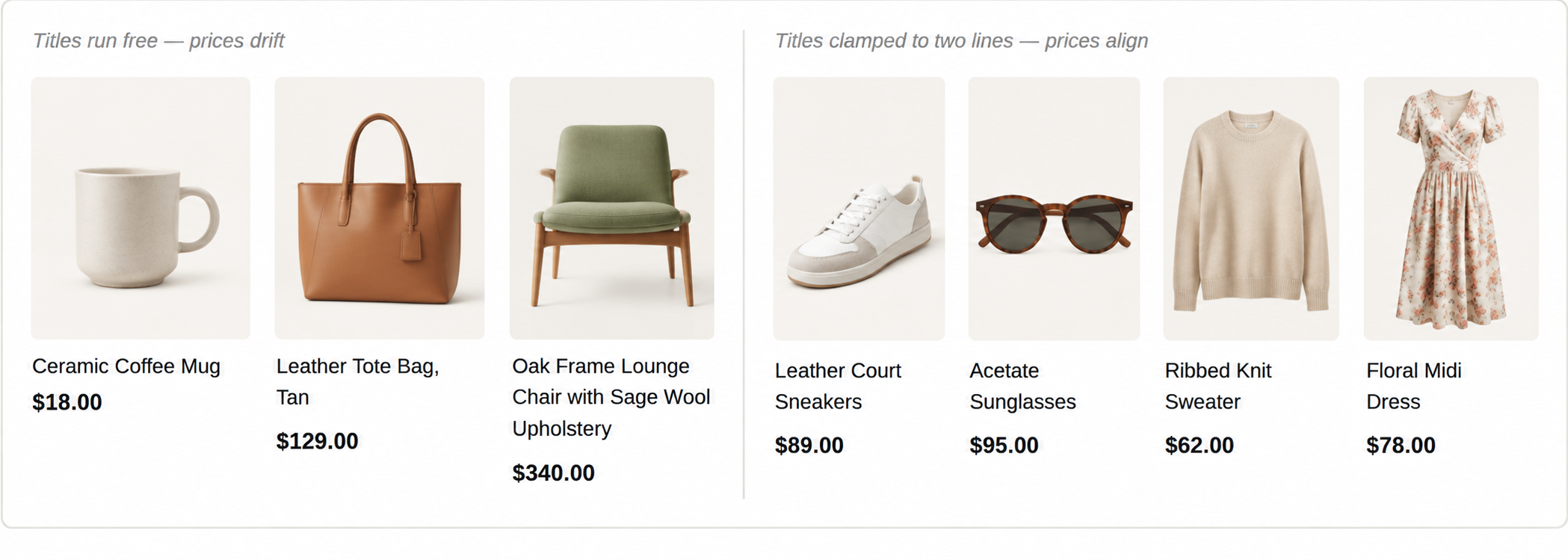
Clamping the title to a fixed number of lines is what makes prices compare at a glance.
- Clamp the title to a fixed line count — two lines suits most catalogues, one is enough for short names. Truncate with an ellipsis rather than letting it run.
- Reserve the space even when it is empty. A card with a one-line title should keep the second line’s height so the price still lands on the shared baseline.
- Reserve space for optional elements too. If some products have a badge or a swatch row and others do not, hold the space on every card or the rows go ragged again.
- Fix the last row. Decide what happens when the final row is incomplete — left-aligned remaining cards is almost always right; stretched or centred cards look broken.
- Long names are a data problem too. If titles are so long that two lines tell the shopper nothing, the fix is shorter product names in the catalogue, with the detail moved to the product page.
Foundation · 3 min
6. The interaction layer
Hover effects are where grid design most often goes wrong, because they are designed on a desktop with a mouse and most shopping happens on a phone without one. Every hover behaviour needs a stated answer to “and on touch?” before it ships.
| Behaviour | Worth it when | On touch |
|---|---|---|
| Second image on hover | The back, inside or alternate colourway genuinely changes the decision — apparel, bags, footwear | No hover exists. Either show a small image-count indicator, or accept that touch users see one image and make sure it is the right one |
| Card lift or scale | As a subtle affordance only — a small scale and a soft shadow. Keep it under about 0.25s | Harmless; simply never triggers. Do not attach information to it |
| Quick add | Repeat purchases and products with no variants to choose — groceries, consumables, refills | Must be permanently visible, not hover-revealed, and at least 24×24 CSS pixels with clear spacing |
| Quick view | Rarely. It duplicates the product page badly and hides what the shopper needs | Avoid on spec-driven catalogues especially — the modal never has room for the specifications |
| Colour swatches | Whenever colour variants exist. Keep them on mobile, where they are usually the first thing dropped | Real tap targets, spaced apart. Swatch rows are the most common target-size failure in grids |
The target-size figure above is not arbitrary. WCAG 2.2 sets Target Size (Minimum) at 24 by 24 CSS pixels at Level AA, with exceptions where undersized targets are spaced far enough apart that their 24-pixel circles do not overlap. The stricter 44 by 44 figure many teams quote is Target Size (Enhanced) at Level AAA — a good goal for primary controls, but the AA requirement is the one you must meet.
Two rules that apply regardless of pattern. The whole card is the link, not just the title — but keep quick-add and swatches as separate controls inside it so they do not fight the card link. And every card needs a visible keyboard focus state; a grid is a long list of links, and it is exhausting to navigate when you cannot see where you are.
In ZenBasket: hover swaps are built by enabling other-angle images in data mapping and adding an on-hover interaction to the card — see effects and animations.
Foundation · 2 min
7. Breaking the grid without breaking scanning
Long grids get monotonous, and the instinct is to add variety. Most added variety costs more in scanning speed than it returns in interest. Three interruptions are usually worth it:
- A content tile in a grid cell — the editorial-hybrid pattern. Occupies cells, keeps the rhythm, answers a real question.
- A subcategory break — a labelled heading splitting a long list into meaningful groups. Useful when a category contains genuinely different product types.
- A promoted row — a labelled strip such as “New this week”, visually distinct and clearly separate from the main grid, so nobody mistakes it for search results.
What is rarely worth it: full-width promotional banners cutting the grid in half, alternating card styles for visual interest, and background colour changes every few rows. Each one forces the eye to re-orient, and the shopper was mid-comparison when it happened.
The rule for anything inserted into a grid: it must be obvious within a glance whether the thing is a product or not. Ambiguous tiles are the worst outcome where shoppers click them expecting a product, and stop trusting the grid.
Foundation · 2 min
8. What breaks grids
| Failure | How it shows up | Fix |
|---|---|---|
| Mixed image ratios | The grid looks untidy and nobody can say why; text starts at different heights across a row | One ratio for the catalogue, enforced at upload. Contain rather than crop for legacy images |
| Inconsistent attributes | Some cards show material or capacity, others do not; shoppers open every product page | Show the field on all cards in a category or none. Fix the missing data or state the absence |
| Cards that shift as they load | A shopper reaches for a card and taps the wrong one; Cumulative Layout Shift above 0.1 | Reserve image space with explicit dimensions or a fixed-ratio container before the image arrives |
| Too many columns | Images too small to judge; click-through drops even though more products are visible | Drop a column. Judge by whether a product can be rejected from the thumbnail alone |
| Everything on hover | Desktop feels rich, mobile conversion does not match it | List every hover behaviour and give each one a touch answer before shipping |
| Badge inflation | Four badges on a card; none of them registers | One badge per card, with a documented priority order when several could apply |
Foundation · 2 min
9. Knowing whether yours works
- Click-through position distribution. Healthy grids get clicks spread across the first several rows. If nearly everything comes from row one, shoppers are not scanning. It is usually a density or consistency problem.
- Products viewed per session. The clearest read on whether the comparison loop is working. It should rise when you fix image consistency, and that is a satisfying thing to measure.
- Grid-to-product-page rate, by device. A gap between desktop and mobile usually means information is hidden behind hover.
- Return-to-grid behaviour. Whether shoppers come back and keep scanning, or leave. Restoring scroll position matters more than most teams assume.
- Cumulative Layout Shift on a real phone — good is 0.1 or less. Grids are the most common place to fail it, because they load many images at once.
Before publishing a grid:
- Every image in the category shares one aspect ratio, background and scale
- The same attributes appear on every card in the category, in the same order
- Brand, title, specification and price are visually distinguishable at a glance
- Titles are clamped so prices sit on a shared baseline
- Space is reserved for badges and swatches even on cards without them
- Column counts are set deliberately at each breakpoint
- The last row of an incomplete grid looks intentional
- Every hover behaviour has a documented touch equivalent
- Tap targets meet 24×24 CSS pixels, swatch rows included
- The whole card is a link, with a visible keyboard focus state
- Image space is reserved before load and no shifting as the grid fills
- The blurred screenshot still shows a clean repeating rhythm
Foundation · 5 min
10. Frequently asked questions
How many products should be in a row on an ecommerce site?
Four on desktop for visual products, three when each product needs a line or two of detail, and one or two for specification-driven catalogues. On a phone, two columns is right for most stores. The test is whether a shopper can reject a product from the thumbnail alone, if not, you have too many columns.
What is the best image size and aspect ratio for a product grid?
The ratio matters more than the pixel size. Square (1:1) is the safest default; portrait (4:5 or 3:4) suits apparel and tall products. What matters most is that one ratio applies to the whole catalogue, with the same background, lighting and product scale in every frame.
Should product cards all be the same height?
Yes, in almost every case. Equal heights are what let prices form a readable column down the page, which is what makes comparison fast. Achieve it by clamping titles to a fixed line count and reserving space for optional elements like badges and swatches. Masonry is the deliberate exception, for catalogues where image shape is part of the product.
Should I use a masonry grid for products?
Only when the image’s proportions are meaningful as in art prints, posters, rugs, photography. Everywhere else the lack of a shared baseline slows comparison, because the eye has to hunt for the price on every card. For a normal catalogue, a uniform grid is faster to scan and easier to make responsive.
Grid view or list view: which should be the default?
Grid when shoppers buy on looks, compact list when they buy on numbers. Offering a toggle is fine, but the default is the real decision, because most shoppers never change it. A spec-driven catalogue defaulting to a visual grid is hiding its better experience behind a control nobody presses.
Should product cards show a second image on hover?
Only when the alternate view genuinely changes the decision, such as the back of a garment. Never put information there that a shopper needs, because hover does not exist on touch devices, where most shopping happens. If the second image matters, add a visible image-count indicator instead.
Why does my product grid look messy even though the design is fine?
Almost always inconsistent images. Mixed aspect ratios, mixed backgrounds, or products sitting at different scales within the frame will make a carefully designed grid look untidy, and the cause is hard to spot because each individual image looks fine. Blur a screenshot: the problem becomes obvious immediately.
How many badges should a product card have?
One. Badges work by standing out, so a card with four has none that register. Decide a priority order for when several could apply and show only the winner. For example, low stock beats new, which beats bestseller.
Can I put banners or content inside a product grid?
Yes, if the tile occupies grid cells rather than cutting across the page, and if it is useful rather than promotional. A sizing guide or buying-help tile earns its slot; a discount banner reads as an advertisement and gets skipped along with the products near it. Anchor tiles to a position in the result set so they do not move as filters change the count.
What size should tap targets be in a product grid?
At least 24 by 24 CSS pixels to meet WCAG 2.2 Level AA, or spaced far enough apart that their 24-pixel circles do not overlap. The commonly quoted 44 by 44 figure is the Level AAA enhanced requirement, a good goal for primary controls. Colour swatch rows are where grids most often fail this.
Why does my product grid jump around while it loads?
Images without reserved space. The text renders first, then each image arrives and pushes everything down, which is measured as Cumulative Layout Shift wherein, good is 0.1 or less. Give every image container explicit dimensions or a fixed aspect ratio so the layout is correct before any image loads.
Does product grid design affect SEO?
Indirectly but genuinely. Product links should be real HTML anchors rather than script-driven clicks so they can be crawled; card images need descriptive alt text, which is often the only text describing that link; and layout shift and slow image loading are experience signals. How filter and pagination URLs should be indexed is a separate question, covered in the product listing page guide.
Foundation · 2 min
11. Where to go next
- Product listing page guide — filters, sorting, paging, empty states, and what belongs on a product card
- Category & collection pages — the merchandising wrapper the grid sits inside
- Hero banner design — the block most often sitting directly above a grid
- Proven Pattern Library — the rest of the pattern set
- Industry store strategies — how grid density and imagery change by what you sell