Foundation · 2 min
What a product listing page is for
A product listing page (PLP) is the mechanism: the grid, the filters, the sorting, the paging. A category page is the merchandised wrapper around it: the heading, the subcategory links, the editorial content.
Job 1: Narrow the list down. Filters and sorting exist to take someone from 200+ results to the dozen worth comparing properly. A shopper who cannot narrow effectively either gives up or, worse, buys the wrong thing.
Job 2: Make comparison easy. Once narrowed, the shopper is scanning cards against each other. Consistency across cards, same elements, same position, matters more than how good any single card looks.
Job 3: Let people explore without losing their place. Shoppers open products in new context, compare, and come back. A listing page that forgets applied filters or scroll position on return breaks that loop, and a broken loop usually ends the session.
Foundation · 2 min
Six decisions to make before you start designing
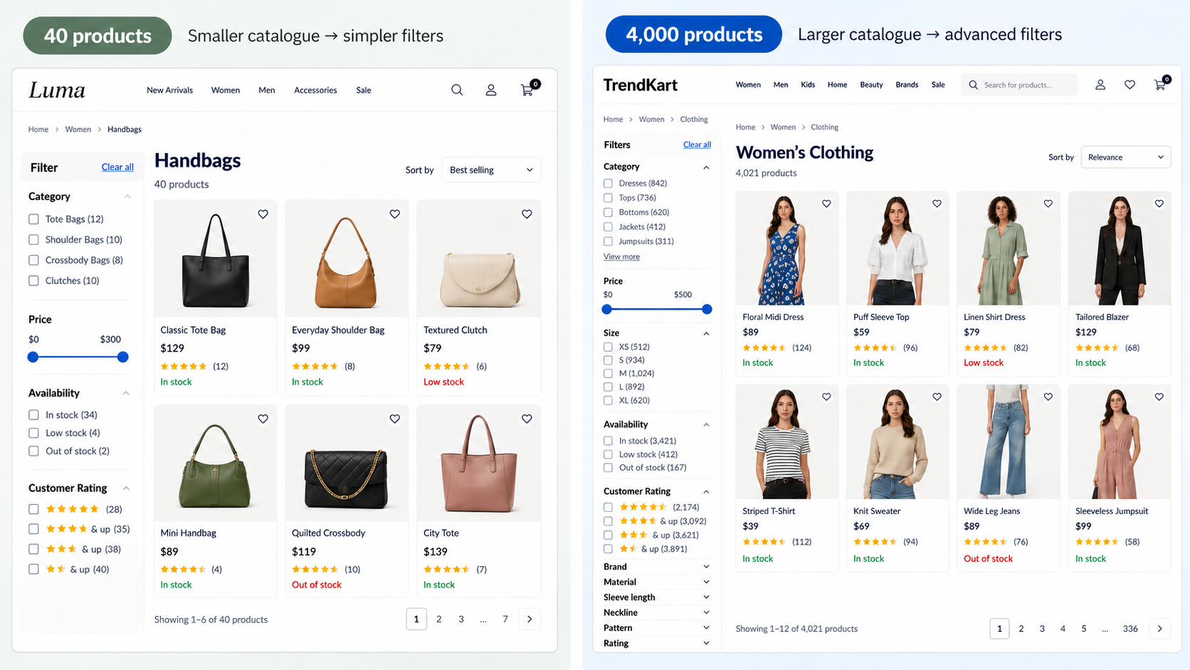
Decision 1: How big is a typical result set? A category with 40 products needs far less filtering machinery than one with 4,000. Design the filter panel for your actual scale, not a hypothetical large catalogue.
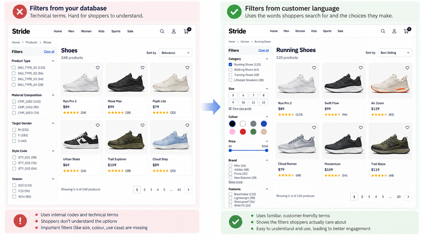
Decision 2: What do people actually filter by? Build filters from the words customers use and the choices they actually make, not from your database columns. A filter nobody understands is a filter nobody uses.
Decision 3: Is your product data clean enough? Filters and sorting are only as good as the underlying attributes. Inconsistent colour names or missing specifications break filtering before a shopper even sees the page.
Decision 4: Which filter combinations should search engines see? Most filter combinations should stay out of the search index. Decide up front which ones are genuinely worth a crawlable URL, and let the rest be for on-page use only.
Decision 5: How do you handle variants? One card per product with all its variants attached is the better default for most catalogues. Decide this once, rather than letting it vary page to page. On hover, show the secondary image or video for whichever variant the shopper has selected, so they get a closer look at that exact option without leaving the grid.
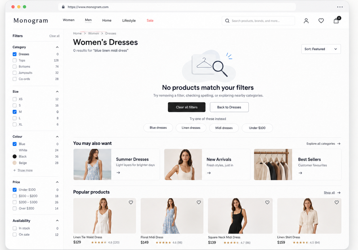
Decision 6: What does an empty result look like? Plan the empty state as carefully as the full one. A filtered dead end costs trust as well as a click.
Foundation · 3 min
The anatomy of a listing page, zone by zone
| # | Zone | What it does |
|---|---|---|
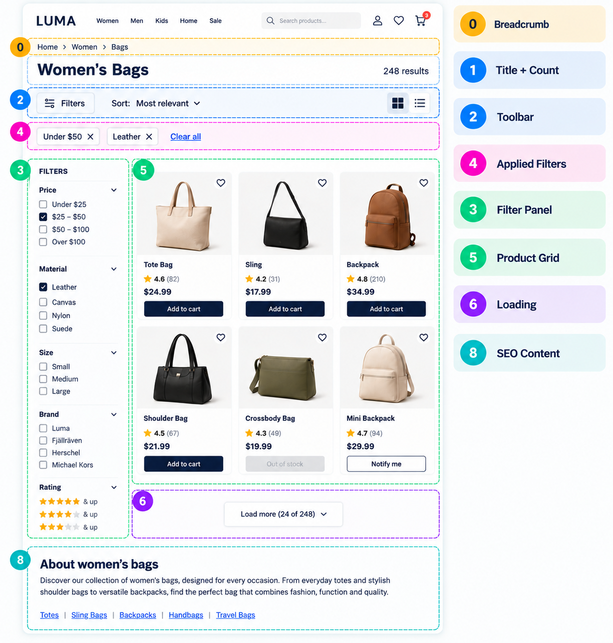
| 0 | Breadcrumb, title and result count | The result count matters more than it looks: “248 results” tells someone whether to start filtering or just start scrolling, and confirms a filter did something when the number drops. Update it live and announce the change to screen readers. |
| 1 | Category introduction | A short paragraph, if any. Mostly a search-engine feature; never let it push products below the fold. Longer copy for search purposes belongs below the grid. |
| 2 | The toolbar | Carries the result count, sort control, mobile filter trigger, and a grid/list toggle if offered. Keep it sticky so filtering and sorting stay reachable deep in the page. Offer the four sort options people expect: relevance, price, rating, newest or best-selling. |
| 3 | The filter panel | A left sidebar on desktop, a full-screen drawer on mobile. Put the most-used filters at the top, show counts next to options, and disable choices that would return nothing. |
| 4 | Applied filters | Every active filter shown as a removable chip, plus “Clear all”. Shoppers forget what they applied, especially after returning from a product page, and wrongly conclude the catalogue is small. |
| 5 | The grid and the product card | The card is the unit of comparison. Include only what helps someone decide whether to click, and keep every element in the same position on every card. The whole card should be clickable. |
| 6 | Promotional tiles | A tile carrying a banner or cross-sell, dropped into the grid at a fixed interval, styled clearly enough that nobody mistakes it for a product. Drop it once filters are applied. |
| 7 | Loading more results | Whichever method you choose, returning from a product page must put the shopper back at the same position with the same results loaded. |
| 8 | The empty state | Say clearly which filter caused an empty result, offer a one-tap way to remove it, and show nearby results rather than a bare “no results found”. |
| 9 | Content below the grid | Longer category copy, related categories and buying-guide links, placed after the products so search-focused content never gets in a shopper’s way. |
Foundation · 2 min
Filter panel rules that matter
| Rule | Why |
|---|---|
| Most-used filters at the top, expanded by default | Filters below the fold get used far less |
| Show how many products each option will return | “Leather (34)” tells the shopper whether it’s worth applying |
| Disable or hide options that would return nothing | A filter leading to an empty page is a wasted click |
| Allow several values within one filter | People want blue or green, not one at a time |
| Explain filters that aren’t self-evident | Unclear filters go unused |
| Use the right control for the data | Checkboxes for multi-select, colour shown as a checklist, a slider for price |
Foundation · 2 min
Product card elements
| Element | Include it when |
|---|---|
| Image | Always. Same crop, background and angle across the catalogue |
| Second image on hover | Useful for apparel and anything with a back view |
| Title | Always. Lead with the distinguishing word; truncate to a fixed number of lines |
| Price | Always. Show discount and original price only when the original is genuine |
| Rating and review count | When you have real reviews. The count matters as much as the score |
| Wishlist | Always. A small save icon in the same corner of every card, so shoppers can shortlist without opening the product. |
| Badges | Sparingly. Only one at a time; more than one competes for attention. |
| Price per unit | For anything sold in packs or by weight |
| Quick add | For repeat purchases and simple products, not where a choice is required first |
Foundation · 2 min
Design decisions with real trade-offs
Pagination, load more, or infinite scroll? Recommendation: a “Load more” button. Pagination felt slow and shoppers rarely went past the first page or two. Infinite scroll got people looking at more products but made them scan carelessly and made the footer hard to reach. A load-more button avoided both problems.
Grid view or list view? Grid by default for visual products; list by default for specification-driven ones. A grid suits clothing, furniture and food. A list gives each product a wider row for specifications, suiting electronics, tools and parts.
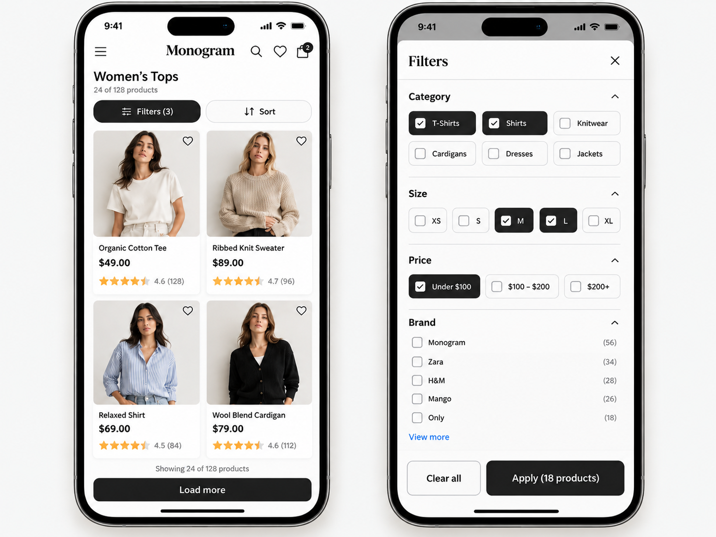
Where should filters live? A left sidebar on desktop is the most reliable pattern, filters stay visible while scanning results. A horizontal bar saves space but struggles with long value lists. On mobile, use a full-screen drawer from a sticky “Filters” button showing the active count.
Instant apply, or an “Apply” button? On desktop, apply instantly so the shopper sees the count change and learns how filters behave. On mobile, where the drawer covers the results, let people select several filters and apply together, with a running count on the button: “Show 42 products”.
What should the default sort be? Relevance, tuned for the category, usually blending popularity, availability, margin and recency. Avoid defaulting to price low-to-high, which fills the first screen with the cheapest, least representative products.
Should you use quick view? Helps when the decision needs one more piece of information; hurts when the product needs real evaluation. Apparel and homeware benefit; electronics and spec-heavy products generally don’t.
One card per product, or one per variant? One card per product with all its variants attached is the better default, it keeps the grid diverse. Show separate cards only where variants are meaningfully different purchases, and make sure selecting a variant updates the card image to match.
Foundation · 3 min
Designing for mobile first
Listing pages are where mobile shoppers spend most of their browsing time, and where a desktop-first design does the most damage, because the filter panel, the thing that makes the page work, is the first casualty of a narrow screen.
Filters need a real home. A sticky bar carrying “Filters” and “Sort”, with the active count on the button. Tapping opens a full-screen drawer; let people select several things and apply together, with a live count on the apply button.
Grid layout. Two columns is right for most stores, one wastes space, three is too small for detail on a phone. Keep price, rating and variant options on the card. Tap targets of at least 44x44 pixels. Reserve image space so the grid doesn’t jump.
Loading behaviour. Show fewer products before the first “Load more” than on desktop, roughly 15 to 30, since scrolling costs more on a phone. Keep the button large and full-width, and test the back button on a real device.
Frequently asked questions
What is a product listing page?
The page where filtering, sorting and browsing actually happen, the grid, the filters, the sort control and the product cards. It’s the mechanism inside a category page rather than a separate destination on most stores.
How many products should a listing page show at once?
Roughly 24 to 36 on desktop before the first “Load more”, fewer on mobile. Enough to feel substantial without asking the shopper to load everything at once.
Should filters show the number of matching products?
Yes. A count like “Leather (34)” tells the shopper whether a filter is worth applying and prevents dead ends.
What should a product card include?
Image, title, price, and rating with review count where you have real reviews. Add variant options for products with variants and price per unit for packs or weights. Keep every element in the same position on every card.
What should the default sort order be?
A relevance order tuned for the category. Avoid defaulting to price low-to-high, which fills the first screen with the cheapest, least representative products.
Should I add promotional tiles inside the product grid?
Sparingly, and only into an unfiltered browse. Style it clearly enough that nobody mistakes it for a product, and drop it once filters are applied.
How should I handle out-of-stock products in a listing?
Show them, marked clearly, rather than removing them silently. Hiding them makes the catalogue look smaller than it is and removes a chance to capture demand.
What should an empty results page say?
Name the filter that caused it, offer a one-tap way to remove the most restrictive one, and show some nearby results rather than a bare “no results found”.
Foundation · 2 min
Building this in ZenBasket
Everything above is platform-independent. If you’re building with ZenBasket, the Product List page ships as its own page type, with the toolbar, filter panel, grid and card as configurable pieces, so most of the work is deciding your filter set and cleaning up product attributes rather than building the listing mechanism from scratch.
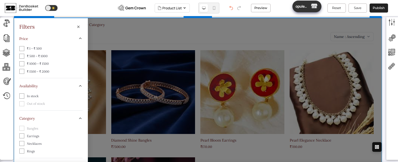
Filter groups built per page, not shared globally. Filter Group Settings let you add and reorder filter groups directly on the Product List page, so tailoring filters to what people actually filter by is a setting rather than a compromise. Combine that with Data Mapping set to one category, and a leaf category owns its own listing and its own filters.
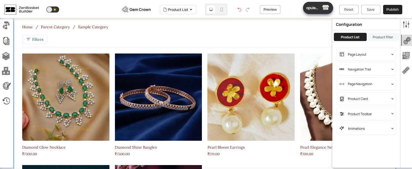
The toolbar matches the zones in this guide directly. Filter button, sort dropdown, view toggle and product count are each their own control in the Product Toolbar settings.
Promotional tiles as a normal section. There’s no dedicated “promo tile in the grid” control, and you don’t need one, adding a section above the grid with an image, text and a button covers the same job, the same drag-and-drop pattern used for a category page’s promotional banner.
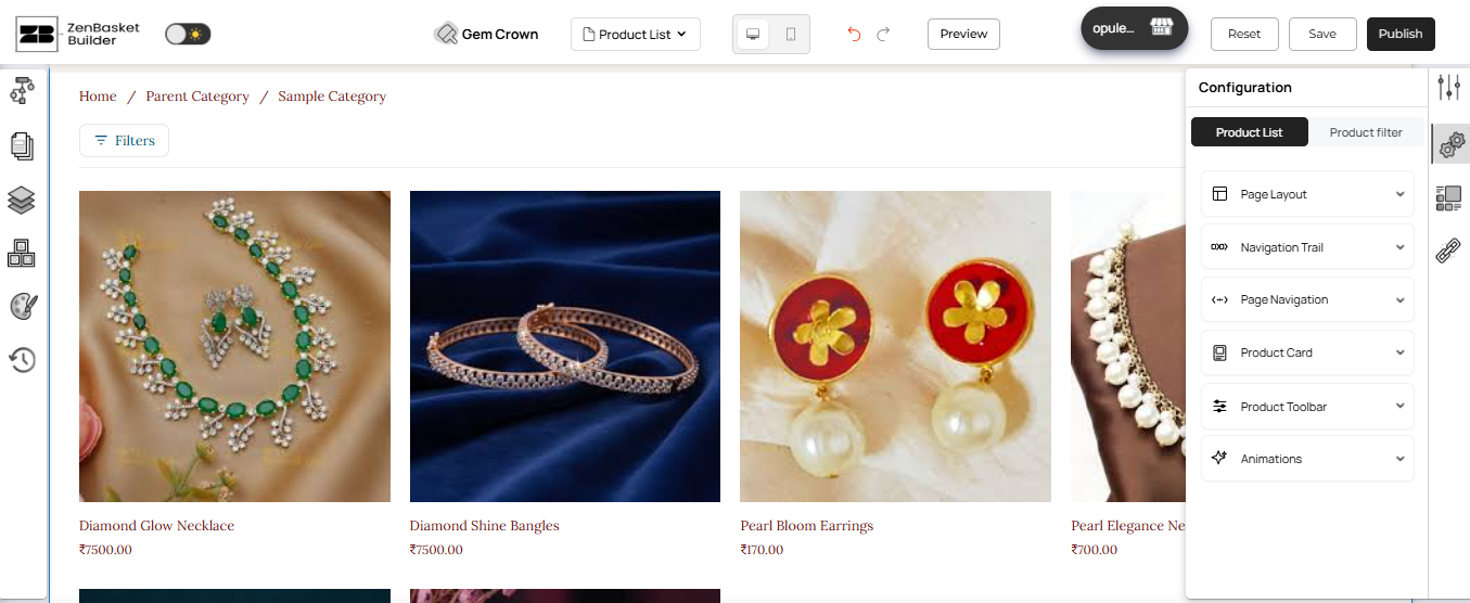
See Product List Page in the help center for the mechanics of both.
Need step-by-step help? Visit the ZenBasket Help Center for Builder instructions.
Prefer to watch it built? The ZenBasket Builder video playlist walks through customizing these page sections step by step.