Foundation · 2 min
1. What a hero is actually for
The hero has one job it is uniquely good at: orientation. A visitor who has never seen your store arrives with a single question — what is this shop? The hero is the largest, earliest, most-looked-at answer available. Nielsen Norman Group’s eye-tracking work found that more than 42% of viewing time on a page falls in its top fifth, and 57% above the fold — down from 80% in 2010, but still a heavy concentration in a small area.
Every other job such as promoting a sale, launching a collection, building brand feeling is secondary, and each one competes for the same pixels. A hero that promotes a sale but never says what you sell has traded its only unique job for one that a banner strip or a category row could have done in a fraction of the space.
The three-second test. Show your homepage to someone who has never seen it, for three seconds, then hide it. Ask two questions: what does this shop sell, and how wide is the range? If they cannot answer the first, the hero has failed regardless of how it looks. If they answer the first but badly underestimate the second, your hero is too dominant and your category entry points are buried beneath it.
Where the hero sits in the homepage zone order, and whether your homepage needs one at all, is covered in the Homepage design guide. This guide is about the hero itself.
Foundation · 9 min
2. The seven hero patterns
Almost every ecommerce hero in the wild is a variation on one of seven patterns. They are not styles — they are structurally different answers to the orientation problem, with different costs. Read each one’s fails when line as carefully as its wins when.
2.1 The statement hero

One image, one sentence, one button. The hardest pattern to do well because nothing else carries it.
A single full-bleed image with a headline, an optional supporting line and exactly one call to action. It is the pattern most people picture when they hear “hero banner”, and the one most often chosen for the wrong reason — it looks like a real brand’s website.
Wins when
You have genuinely good photography, a narrow catalogue, and something specific to say. A single-product brand, a new collection launch, a store whose whole proposition fits in six words.
Fails when
The photography is stock, or the headline is a mood rather than a fact. A statement hero with nothing to state is the most expensive empty space on the internet — it occupies the highest-attention region of the page and returns no information.
Costs you
Your entire above-the-fold budget, and usually your Largest Contentful Paint score. One image, one link, nothing else.
In ZenBasket: a blank section with a background image, set from section customization, plus heading and button elements.
2.2 The split hero
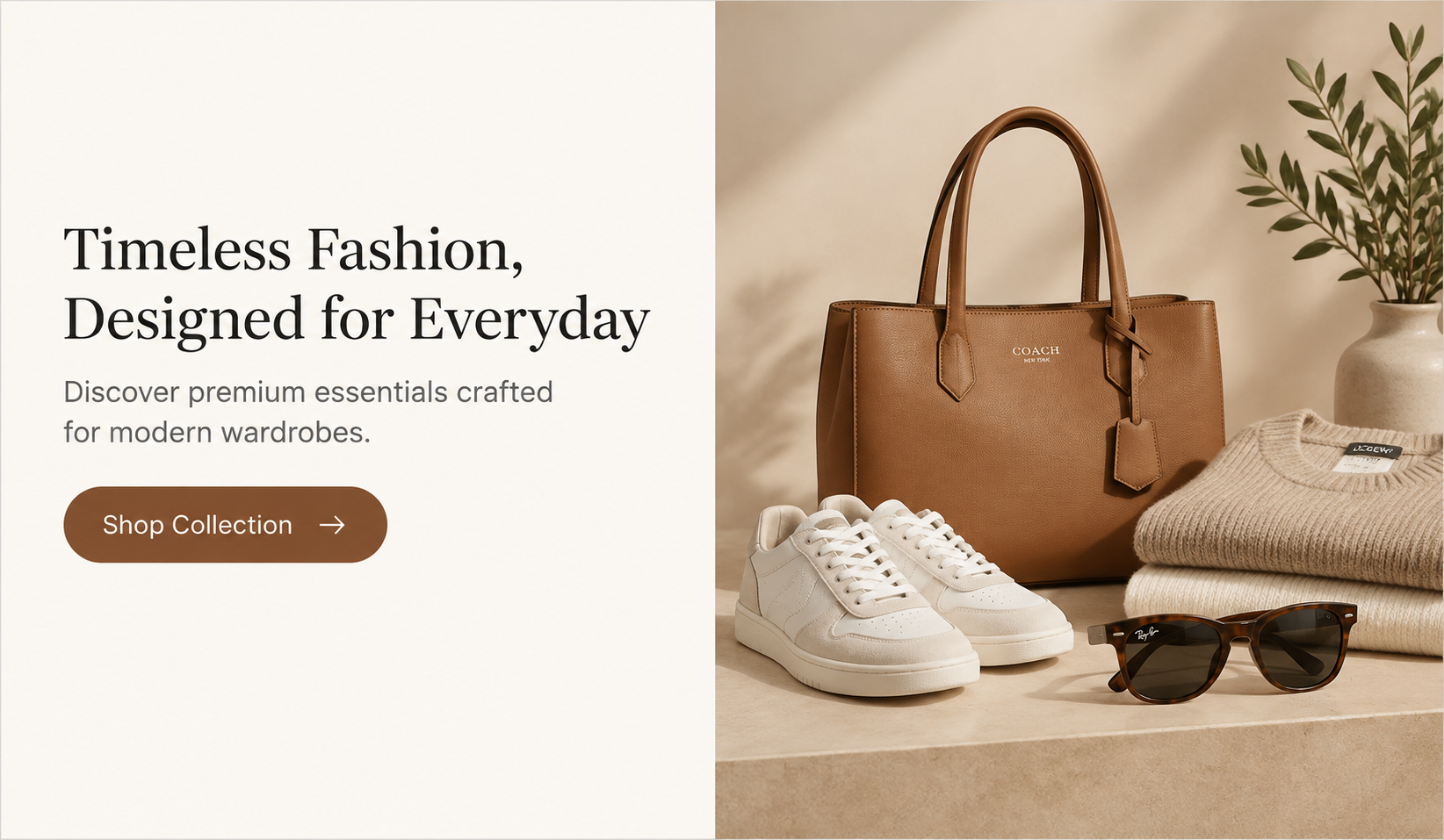
Copy gets its own space instead of fighting the image for contrast. Reads reliably on every screen.
Copy on one side, image on the other. Less glamorous than the statement hero and better at the actual job, because the text sits on a plain background where it is legible, and you can say three sentences instead of one.
Wins when
You need to explain something — a proposition that is not obvious from a photograph, a service model, a made-to-order process. Also the safest choice when your photography is merely adequate, because the image is decoration rather than load-bearing.
Fails when
Nobody decides what happens on mobile. Stacked badly, a split hero becomes a full screen of text above a full screen of image, and the visitor scrolls two screens before reaching anything they can click.
Costs you
Visual drama. It will never be the thing anyone screenshots.
2.3 The category hero
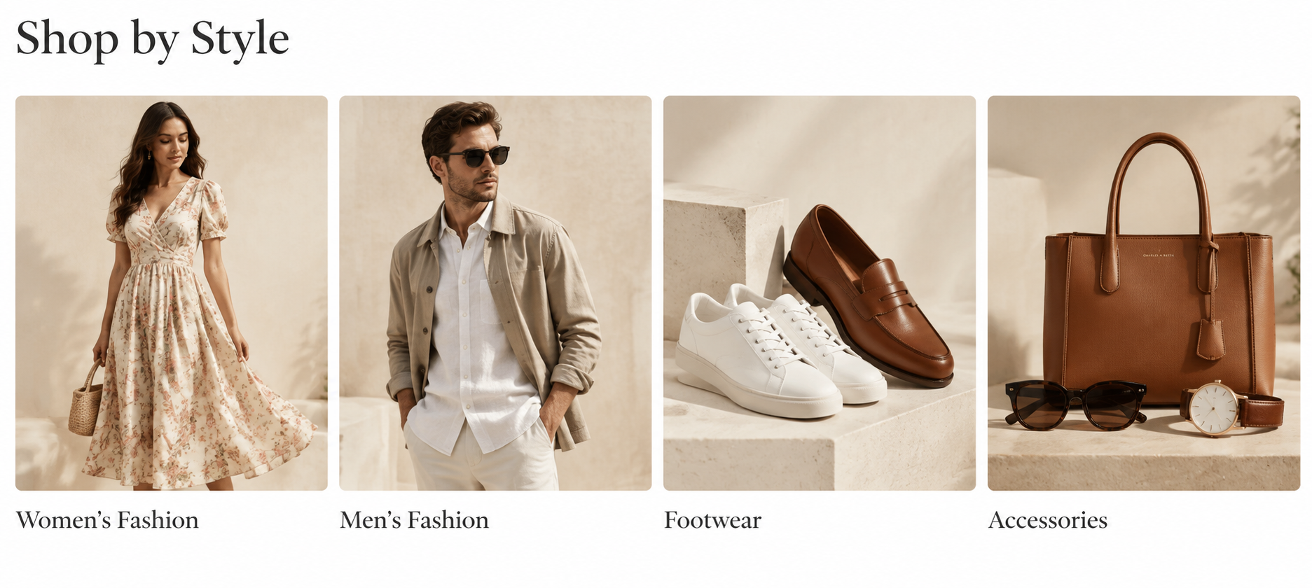
The hero is replaced by the routes. Answers “what do you sell” and “where do I go” in one block.
There is no banner. The top of the page is a short heading and a row of category entry points. This is the pattern most broad-catalogue stores should be using and the one they are most reluctant to choose, because it does not look like a design.
Wins when
You sell across several distinct categories, most traffic is returning or branded, and the real problem is routing rather than persuasion. It answers both three-second-test questions at once: what you sell, and how wide the range is.
Fails when
You have two categories. Four tiles saying “Products” and “Sale” is worse than a sentence. Also fails when the labels live inside the images — unreadable to search engines, unreadable at small sizes, and untranslatable.
Costs you
Campaign space. There is nowhere obvious to put a seasonal promotion, so it has to go in an announcement bar or a strip below.
In ZenBasket: a data-driven slider mapped to featured categories, so tiles follow the catalogue instead of being rebuilt by hand.
2.4 The product-led hero
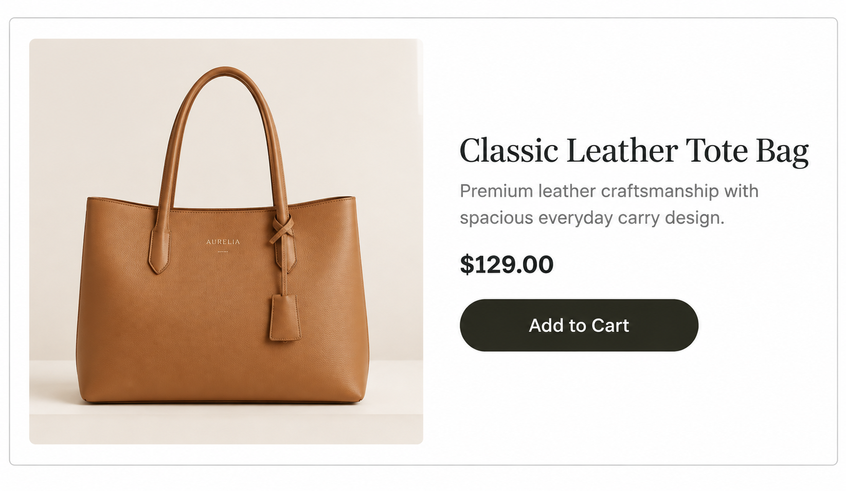
A real product with a live price. The hero becomes a shortcut rather than an advertisement.
One actual product, pulled from the catalogue rather than mocked up in an image with real name, real price, real stock state, and a button that adds it to the basket. It collapses the distance between arriving and buying to a single interaction.
Wins when
One product dominates your revenue, you are running a launch, or you are a single-product brand. Also strong for repeat-purchase categories where returning customers come back for the same thing.
Fails when
It is hand-built as a static image. The moment the price changes or the item sells out, your homepage is lying to every visitor. If you cannot bind it to live catalogue data, use a different pattern.
Costs you
Breadth. A visitor who does not want that product learns nothing about what else you sell, so the category row underneath has to work harder.
In ZenBasket: a data-driven box or single product mapping, so price and availability stay live.
2.5 The shoppable hero
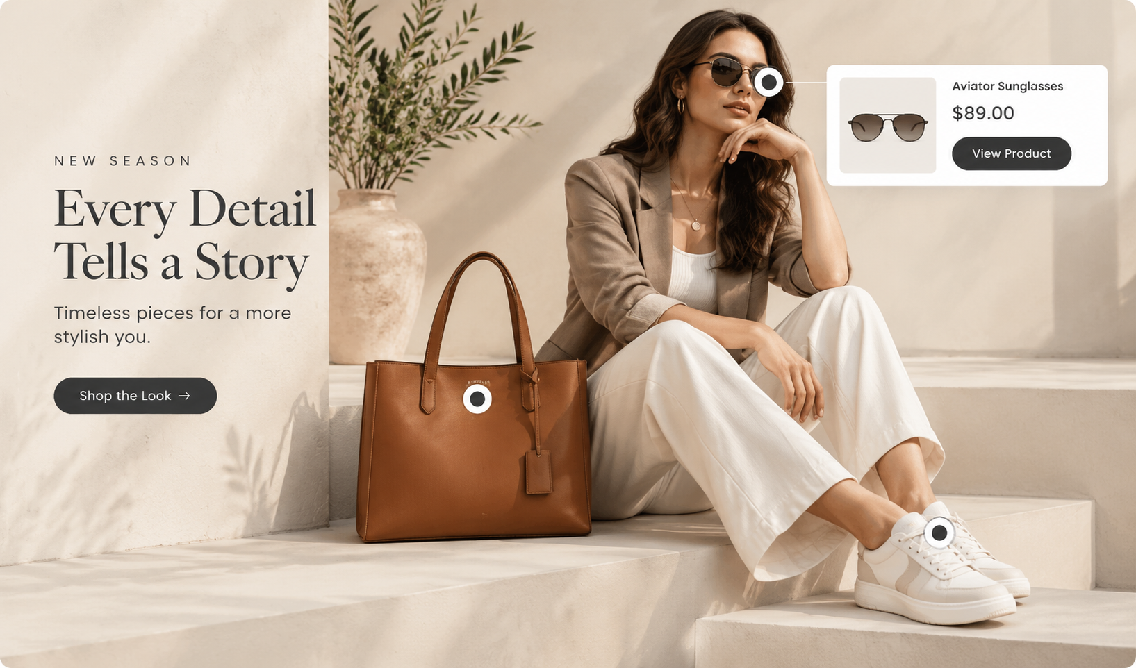
Markers on a lifestyle image open live product cards. The pattern that fixes the most common hero complaint.
A lifestyle photograph with clickable markers on the items in it. Hover or tap a marker and a live product card appears. This is the one pattern that solves a documented, specific and very common failure.
Baymard Institute’s navigation research found that around 70% of sites fail to link the products shown in their inspirational imagery.
Wins when
Your products are shown in context and shoppers want the whole look — fashion, furniture, interiors, beauty routines, food styling. Anywhere the photograph is doing genuine selling work.
Fails when
The markers are decorative, or the image contains eight of them. Three to five is the useful range. It also fails on mobile if the markers are smaller than a fingertip or the card opens off-screen — test this before anything else.
Costs you
Maintenance. Every marker is tied to a product, so discontinued items leave dead markers on your homepage unless someone owns the upkeep.
In ZenBasket: the hotspot and tag elements, with each marker’s card bound to a specific product.
2.6 The motion hero

Continuously drifting image columns behind static copy. Atmosphere without a video file.
Columns of images drifting slowly and continuously, usually upward, with the headline and button held still on top. It produces the feeling people want from a hero video at a fraction of the weight, and it does not need a play control or a poster frame.
Wins when
You have a lot of decent imagery and no single image strong enough to carry a statement hero. The volume becomes the message: this store has range.
Fails when
Motion competes with the copy. Slow and continuous reads as texture; fast or stepped reads as a carousel and drags the eye away from the words. It also fails if it ignores a visitor’s reduced-motion preference.
Costs you
Clickability. Drifting images are awkward targets, so the button has to do all the work.
In ZenBasket: a slider set to autoplay without a timer, vertical orientation, direction to top, at a slow speed — duplicated to make a second column and offset. See also effects and animations.
2.7 The rotating hero (carousel)
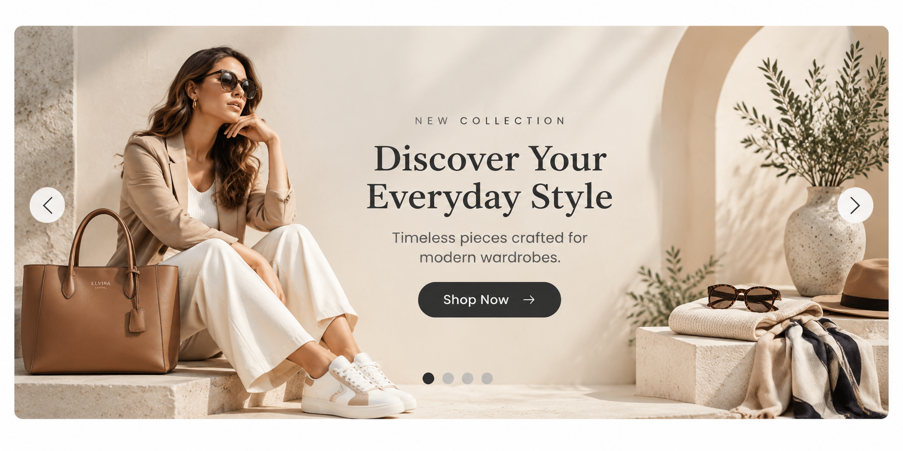
Four messages in the space of one. In practice, most visitors see only the first.
Multiple slides in one frame. It exists because it resolves an argument that every team gets its banner and that is close to the only problem it reliably solves.
Wins when
Slides are genuinely equivalent alternatives rather than a ranked list — four seasonal collections of equal weight, say — and the visitor is expected to browse rather than be told something.
Fails when
Slide one carries the message that matters. Everything after it is optional in practice, so a five-slide carousel is a one-slide hero with four slides of hope attached.
Costs you
Load weight, layout stability, accessibility work, and the honest answer to “which message is most important?” — a question the carousel lets you avoid answering.
In ZenBasket: the content rotator, which offers per-slide styling, a pause-on-hover option and a visible play/pause control — use all three if you build one.
Foundation · 2 min
3. Choosing your pattern
The choice is made by three facts about your store, not by taste. Answer them honestly and the field narrows to one or two.
| If this is true of your store | Start with | Because |
|---|---|---|
| Broad catalogue, several distinct categories | Category hero | Routing is the real problem; persuasion is not |
| One product, or one product drives most revenue | Product-led hero | Nothing is gained by delaying the product |
| Products are bought as a look or a set | Shoppable hero | Fixes the “I want this — what do I do?” failure |
| Strong photography, narrow range, something specific to say | Statement hero | The only case where one image earns the space |
| The proposition needs explaining | Split hero | Text on a plain background is legible and can be longer |
| Lots of good imagery, no single hero shot | Motion hero | Volume communicates range; weight stays low |
| Mostly paid or campaign traffic | Match the ad, not the brand | Consider a landing page instead of the homepage entirely |
| Several teams each want a banner | Fix the process | A carousel hides the prioritisation problem rather than solving it |
Two patterns can be combined, and the pairing that works most often is a small statement or split hero with the category row immediately beneath it, both visible without scrolling. That gives you a brand moment and a route in the same screen, which is what most stores actually wanted from the hero in the first place.
Foundation · 2 min
4. Spend the budget on the headline, not the photograph
A stock photograph with a specific headline outperforms a beautiful photograph with a vague one. Not because photography does not matter, it matters enormously on product pages. But the hero’s unique job is informational, and images are bad at conveying specifics. A photograph can say “calm”, “premium”, “handmade”. It cannot say “handmade leather bags, made in Chennai, shipped in three days”. Only words do that, and words are the cheapest thing on the page to change.
Four rules that survive contact with real stores:
- A stranger should learn a fact. “Handmade leather bags, made in Chennai” beats “Timeless. Effortless. Yours.” Test it by asking whether the headline could sit on a competitor’s site unchanged. If it could, it is not a headline, it is a mood.
- The button label names its destination. “Shop bags” beats “Discover”. “Explore” and “Learn more” are the two labels that most reliably reduce clicks, because the visitor cannot predict what happens next.
- One call to action, not three. If you cannot decide between three buttons, the hero is being asked to serve three audiences and should be a category hero instead.
- Headline text is HTML text. Never bake it into the image. Text inside a picture is invisible to search engines and to AI assistants describing your store, cannot be selected or translated, blurs on high-density screens, and cannot be re-read by a screen reader.
Foundation · 2 min
5. Hero height, and what the fold really means
“There is no fold, people scroll” is half true and gets misapplied. People do scroll — but the NN/g data above shows 74% of viewing time still lands in the first two screenfuls and 81% in the first three. The fold is not a wall; it is a steep discount applied to everything below it.
The practical consequence is that hero height is a budget decision, not an aesthetic one. Every hundred pixels of hero is a hundred pixels your category links do not get. A full-viewport hero on mobile means a visitor must scroll a complete screen before seeing a single thing they can act on — and on a phone the hero is usually the worst-cropped version of the image, too.
- Show the seam. Whatever the height, the top of the next block should be visible without scrolling. That single constraint prevents most hero overreach, and it removes the need for a “scroll down” arrow, which is a symptom rather than a fix.
- Mobile is a different composition, not a squeeze. A 16:9 landscape hero cropped to portrait usually loses the subject. Either art-direct a separate crop or choose a pattern that restacks cleanly.
- Reserve the space. A hero that loads after the rest of the page shoves everything down as it arrives. Give the block explicit dimensions so nothing shifts.
- The hero is almost always your Largest Contentful Paint element — the metric that measures when a page’s main content becomes visible, with a good score at 2.5 seconds or less at the 75th percentile. Background images count as candidates just as
<img>elements do, so a CSS background hero is not a way around it.
Foundation · 2 min
6. The five ways heroes fail
Nearly every broken hero fails in one of five ways. Each has a specific fix, and none of them is “redesign it”.
| Failure | How it shows up | Fix |
|---|---|---|
| It says nothing | Strangers fail the three-second test; bounce rate is high for first-time visitors specifically | Rewrite the headline as a fact. If the store cannot be described in a fact, that is a positioning problem, not a design one |
| It shows things you cannot reach | Products visible in the image with no link; the Baymard failure above | Make the image shoppable, or crop out what you cannot link |
| It is too tall | Scroll-depth data shows most sessions never reach the category row | Cut the height until the next block’s top edge is visible |
| It is heavy | LCP above 2.5 seconds on mobile; layout shifts as the image lands | Modern format, correctly sized responsive variants, explicit dimensions, no lazy-loading on the one image that must appear first |
| It is stale | A finished sale, a past season, an out-of-stock product | Give every campaign hero an owner and an end date at the moment it goes live — or bind it to catalogue data so it cannot go stale |
Two accessibility failures sit underneath several of these and are worth naming separately. Text over an image must reach 4.5:1 contrast against the actual pixels behind it, not against an average — which usually means a scrim or a solid panel rather than hoping. And any hero that moves, rotates or drifts must respect a visitor’s reduced-motion setting and offer a visible pause control if it moves on its own.
Foundation · 2 min
7. Knowing whether yours works
Do not judge a hero by conversion rate. Almost nobody buys from a hero; it routes people to the page that sells. Measured that way, a good hero looks like a bad one and gets replaced with a worse one.
- Hero click-through versus the block below it. If the category row beneath the hero out-clicks it several times over, the hero is taking space it has not earned. Shrink it.
- Scroll past the hero. The share of sessions that reach the next block at all. A low number is a height problem, not a content problem.
- Three-second tests with five strangers. Cheap, fast, and the only reliable read on the orientation job. Run it before any A/B test.
- LCP on a mid-range Android on a slow connection — not on your laptop, and not on the newest iPhone in the office.
- For shoppable heroes, marker open rate and card click-through. Markers that are never opened are usually too small or too many.
Foundation · 3 min
8. Building it in ZenBasket
Everything above is platform-independent. This section is specific to ZenBasket Builder, where all seven patterns are built the same way at the start — add a section, drop in elements, configure — and diverge only in which element carries the pattern.
Pattern to element
| Pattern | The element that carries it |
|---|---|
| Statement | Section background image, plus heading and button elements — customizing sections |
| Split | Two boxes in one section; image set as a box background — adding a new section |
| Category | Slider mapped to featured categories |
| Product-led | Data-driven box or single product mapping |
| Shoppable | Hotspot plus tag elements |
| Motion | Slider on continuous vertical autoplay; effects and animations |
| Rotating | Content rotator |
Two things worth knowing before you start
Desktop and mobile are linked, but not identically. Adding, editing, duplicating and pasting an element applies to both views; deleting does not, and neither does a font size changed in the property box — which is exactly the control you want for a hero headline that needs to be smaller on a phone. Font size changed from the floating toolbar does apply to both. Knowing which is which saves the most common hour lost to hero work.
Theme tier changes what you can restyle. On a free theme you can lay out a hero freely on a blank section, but native page sections are limited to layout choices. Premium themes unlock individual styling of the text, images and buttons inside those native sections. If your hero is a blank-section build, a free theme takes you a long way; if you want the native sections around it to match, that is where a premium theme earns its place.
Trying a premium theme before you commit
ZenBasket lets you apply a premium theme and customise it in the builder before buying it — you simply cannot publish it live until it is purchased. That makes an honest evaluation possible: apply the theme, build your chosen hero pattern in it, view it on a real phone, and only then decide.
One caution the theme marketplace makes explicit and people still miss: choosing Replace Current Theme swaps your design, layout and settings for the new theme’s defaults. Choosing Keep Existing Theme cancels the switch and leaves your customisations intact. If your current hero took a week to build, know which button you are pressing.
New to the builder? Start with adding a new section, then header customization — the header sits directly above every hero and the two are usually designed together.
Foundation · 6 min
9. Frequently asked questions
What is a hero banner on an ecommerce website?
The first full-width block on a page, usually the homepage, combining an image or images with a headline and a call to action. Its reliable job is orientation — telling a first-time visitor what the store sells. Promotion and brand-building are secondary jobs that compete for the same space.
What size should an ecommerce hero banner be?
There is no correct pixel size, because it depends on viewport. The rule that works: whatever the height, the top edge of the next block must be visible without scrolling on a phone. Export responsive variants rather than one large image, and art-direct a separate crop for portrait screens instead of squeezing the landscape one.
Should my homepage hero be a carousel?
Usually not. NN/g’s research finds people commonly miss everything after the first frame, and animated content is looked at only about 27% of the time. Use one if the slides are genuinely equivalent alternatives rather than a ranked list. If you do, cap it at five frames, do not auto-forward on mobile, keep controls inside the carousel and make the current position obvious.
Should I use a video as a hero background?
Rarely. It is the heaviest possible element in the position that determines your load-speed score, and usually carries no information a still could not. If motion is genuinely the point, a drifting image column costs a fraction of the weight and needs no play control. If it must be video, mute it, give it a poster frame and a visible pause control, and measure the cost on a mid-range phone first.
What should a hero banner headline say?
A fact a stranger can learn. “Handmade leather bags, made in Chennai” rather than “Timeless. Effortless. Yours.” A quick test: if the headline could sit unchanged on a competitor’s site, it is a mood, not a headline. Keep it as real HTML text — never baked into the image.
How many buttons should a hero have?
One. If you cannot choose between two or three, the hero is serving multiple audiences and should be a category hero instead — that is the pattern designed for exactly this situation.
What is a shoppable hero banner?
A lifestyle photograph with clickable markers on the products in it; tapping a marker opens a live product card. It exists to fix a documented failure — Baymard found around 70% of sites show products in inspirational imagery without linking to them, and shoppers abandon rather than search. Keep it to three to five markers and test the tap targets on a phone.
Does a hero banner hurt SEO?
Not by existing, but three common versions do. Headline text baked into an image gives search engines and AI assistants nothing to read. A heavy hero damages Largest Contentful Paint, which is a ranking-relevant experience signal. And a tall hero pushing category links below the fold weakens the internal linking that distributes authority through the site. Real text, a light image and a short block solve all three.
Why is my hero image slow to load?
Most often it is exported at desktop dimensions and served to phones, saved in an older format, or lazy-loaded — which delays the one image that must appear first. Serve responsive variants, use a modern format, set explicit dimensions so nothing shifts, and never lazy-load the hero.
Should the hero be different for paid traffic?
Yes, and usually the whole page should be. A homepage serves every visitor and routes them onward; a landing page serves one campaign and one action. Sending paid traffic to a homepage hero wastes the targeting you paid for. Match the ad’s promise in the first line the visitor reads.
How do I know if my hero banner is working?
Not by conversion rate. Compare its click-through against the block directly beneath it, measure what share of sessions scroll past it, run three-second tests with five strangers, and check Largest Contentful Paint on a mid-range Android. A hero out-clicked several times over by the row below it is taking space it has not earned.
Can I build these hero patterns on a free ZenBasket theme?
Yes. All seven are built on a blank section with standard builder elements, and blank sections are fully editable on free themes. The difference appears in the native page sections around the hero — on a free theme those are limited to layout choices, while premium themes allow individual styling of their text, images and buttons. You can apply and customise a premium theme before purchasing to see the difference; you just cannot publish it live until you buy it.
Foundation · 2 min
10. Where to go next
- Homepage design guide — where the hero sits in the zone order, and everything below it
- Proven Pattern Library — the other homepage patterns, including product grids, feature banners and trust signals
- Category & collection pages — category heroes follow different rules from homepage heroes, and are usually smaller
- Industry store strategies — what changes about hero imagery when you sell fashion, grocery or furniture