Foundation · 2 min
1. What this section is actually for
Most stores build a featured category section for the wrong reason: the homepage looked empty below the hero, and categories were the easiest thing to fill it with. That produces a row of tiles that duplicates the navigation menu, in a less usable form, taking up a screen of space.
The section earns its place when it does something navigation cannot: it makes an editorial argument. Navigation is exhaustive and neutral — every category, alphabetical or logical, no opinion. A featured category section is selective and opinionated: these four, right now, because of the season, the stock position or what actually sells. That is a merchandising decision, and it is the only thing the section is uniquely good at.
It is also sitting in expensive space. Nielsen Norman Group’s eye-tracking found 57% of viewing time falls above the fold and 74% within the first two screenfuls, so a category section immediately under the hero is consuming some of the most valuable attention on the site.
The duplication test. Open your main navigation and your featured category section side by side. If the section shows the same categories in the same order, delete it and give the space to something else — you have built a menu with pictures, and the menu was already faster. If the section shows a deliberate subset in a deliberate order, it is doing its job.
Scope. This guide covers the featured category section as a merchandising block, wherever it appears — homepage, landing page, or partway down a long page. Subcategory tiles on a category page are navigation and follow different rules; those are in the Category & collection page guide. What belongs in the hero slot itself is in the Hero banner design guide.
Foundation · 7 min
2. The six featured category patterns
These differ in how much hierarchy they express and how much they ask the image to do. Read each one’s fails when line as carefully as its wins when.
2.1 The tile row
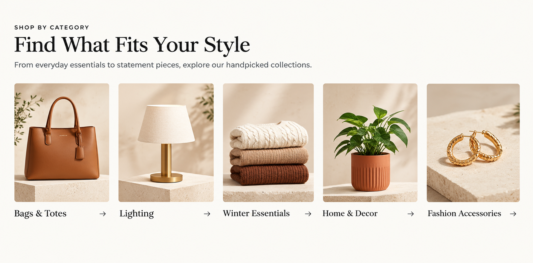
Four equal tiles, labels as real text beneath the image. Plain, and correct more often than it looks.
Equal tiles in a single row, each an image with a label beneath. The default, and correct far more often than its plainness suggests.
Wins when
Three to five categories genuinely have equal claim on attention, and you want the section read as a set of routes rather than a ranked list.
Fails when
It runs to eight or ten tiles. Past about six the row stops being an editorial selection and becomes the menu again, and the tiles shrink below the size at which the image helps.
Costs you
Hierarchy. Everything gets equal weight whether it deserves it or not.
2.2 The asymmetric mosaic
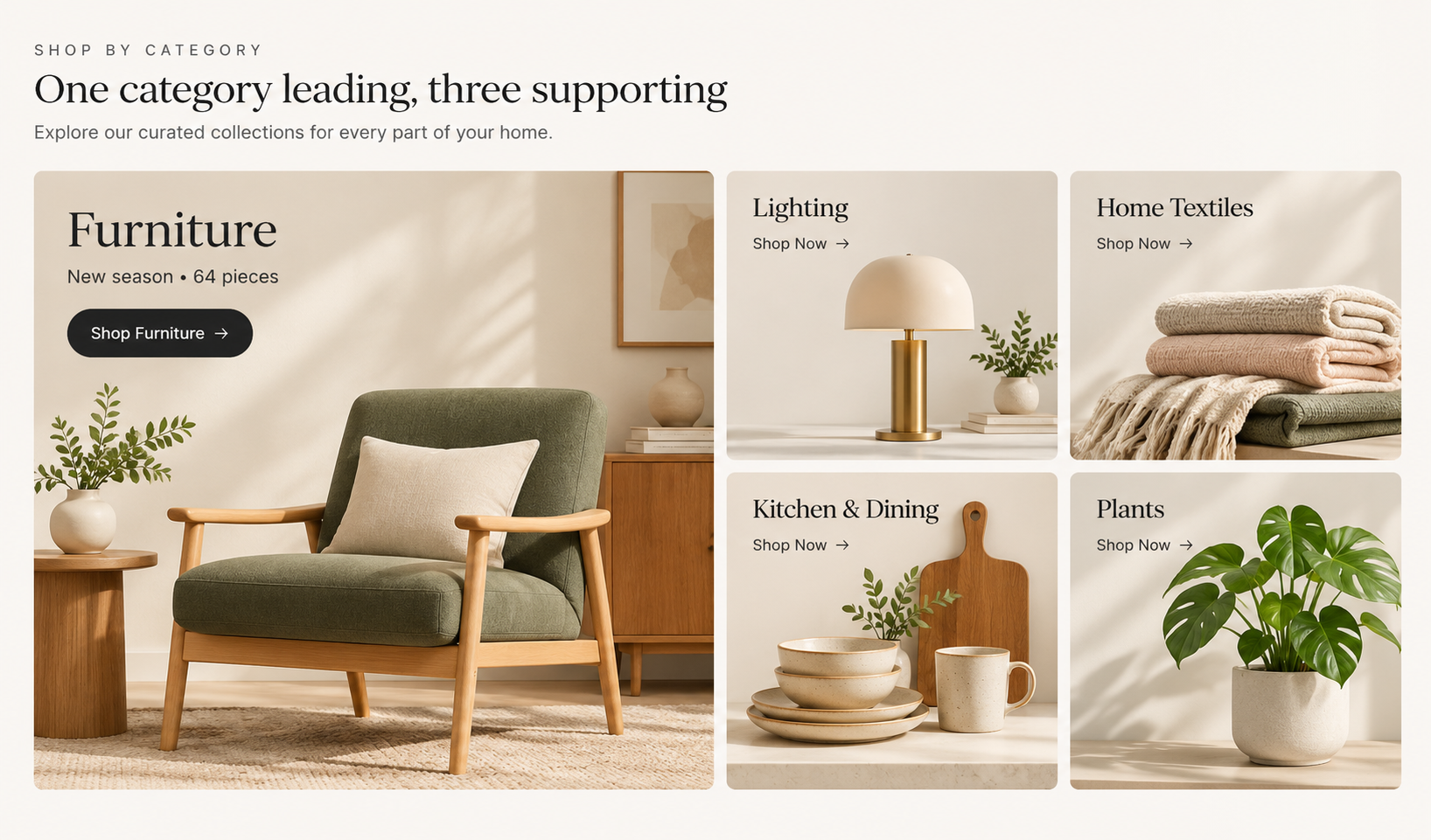
The layout itself states the priority — no “featured” badge needed.
One category promoted to a large cell with several smaller ones packed around it. The layout itself states a priority, which is what the tile row cannot do.
Wins when
One category is genuinely the story this month — a seasonal push, a launch, the thing with stock to clear — and the rest are supporting routes.
Fails when
The large cell never changes. A permanent hero category trains returning shoppers to skip the whole block, and it is usually large because someone senior asked, not because the data said so.
Costs you
A harder responsive problem: the large cell has to decide what it becomes at two columns and at one, and “just make it full width” is rarely right.
2.3 The overlay card
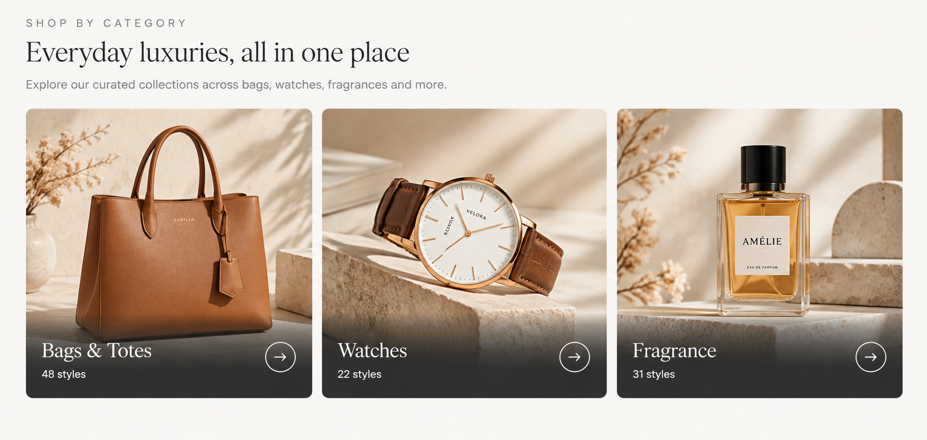
Text over image, over a real gradient scrim. The hover arrow is decoration; the label and count are not.
The label and a short description sit on the image, usually over a gradient scrim, often with an arrow or icon that slides up on hover. The most common premium-theme treatment and the one most often implemented badly.
Wins when
Category imagery is strong and consistent, and you want the section to carry brand feeling as well as routing. It also lets you add a line of positioning — “Bags & Totes · 48 styles” — without a separate caption row.
Fails when
Contrast is left to chance. Text over a photograph must clear 4.5:1 against the actual pixels behind it, which means a real scrim or a solid panel, not an optimistic guess on a light image. It also fails when the hover reveal hides something a touch user needs — hover does not exist on a phone.
Costs you
Photography discipline. Every image now needs a quiet area where text can sit.
2.4 The category carousel
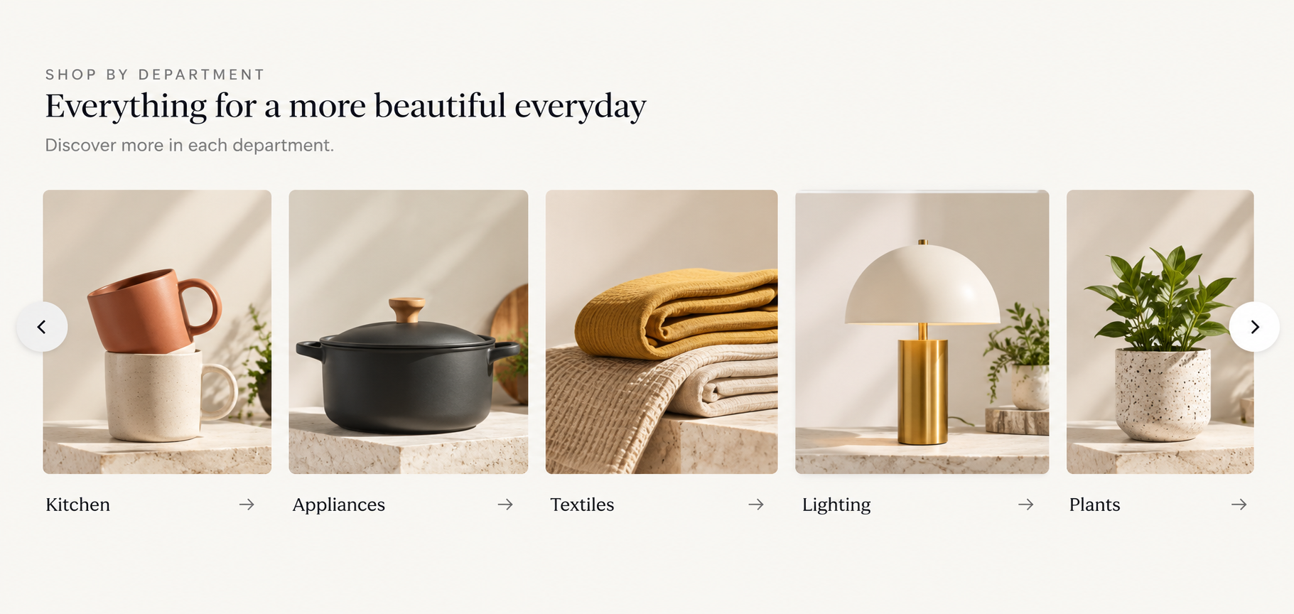
The partially visible tile is what tells people it scrolls. A strip ending flush at the container edge reads as a finished row.
A horizontally scrollable strip, usually data-driven so it follows the catalogue rather than being rebuilt by hand. The partially visible tile at the edge is what tells people it scrolls.
Wins when
You have more categories than fit but they are genuinely equivalent — a broad marketplace, a grocery store with many departments. Swiping is natural on mobile, where this pattern is strongest.
Fails when
It hides the important ones. Anything past the second tile is seen by a minority, so a carousel is a ranked list pretending to be a set. If it exists because you could not choose, you have automated the avoidance of a decision.
Costs you
Discoverability, plus real accessibility work: keyboard reachability, visible focus, and no auto-advance.
Always show a cut-off tile at the edge rather than ending flush. A strip that ends cleanly at the container edge reads as a complete row, and people never scroll it.
2.5 The editorial split
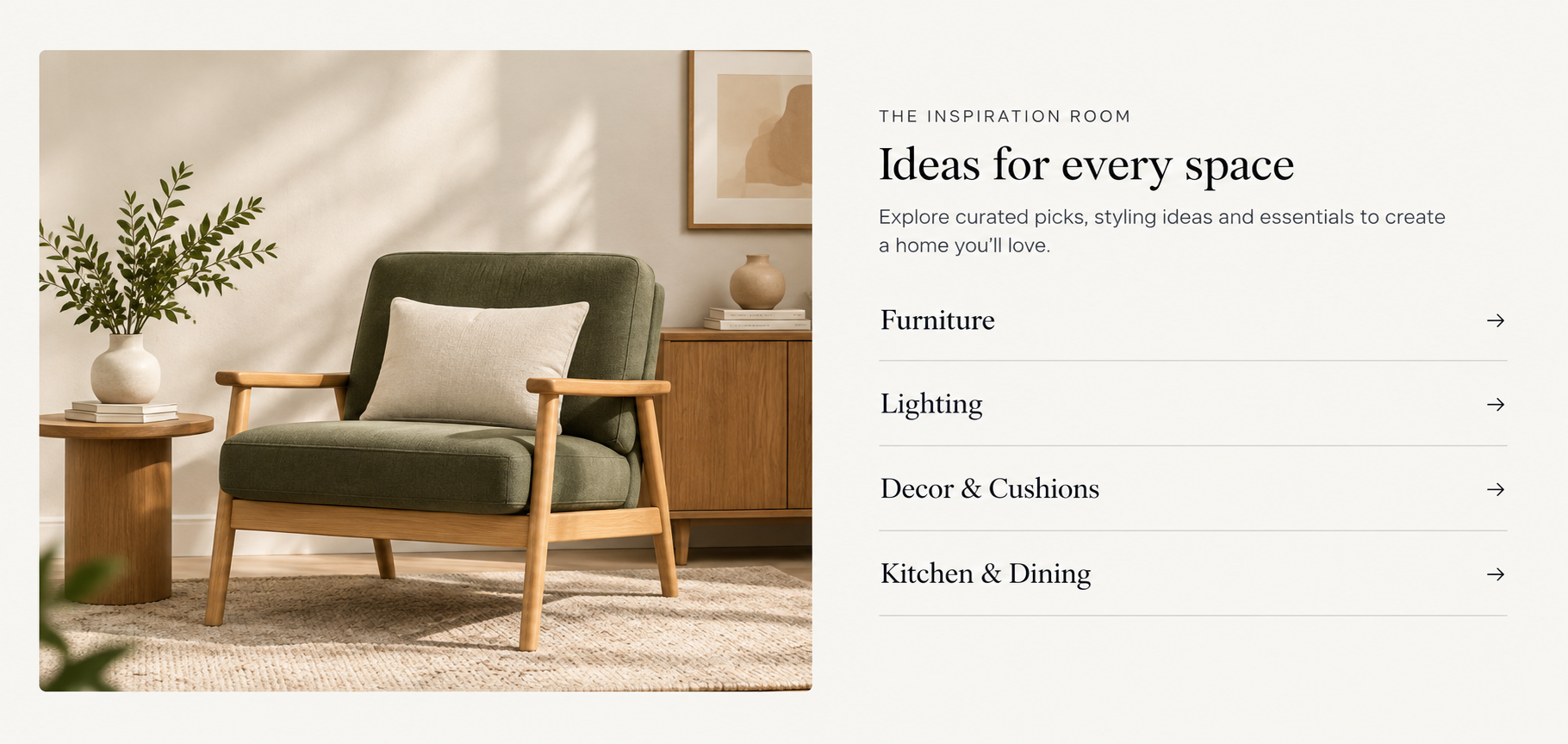
The image carries the story; text links carry the routes. Handles long category names better than any tile layout.
One large lifestyle image on one side, a short list of linked categories on the other. Closer to a magazine page than a tile grid, and the pattern that handles long category names best.
Wins when
Category names are long or need explaining, or the section is telling a seasonal story with several routes out of it. Text links are easy to scan and cost nothing to load.
Fails when
The image is decorative and unlinked. If it shows products, they must be reachable — Baymard found around 70% of sites fail to link the products in their inspirational imagery, and shoppers abandoned rather than hunting for them.
Costs you
Visual weight per category. Text links do not sell a category the way a photograph does.
2.6 The shoppable category image
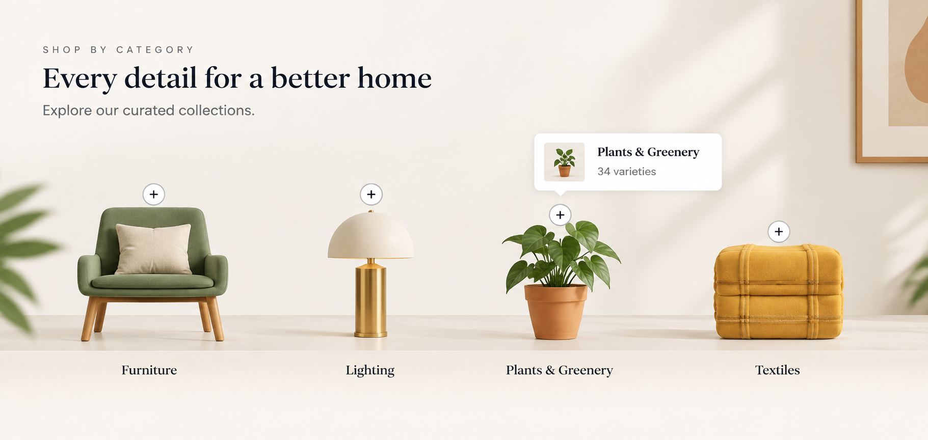
One scene, four categories, every visible thing reachable. The most expensive pattern here to keep current.
A single lifestyle scene with markers on it, each opening into a category rather than a single product. One image does the work of five tiles, and the scene shows how the categories relate.
Wins when
Categories are naturally seen together — a styled room, a full outfit, a laid table. It is the strongest answer to the Baymard failure above, because every visible thing has a route.
Fails when
The markers are decorative or there are too many. Three to five is the useful range. It also fails on mobile if markers are smaller than a fingertip or the panel opens off-screen, so test that before anything else.
Costs you
Maintenance and a real photography brief. This is the most expensive pattern here to keep current.
Markers pointing at individual products rather than categories is a different pattern with different rules — see Shoppable images and product hotspots.
Foundation · 2 min
3. Choosing your pattern
Start here, then read that pattern’s “fails when” line before committing
| If this is true | Start with | Because |
|---|---|---|
| Three to five categories of equal importance | Tile row | Equal weight is honest and fastest to scan |
| One category is this month’s story | Asymmetric mosaic | Layout states the priority without a label saying so |
| Strong, consistent category photography | Overlay card | Image carries brand feeling and routing at once |
| Many genuinely equivalent departments | Category carousel | Swiping suits mobile; nothing is being ranked |
| Long category names, or a seasonal story | Editorial split | Text links handle length; the image carries the story |
| Categories that are shopped together | Shoppable category image | One scene shows how they relate, and every item has a route |
| You cannot decide which categories matter | Fix the merchandising first | No layout rescues an unmade decision — see section 4 |
Foundation · 2 min
4. How many categories to feature
The claim in this guide most worth arguing about: a featured category section should show fewer categories than your store has, and if it shows all of them you have built a menu with pictures. The word “featured” implies selection. A section that features everything features nothing, and it costs a screen of the most valuable space on the page to say what the navigation already said in a fraction of the room.
This is uncomfortable because the pressure runs the other way. Every category owner wants their tile, and leaving a category out feels like a demotion. But the section’s value comes entirely from the editing. ZenBasket’s own guidance agrees: there is no hard limit on how many categories you can mark as featured, and the platform still recommends keeping the selection to your most important ones to keep the homepage clean and navigable. (Featured categories.)
- Four is the workhorse. Three feels thin unless the tiles are large; six is the point past which people stop reading labels and start pattern-matching on images alone.
- Pick by commercial reality, not tidiness. Margin, stock position, seasonality, and what new visitors misunderstand about your range. “One from each department” is symmetry, not merchandising.
- Order matters more than people expect. The first tile gets disproportionate clicks. Put the category you most want browsed there, not the one that is alphabetically first.
- Give it a review date. A featured selection that has not changed in a year is not featured, it is furniture. Reordering is drag-and-drop, so there is no excuse.
A store with fifty categories does not need a fifty-tile section. It needs four tiles and a working navigation.
Foundation · 2 min
5. The label problem
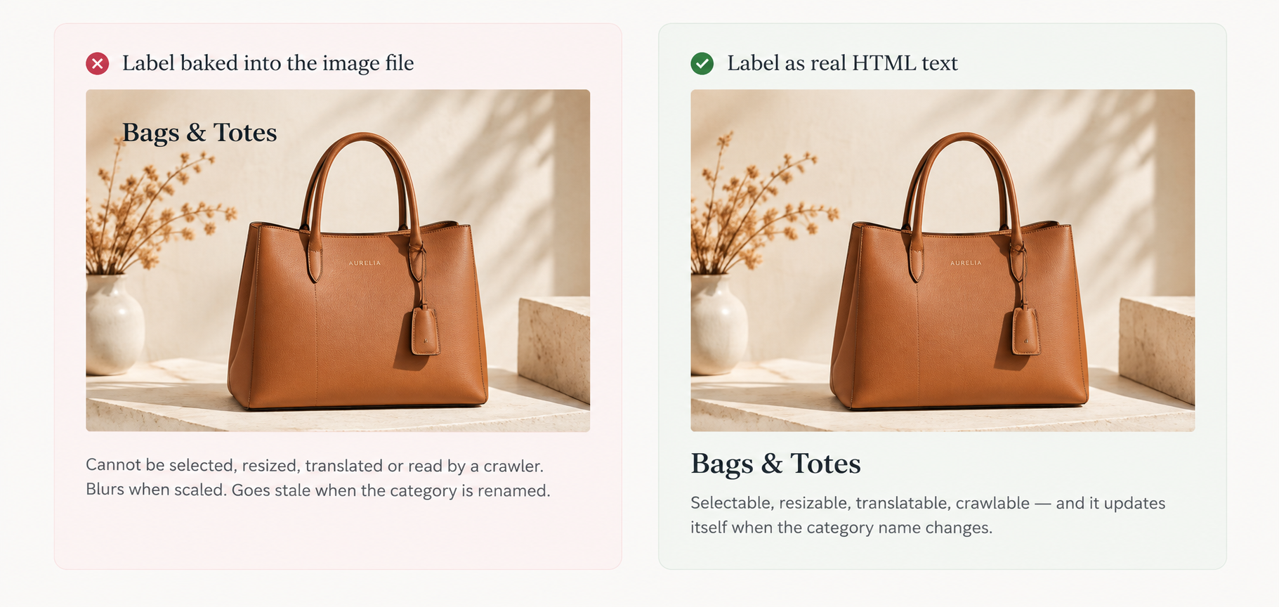
The most common technical mistake in these sections, and the cheapest one to avoid.
The single most common technical mistake in these sections is baking the category name into the image file. It looks fine in the design tool and fails in five separate ways.
- It is an accessibility failure. WCAG 2.2 Success Criterion 1.4.5, Images of Text, is Level AA and requires that text conveying information be real text wherever the technology can achieve the presentation. Text locked in a picture cannot be resized, recoloured or respaced by someone who needs to do that to read it.
- Search engines and AI assistants cannot read it. Category tile labels are often the only text describing that internal link, so burying them in a JPEG removes one of the clearer signals about how your catalogue is organised.
- It cannot be translated. Selling in India and the US, or adding a second language later, means re-exporting every image instead of changing a string.
- It goes stale. Rename a category and the tile still shows the old name until someone re-opens the source file.
- It blurs. Text rasterised at one size and scaled to another never looks as crisp as rendered type.
Two rules that follow:
- The label is HTML text, always — beneath the image, or over it with a real scrim. The image is the picture; the label is text on top.
- The whole tile is the link, with one accessible name. Do not create a separate link on the image and another on the label — that produces two adjacent links to the same place, which is tedious with a keyboard and confusing with a screen reader. If the image is decorative once the label is present, give it an empty
altrather than repeating the category name.
Foundation · 2 min
6. Choosing the image for a category
A category image has a harder job than a product image: it has to represent a whole group without misleading anyone about what is in it.
- Representative, not aspirational. If the “Bags” tile shows your most unusual piece, shoppers calibrate the whole category to it and some will not click. Pick something typical of the range and its price level.
- One treatment across the set. One aspect ratio, one background family, one lighting approach, one product scale. Mixed treatments make a carefully designed section look untidy in a way that is hard to diagnose — the same failure that breaks product grids, covered in How to design product grids.
- Lifestyle or plain, but not both. Three tiles on white beside one shot in a room breaks the rhythm harder than a font mismatch.
- Leave room for the label if you are using the overlay card. A quiet corner in every shot is a photography brief, not a CSS fix.
- Reserve the image space before it loads. Tiles that resize as pictures arrive shift the page under the cursor, and this section usually sits exactly where people are reaching to click.
Foundation · 2 min
7. When a category section is the wrong pattern
Often the block is not really about categories at all. Three neighbouring patterns solve jobs a category section does badly, and picking the right one matters more than styling the wrong one well.
| If the real job is… | Use | Why not a category section |
|---|---|---|
| Letting people buy the specific things in a styled scene | Shoppable images and product hotspots | A category tile drops the shopper into a list and makes them find the item again. Markers on the image go straight to it |
| Explaining or selling one product properly | Single-product storytelling sections | One product in a category grid gets a thumbnail and a name. A storytelling section gives it the space to answer objections |
| Proving a visible change or result | Before-and-after sections | Transformation is a comparison, not a destination. A draggable split does in one interaction what a category tile cannot do at all |
These are not alternatives to each other so much as different answers to “what is this block for?”. A homepage running all four — a category section, a shoppable scene, one product told properly, and a before-and-after — is well merchandised. A homepage running four category sections is not.
In ZenBasket, all three are built with dedicated elements: hotspot for shoppable scenes, single product mapping for storytelling blocks, and split view for before-and-after comparisons.
Foundation · 2 min
8. What breaks these sections
| Failure | How it shows up | Fix |
|---|---|---|
| It duplicates the navigation | Same categories, same order, one screen lower; near-zero clicks | Cut to a deliberate subset, or remove the section |
| Labels baked into images | Blurry text, untranslatable, invisible to search engines and assistants | Real HTML text, over a scrim or beneath the image |
| Unreadable overlay text | Fine on the dark sample image, illegible on the light one | A real scrim or solid panel; verify 4.5:1 against the actual pixels |
| Mixed image treatments | The section looks untidy and nobody can say why | One ratio, one background family, one product scale across the set |
| Stale selection | Last summer’s categories still featured in winter | Give the selection an owner and a review date; reordering is drag-and-drop |
| Hover-only information | Desktop looks rich, mobile users never see the description | Anything a shopper needs stays visible; hover is decoration only |
Foundation · 2 min
9. Knowing whether yours works
- Section click-through versus the navigation. If the menu out-performs the section for the same categories, the section is decoration.
- Click distribution across tiles. Healthy sections spread across all tiles. If one takes nearly everything, the others are there for politics, not shoppers.
- Scroll-past rate. The share of sessions that reach the section at all. Low numbers are a hero-height problem, not a content problem.
- Onward behaviour, not just the click. A tile with high clicks and immediate bounces is promising something the category does not deliver — usually a misleading image.
- Mobile versus desktop click-through. A large gap almost always means information is hidden behind hover.
Before publishing:
- The selection is a deliberate subset, not the whole menu
- Four to six tiles, ordered by commercial priority
- Every label is real HTML text
- The whole tile is one link with one accessible name
- Overlay text clears 4.5:1 against the actual pixels behind it
- One ratio, background family and product scale across every tile
- Image space reserved before load — no shifting
- Nothing a shopper needs is hover-only
- A carousel shows a cut-off tile and is keyboard reachable
- The selection has an owner and a review date
Foundation · 3 min
10. Choosing a ZenBasket theme for category merchandising
Everything above is platform-independent, which is what makes the rest of this section worth reading rather than skipping. If you are choosing or changing a ZenBasket theme, the category section is one of the better things to judge it on, because a theme that handles this block well usually handles the rest of the homepage well too.
How to judge a theme’s category section in five minutes
Open the theme’s demo store on a phone and check six things drawn from this guide:
- Are category labels selectable text, or baked into the image? Try to select one.
- Does the section restack sensibly at two columns, or just shrink?
- Is overlay text readable on the lightest image in the set?
- Does anything important appear only on hover?
- Is the whole tile tappable, or only the label?
- Does the layout still look deliberate with four tiles rather than the demo’s eight?
A theme that fails one or two of these is fixable in the builder. A theme that fails four is fighting you.
Where to start by store type
Theme categories verified September 2026. Check the collection page for the current range.
| If you sell… | Start with | Why for this pattern |
|---|---|---|
| Fashion and apparel | FuFashia (free), Trendrivo (premium) | Category imagery is doing the selling; overlay cards suit a styled catalogue |
| Beauty and personal care | Glimmova (free), Glowique (premium) | Routine and concern-led categories reward the editorial split |
| Grocery and daily essentials | Essneed (free), Dailfresh (premium) | Many equivalent departments — the carousel pattern’s natural home |
| Furniture and interiors | FurniRix (free), elGrandeur (premium) | Room-set imagery makes shoppable category scenes worth the effort |
| Food and beverage | Sipplio (free), Tasteeva (premium) | Appetite-led photography suits large asymmetric cells |
Browse the full range on the ZenBasket themes collection, where each theme has a live demo store you can open on your own phone. Free themes are genuinely enough for every pattern in this guide when the section is built on a blank section — premium themes earn their place when you want the native sections around it to match without rebuilding them.
You can apply a premium theme and customise it in the builder before buying it; you simply cannot publish it live until it is purchased. Build your chosen pattern in it, view it on a real phone, then decide. Note that choosing Replace Current Theme swaps your existing design, layout and settings for the new theme’s defaults, while Keep Existing Theme cancels the switch.
Foundation · 2 min
11. Building it in ZenBasket
Step zero happens outside the builder. The section pulls from the categories you have marked as featured in the dashboard, so set that selection first — it is also where the order is controlled, by drag and drop. (Featured categories, and categories for the underlying taxonomy.)
Pattern to element
| Pattern | How it is built |
|---|---|
| Tile row | A data-driven slider mapped to featured categories, set to show all cards without scrolling |
| Asymmetric mosaic | Boxes on a blank section, sized per cell — see customizing sections |
| Overlay card | A slider card with a semi-transparent box layered over the image, plus effects and animations for the hover reveal |
| Category carousel | The same slider, left scrollable, with arrows configured |
| Editorial split | Two boxes on one section, image set as a box background, category links as text |
| Shoppable category image | The hotspot element with markers linked to categories |
Start from adding a new section and choose a blank section — every pattern here is built on one, which is why they all work on free and premium themes alike.
One builder behaviour worth knowing before you start: deleting an element in the desktop view does not delete it in the mobile view, and font sizes changed in the property box are device-specific while those changed from the floating toolbar apply to both. For a section whose whole job is restacking cleanly on a phone, that distinction saves the most commonly lost hour.
Foundation · 5 min
12. Frequently asked questions
What is a featured category section?
A merchandising block, usually on the homepage, that sends shoppers into a deliberately chosen handful of categories using images and labels. It differs from navigation in being selective and opinionated rather than exhaustive — it argues that these categories matter right now.
How many categories should I feature on my homepage?
Four is the workhorse; three can feel thin and past about six people stop reading labels. Choose by commercial reality — margin, stock, season, and what new visitors misunderstand about your range — rather than showing one from each department. If it lists everything, your navigation already does that better.
Should category names be part of the image?
No. Text baked into an image fails WCAG 2.2 Success Criterion 1.4.5 at Level AA, cannot be read by search engines or AI assistants, cannot be translated, goes stale when you rename a category, and blurs when scaled. Keep the label as real HTML text over a scrim or beneath the image.
Should the whole category tile be clickable, or just the label?
The whole tile, as a single link with one accessible name. Separate links on the image and the label create two adjacent links to the same destination, which is tedious with a keyboard and confusing with a screen reader. If the label is present, the image can usually take an empty alt attribute.
Is a category carousel a good idea?
Only when the categories are genuinely equivalent, such as departments in a broad marketplace or grocery store. Anything past the second tile is seen by a minority, so a carousel is a ranked list pretending to be a set. If it exists because you could not choose which categories matter, it has automated the avoidance of a decision.
Where should the featured category section sit on the page?
Usually directly below the hero, and often it should replace part of it. Around 57% of viewing time falls above the fold, so a section pushed below two screens of hero will be seen by a minority. If the hero has nothing specific to say, the category section is a better use of that space.
What image should I use for a category tile?
Something representative of the range and its price level rather than your most unusual piece — shoppers calibrate the whole category to that one image. Apply one aspect ratio, one background family and one product scale across the whole set, and leave a quiet area for the label if you are using an overlay treatment.
How is a featured category section different from category page navigation?
A featured category section is merchandising: selective, seasonal, arguing for a few categories. Subcategory tiles on a category page are navigation: exhaustive, stable, helping someone already browsing narrow down. The first is edited; the second should be complete.
Can I use hover effects on category tiles?
Yes, as decoration. Never put information there. Hover does not exist on touch devices, where most shopping happens, so a description or a category count revealed on hover is invisible to the majority of your shoppers. Keep a subtle lift or scale, under about 0.25 seconds, and respect reduced-motion preferences.
Should I link a lifestyle image in a category section?
Yes, and to the specific things in it wherever possible. Baymard found around 70% of sites show products in inspirational imagery without linking them, and shoppers abandoned rather than searching for the item. If you cannot link what is shown, crop it out or use a shoppable pattern with markers instead.
How often should I change which categories are featured?
Often enough that it reflects the current season and stock position — quarterly at minimum for most stores, monthly for fashion and seasonal ranges. A selection unchanged for a year is not featured, it is furniture. Give it an owner and a review date rather than relying on someone noticing.
Do I need a premium theme to build these patterns?
No. Every pattern in this guide is built on a blank section with standard builder elements, which are fully editable on free themes. Premium themes matter when you want the native sections surrounding it to be individually styled to match. You can apply and customise a premium theme before purchasing to compare; you just cannot publish it live until you buy it.
Foundation · 2 min
13. Where to go next
- Shoppable images and product hotspots — when markers should point at products rather than categories
- Single-product storytelling sections — giving one product the space a grid cannot
- Before-and-after sections — proving a visible change
- Hero banner design — the block directly above this one, including the category hero
- How to design product grids — image consistency rules that apply here too
- Category & collection pages — where shoppers land when they click a tile