Foundation · 3 min
What a product detail page is actually for
Most guides describe the product detail page as “where you sell the product.” That framing produces bad pages, because it encourages persuasion where the shopper wants information. A shopper who has reached your product page has already been persuaded enough to look. What they are doing now is checking, running through a private list of conditions the product has to satisfy before they will part with money.
Design the page against those four jobs:
Job 1: Confirm the match
Within about two seconds, the shopper must be able to tell whether this is the product they were looking for. That is the work done by the first image, the product title, and the breadcrumb trail. If someone arrives from a search engine on a page for a “blue running shoe” and the first image shows a black one because a variant was pre-selected wrongly, you have already lost.
Job 2: Answer the blocking questions
Every product has a small set of questions that block the purchase. For a t-shirt it is fit, fabric and washing. For groceries it is quantity, shelf life and whether it is fresh on delivery. The page’s information architecture exists to answer these, in the order the shopper thinks of them, not in the order your product information system happens to store them.
Job 3: Make configuration effortless
Choosing a size or colour should never require the shopper to think about your data model. If a variant is out of stock, say so before they select it. If a size runs small, say so at the point of choosing, not in a size guide three clicks away. If two options are incompatible, prevent the combination rather than failing at checkout.
Job 4: Reduce perceived risk
Risk is what stops a first-time buyer on an unfamiliar store. Returns policy, delivery estimate, payment security, real customer reviews and a visible way to contact a human all reduce it. Note the word perceived: a generous returns policy that is buried in the footer reduces no risk at all. Placement matters as much as substance. The returns policy is the clearest example.
→ Full guide: Delivery, Pickup and Return Information on Product Pages
Foundation · 3 min
Six decisions to make before you open a design tool
Decision 1: Is this a considered purchase or an impulse purchase?
A $25 phone case and a $8500 sofa need different pages. Impulse products need short pages, few decisions and a fast path to cart. Considered purchases need depth: specifications, comparisons, dimensions, reviews, sometimes a way to save the item and come back. Trying to serve both with one template produces a page that is too heavy for cheap items and too thin for expensive ones.
Decision 2: How complex is your variant structure?
One product with one option is a very different design problem from a product with colour × size × material and 60 combinations, some of which do not exist.
Decision 3: Is the product visual or specification-driven?
Apparel, décor, jewellery and food sell on imagery; the gallery deserves the largest share of the page. Electronics, tools, industrial supplies and auto parts sell on specifications; a scannable, comparable spec table matters more than a fifth lifestyle photo. Most stores over-invest in photography for spec-driven products and under-invest in structured attributes.
Decision 4: Do you have reviews yet?
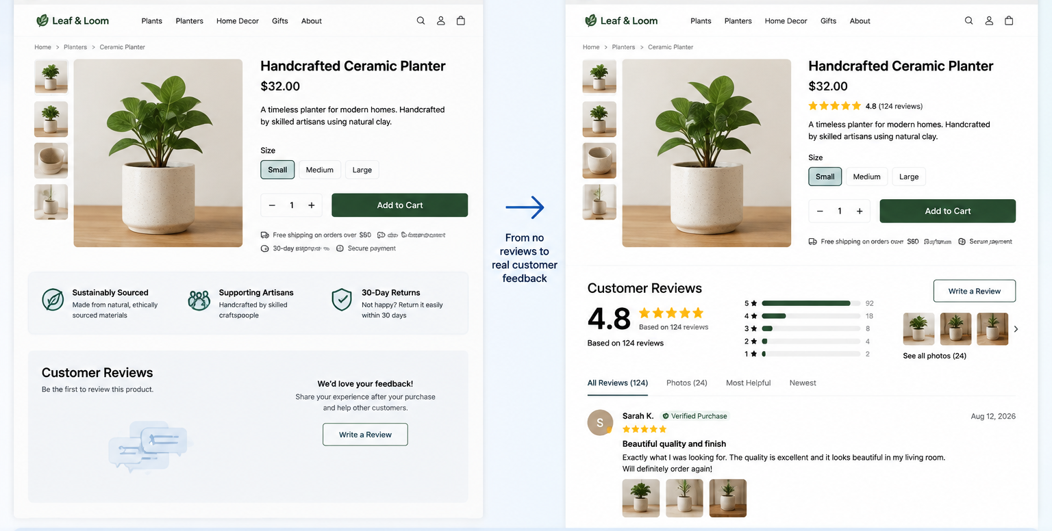
A new store has a cold-start problem: the review block is the strongest trust element on the page and you have nothing to put in it. Do not fake it: fabricated reviews are a legal risk in several markets and a reputational one everywhere. Instead, design for the empty state deliberately: lead with founder or sourcing credibility, materials provenance, a clear returns promise, and a visible request for feedback after the first orders. Then design the review block for the state you will be in three months from now.
Decision 5: What is your realistic mobile share?
For most consumer retail and similar markets, the majority of product page sessions are on a phone. Check your own analytics rather than assuming. If mobile is dominant, the mobile layout is the primary design and the desktop layout is the adaptation, not the other way around. Designing desktop-first and shrinking is the single most common cause of a cramped, scroll-heavy mobile product page.
Decision 6: What happens after add-to-cart?
This is a product page decision even though it affects the cart. Three options: a side drawer that keeps the shopper on the page, a redirect to the full cart page, or an inline confirmation with no navigation. Each has consequences for cross-selling and for how quickly a shopper can add a second item. Decide before design, because it changes what the add-to-cart button needs to communicate.
Foundation · 8 min
The anatomy of a product detail page, zone by zone
Think in zones rather than a list of components. Each zone has a job, and elements belong to the zone whose job they serve.
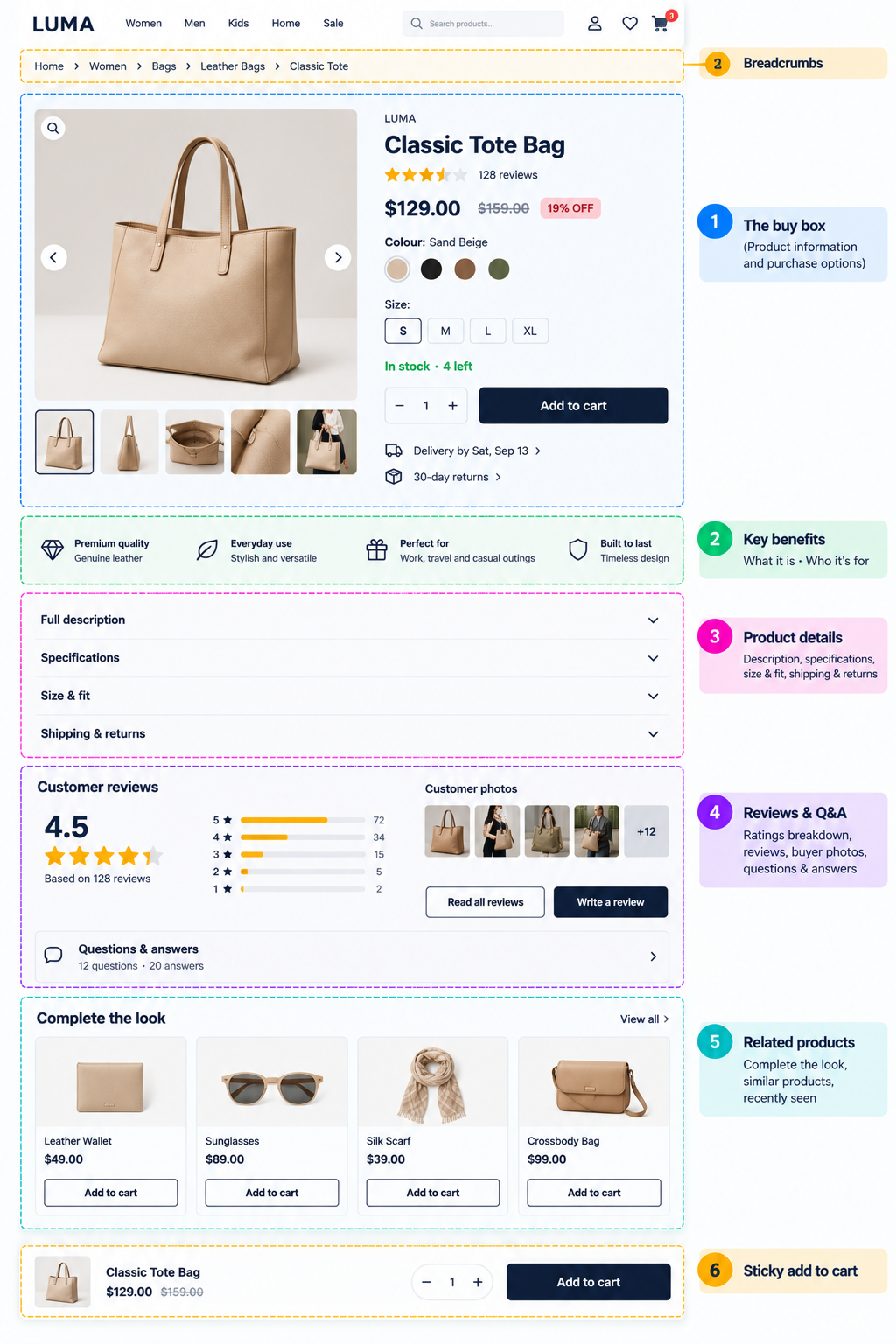
The six zones of a product detail page. Zone 6 is mobile-only in most designs.
→ Full guide: Product Page Information Hierarchy
Zone 1: The buy box
Everything needed to make and act on the decision, positioned so that a shopper who already knows what they want never has to scroll. On desktop this is a two-column layout with the gallery on the left; on mobile it stacks with the gallery first.
| Element | Why it’s there | The rule |
|---|---|---|
| Breadcrumbs | Orients shoppers arriving from search; gives a one-click route back to similar products. | Show the real category path, not a generic “Home › Products”. |
| Image gallery | Carries most of the persuasive weight and answers “what does it actually look like”. | Multiple angles, at least one in-use or in-context shot, one scale reference, zoom on every image. Images must update when a variant changes. |
| Product title | Confirms the match and is the main on-page SEO signal. | Specific and human: “Cotton Crew-Neck T-Shirt: Men’s” beats “T-Shirt”. Avoid stuffing keywords; avoid internal SKU codes. |
| Rating summary | A one-glance trust signal that also anchors the reviews further down. | Link it to the review section. Never display a rating you cannot substantiate. |
| Price | The single most-looked-for number on the page. | Show final payable price prominently. State whether tax is included. If you show a struck-through price, it must be a price you genuinely charged. |
| Variant selectors | Turns a catalogue entry into the specific thing the shopper wants. | Show unavailable combinations as disabled, not hidden. Label every swatch in text as well as colour. |
| Stock status | Prevents the worst experience in ecommerce: discovering unavailability at checkout. | Be accurate. Low-stock messages must reflect real inventory; invented urgency is both a trust risk and, in some jurisdictions, a legal one. |
| Quantity | Needed for consumables and packs; noise for one-off purchases. | Default to 1. Use a stepper, not a free text field, and cap it at available stock. |
| Add to cart | The action the whole page exists to enable. | One primary button, visually dominant, full-width on mobile. If you also offer “Buy now”, it must be visually secondary: two equal buttons create hesitation. |
| Delivery estimate | “When will I get it” is one of the top blocking questions and is rarely answered early enough. | A date beats a duration. “Arrives Saturday, 5 Sept” is more useful than “3–5 business days”. Use the shopper’s pincode or location where you can. |
| Returns summary | Lowers perceived risk exactly where the risk is being weighed. | One line next to the button, linked to full terms. If returns are not free, say so here rather than letting them discover it later. |
| Payment and trust marks | Reassures first-time buyers on an unfamiliar domain. | Real, earned marks only. A row of generic badges reads as decoration and can reduce trust rather than build it. |
Zone 2: The short pitch
Directly below the buy box, three to five scannable lines answering “what is this and who is it for”. This is not the full description. It exists for the shopper who has scrolled past the fold and needs a reason to keep going. Bullets work well here; paragraphs generally do not.
Write it in the shopper’s language, not your catalogue’s. “Keeps coffee hot for 12 hours” is a benefit; “double-walled vacuum insulation” is a specification. Both belong on the page, but only the first belongs here.
→ Full guide: How to Write and Structure Product Descriptions
Zone 3: Deep detail
Everything a careful shopper wants and a quick shopper wants collapsed. This is where the full description, the specification table, sizing or compatibility information, care instructions, and shipping and returns detail live.
Use accordions rather than tabs (see the trade-offs section below), keep the first accordion open by default, and give each section a plain-language label. Specifications belong in a two-column table with consistent attribute names across your catalogue, not in a paragraph.
→ Full guide: Size Charts and Specification Information
Zone 4: Social proof
This zone is widely under-built.
Two details that matter more than most stores realise. First, let shoppers sort and filter reviews by rating, by recency, and for apparel by the reviewer’s size. A shopper looking for reasons not to buy will find the one-star reviews anyway; making them easy to reach reads as confidence. Second, display negative reviews. A page of nothing but five-star reviews is read as filtered, and it removes the contrast that makes positive reviews credible.
The question-and-answer block is underrated. Every answered question is a hole in your page description that you can then fix permanently, and it produces exactly the kind of specific, real-language content that both search engines and AI assistants draw on when answering shoppers’ questions.
→ Full guide: Ratings and Reviews on Product Pages
Zone 5: Related products
Three distinct jobs, often confused with each other:
-
Alternatives (“similar products”) for the shopper who is not convinced by this one. Place these lower: too high and they pull people away from a decision they were about to make.
-
Complements (“complete the look”, “frequently bought together”) for the shopper who is convinced. These belong closer to the buy box and raise order value.
-
Recently viewed, which supports comparison shopping and belongs at the very bottom.
If the recommendations are not genuinely relevant, remove the block. A row of unrelated products is worse than empty space: it signals that the store does not understand its own catalogue.
Zone 6: The sticky bar
On mobile, a persistent bar carrying the price and the add-to-cart button once the original button scrolls out of view. Product pages are long; without it, a shopper who is convinced by a review at the bottom of the page has to scroll back up to act. Keep it to price, selected variant, and one button. On desktop a sticky buy box is optional and usually only worth it on very long pages.
→ Full guide: Sticky Add-to-Cart Design
Foundation · 4 min
Design decisions with real trade-offs
These are the questions where the honest answer is “it depends”, and where the dependency is worth understanding.
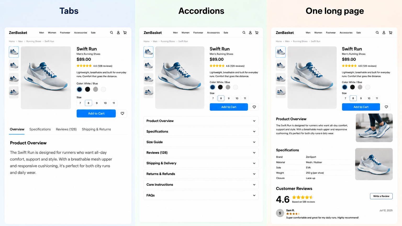
Tabs vs accordions vs one long page
Recommendation: accordions on mobile, accordions or expanded sections on desktop, tabs almost never.
Tabs hide content behind a horizontal control that many shoppers read as page decoration rather than navigation. Anything in a non-default tab is effectively invisible to a large share of visitors, which is a problem when the hidden tab contains the shipping policy or the size guide.
Whatever you choose, the content must be present in the HTML for search engines and assistive technology, not loaded only on click.
Gallery layout: thumbnails below, thumbnails beside, or carousel
On desktop, vertical thumbnails to the left of the main image show the most images without scrolling and make it obvious how many exist. Thumbnails below the image is a close second. A carousel with no thumbnails is the weakest option on desktop because the shopper cannot tell how much there is to see.
On mobile, a swipeable gallery with position dots or a “3 / 8” counter works best. The counter is better than dots once you have more than about five images, because dots become too small to read.
For products where detail matters (fabric, finish, engraving), zoom is not optional. Click-to-open-lightbox with pinch-zoom on mobile is the most reliable pattern; hover-magnifier on desktop is a nice addition but does not replace it.
→ Full guide: Ecommerce Product Image and Media Galleries
Swatches vs dropdowns for variants
Use visual swatches when the option is visual (colour, pattern, finish) and when there are roughly seven or fewer. Use a labelled button row for sizes. Use a dropdown only when options are numerous, non-visual, and hierarchical.
Two rules that hold regardless: never rely on colour alone (the swatch needs a text label on hover, focus and selection, both for accessibility and because “which of these two greys is ‘Slate’?” is a real question), and never make the shopper guess whether a combination exists. Disabled-with-explanation always beats hidden.
→ Full guide: Designing Product Variant Selectors
Should out-of-stock variants be hidden?
No. Hiding them makes the shopper wonder whether they missed something, and it removes a selling opportunity: a disabled option with “Notify me when back in stock” captures demand you would otherwise lose entirely. Show it, disable it, explain it.
Cart drawer vs redirect to cart page
A drawer keeps shoppers on the product page and suits stores where multi-item baskets are common: grocery, beauty, accessories. A redirect to the full cart page suits high-consideration single-item purchases where the next step really is checkout. The worst option is a silent add with only a small badge change, because a meaningful share of shoppers will not notice and will click again.
Should the price show the original price struck through?
Only if the struck-through price is genuine. Permanent “discounts” against a price you never charged are misleading, are increasingly regulated, and train regular customers to wait for a sale that is always running. If you discount, show the amount or percentage saved as well as the final price: shoppers should not have to do arithmetic.
Do you need a wishlist?
Wishlists are most useful for considered purchases, gifting, and categories where people browse over multiple sessions. Close to useless for consumables and low-value impulse items, where it mostly adds a competing button next to add-to-cart. If you add it, make it clearly secondary and make sure it survives sign-in.
Foundation · 2 min
Designing for mobile first
The mobile product page is not the desktop page at a narrower width. It is a different information sequence, because the shopper sees roughly one element at a time.
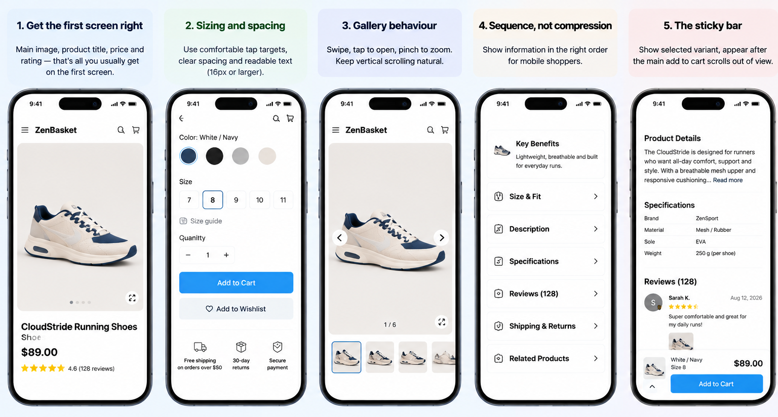
Get the first screen right
On a phone, the first screen should contain the main image, the product title, the price and the rating. That is usually all that fits. Anything else you add (a promotional banner, a breadcrumb bar three lines deep, a shipping ticker) pushes the price below the fold. If a shopper has to scroll to find the price, the page has failed its most basic job.
Sizing and spacing
-
Tap targets of at least 44 × 44 CSS pixels for anything interactive, with a comfortable margin around each. Size swatches placed too close together are one of the most common sources of mis-taps.
-
Body text at 16 pixels or larger. Smaller text triggers zoom on some devices and pushes layout around.
-
Full-width primary button. Do not centre a narrow button in a wide space.
Gallery behaviour
Swipe to move between images, tap to open full-screen, pinch to zoom. Reserve the image’s space in the layout before it loads so that the page does not jump. Never trap vertical page scrolling inside a horizontally-swiping gallery: if a shopper’s thumb starts on the image and moves down, the page should scroll.
Sequence, not compression
Because mobile shoppers scroll a lot, the order of zones matters more than on desktop. A workable default order after the buy box: key benefits, size or compatibility information, description, specifications, reviews, shipping and returns, related products. Move anything category-specific and decision-critical (ingredients for beauty, dimensions for furniture, compatibility for parts) up above the description.
The sticky bar
Appear once the main add-to-cart scrolls out of view, not immediately. Show the selected variant, so the shopper is not adding to cart blind. Keep it under about 15% of screen height, and make sure it does not cover the last line of content or sit under the browser’s own bars.
Foundation · 2 min
SEO and structured data
On-page fundamentals
-
One H1, the product name. Section headings below it in order.
-
Unique title tag and meta description per product, generated from a template but with real product attributes, not the same sentence 4,000 times.
-
Clean, stable URLs. Prefer /products/cotton-crew-neck-tshirt over a parameter string. Do not change them casually; if you must, redirect.
-
Canonical handling for variants. Decide whether each variant gets its own indexable URL or whether they all canonicalise to one product page. Both are valid; leaving it undecided produces duplicate-content problems.
-
Descriptive image filenames and alt text: these are your entry into image search, which matters more in visual categories than most stores act on.
-
Internal links to the parent category, the size guide, and genuinely related products.
Writing for AI assistants as well as search engines
Shoppers increasingly ask an assistant rather than typing a query. Assistants favour pages that state facts plainly and in a structure they can extract: a clear answer near the top, specifications as a table with consistent attribute names, a real FAQ block in question form, explicit units and measurements, and unambiguous availability and pricing. The same habits that make a page readable for a shopper in a hurry make it usable for a machine, which is convenient, because it means you are not writing two pages.
Foundation · 7 min
Frequently asked questions
What is a product detail page?
A product detail page, often shortened to PDP, is the page dedicated to a single product in an online store. It carries the product’s images, title, price, variant options, description, specifications, reviews and the add-to-cart button.
How many images should a product page have?
There is no universal number, and any guide that gives you one is guessing. Work backwards from the questions instead: you need enough images to show every angle a shopper would want, at least one image conveying scale, at least one showing the product in use or in context, and a close-up of any detail that affects the decision: texture, finish, stitching, ports, controls.
How long should a product description be?
Long enough to answer the blocking questions, structured so nobody has to read all of it. In practice that means a short benefit-led summary near the top, then full detail in a collapsible section, then specifications as a table. Length matters far less than structure: a 200-word description that answers the right questions beats an 800-word one that does not.
Should the price include tax?
Follow the convention of your market and, above all, be explicit. In markets where consumer prices are quoted inclusive of tax, quote them that way; where they are quoted exclusive, label it clearly. What causes abandoned carts is not the tax itself but discovering it late. The same applies to shipping: state it, or state the threshold for free shipping, on the product page.
Should out-of-stock products be removed from the site?
Generally no, particularly if the page has earned search visibility or inbound links. Keep the page live, mark availability accurately, and offer a back-in-stock notification and links to alternatives.
Should each product variant have its own URL?
It depends on whether shoppers search for the variant. If people search for “navy cotton crew-neck t-shirt”, separate indexable URLs per colour can earn traffic that a single page would not. If they search only for the base product, one URL with variant selection is simpler and concentrates ranking signals.
How do I reduce returns?
Returns are usually an expectation problem, not a product problem. The fixes are all on the page: accurate colour reproduction, scale references, real measurements rather than only letter sizes, material composition, close-up detail shots, video where relevant, and reviews that mention fit and quality. Making the returns policy easy to find does not increase returns: it increases first purchases, because it lowers the risk of trying.
Should I use urgency and scarcity messaging?
Only when it is true. “Only 3 left” tied to real inventory is useful information. The same message shown permanently on every product is deceptive, is regulated in a growing number of markets, and is noticed by repeat visitors, at which point it undermines the credibility of everything else on the page, including your delivery estimates.
What is the ideal product page layout?
There is no single ideal, but there is a reliable default: a two-column buy box on desktop with the gallery on the left and purchase controls on the right, stacking to gallery-then-controls on mobile; followed by a short benefit summary; then collapsible detail; then reviews; then related products; with a sticky add-to-cart bar on mobile. Deviate from this when a specific product need justifies it, not for novelty.
How fast should a product page load?
Use Core Web Vitals as the target: Largest Contentful Paint at 2.5 seconds or less, Cumulative Layout Shift at 0.1 or less, and Interaction to Next Paint at 200 milliseconds or less, measured on real users rather than a lab test on a fast connection. On product pages the main gallery image is nearly always the element that determines the first of these.
Do I need video on a product page?
Not universally. Video earns its place when the product has motion, assembly, drape, scale or an operating sequence that photographs cannot convey: apparel, furniture, appliances, tools, jewellery. For a flat, simple product, good photography is enough. If you add video, keep it short, muted by default, and below the main image rather than replacing it.
How do I design a product page when I have only one product?
A single-product store blurs the line between a product page and a landing page. Keep the buy box discipline (images, price, options, one clear button, delivery and returns near it) and then extend downward with the storytelling a landing page would carry: the problem it solves, how it works, comparisons, founder story, detailed social proof. Repeat the buy box at natural decision points down the page rather than forcing a scroll back to the top.
What are the most common product page mistakes?
In rough order of how often they appear: too few images and no zoom; manufacturer descriptions copied verbatim; shipping cost and delivery time not stated until checkout; the size guide hidden; unavailable variants hidden rather than disabled; the price pushed below the fold on mobile by banners; a slow main image; generic trust badges standing in for real reassurance; and an add-to-cart button competing with an equally loud second button.
How do I know if my product page is working?
Combine four sources. Analytics tells you the product-page-to-cart rate and where people leave. Session recordings and scroll maps tell you what they never see. Your support inbox tells you which questions the page failed to answer. And your returns data, coded by reason, tells you which expectations the page set wrongly. Anything appearing in two of those four is worth fixing before you run a test.
Foundation · 2 min
Building this in ZenBasket
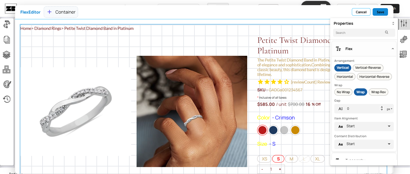
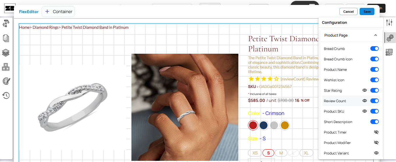
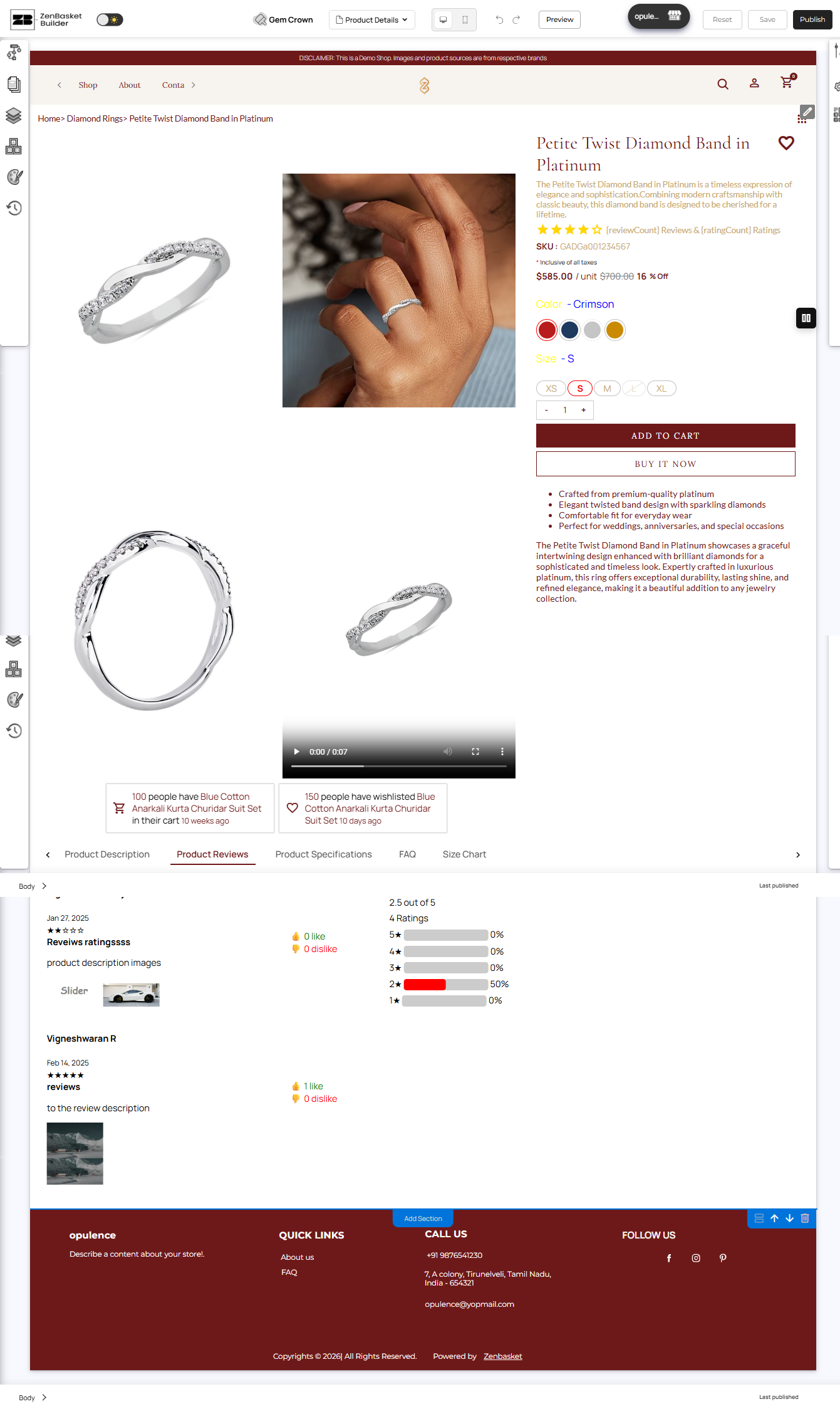
Everything in this guide is platform-independent: the principles hold whatever you build on. If you are building with ZenBasket, the product page template gives you the buy box, gallery, variant selectors, stock handling and review block as configurable sections, so most of the work above is arrangement and content rather than development.
-
Responsive layouts by default, including the mobile sticky add-to-cart pattern
-
Product structured data generated from your catalogue attributes
In the meantime, the ZenBasket Builder Help Center covers setup instructions today, including the Product Details Page article. Prefer to watch it built? The ZenBasket Builder video playlist walks through customizing page sections step by step.