Foundation · 2 min
1. Why people scroll to the footer
There are two reasons people reach a footer:
- They did not find what they wanted higher up, so the footer is a second chance, or a last resort for content missing from the main navigation.
- They scroll there deliberately, expecting contact details, company information or help.
Some also use it as navigation simply because they are already at the bottom.
For a store, the deliberate visit matters most. Many notices a footer never gets in the way of people whose needs were met higher up, so it is nearly cost-free as long as it doesn’t become so bloated that it slows the page.
Try the four-question test. Tell someone: “You are about to pay this store. Using only the footer, find how to contact them, the returns policy, how long delivery takes, and where to track an order.” Time it. Anything not found in under a minute is missing, mislabelled or buried.
Foundation · 2 min
2. What an ecommerce footer holds
For a store, that layer extends to buying, not just company information.
| Element | Why it is there | The rule |
|---|---|---|
| Contact | Proves a person is reachable | Phone, email and, if you have one, a physical address and hours. A form alone is weaker than a number. Say how fast you reply. |
| Order help | Answers “where is my order” without an email | Track order, shipping and delivery, returns and refunds, cancellations. Name them separately; they are four questions. |
| Policies | The checks a cautious buyer makes before paying | Privacy, terms, and returns as its own link. Every one must open a real, current page. |
| Business details | Shows who is behind the store | Legal name and registered address. Some markets expect specific details, for example India’s e-commerce rules on grievance officer contact; confirm what applies to you. |
| Payment methods | Shows how they can pay, and that it is ordinary | Real methods you accept, as recognisable marks with text alternatives. Not generic “secure” badges. |
| Cookie preferences | Lets people change a consent choice | A persistent link, not a one-time banner. Confirm requirements per market. |
| Shop links | Second chance to be routed | Main categories only (see sections 3 and 4). |
| Sign-up and social | Lets interested people stay in touch | One email field or link. Social links only to accounts you keep active. |
| Copyright line | States ownership | One line, current year, at the very bottom. Housekeeping, not content. |
Testimonials and awards can sit in a footer. This is for startups and lesser-known brands, warning that too many can read as a business that has to prove itself. Embedded social feeds only earn their weight for visual brands that post often; otherwise a plain link works better.
Foundation · 4 min
3. Five footer patterns
+------------------------------------------------------------+
| SHOP      ORDER HELP      COMPANY       CONTACT            |
| Women     Track order     About us      +91 00000 00000    |
| Men       Shipping        Our makers    help@store.com     |
| Home      Returns         Stockists     Mon-Sat 10-6       |
| Sale      Cancellations   Privacy       [ Email ] [ Go ]   |
|                           Terms         social icons       |
+------------------------------------------------------------+
| UPI · Visa · Mastercard · COD                              |
| Store Pvt Ltd, registered address · Cookie preferences · © |
+------------------------------------------------------------+
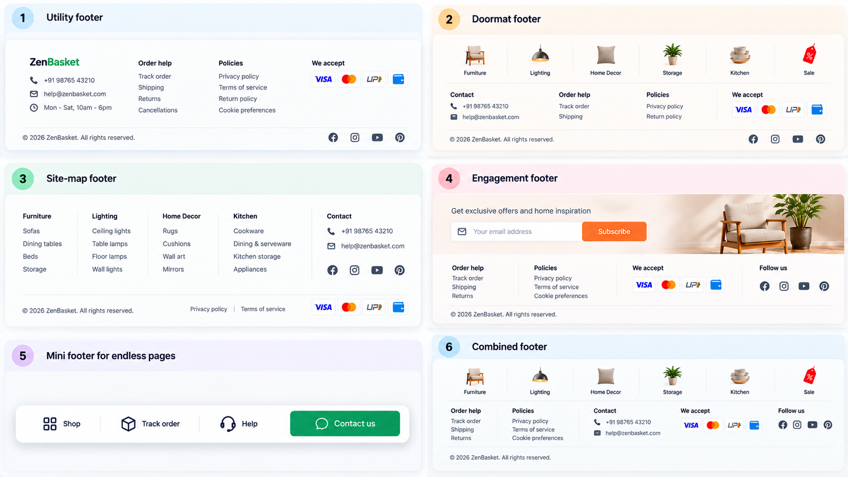
Every store needs a Utility footer, and the other four patterns are additions you make depending on your catalogue, your pages and your audience.
Utility footer. A utility footer holds contact details, order help, policies, payment marks and a copyright line, and nothing else. Every site needs this layer, so for many small stores it is the whole footer. It works best when the catalogue is small and the header already routes people well. It falls short on a large catalogue, because shoppers at the bottom of a long page have no route back into the site.
Doormat footer. A doormat footer repeats the main navigation at the bottom of the page, so it is the first thing seen on arrival and the last on leaving. It is a good fit for long pages where the global navigation is out of reach, such as category pages with load-more, long product pages and most mobile layouts. It costs very little if you keep it to top-level categories, but it should never be the only navigation content in the footer, because people still need the utility layer beside it.
Site-map footer. A site-map footer shows top-level categories plus a few selected second-level ones, exposing topics the menu doesn’t make obvious. It helps when a broad catalogue has valuable subcategories the header can’t show, or when shoppers often arrive deep in the site. A full site map belongs in the footer only for sites of roughly 25 pages or fewer, and larger sites should link to a separate site-map page instead. If it lists everything, it becomes a wall of links past two levels, and nobody scans it.
Engagement footer. An engagement footer places a sign-up prompt and social links, sometimes with a feed, above the utility layer. People do go to the footer for coupons, promotions and updates, so this is a legitimate use. It works when you send email people actually want, or when your brand is visual and posts regularly. It backfires when it pushes the utility links down or the feed looks stale, and a feed script can also slow the page.
Mini footer for endless pages. If a listing loads more products as you scroll, there is no bottom to reach, and the footer never appears. The result is a game of “whack-a-mole”, with links disappearing below the fold. The fix is to move footer content to a sticky mini footer in a side rail, or into an expanded global navigation. Using a load-more button is often the cheapest fix, because it gives you a real footer again and saves you maintaining a second footer design.
Combining them. Most stores want the Utility footer plus a Doormat or a short Site-map, and the Engagement strip only if it earns its height. Footers can also vary by who is viewing, which suits stores with separate shopper and trade audiences. Most other stores don’t need that.
Foundation · 2 min
4. Structure and link names
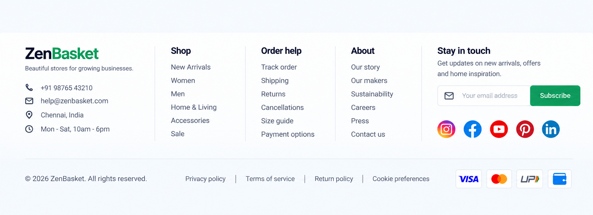
A footer’s search value comes from being clear and complete, not from keyword stuffing. It gives crawlers an easy route to your main pages, but fifty near-identical category links dilute every one of them for shoppers, the audience it was built for. Surface the pages worth surfacing; leave the rest to navigation and a site-map page.
- Two levels at most. “if everything is important, nothing is important”. Link the one lower-level page that matters; don’t mirror the tree.
- Group under headings. Unstructured footers become dumping grounds. Bold column headings, normal-weight links.
- Use the conventional word. “Contact us” beats “Company info”; “Returns” beats “Help”. Vague labels like “Resources” are a leftover from older footers; card-sort or test when unsure.
- One link, one job. “Shipping & returns” hides two questions; shoppers wanting a refund won’t look under shipping.
- Order by need, not org chart. Order help comes before “About us”. Careers and press go last: secondary tasks that suit a footer because they aren’t for most visitors.
- Same everywhere. Consistent, predictable and easy to find. Don’t vary it page to page without a real reason.
Foundation · 2 min
5. Mobile, accessibility and speed
Mobile. Don’t hide or collapse the footer; “people expect it to be there”. A four-column footer does become a very long list, so as a judgement call (not a research finding): keep contact, order help and policies fully visible as plain lists, and collapse only the long shop-category list under a visible heading with an unmistakable expand control.
Accessibility.
- Legible text: readable size, 4.5:1 contrast (WCAG 2.2 AA), no decorative fonts. Tiny, low-contrast text.
- Landmark: a real
<footer>with links in lists under real headings. - Tap targets: at least 24×24 CSS pixels with spacing between lines; payment and social icons need text alternatives.
- Focus: visible on every link, including on a dark background.
Speed. Payment marks, feed widgets and newsletter scripts sit below the fold: load them late, set image dimensions so the page doesn’t shift, and prefer a plain link to an embedded feed.
Foundation · 2 min
6. What breaks footers
| Failure | How it shows up | Fix |
|---|---|---|
| Dumping ground | Orphan links with no pattern; people skip it | Group under headings; delete links with no reader |
| Whole site map | Three levels, dozens of links | Top two levels plus a link to a site-map page |
| Vague labels | “Resources”, “Company info”, “Help” holding everything | Conventional, specific names; test unsure ones |
| Hidden or tiny | Collapsed by default; grey 11px text | Legible and visible; collapse nothing essential |
| Dead links | A policy link that 404s or shows last year’s text | Check every link before launch and each quarter |
| Fake trust | Generic “100% secure” graphics, unearned logos | Real payment methods and real registered details |
| Unclear contact | A form only, no number, no hours | Phone or email as text, with response time |
| Endless-page footer | Links vanish as products load | Load-more button, or a sticky mini footer |
Foundation · 2 min
7. Knowing whether yours works
A footer’s success is mostly invisible: shoppers find what they need and carry on. Measure the absence of friction.
- Footer link clicks by link. Expect order help and returns near the top. If “About us” leads, earlier pages aren’t answering questions.
- Support contacts asking what the footer should answer (“where is my order”) mean links are missing or mislabelled.
- Footer clicks that lead to exit. A policy page followed by leaving suggests an unsatisfying answer, not a footer failure.
- The four-question test, with five people each time you restructure.
- Testimonials and awards: usability-test or A/B-test the number shown rather than guessing.
Before you publish
- Same footer on every page, including cart and checkout (reduced there, never removed)
- Phone or email, hours and response time visible as text
- Track order, shipping, returns and refunds each have their own link
- Privacy, terms and returns policy open real, current pages
- Legal name and registered address present; market-specific details confirmed
- Payment marks show only accepted methods, with text alternatives
- A cookie-preferences link exists
- Two levels at most, grouped under headings, conventional link names
- Text legible, contrast 4.5:1, links have visible focus
- Nothing essential collapsed on mobile
- Late-loading widgets don’t shift the layout
- Every link checked; no tracking parameters on internal links
Foundation · 2 min
8. Building it in ZenBasket
The footer is a global element, edited from the settings icon below the footer in the builder, so one change applies to every page. Footer customization covers the variant (Classic Dark or Classic Light), gradient, visible groups (about, information, other menus, disclaimer), heading and underline styling, policy link styling, contact details and social media settings including icon alignment.
| You need | Use |
|---|---|
| Contact block with phone, address, email | Contact settings in footer customization |
| Policy and information links | Policy and general settings in the same panel |
| Social links | Social media settings; for a feed, the social media element |
| Logo, language, working hours | Store assets, dragged into the footer |
| Doormat or site-map links | Navigation menu and the other-menus group |
| Showroom location | Map element |
| Sign-up or contact form | Forms |
New to the builder? Start with Getting started. Check the mobile view before publishing; desktop and mobile edits don’t all sync.
Foundation · 3 min
9. Frequently asked questions
What should an ecommerce footer include?
Contact details, order help (tracking, shipping, returns), policies, registered business details, payment methods and a cookie-preferences link as the core. Add main shop categories and an email sign-up or social links if they earn their space, and a one-line copyright notice at the bottom.
Why do shoppers use the footer?
They did not find what they wanted higher up, so the footer is a last resort or second chance; or they scroll there deliberately for contact details, company information and help. Some also use it as navigation when already at the bottom of a long page.
Should contact details be in the footer if they are also in the header?
Yes. Always including utility links in the footer even when the header has them, because the footer is where people look for contact and support information.
How many links should a footer have?
As few as cover the utility layer plus your main categories, grouped under headings and no deeper than two levels. NN/g warns against a full site map in the footer unless the site has about 25 pages or fewer; link to a separate site-map page instead.
Is a doormat footer worth using?
On long pages, yes. Repeating the main navigation at the bottom saves a scroll back to the top, which matters on mobile and on category pages with load-more. It supplements the utility links rather than replacing them.
Should I collapse the footer on mobile?
Not the essentials. NN/g advises against hiding the footer because people expect it. Keep contact, order help and policies visible; if the footer is very long, collapse only the shop-category list under a clear heading.
What should I do about infinite scroll and the footer?
An endless page has no bottom, so links slip away before people reach them. Use a load-more button so a real footer appears, or move footer content into a sticky mini footer in a side rail, as NN/g recommends.
Do footer links help SEO?
They give crawlers a consistent route to your main pages, which is useful. Stuffing the footer with keyword-heavy links is not: it dilutes the links shoppers need. Surface the pages worth surfacing, and put the long tail on a site-map page.
Should I show testimonials or awards in the footer?
It can help a lesser-known brand build credibility, but NN/g cautions that too many may suggest the business needs to prove itself. Test the number with your audience. The wider rules are in the testimonial section guide.
Do I need a footer on the checkout page?
A reduced one. Keep returns, shipping, privacy and contact links, because hesitating shoppers look for them, but remove categories and promotions that lead away from payment. Open policy links in a modal or new tab so form data is not lost.