Foundation · 2 min
What Makes an Electronics Store Work
An electronics store is designed around one question a shopper cannot answer alone: will this work with what I already own? Publish complete specifications as text, using the same field names across every product. Make it easy to compare two similar models on the few things that differ. Say plainly what each product works with and what is in the box. Keep storage sizes and colours as versions of one product, not several. Then answer the three things a marketplace answers well — warranty, stock and delivery — before the shopper has to ask.
Foundation · 2 min
1. Why electronics stores are designed differently
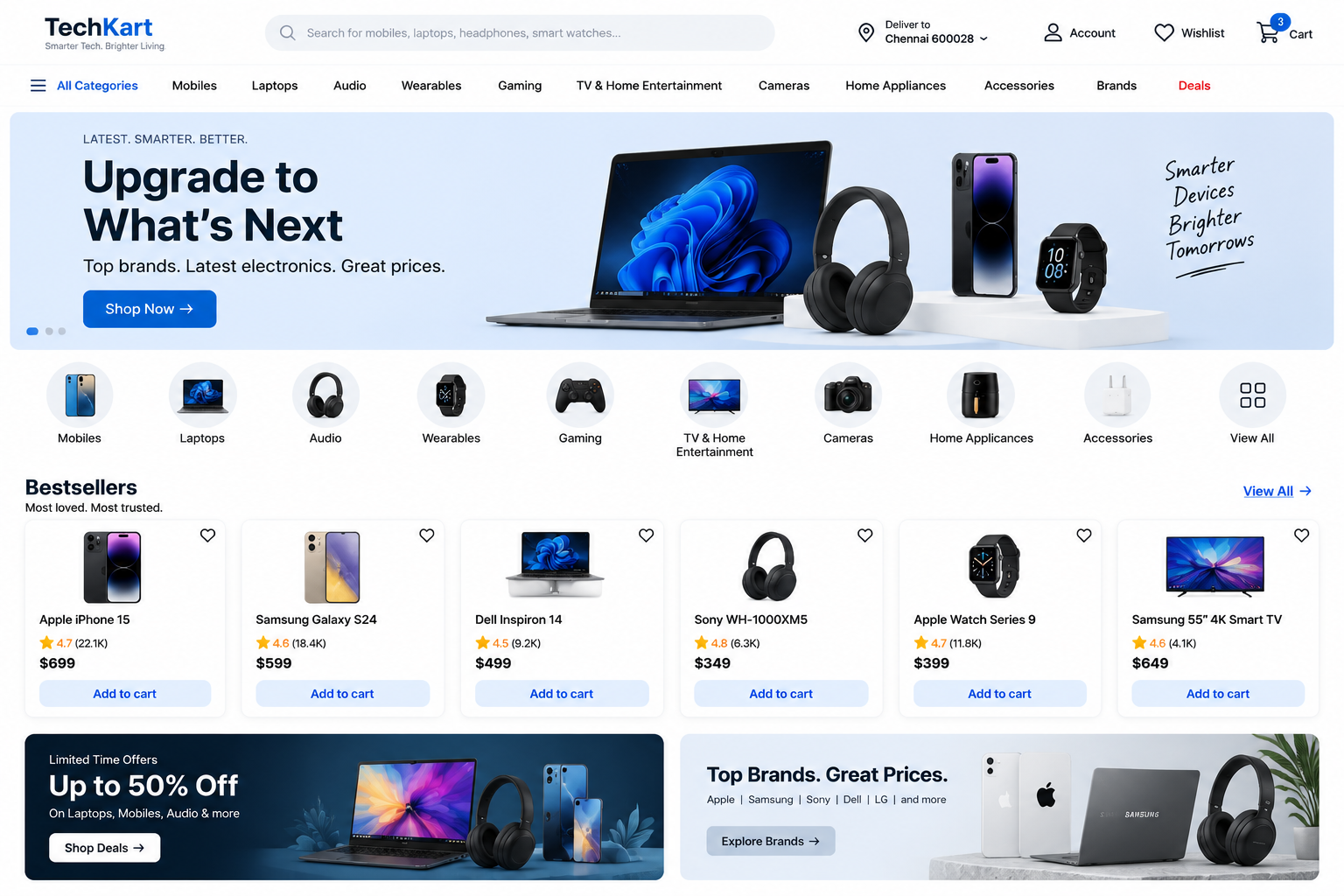
Electronics shoppers usually arrive knowing roughly what they want. They are not being persuaded to want the product; they are checking that this is the right one, that it works with the things they already own, and that buying it from you is safe. Four consequences shape everything below.
| The difference | What it does to your store |
|---|---|
| Shoppers check details, not stories | The specification table becomes the main part of the product page, and it has to be complete and consistent or nothing else works. |
| People compare before they buy | Two or three models get weighed against each other. If you do not help, the comparison happens on someone else’s site. |
| The product must work with existing kit | Compatibility stops being a specification and becomes a plain-English answer that decides the sale. |
| Marketplaces set the expectation | Warranty, stock and delivery are compared as closely as price, so all three belong on the product page. |
One claim worth arguing with: in electronics, the specification table is the product page. Marketing copy is skimmed and often skipped, while the specifications, the model number and the box contents are read closely. Money spent on clean, complete product data returns more than money spent on persuasive writing.
Foundation · 2 min
2. Technical specifications
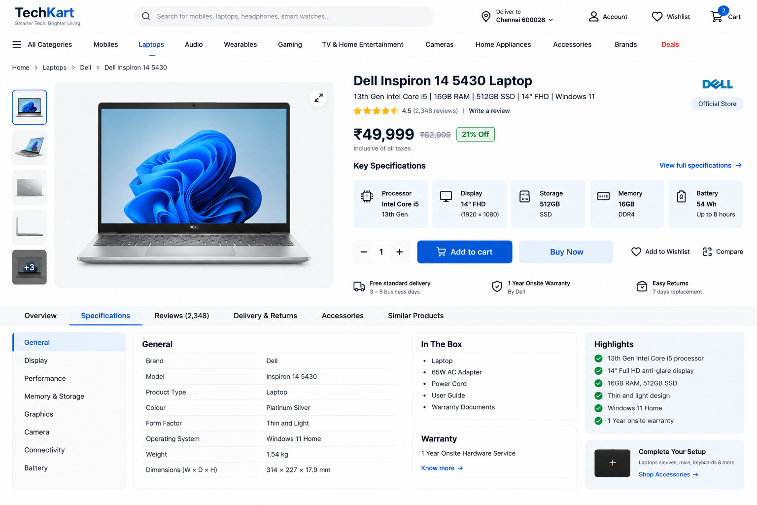
Specifications are what shoppers scroll to, what they compare, and what they quote back to you when something is wrong. Treat them as the main content of the page rather than as small print at the bottom.
- Show the four or five specifications people choose on near the top, and keep the full list further down in switchable panels or an expandable panel.
- Use the same field names and the same units for every product in a category. Inconsistent naming is what makes a list impossible to compare and impossible to filter.
- Give the exact model number, and say what is in the box. Two products with the same name often differ by a cable, a mount or a region.
- Where a number needs explaining, add a short plain-language line beside it — the figure for the technical shopper, the sentence for everyone else.
Write specifications as real text rather than uploading a picture of the manufacturer’s spec sheet. An image cannot be searched, compared, translated or read aloud, and it is the commonest reason a well-stocked electronics store is invisible in search and in AI answers. Show the image as well if you like, but never instead.
 ACME SoundOne 40  ·  Model AC-SO40-BLK

  Key specs   40 mm drivers · 30 h battery · USB-C · Bluetooth 5.3
  Works with  Android, iOS, Windows, macOS   [ Full compatibility ]

  In stock — dispatched today, delivered 12–14 Sep
  2-year warranty, handled by us      [ What it covers ]

  Colour  ( Black )  ( White )  (✕Blue — notify me )
Everything an electronics buyer checks, in one block, above the fold on a phone.
Foundation · 2 min
3. Comparison tables
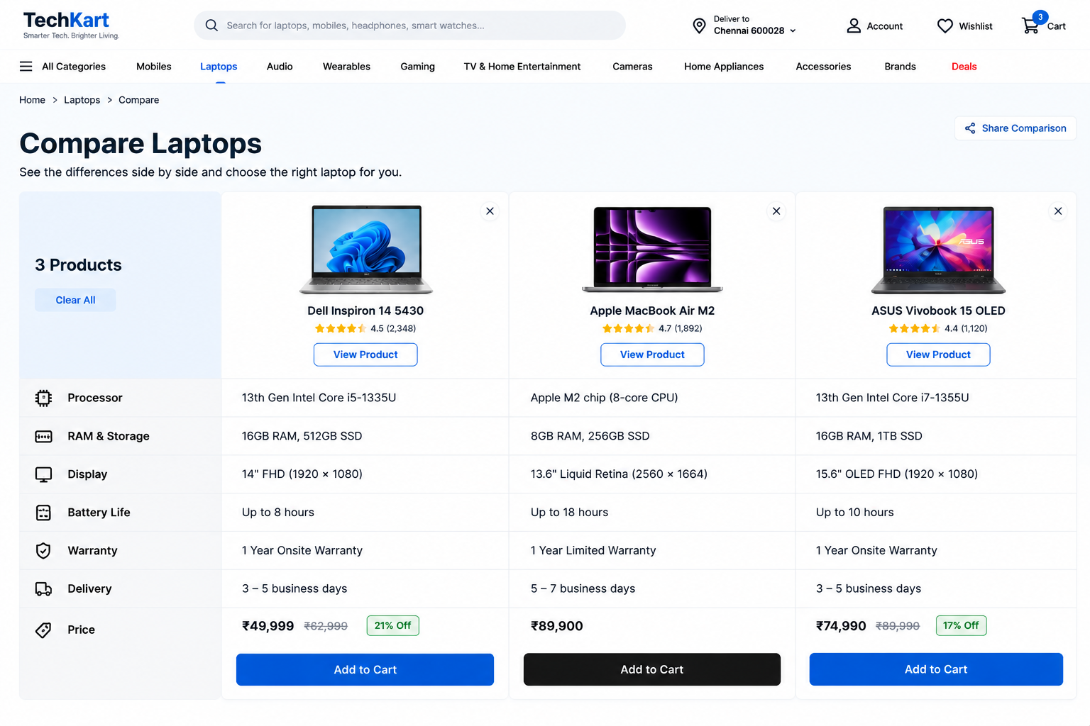
Almost nobody buys the first model they look at. They narrow to two or three and weigh them against each other, usually in separate browser tabs. A store that helps with that keeps the decision on its own site instead of sending it to a review blog.
- Show only the rows that differ — the specifications people choose on, the price, the warranty and the delivery date. Twenty identical rows hide the differences instead of showing them.
- Keep the row order the same for every comparison in a category, so the eye learns where to look.
- Do not rely on coloured ticks and crosses alone. Write yes, no, or the value itself, so the table still makes sense to someone who cannot distinguish the colours.
No comparison tool? A single line on the product page saying how this model differs from its nearest sibling — more storage, brighter screen, older connector — answers the question at the moment it is asked.
Either version only works if your specifications are entered consistently. In ZenBasket a comparison block is built from a data driven box per model, placed side by side and fed from the catalogue, so the figures stay correct when a price or a specification changes.
Foundation · 2 min
4. Compatibility
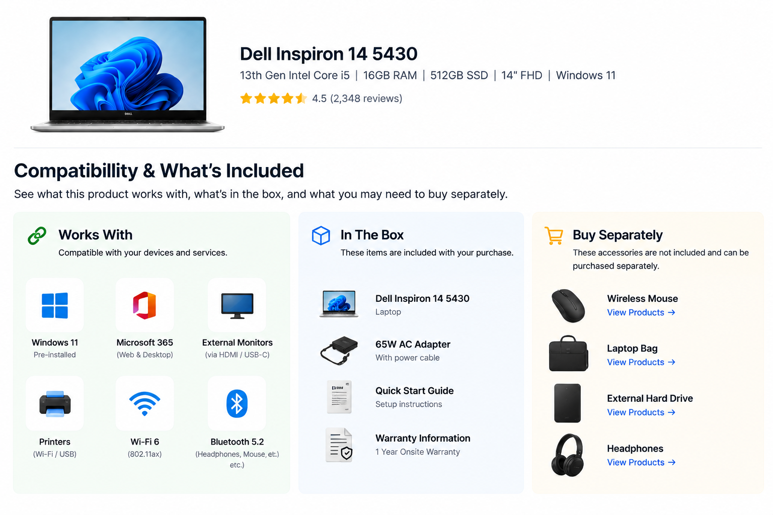
This is the question that stops more electronics purchases than price does. Will this charger work with my phone, will this lens fit my camera, will this bulb work with the app I already use? Answer it in plain words on the product page rather than leaving the shopper to work it out from a specification.
- Say what the product works with, and say what it does not. Both halves matter.
- Name the connection, socket, operating system or app version it needs.
- Where a product fits only certain models, list them. A works-with list is one of the most valuable pages an electronics store can publish, and it brings in search traffic of its own.
- Say what is included and what has to be bought separately. A missing cable feels like a fault rather than a choice.
- Where an older standard is involved, say so plainly instead of assuming the customer knows which generation of a connector they own.
Compatibility earns its own tab on the product page, and often its own guide page for the questions people type into search engines. If you sell the adapter that bridges a gap, that is the moment to offer it.
Foundation · 2 min
5. Filters
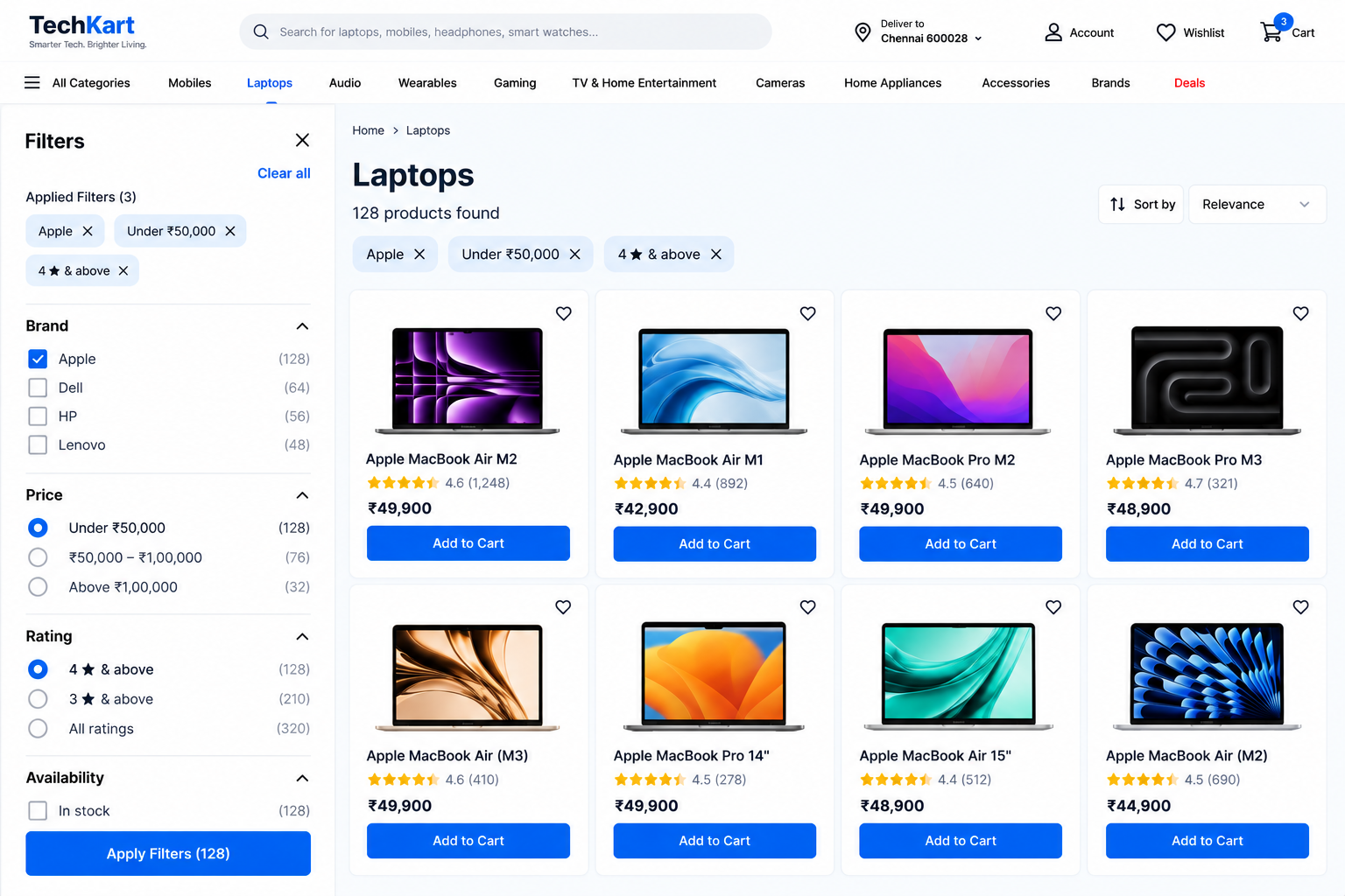
Electronics is the category where filters do the most work, because shoppers arrive with requirements rather than tastes: a laptop under a certain price with a certain amount of memory, a television of a particular size that fits a wall.
- Brand, price and availability apply everywhere. Beyond that, filter on what matters in the category — screen size, capacity, connection type, power rating.
- Ranges usually beat exact values, because few people know the precise figure they want.
- Show applied filters as chips that can be removed one at a time, so nobody has to start again to undo one choice. Keep them a comfortable size to tap on a phone.
- Let people filter to what is in stock, and keep the result count visible.
- On a phone, filters belong in a drawer with an apply button rather than reloading the page on every tap.
Filters are also where speed is won or lost. A filter that takes a second to respond makes people stop narrowing and leave, so keep listing pages light: export images at the size they are shown, set their dimensions so the grid does not jump, and load reviews and long panels only when opened. Filter and sort behaviour, including the applied-filter chips, is configured in the product list page settings, and on-site search in search variants. Filter panel mechanics in general are in the filter pattern and the product listing page guide.
Foundation · 2 min
6. Product variants
The rule: one product record per model. Storage size, colour and regional version are options of it, each carrying its own price where it differs, its own stock, and its own photograph where the look changes.
| The mistake | What it costs |
|---|---|
| Each storage size loaded as a separate product | Near-duplicate pages competing in search, a repetitive listing page, and reviews split several ways instead of pooled. |
| Choosing a version does not change the address of the page | Nobody can share or bookmark the version they mean, and search engines only ever see the default. |
| Option names typed differently on different products | “Space Grey”, “Space grey” and “Grey” become three filter options, and the filter panel stops working. |
| Unavailable combinations still selectable | The shopper reaches checkout and fails there, which is where they leave for a marketplace. |
Choosing an option should update the image, the price, the delivery estimate and the address of the page. Where a version differs in something technical rather than cosmetic — a different connector on the same model — say so at the point of choosing, not further down in the specifications. Always show the option name in text beside any colour swatch, so the choice is never carried by colour alone.
Options and variants are set up in the product catalogue, and the product page can show them as a dropdown or as swatches. See product options and variants and the product details page settings.
Foundation · 2 min
7. Warranty
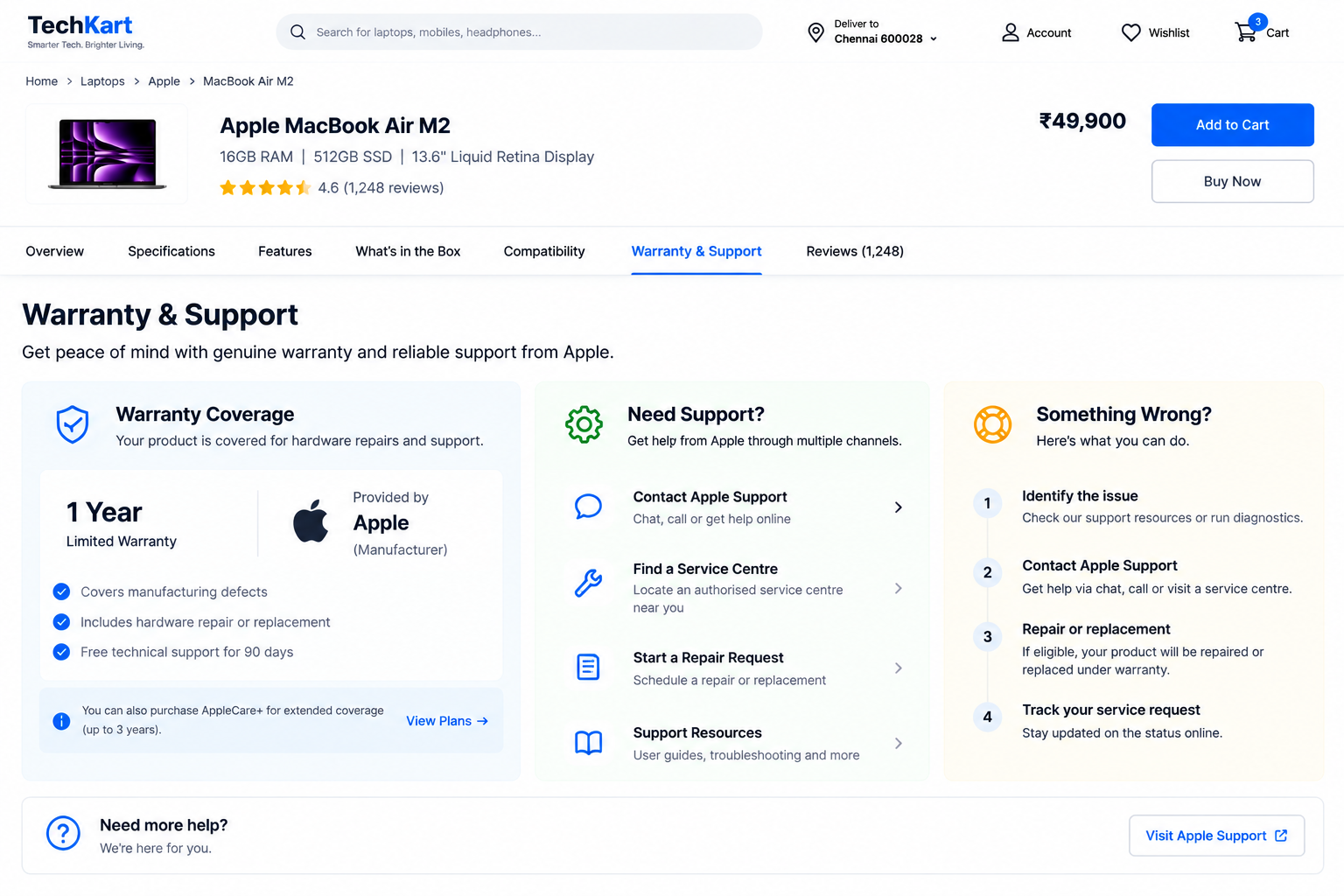
Warranty is where a specialist store beats a marketplace, and most stores waste the advantage by hiding it in a policy page. Put the length next to the price, and the terms one tap away.
- Say what it covers, who provides it — you or the manufacturer — and what the customer does if something goes wrong.
- Say whether the product is repaired or replaced, and roughly how long that takes.
- If registration is needed to activate the warranty, say so before purchase, not in the box.
- Be honest about what is not covered. Accidental damage and normal wear are the two things customers most often assume are included.
- Sell extended cover as a clear choice with the price and the difference stated, never as a checkbox that quietly raises the total.
Keep the invoice easy to find in the customer’s account, because that is what a service centre will ask for two years from now. Warranty content sits naturally in a panel beside the specifications, with a service request form for claims and your contact details in the footer.
Foundation · 2 min
8. Reviews
Electronics buyers read reviews closely, and for specific reasons: whether the product works as claimed, how it holds up after a few months, and whether it worked with the setup the reviewer already had.
- Ask what the customer uses the product with, and how long they have had it. Those two questions produce far more useful reviews than a star rating alone.
- Let people add photographs, and let shoppers browse them in one place.
- Publish critical reviews as well as positive ones. A page with nothing but five stars reads as filtered, and shoppers will go and read reviews elsewhere.
- Reply in public to reviews reporting a fault, saying what you did. That reply is often read by more people than the review itself.
The star rating and review count are turned on in the product details page settings, and both hide themselves on the storefront when a product has no reviews yet — which is better than showing an empty rating on a new listing.
Foundation · 2 min
9. Accessories
Accessories are where an electronics store makes its margin, and where a suggestion is genuinely welcome — nobody wants to discover at home that the cable was sold separately.
- Split them in two. The things the product needs to work belong close to the buy area; the optional extras belong lower down or in the cart.
- Only suggest accessories that fit the model being viewed. A wrong suggestion undoes the trust the compatibility section just built.
- Bundles work when the saving is real and the contents are listed plainly.
- The moment after add-to-cart is the best one for small extras, because the decision has already been made.
- Judge the block on whether orders contain more items, not on how many people click it.
A compatible-accessories row is built from a data driven box or a single product element, and a saving can be flagged with product badges.
Foundation · 2 min
10. Availability
Electronics stock moves quickly, and a customer who finds out at checkout that an item is unavailable usually goes to a marketplace rather than waiting.
- Show stock on the listing tile as well as the product page, and add a text label rather than relying on a colour.
- Be specific. “In stock”, “arriving next week” and “discontinued” are three different messages; a single vague “unavailable” answers none of them.
- Only show a low-stock warning when stock is genuinely low. Invented urgency is noticed quickly in this category.
- Where availability depends on the version chosen, show it at the moment the option is selected, not at checkout.
- Give people something to do: a notify-me option, a pre-order where the launch date is real, or a pointer to the nearest equivalent model.
Waiting List: let shoppers join a waiting list and be notified when an unavailable product or version comes back — how the waiting list works.
Pre-order: take orders for a launch and set expectations about availability — how pre-orders work.
The low-stock warning itself is a setting on the product details page, and a restock can be announced with an attention banner.
Foundation · 2 min
11. Delivery
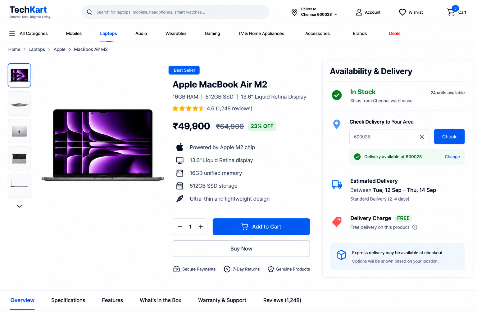
Delivery is compared as closely as price, because marketplaces have set the expectation. The store that answers “when will it arrive?” earliest usually wins the order.
- Put a real estimate on the product page, phrased as a date or a short range rather than a vague promise, and say what it depends on: in stock, ordered in, or made to order.
- Let people check their pincode or postcode before they get attached to the product.
- Show the delivery charge in the same place. A charge that appears at the last step on an expensive order feels like a trick.
- Say whether the item needs a signature or an identity check, because expensive goods often do and customers need to plan for it.
- When an order mixes an in-stock item with a slower one, say whether it ships together or separately. This is the commonest complaint in the category, and it is a design decision rather than a logistics one.
Large appliances need the same care as furniture — access, stairs and installation. Delivery promises and dispatch cut-offs can be carried by an attention banner and a timer set to a real cut-off, with access notes collected through a form and service or collection points shown on a map.
Foundation · 2 min
12. Choosing a ZenBasket theme for your electronics store
Everything above is platform-independent. If you are building on ZenBasket, start from the theme mapped to this category. From the ZenBasket theme collection; current pricing is on that page.
| If you sell | Start with | Why |
|---|---|---|
| Consumer electronics and gadgets | Devicea (free) | The mapped electronics theme: category-led, with room for specification-heavy product pages. |
| Gaming gear and accessories | Tidalix (free) | Built for sports and gaming, which suits a younger, deals-led range. |
| Audio and musical equipment | Pitchrix (free), Harmonikal (premium) | Music and instrument themes, where the sound and the story matter alongside the specification. |
How to judge an electronics theme in ten minutes
Open the live demo on your phone, not your laptop:
- Can the product page hold a long specification list without becoming unreadable?
- Is there room near the price for warranty, stock and a delivery estimate?
- Can a product carry several versions, each with its own price and stock?
- Are applied filters shown as chips that can be removed one at a time?
- Is there a sensible place for compatible accessories?
- Does the layout still look right with only twelve products in it?
A theme failing the first two costs more to fix than the price gap between any two themes in the collection.
There is no premium theme mapped specifically to electronics today, so if you outgrow Devicea, judge a premium theme on whether its product page can carry what this guide asks for rather than on how its homepage looks. You can apply and customise a paid theme to try it before buying, although it cannot be published live until it is purchased — so preview properly first, and see customising site themes.
Foundation · 2 min
13. Building it in ZenBasket
Sections you design yourself — a banner, a buying guide, an accessories row — are added to a blank section and filled with elements from the left panel. The pages the store already provides, such as the product page, the listing page and the cart, are edited in place by double-clicking the section. Most of an electronics store lives in that second group, so much of the work is turning the right settings on rather than building from scratch. Product data itself — specifications, versions, prices and stock — is managed in the catalogue, and the storefront reads from it, so agree your field names there first.
| What this guide asks for | What to use |
|---|---|
| Specifications, compatibility and warranty on the product page | Switchable panels or expandable panels |
| Gallery, version selector and buy block | Product details page settings |
| Storage sizes and colours on one product | Product options and variants |
| Listing grid, sorting, filters and filter chips | Product list page settings |
| Comparison block and accessories row | Data driven box and single product |
| Category navigation for a wide range | Navigation menu, mega menu layout |
| Search that copes with model numbers | Search variants |
| Deals, launches and dispatch cut-offs | Attention banners and timer |
| Back-in-stock and launch handling | Waiting list and pre-order |
| Buying guides and compatibility pages | Add a page, then add sections |
| Brand pages for a multi-brand store | Brands |
| Logos, colours and typography | Customising site themes |
New to the builder? Start with Getting started, then adding sections and customising them.
Foundation · 4 min
14. Frequently asked questions
Where should specifications appear on the page?
The few people choose on belong near the price, with the full list one tap away in a panel or tab. Use the same field names and units across every product in a category.
Can I just upload the manufacturer’s spec sheet image?
Not on its own. An image cannot be searched, compared or read aloud, so the specifications need to exist as text on the page even if you also show the image.
What should a comparison table include?
Only the rows that differ between the models, plus price, warranty and delivery. Identical rows hide the differences instead of showing them.
How should I handle compatibility?
Say in plain words what the product works with and what it does not, name the connection or software version it needs, and list the models it fits.
Should I list what is in the box?
Yes, along with what has to be bought separately. A missing cable or adapter feels like a fault rather than a choice.
Which filters does an electronics store need?
Brand, price and availability everywhere, plus the specifications that matter in each category, such as screen size, capacity or power rating. Ranges usually work better than exact values.
Should each storage size be a separate product?
No. Keep versions as options of one product, each with its own price and stock, so reviews stay together and the listing shows the model once.
Where should warranty information go?
Next to the price, with a short explanation of what it covers, who provides it, and what the customer does if something goes wrong. Say what is not covered too.
How do I get useful reviews for technical products?
Ask what the customer uses the product with and how long they have had it. Those reviews answer the questions shoppers actually have.
Should I publish negative reviews?
Yes. A page with only five-star reviews reads as filtered, and shoppers will read reviews elsewhere instead.
How should accessories be suggested?
Put the ones the product needs to work close to the buy area and the optional extras lower down or in the cart, and only suggest items that fit the model being viewed.
What should I show when a product is out of stock?
The reason and a next step: back on a date, discontinued, or available to pre-order, with a notify-me option and a pointer to the nearest equivalent model.
Are low-stock warnings a good idea?
Only when they are true. Real low-stock information helps; an invented countdown is noticed quickly and costs more trust than it gains orders.
How should delivery information be shown?
As a date or short range on the product page, with the charge, what it depends on, and whether a mixed order ships together or separately.
What is the best ZenBasket theme for an electronics store?
Devicea is the mapped electronics theme. If you outgrow it, judge a premium theme on whether its product page can carry long specifications, warranty and stock information.