Foundation · 12 min
Quick add or quick view?
· 8 min
What goes on a product card is product card anatomy. How an overlay should behave once you’ve chosen one is quick view and pop-ups. This page decides whether to have one at all.
There’s a version of this question with a clear, evidence-backed answer, and it isn’t the one usually asked. The right choice depends almost entirely on what you sell, and for a large group of stores the correct answer is neither.
Who does what
| Your theme decides | Whether quick view or quick add appears on cards, and what the overlay contains |
| You decide | Whether to switch it on, and what your product cards show without it |
| You can fix yourself | The underlying problem, which is almost always the card |
| You test | Whether the overlay returns shoppers to the right place, on a phone |
Three options, not two
| What it is | Shopper’s next move | |
|---|---|---|
| Neither | The card carries enough to decide | Click through to the product page |
| Quick add | An add-to-cart control on the card itself | Item in basket, keep browsing |
| Quick view | An overlay with more detail and add-to-cart inside | Decide in the overlay, or click through |
Framing it as two options is how stores end up with an overlay they didn’t need. The third option, improving the card until neither is required, is frequently the cheapest and helps every shopper rather than the subset who discover the feature.
What the research actually says
This is one of the few decisions in ecommerce where large-scale testing has produced a genuinely split verdict, and the split runs along product type rather than preference.
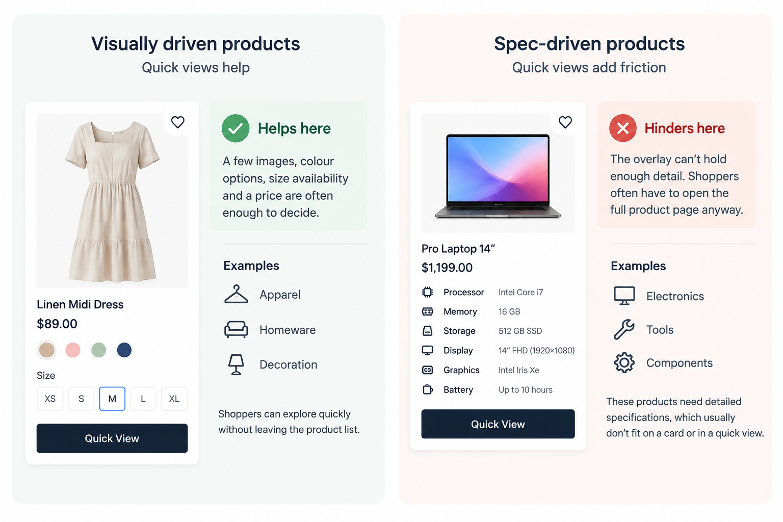
For visually driven products: apparel, homeware, decoration, anything where a few images and a price settle the question, quick views help. Shoppers are measurably reluctant to make repeated trips between a list and product pages, and that reluctance makes them dismiss items early rather than investigate them. Some will discard a product that would have suited them simply to avoid the round trip. A quick view removes the trip and keeps them anchored in the list. Around half of sites selling visually driven products don’t offer one.
For spec-driven products: electronics, tools, components, anything decided on numbers, quick views add friction. The overlay can’t hold enough. A shopper opens it, finds it doesn’t answer their question, closes it, and opens the product page anyway. That’s a wasted step at the moment they were most engaged. Roughly a fifth of spec-driven sites provide one regardless.
And the finding that reframes the whole question: a quick view is frequently a symptom of a weak product card. Separate benchmarking found close to half of ecommerce sites provide too little information in their product lists. In testing, a striking number of participants believed the quick view was the product page, then dismissed products because the overlay didn’t contain what they were looking for, never realizing a fuller page existed.
That’s the expensive failure. Not a wasted click, but a lost sale on a product that would have suited them.
Think in three levels, not two
The useful model isn’t card-versus-page. It’s a ladder, and each rung answers a different depth of question.
| Level | Holds | Example, supplements |
|---|---|---|
| The card | The facts that separate this product from its neighbor | Key ingredient, dosage, price |
| The quick view | Enough to decide, without leaving the list | A fuller ingredient list, sizes, add to cart |
| The product page | Everything | Complete ingredients, warnings, reviews, delivery |
Designed this way, an overlay has a defined job, it holds the middle tier. Designed without this model, the overlay becomes an arbitrary subset of the product page, which is exactly what makes shoppers mistake one for the other.
The deciding test
Can a shopper tell two of your products apart from the card alone?
Yes, and the remaining question is visual; which color, how it hangs, what the back looks like. Quick view earns its place. It answers a visual question without a page load.
Yes, and there’s no remaining question; grocery, consumables, repeat purchases. Quick add. Skip the overlay entirely; the shopper wants the item in the basket, not more information.
No, your cards are missing the deciding fact. Fix the card first. An overlay layered over a card that doesn’t distinguish products is a workaround that costs a click and teaches shoppers your list can’t be trusted.
Products differ on numbers; specifications, compatibility, capacity. Neither. Send them to the product page, where the answer actually fits.
The default
Quick add for repeat-purchase catalogues. Quick view for visual ones. Neither for spec-driven ones.
If you’re between two of those, do nothing and improve the card. That’s the cheaper fix and it helps every shopper.
If you use quick add
The button should become a quantity control once it’s been used. This matters most in grocery and consumables, where a shopper adds many items and frequently wants two or three of something. A static add button forces them into the product page to change quantity, which is the exact trip quick add existed to prevent. Tapping it once adds the item; the control then becomes a stepper showing what’s in the basket.
Show which products are already in the cart. A shopper adding thirty grocery items loses track. Highlighting items already added removes a category of small frustrations, and it’s rare enough that it makes a store feel attentive.
Handle the variant problem honestly. Quick add works cleanly when there’s nothing to choose. For a product with sizes, it either needs to open a small selector or it isn’t quick add at all, and silently adding a default size produces the single most avoidable kind of return.
If you use quick view
Three things break them, and all three are invisible to the person who built it.
The back button goes to the wrong place. A shopper who opens a quick view and presses back should return to the product list. Sending them to whatever they were viewing before the list is disorienting and common.
They lose their place in the list. Someone who quick-viewed the twenty-eighth product and closed it should still be at the twenty-eighth product. Landing back at the top of a long list is a genuine reason people abandon browsing, and a surprising share of sites get it wrong.
It’s mistaken for the product page. This is the one to design against deliberately. On mobile especially, where testing found the problem occurs and desktop testing didn’t, keep the product list visible behind the overlay. A partial-height panel with the grid showing behind it reads as a layer. A full-screen overlay reads as a page, and a shopper who thinks they’re on the product page will judge your product on a third of its information.
Always include a visible route through, worded as a destination, “View full details”, rather than only an X in the corner.
How to do it in ZenBasket
A listing page should answer the shopper’s first questions before asking them to open another page.
Use the simplest interaction that solves the decision.
| What you decided | What it becomes |
|---|---|
| The card is missing the deciding fact | Add that information to the product card |
| The shopper already knows what they want | Add a quick purchase action |
| A short preview helps, but the full page is not needed yet | Use a quick view experience where appropriate |
| The product requires detailed comparison | Keep the shopper on the full product details page |
| A variant is unavailable | Show the state clearly and provide the next action |
Do it in this order.
1. Improve the product card first.
Add the information shoppers need to compare products:
- size availability
- key specifications
- price information
- color options
- important labels
A stronger card often removes the need for extra interactions.
2. Add quick actions only where the decision is simple.
Quick actions work best when shoppers already understand the product.
They become complicated when choosing:
- size
- color
- configuration
- compatibility
requires more information.
3. Add quick view only when it solves a real problem.
A quick view should reduce unnecessary navigation, not create another incomplete product page.
Then check three things
- Open the interaction from a lower position in the product list and confirm the shopper can return without losing their place.
- Test the browser back button and ensure navigation behaves naturally.
- Ask someone unfamiliar with the store to use it. If they mistake the preview for the full product page, the boundary is unclear.
Read next in the Help Center
- Product List Page — controls what each product card displays in a listing. Start here: this is where the fix usually is, before any overlay decision.
- Product Details Page — the full page an overlay must link through to, and what it should contain that the overlay doesn’t.
- Customizing Sections — arranging the listing page itself, including how many products sit in a row.
- Product Specification — entering the specification data that determines whether a card can distinguish your products at all.
Foundation · 9 min
Pagination or infinite scroll?
Which filters to offer is filters and facets ,and how sorting behaves is sorting options. This page decides how the next set of products arrives, and whether search engines can reach them.
The framing is wrong twice over. There are three options, not two, and the one that tests best with shoppers is the one that most often breaks your search visibility unless you build it carefully.
Who does what
| Your theme decides | Which loading pattern the listing uses |
| You decide | How many products load at once, and whether the footer stays reachable |
| You control | Page weight, which is what makes any of these feel fast or slow |
| Worth checking with a developer | Whether every product is reachable by a real link. This is the one technical point on the page that’s worth escalating |
The three patterns
| What happens | Known problem | |
|---|---|---|
| Pagination | Numbered pages, Next and Previous | Reads as slow. Shoppers rarely go past the first page or two |
| Infinite scroll | More products load automatically at the bottom | Footer becomes unreachable. Position is lost on return |
| Load more | A button loads the next set onto the same page | Page grows heavy if unmanaged. Needs care for search |
What testing found about shoppers
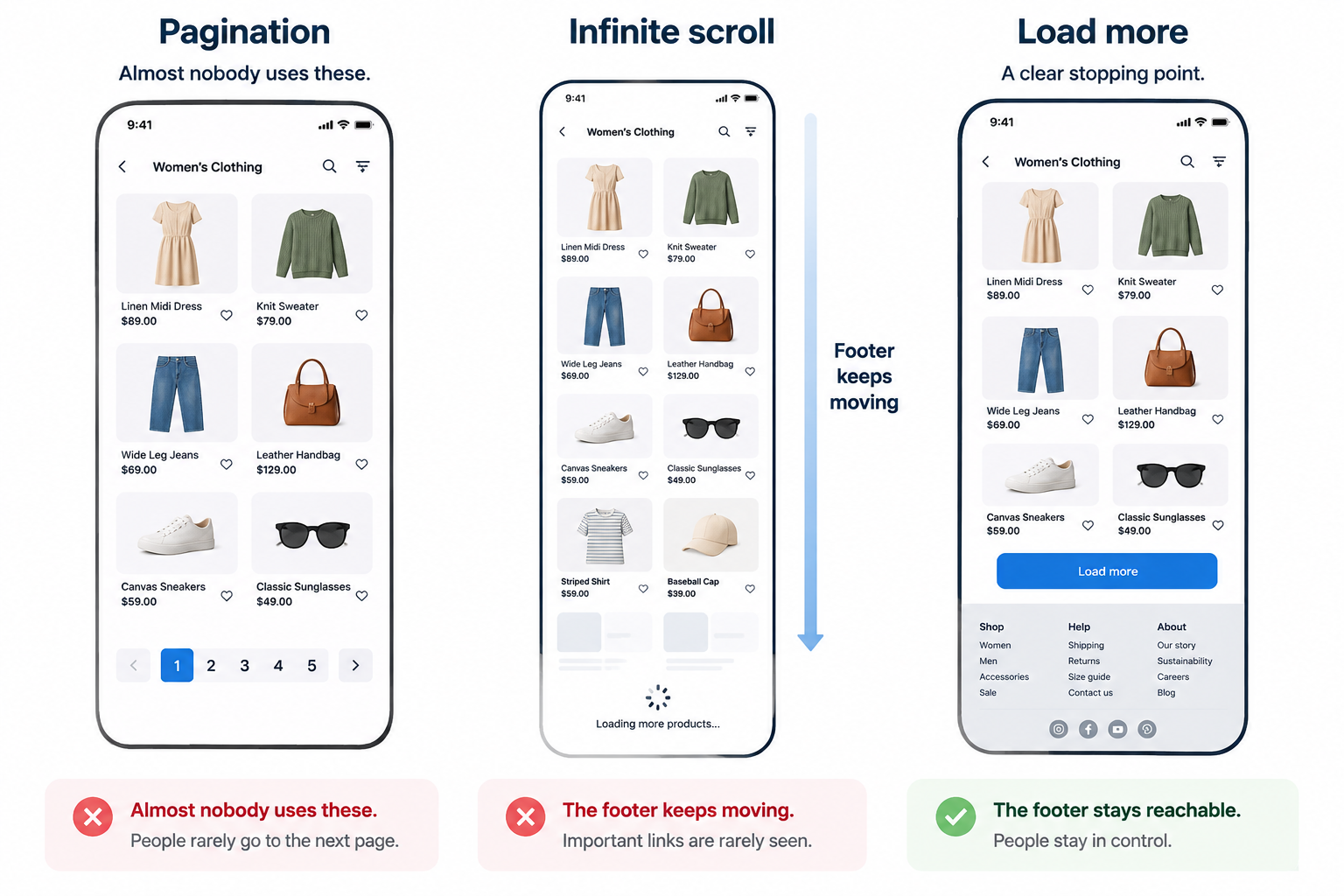
Across years of testing on leading ecommerce sites, the best-performing pattern was a “load more” button combined with lazy loading, not pagination, and not infinite scroll. The findings on each are specific.
Pagination is perceived as slow, even when it isn’t. Two related observations make it worse than it looks. Shoppers use the number of page links as a gauge of catalogue size, and a long row of numbers reads as “this will take a while”, which reduces browsing rather than encouraging it. And almost nobody uses the numbered links at all. They use Next and Previous, which means the numbers are mostly decoration with a cost.
Infinite scroll can be actively harmful, particularly on search results and on mobile. Three distinct reasons:
The footer keeps retreating as new products load, so anything in it, contact details, delivery information, size guides, policies, becomes effectively unreachable.
A shopper who opens a product and comes back loses their position in a list they can’t page back to.
And past a certain depth, people stop evaluating individual products and simply scroll. That’s engagement without intent, and it looks like success in analytics while producing nothing.
Load more fixes both. It gives a natural stopping point, keeps the footer reachable, and lets far more products sit on one page without the performance cost, because images below the fold only load as they’re approached.
The part that affects whether you get found
This is where the shopper answer and the search answer pull apart, and it’s the reason this decision deserves more attention than it usually gets.
Search engines don’t scroll, and they don’t press buttons. Google’s own guidance is explicit: its crawlers follow links in the page’s HTML and generally don’t trigger actions that require a user. So if the only route to your two-hundredth product is a shopper clicking “load more” ten times, that product may never be found, not by search engines, and not by the AI assistants that increasingly decide what gets recommended.
Four things matter, and none of them changes what the shopper sees:
Every page in the series needs a real address. Page two should exist at its own URL, reachable by a genuine link, whether or not a shopper ever sees a page number.
Each of those pages points its canonical at itself. Not at page one. This is the most common mistake in the area and it’s actively harmful: pointing every page back at page one tells search engines the deeper pages don’t matter, and the links they contain, including the only links to the products on them, lose their value.
Don’t block the deeper pages. Marking pages two onwards as not-for-indexing seems tidy and does real damage: those links eventually stop being followed at all, so the products only listed there become unreachable.
Stop implementing the old markup. The rel-next and rel-previous tags were dropped as a ranking signal years ago. If your platform emits them, that’s harmless, but they’re not a strategy, and treating them as one hides the problems that actually matter.
A practical shortcut for smaller catalogues: if a category holds fewer than a couple of hundred products, a single page showing all of them, with images loading as they’re reached, is often the cleanest answer for everyone. One address, every product visible, nothing hidden behind an interaction.
And the reason this now matters more than it did: a page that can’t be crawled can’t be cited. The same technical foundation that decides whether you appear in search results decides whether an AI assistant can see your catalogue at all.
The deciding test
Are shoppers browsing, or looking for something specific?
Looking for something specific; search results, a filtered list, any goal-directed task. They need to find a product, compare it, leave, and return to the same spot. Infinite scroll is the worst choice here; it’s where testing found the most harm.
Browsing without a target; a new-season category, a lookbook, a homepage feed. Infinite scroll does less damage, because there’s no position to lose.
Either way, load more works. That’s why it’s the recommendation: it behaves acceptably in both modes, where the other two each fail badly in one.
The default
Load more, with lazy-loaded images, around 24 to 48 products before the button, and real addresses behind the scenes.
That range is also what Google’s own ecommerce guidance suggests as reasonable, which is convenient, but the right number for you depends on how heavy each card is. Fewer for large imagery or dense specifications, more for small thumbnails. The number should be the point where a shopper deserves a pause, not a technical limit.
Three things people get wrong
Search results need different treatment from categories. A shopper scanning search results is checking whether their guess was right, then refining. Interrupting that with a button costs less than losing their position. If your theme gives you only one behavior, optimize it for category browsing and make sure search preserves position.
The URL has to survive the journey. A shopper who loaded four sets, opened a product, and pressed back should return to the same view at the same scroll position. If the page resets to the first set, you’ve lost them, and they’ll conclude your catalogue is smaller than it is. This is the same requirement filters and sorting have, and it breaks in the same place.
Filters multiply everything. Every combination of filters can generate another address. On a catalogue with several facets that runs into thousands of near-identical pages, which wastes the attention search engines give you. Decide deliberately which filtered views are worth being findable, usually a handful of high-intent ones, and leave the rest out.
How to do it in ZenBasket
Most of this decision is made by your theme. Your part is the number of products, the page weight, and confirming nothing has been made unreachable.
| What you decided | What it becomes |
|---|---|
| Shoppers should get a natural pause | A load-more control rather than continuous scroll |
| The page should stay fast | Product images loading as they’re approached |
| The footer must stay reachable | Not using continuous infinite scroll on category pages |
| A sensible number per set | The products-per-page setting on the listing |
| Every product should be findable | Real page addresses behind the scenes, worth confirming |
Do it in this order.
1. Set the number of products and test the weight. Load a category on a phone on mobile data. If it’s slow, reduce the number before changing anything else, the pattern matters far less than the seconds.
2. Check what happens at the bottom. Scroll to the end of your longest category and try to reach your own footer.
3. Test the return journey. Open a product from deep in the list and press back.
4. Then, the technical one. Ask whoever maintains your store whether page two of a category has its own address, and whether it points its canonical at itself. This is the only item on this page that needs someone technical, and it’s the one that decides whether your catalogue is visible at all.
Then check three things. Reach your own footer from the bottom of a category on a phone. Open the fifteenth product, press back, and confirm you land where you left. And count the seconds for a category page to become usable on mobile data, that number matters more than which pattern you chose.
Read next in the Help Center
- Product List Page — listing layout, how many products appear, and how they load. This is where the products-per-page decision lives.
- Customizing Sections — arranging the listing page around the product grid.
Foundation · 9 min
Grid or carousel?
· 8 min
What occupies the top of your homepage is choosing a hero format, that’s a banner decision. This page is about products: laid out, or scrolled past.
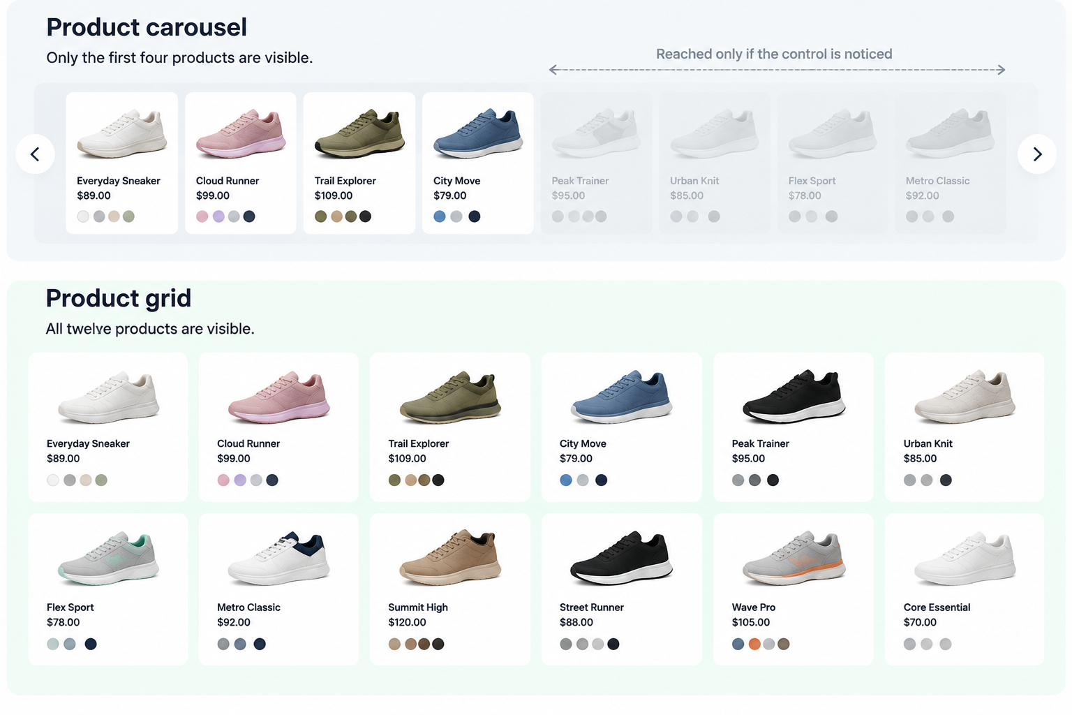
A grid shows what’s there. A carousel shows four things and hides the rest behind an interaction most people never perform. The question is whether this section is the reason the shopper is on the page.
Who does what
| The builder gives you | Both; a product grid, and a horizontally scrolling row |
| You decide | Which sections deserve vertical space, and how many products each holds |
| You maintain | Nothing. Both follow your product data |
| Behaves differently on | Mobile, where swiping is natural and arrows aren’t |
Why people choose carousels, honestly
Vertical space. A grid of twenty products is a long page; a carousel puts twenty products in the height of four. That’s the actual reason, and it’s a reasonable one, pages have to end somewhere, and a homepage with six full grids is a scroll nobody finishes.
The cost is that the products past the fourth are effectively hidden. They exist, but reaching them requires the shopper to notice a control and choose to use it. Testing consistently finds carousel controls are small, low-contrast, positioned where they’re overlooked, or have hit areas too small to use comfortably. When the control is missed, the shopper doesn’t perceive a carousel at all, they perceive a section containing four products, and move on.
Two numbers worth knowing. Carousel use among major ecommerce sites has been declining year on year. And among sites that still have one, close to half have implementations with recognized usability problems. A carousel that works is achievable, it just requires getting a long list of details right, where a grid requires getting none of them right.
The comparison
| Grid | Carousel | |
|---|---|---|
| Shows | Everything, at once | Three to five, rest hidden |
| How it’s read | Vertical scanning, how people read anyway | Horizontal interaction, learned, and optional |
| Vertical space | Grows with product count | Fixed |
| Comparing items | Easy. They’re side by side | Hard. They scroll out of view |
| On desktop | Works. Reflows to more columns on wide screens | Arrows frequently missed |
| On mobile | Two columns, scrolls naturally | Swipe is instinctive, so it works better here |
| Getting it right | Nothing to get wrong | A list of details, each of which can fail |
| Found by search | All products in the page | Usually fine, unless items load on arrow click |
Two rows there surprise people.
Carousels work better on phones than desktops. Swiping is instinctive; clicking small arrows isn’t. Most stores assume the opposite and spend their effort on the desktop version.
Grids get better on large screens and carousels don’t. A grid reflows into more columns as the window widens, a shopper on a large display can see ten products where a smaller screen showed six. A carousel shows the same four or five at every width, so the extra space produces nothing.
The deciding test
Is this section the reason the shopper is on this page?
Yes, the main category listing, search results, a “shop all” section, a collection you’ve sent advertising traffic to. Grid. These products are the point of the page, and hiding two-thirds of them behind a swipe defeats it.
No, related products, recently viewed, cross-sell, a small curated set on the homepage. A carousel is fine. The shopper isn’t here for this section, and the space it saves is worth more than the products it hides.
The secondary factor, when it’s close: how many products? A carousel holding eight to twelve is a reasonable browse. One holding thirty is a filing cabinet, and nobody reaches the end. If you have thirty products worth showing, they belong in a grid or on their own page.
The default
Grid for anything that’s the purpose of the page. Carousel for anything supporting it.
On the homepage specifically, a grid of six to eight products almost always outperforms a carousel of twenty, because six to eight actually get seen.
Five things that separate carousels that work
Always show a partial next item. A card cut off at the edge of the screen is the only affordance that reliably communicates “there’s more”. Arrows alone don’t, and a row that ends cleanly at the edge reads as the end of the set. This single detail does more than any other.
Make the controls large, visible and easy to hit. Small low-contrast arrows are the most common reason a carousel fails. If a shopper has to look for the control, most won’t.
Don’t auto-advance a product row. A banner rotating is one thing. Products moving while someone is reading a price is another, it makes the row hard to use and occasionally moves the item out from under a tap.
Cap it at eight to twelve. Past that the shopper is doing filing, not browsing.
Make it reachable without a mouse, and make it stop. Every item should be reachable by keyboard, and any movement should stop when the device’s reduce-motion setting is on. A carousel is one of the few sections that can be completely unusable for some people while looking fine.
One thing to check that nobody checks
Count the carousels on your homepage.
If three of your sections are carousels, your homepage is showing roughly twelve products where it appears to offer sixty. The page looks full and performs as though it’s nearly empty, and because each section individually seems reasonable, nobody notices the aggregate.
This is the single most common way a homepage quietly underperforms, and it takes thirty seconds to spot.
How to do it in ZenBasket
ZenBasket provides different sections for different shopping goals. The decision is not about choosing one layout everywhere, it is about matching the section to the shopper’s task.
| What you decided | What it becomes |
|---|---|
| These products are the main focus of the page | A product grid section |
| These products support another message or category | Content Rotator section |
| Shoppers need to compare many products | Full product listing page |
| Shoppers are exploring featured products | Horizontal product/content row |
Recommended setup
1. Use grids for primary product discovery. Category pages and catalogue pages should make products easy to scan, compare and filter.
2. Use Content Rotators for supporting sections. Featured products, new arrivals, collections or promotional groups are better suited for smaller product rows.
3. Keep product movement controlled. Avoid making shoppers wait for products to appear. Let them choose when to browse further.
4. Check the experience on mobile. Confirm that product rows are easy to swipe and that important products are not hidden behind unclear controls.
Read next in the Help Center
- Content Rotator (Carousel) — building horizontally scrolling rows, including the controls and how many items show at once.
- Product List Page — grid layout for category listings, and how many products per row.
- Customizing Sections — adding and arranging product sections on any page, which is where the primary-versus-supporting decision gets applied.
- Effects & Animations — movement settings, including auto-advance and how reduced motion is handled.