Foundation · 11 min
Design for mobile first, or adapt the desktop version?
· 8 min
Making individual complex sections work at every width is making complex sections work on every screen. Finding what’s already broken is where complex sections break on mobile. This page is about the order you work in, and what that order does to the result.
This is a workflow decision, not a design one, and it’s decided before you place a single section. Whichever order you work in, the store that comes out the other end is different.
Who does what
| The builder gives you | Separate desktop and mobile views, where layout, element size and spacing can each be set independently |
| You decide | Which view you design first, and whether the other one gets deliberate attention or inherits |
| You control | What survives at 360 pixels wide, which is the only real test |
| Nobody else checks | Whether the mobile version is good. Shoppers don’t report it. They leave |
The two workflows produce different stores
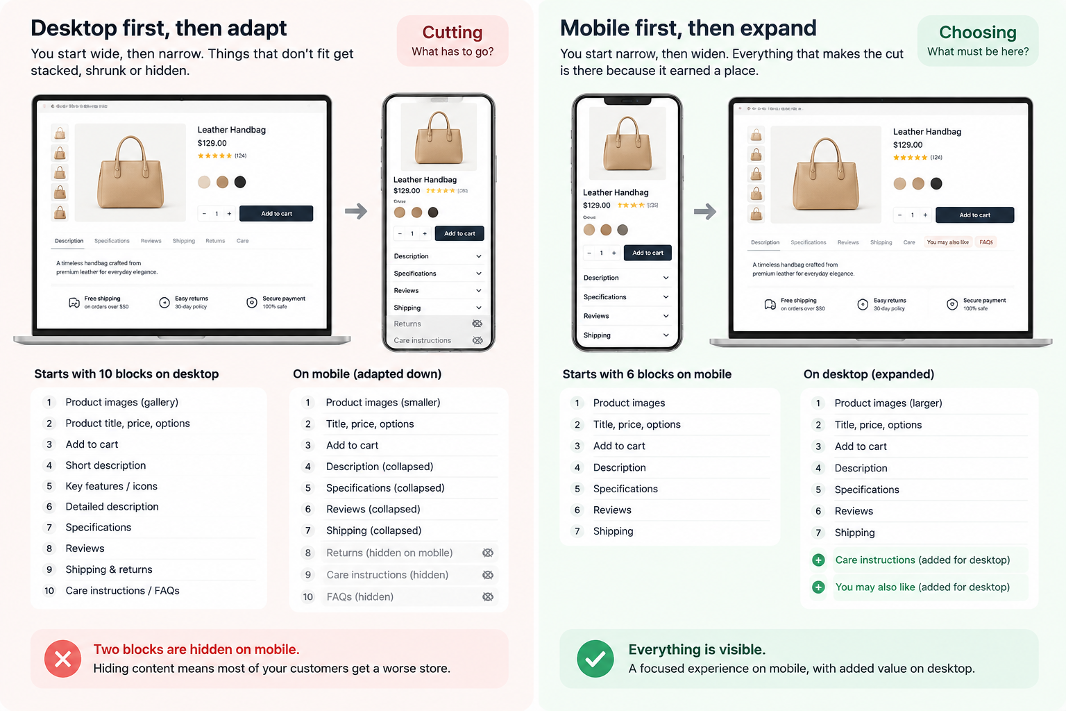
Designing desktop first, then adapting. You lay out a page with room to spare, then narrow it. Things that don’t fit get stacked, shrunk, or hidden. The questions you ask are what has to go and what can be squeezed.
Designing mobile first, then expanding. You lay out a page with severe constraints, then widen it. Everything that made the cut is there because it earned a place. The questions you ask are what must be here and what can now be added.
The difference isn’t philosophical. Cutting and choosing produce different results, even from the same starting material, because cutting starts from an assumption that everything currently there belongs, and choosing doesn’t.
That’s the whole argument for mobile first, and it has nothing to do with screen sizes. A 360-pixel-wide screen is a forcing function. It makes you decide what your page is actually for, and a decision made under constraint tends to be a better decision.
Why adapting down goes wrong in a specific way
It isn’t that the mobile version looks bad. Usually it looks fine.
It’s that the mobile version inherits desktop assumptions it can’t support.
A desktop layout can put two things side by side and let a shopper compare them. Narrowed, they stack, and now they’re sequential, which means comparison is gone even though both are present.
A desktop layout can rely on a shopper seeing a section and a sidebar at the same time. Narrowed, one comes first and one comes second, and the relationship between them is something the shopper has to remember rather than see.
A desktop layout can afford a decorative hero that pushes content down, because there’s a second screenful visible. Narrowed, that hero is the first screen, and the shopper has to scroll before learning what you sell.
None of these show up as broken. They show up as a store that works and doesn’t convert.
The cost of mobile first, stated honestly
Mobile first has a real failure mode and most advocacy for it skips over this: a store designed for a phone and then not expanded looks sparse and underconfident on a desktop.
A single column of stacked blocks at 1440 pixels wide, with large empty margins, reads as a page someone forgot to finish. And while most of your traffic is likely on phones, a meaningful share of your revenue often isn’t, desktop sessions tend to convert at a higher rate in most catalogues, because the screen supports comparison and the context supports considered purchases.
So mobile first is only half an instruction. The full version is design mobile first, then expand deliberately, treating the wide layout as its own piece of work rather than as a phone layout with more air around it.
What that expansion should add: more columns where comparison helps, content side by side where the relationship matters, and larger imagery where the product is visual. What it should not add: content that wasn’t important enough for the phone.
The deciding test
Where does your traffic come from, and where does your revenue come from?
Check both, because they usually differ, and the gap is the decision.
Traffic mostly mobile, revenue mostly mobile; grocery, food ordering, repeat purchases, anything impulsive. Mobile first and spend little time on desktop beyond making it comfortable.
Traffic mostly mobile, revenue mostly desktop, furniture, electronics, jewelry, anything considered. This is the common case and the most misread one. Mobile is where people discover and research; desktop is where they commit. Both need real work, and the mobile version’s job is to be good enough to get someone to come back on a laptop.
Traffic and revenue both desktop; B2B, wholesale, trade catalogues. Rare in consumer retail, real in some sectors. Design for the screen your customers use, whatever the general advice says. But still build the phone version properly, because that’s where your buyers look you up before they call.
The default
Design the phone layout first. Then expand it deliberately, as a second piece of work.
Not “design once and let it reflow”, which is the third option nobody chooses on purpose and most stores end up with.
What to do when the store already exists
Most people reading this aren’t starting fresh. Rebuilding mobile first isn’t realistic, so the useful version is a pass rather than a rewrite:
Open your five most-visited pages on a real phone, on mobile data. Not a narrowed browser window, the physics of touch, scrolling and rendering are all different.
On each one, write down what’s hidden. Anything present on desktop and absent on the phone is either unnecessary on both, or missing from the version most of your customers see. There is no third possibility.
Then write down what you had to scroll past to reach the thing the page is for. That’s your inherited desktop assumption, and moving it is usually a five-minute change.
Two passes, an hour, and it gets you most of the benefit without rebuilding anything.
How to do it in ZenBasket
The builder holds separate views for desktop and mobile, and this decision is really about which one you fill in first and which one gets your attention.
| What you decided | What it becomes |
|---|---|
| The phone layout is the real one | Building in the mobile view first, then switching to desktop |
| Desktop deserves its own work | Adjusting layout, element size and spacing separately in the desktop view |
| Nothing should be hidden from phone shoppers | Checking each section appears in both views |
| Spacing shouldn’t just shrink | Setting spacing per device rather than accepting the inherited value |
| Sections should be reorderable | Moving sections so the important one is first on a phone |
Do it in this order.
1. Start in the mobile view and build the page there. Place only what has to be on the page. This is the constraint doing its work, and it’s the entire point of the exercise.
2. Switch to the desktop view and expand. Widen sections, add columns where comparison helps, increase image sizes. Treat this as a second design task rather than a check.
3. Set spacing per device rather than letting it inherit. Padding that looks generous on a wide screen wastes most of a phone screen, and the two values should be chosen separately.
4. Reorder sections for the phone if the priority differs. On a phone the order is literal, whatever is first is what they see. On desktop, things sitting side by side are seen together.
5. Publish and check on an actual phone. The builder’s preview is accurate about layout and not about everything else.
Then check three things. On a real phone, open your homepage and count the seconds until you can tell what you sell. Try to scroll sideways on every page, if anything moves, one element is too wide. And set your phone’s text size to its largest and reload, which is the fastest way to find layout that only works at one size.
Read next in the Help Center
- Getting Started — the builder workspace, including how the desktop and mobile device views work and how to switch between them. Start here if you haven’t used the device views before.
- Layouts — structuring and organizing pages, which is where the mobile-first order actually gets applied.
- Customizing Sections — section layout, spacing and background, all of which can be set separately per device.
- Working with Elements — adding, moving and resizing elements, including per-device sizing.
- Adding New Section — inserting sections and positioning them, which is how you reorder for the phone.
Your theme has its own guide. How much each section adapts on a phone differs between themes. Find yours in the Paid Themes or Free Themes list in the Help Center.
Foundation · 12 min
Hamburger menu, visible items, or both?
· 8 min
The desktop menu decision, whether a category needs a full panel or a simple submenu, is mega menu or simple menu. What belongs in a header is header anatomy. This page is about how shoppers navigate on a phone.
The hamburger icon is universally recognized, and recognition isn’t the same as use. People don’t tap what they can’t see, and on a phone, navigation taps are one of the clearest predictors of whether a session goes anywhere.
Who does what
| The builder gives you | A menu that can be set to display as a horizontal bar or as a hamburger |
| You decide | How many categories are visible without a tap, and what the drawer contains |
| You control | The order of your top-level categories, which decides what the visible ones are |
| Worth knowing | A mega menu doesn’t appear on phones at all. Whatever you build there, mobile shoppers get the drawer |
The evidence, and what it does and doesn’t say
Hidden navigation reduces discoverability and increases the time it takes to complete a task. That finding has held up across years of usability research, and the mechanism is straightforward: a shopper who doesn’t know what’s behind an icon has no reason to tap it.
Several large consumer apps have measured the same thing directly, moving from a hamburger to visible navigation and seeing substantial increases in how often people navigate at all.
But the conclusion people draw from this is usually too strong. The finding isn’t that hamburger menus are bad. It’s that hidden navigation shouldn’t be the default when there’s room to show something. A hamburger is a reasonable container for secondary links. It’s a poor container for your entire catalogue.
Which points at a third option that most stores skip.
Three options
| What it is | Cost | |
|---|---|---|
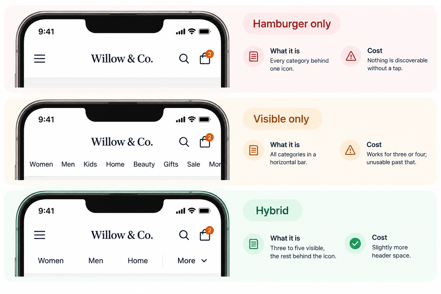
| Hamburger only | Every category behind one icon | Nothing is discoverable without a tap |
| Visible only | All categories in a horizontal bar | Works for three or four; unusable past that |
| Hybrid | Three to five visible, the rest behind the icon | Slightly more header space |
The hybrid is what current usability guidance recommends for most consumer sites, and it’s the option that gets skipped because it looks like a compromise. It isn’t. It’s a recognition that your categories aren’t equally important, three of them probably account for most of your sales, and those three can be visible while the long tail sits behind the icon.
The deciding test
How many top-level categories do you have, and do shoppers arrive knowing what they want?
Three or four categories, show them all. There’s room, and a hamburger for three items is hiding something for no reason.
Five to eight, hybrid. Show your three or four best-selling categories; put the rest behind the icon. The choice of which three is a merchandising decision, not a design one, and it should be made from your sales data.
More than eight, hybrid, and also look at your category structure. If your top level genuinely needs more than eight entries, the problem may be that some of them are filters rather than categories.
Shoppers arrive knowing exactly what they want, spare parts, consumables, repeat purchases. Prioritize search over the menu entirely. A prominent search field does more than any menu arrangement, and a large share of mobile shoppers reach for search first regardless.
The default
Hybrid: three to five visible categories, chosen by sales, plus a hamburger for everything else. Search visible at all times.
The drawer itself
Most of the effort goes here, because once someone has tapped the icon, the drawer is your entire navigation.
Full-screen or a proper slide-in panel, not a small dropdown. A dropdown containing twenty links in a phone-width column is a scroll inside a scroll.
Keep the same depth you have on desktop. A drawer that flattens three levels into two has lost part of your catalogue. Simplify how it’s presented, one level at a time, with a clear way back, never what it contains.
Level by level, not everything at once. A drawer showing every category and subcategory in one long list is a wall. Show top-level categories; tapping one reveals its children with a visible route back.
Tap targets around 44 to 48 pixels, with space between them. A dense list of links at body-text size produces mis-taps, and a mis-tapped category costs a page load and a return journey.
Put the close control where a thumb reaches it. Top-right on a large phone is at the edge of comfortable reach; consider a close affordance lower down as well, or make tapping outside the drawer close it.
Keep the position consistent across every page. Navigation that moves breaks the muscle memory shoppers build in the first few pages, and that muscle memory is doing a lot of quiet work.
Two things to get right around the menu
Search should be visible, not hidden behind an icon. On mobile the header is crowded and search is often the first casualty, which is backwards, search is where high-intent shoppers go first. If header space is genuinely tight, a persistent icon in the header is acceptable. Inside the menu drawer is not.
Show which section they’re in. A shopper who tapped into a category and then scrolled has no way of knowing where they are unless you tell them. This is the same point as on desktop and it matters more on a phone, because there’s no persistent menu bar providing context.
What about a bottom bar?
Some stores use a fixed bar at the bottom of the screen with four or five destinations, borrowing the pattern from apps. It sits in the natural thumb zone, which makes it genuinely easier to reach than anything in the header, and app-like stores with frequent repeat visits do well with it.
Two cautions. It’s a different pattern from a menu and needs its items chosen as destinations rather than categories; home, search, cart, account, and one more. And it’s another thing permanently occupying screen space, so it has to be counted alongside a sticky header, a cookie notice and anything else that stays put.
It isn’t a standard menu type, so treat it as a design choice for the header and footer area rather than a setting.
How to do it in ZenBasket
The menu element can display as a horizontal bar or as a hamburger, and the header can be arranged separately for mobile.
| What you decided | What it becomes |
|---|---|
| Show three categories, hide the rest | Ordering your menu items so the important ones come first, and arranging the mobile header to show them |
| The rest go behind the icon | The hamburger menu type for the secondary set |
| Panels should open on tap | The submenu trigger set to click rather than hover |
| Shoppers should see where they are | The active item and active submenu colors, which default to looking like everything else |
| Search should stay visible | A search element placed in the header rather than inside the drawer |
| Mega menus won’t help here | Accepting that your mega menu is desktop-only, and building the drawer properly |
Do it in this order.
1. Order your top-level categories by sales, not by habit. This is the decision. Everything else is arrangement.
2. Set the trigger to click rather than hover. Hover doesn’t exist on a touchscreen, and a click trigger makes desktop behave the same way as mobile, one behavior to test instead of two.
3. Arrange the mobile header. The header can hold elements separately for mobile, so the visible categories, search and cart can be positioned for a phone rather than inherited from the desktop arrangement.
4. Set the active state colors. They default to looking like every other item, and this is a two-minute change that removes a persistent, quiet disorientation.
5. Check the drawer contains your full structure. If your desktop menu has three levels and the drawer has two, something is missing for your largest group of customers.
Then check three things, on a real phone. Open the menu and tap the category that sits furthest from your thumb, if you have to shift your grip, reconsider the arrangement. Tap into a category and confirm you can see which one you’re in. And count how many taps it takes to reach a specific product from the homepage; more than three, and the structure needs looking at rather than the menu.
Read next in the Help Center
- Navigation Menu — creating and customizing menus, including the horizontal and hamburger display types, the submenu trigger, and the active state colors. Start here.
- Header Customization — the header area including logo, navigation and menus, which is where the visible-categories decision gets applied.
- Adding Elements in Header, Footer Page — placing menus, icons and widgets in the header, including arranging them for mobile.
- Search Bar Customization — the search field’s appearance, placement and behavior, which decides whether high-intent shoppers find it.
- Search Variants — adding a product search bar and customizing how it looks and behaves.
- Stepper — presenting hierarchical content such as category paths as a stepper or tree view, which is one route to a level-by-level drawer.
Your theme has its own guide. Mobile header and drawer behavior differ between themes. Find yours in the Paid Themes or Free Themes list in the Help Center.