Foundation · 2 min
Who does what
| The website builder gives you | All three options below, chosen separately for each menu item |
| You decide | Which items need a panel, whether it opens on hover or click, and how the current section is marked |
| You maintain | A mega menu is a panel you design. New categories don’t appear in it by themselves |
| Doesn’t apply on phones | Mega menus aren’t shown on mobile. Shoppers there get the drawer instead |
Foundation · 2 min
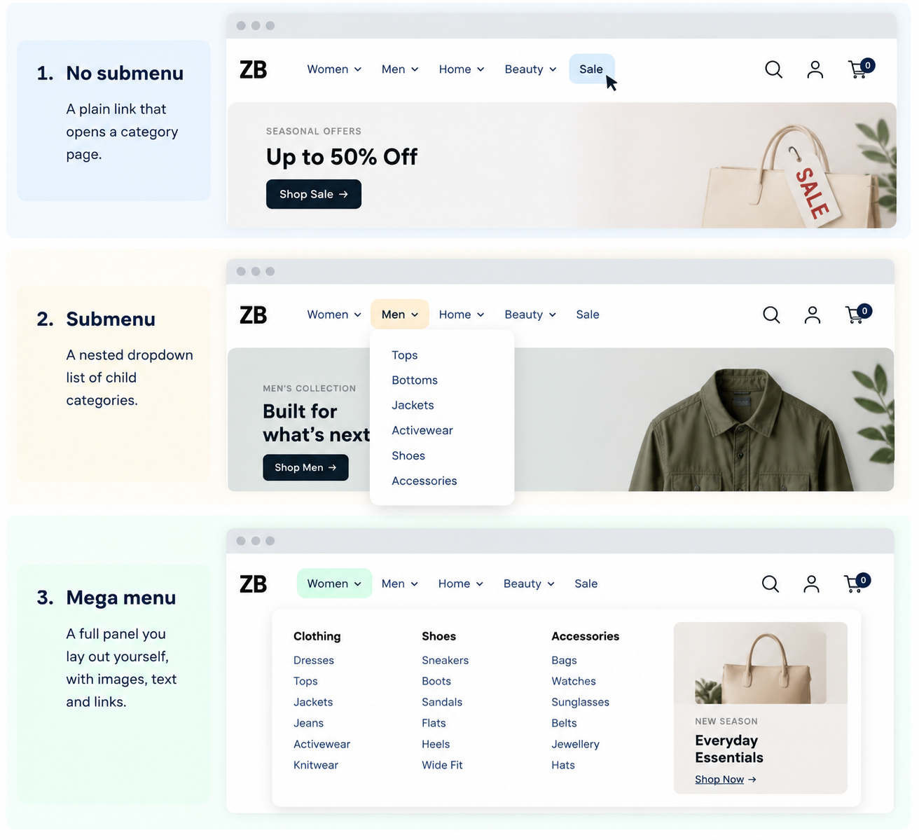
It’s three options, and you choose per item
The first thing to know is that this isn’t one decision for your whole menu. Each top-level item is decided separately; so “Women” can open a full panel while “Sale” stays a plain link.
| What it is | Updates itself? | |
|---|---|---|
| No submenu | The top-level item links straight to a category page | n/a |
| Submenu | A nested dropdown list of child categories | Yes |
| Mega menu | A panel you lay out yourself, with images, text and links | No |
That last column is the part most stores discover too late. A submenu reflects your categories. A mega menu is a designed panel, so a category you add next month won’t appear in it until someone puts it there.
Foundation · 2 min
What’s really being decided
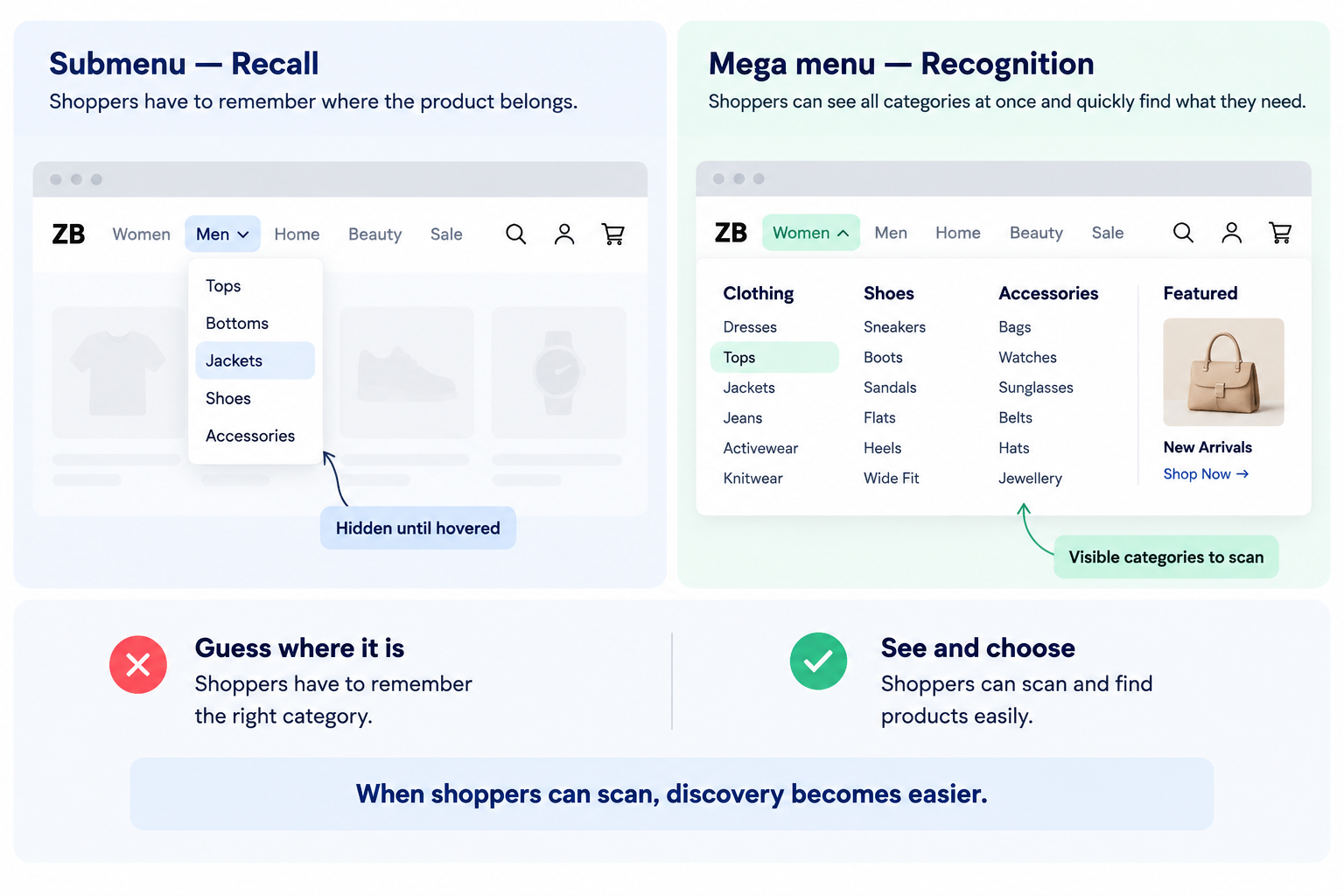
A submenu shows one column of child categories when a shopper opens a parent. To find something, they have to guess which parent it lives under, open it, read, and, if they guessed wrong, back out and try again.
A mega menu shows several groups at once, under headings.
The difference is recognition versus recall. A mega menu lets someone scan and spot the word they wanted. A submenu asks them to predict where you filed it. When their mental model matches yours, submenus are fine. When it doesn’t, they hunt, and each wrong guess costs a moment of doubt about whether you stock the thing at all.
That’s the whole trade. Everything else is detail.
Foundation · 2 min
The comparison
| Submenu | Mega menu | |
|---|---|---|
| Shows | One parent’s children at a time | Several groups at once |
| Asks the shopper to | Guess correctly first time | Scan and recognize |
| Suits | Narrow catalogues, obvious categories | Broad catalogues, overlapping categories |
| Breaks when | A shopper’s mental model differs from yours | It grows past roughly 30–40 links and becomes a wall |
| Maintenance | None, it follows your categories | Real. Someone updates it by hand |
| On mobile | Becomes part of the drawer | Not shown at all |
Foundation · 2 min
The test that decides it
Can a shopper see every child in one category without scrolling?
If your top level is six categories and each has four or five children, a submenu shows all of them in one comfortable column. It works, and a mega menu would be a large panel displaying very little.
If any parent has more than about ten children, a submenu either scrolls or truncates, and both are failures. That’s the point a mega menu starts earning its complexity.
Two secondary factors, for when the first is close:
Do your categories overlap? If a shopper could reasonably expect “waterproof jackets” under two parents, showing both at once solves a problem your taxonomy created. Submenus make overlap expensive.
Do people browse, or search? Catalogues where shoppers arrive knowing the product lean on search, and the menu matters less. Catalogues where people arrive to explore need the structure visible.
Foundation · 2 min
The default
Start with submenus. A mega menu is a fix for a problem most stores don’t have yet, and it brings maintenance nobody budgets for.
Add a mega menu to a single item when you can name the reason, a parent that no longer fits one column, or search logs showing people looking for things your menu already contains. You don’t have to commit the whole bar.
Foundation · 2 min
Hover or click?
Both submenus and mega menus can open either way, and this is a real decision rather than a preference.
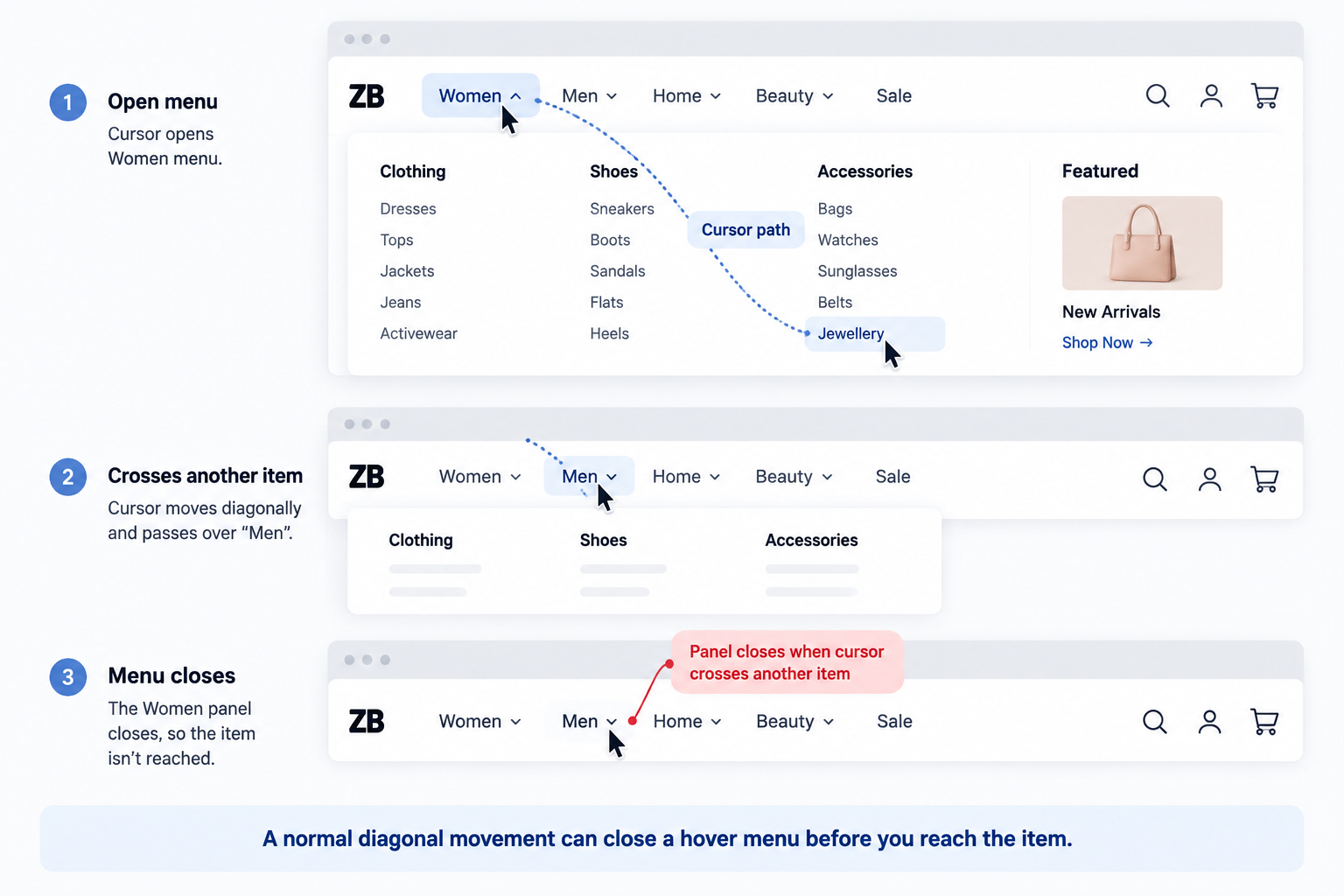
Hover feels faster and has one specific failure. A shopper moving diagonally toward the item they want passes over neighboring categories on the way, and the panel they were aiming at closes under the cursor. They usually try twice.
Click has no equivalent failure. One tap opens it, it stays open until dismissed, and it behaves exactly like the tap mobile shoppers already get.
Use hover for short submenus, click for mega menus. The bigger the panel, the more expensive an accidental close, and the longer the diagonal someone has to travel to reach the far column.
Foundation · 2 min
Show people where they are
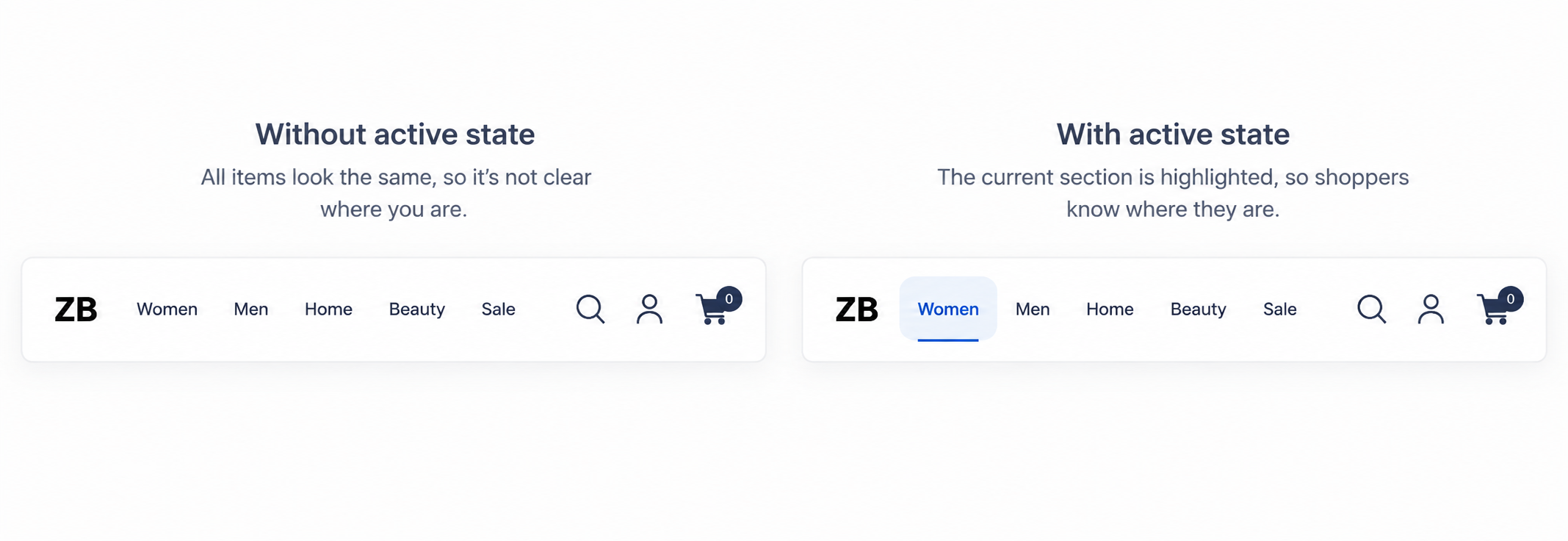
Around two-thirds of ecommerce sites give no indication of which section a shopper is currently in. It’s among the cheapest fixes available and one of the most commonly skipped.
Menus carry a separate color for the current item and for the current submenu item, plus an optional decorative underline on the active section. All of them default to looking like everything else until you change them.
Set these before launch. It takes two minutes and it removes a quiet, persistent disorientation, particularly for the large share of shoppers who arrive on an internal page from a search result rather than your homepage.
Foundation · 2 min
If you build a mega menu
Four things separate the ones that work from the ones that don’t.
Group under headings, always. A mega menu without headings is a submenu that got bigger, more options, no more help.
Cap it. Past roughly thirty to forty links, shoppers stop reading and go to search instead. If yours exceeds that, the problem is your category structure rather than your menu.
Put your real categories in it. Because the panel is designed by hand, it’s easy to fill with campaign links and seasonal promotions and end up with a menu that doesn’t show what you sell. The main navigation’s first job is to display your product categories.
Decide who updates it. Every new category, every renamed one, every discontinued range. If nobody owns that, the menu drifts out of step with the catalogue within a season, and a menu that’s wrong is worse than one that’s plain.
Foundation · 2 min
Remember the mobile split
Mega menus don’t appear on phones at all. Mobile shoppers get the drawer whatever you build on desktop.
So every hour spent designing a mega menu is an hour spent on desktop shoppers only. Given where most store traffic now comes from, that’s worth knowing before you start rather than after.
If your phone traffic dominates and your desktop traffic is thin, the honest answer to this whole decision may be: use submenus and spend the time on the drawer instead.
Foundation · 2 min
How to do it in ZenBasket
Every choice on this page becomes a setting on an individual menu item, so the work is done per item rather than once for the whole menu.
| What you decided | What it becomes |
|---|---|
| This category needs its structure shown | A mega menu on that one item |
| This category has four or five children | A submenu on that item |
| This is a destination, not a parent | Leave it as a plain link |
| Panels should open on click | The submenu trigger, set once for the menu |
| Shoppers should see where they are | Active color, active submenu color, and the underline on the current section |
Do it in this order. Set the trigger and the active state first, because they apply to the whole menu and are quick. Then add submenus, which follow your categories and need no layout work. Add mega menus last, and only to the items that failed the scrolling test, each one is a panel you lay out by hand, and it’s the only part that carries ongoing work.
Then check three things. Open the menu five times on a desktop and see whether the trigger still feels right. Load the store on a phone and confirm the drawer shows everything a desktop shopper gets. And click into a category to confirm the active state actually marks it.
Read next in the Help Center
-
Navigation Menu — adding menu items, attaching submenus and mega menus, trigger and active state settings.
-
Header Customization — where the menu sits in the header, and the mobile drawer.