Foundation · 7 min
Tabs or accordions on product pages?
What belongs on a product page and in what order is product page information hierarchy. How to write the content is product descriptions. This page decides how that content is packaged once it’s written.
Before choosing between them, answer the question sitting underneath both: should this content be hidden at all? Most product pages hide something the shopper needed, and nobody finds out because the shopper simply leaves.
Who does what
| The builder gives you | Both, a tab element and an expandable panel element, usable anywhere on a page |
| You decide | What stays visible, what goes behind a control, which control, and what opens by default |
| You maintain | Nothing. Both follow your content |
| On phones | Tabs degrade. Accordions behave identically at every width |
The decision before this one
Anything placed behind a tab or an accordion is read by far fewer people than the same content sitting open on the page. That’s the trade, and it should be made deliberately rather than inherited from a theme.
The evidence on tabs specifically is unusually clear. Large-scale usability testing has found that content held in horizontal tabs on product pages is routinely overlooked, shoppers scroll past the tab strip without registering that it contains anything, then report the site “doesn’t say” something that was two clicks away the whole time. It happens across mass-market retail, direct-to-consumer and B2B alike, and roughly a quarter of tested users miss tabbed content entirely. Around 28% of ecommerce sites still use the pattern as their main product-page layout.
So sort your content into two piles before you pick a control.
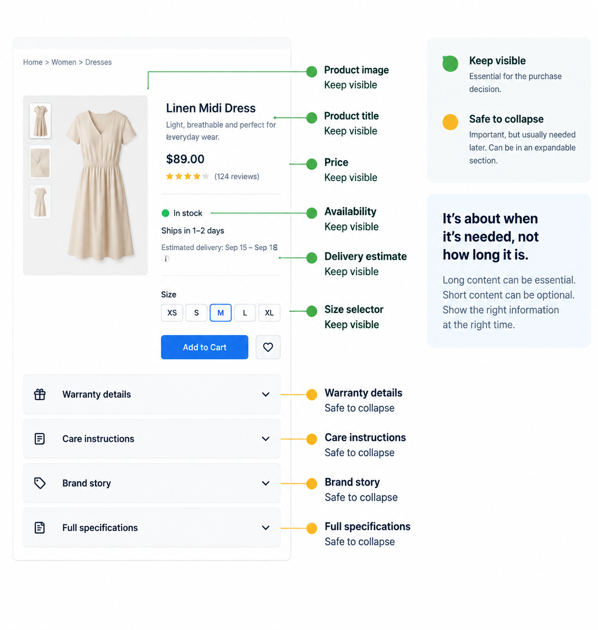
Needed to decide. Price, availability, delivery date, returns window, sizing, and the two or three specifications that separate this product from the near-identical one on the next tab of the shopper’s browser. These stay visible. Hiding them doesn’t tidy the page, it removes the reason to buy.
Needed after deciding, or by some people only. Full specification tables, care instructions, warranty terms, compatibility lists, the brand story. This is what tabs and accordions exist for.
If everything on your page falls in the first pile, you don’t need either control. That’s a legitimate outcome and more common than stores expect.
The third option most stores skip
There’s a version of this that isn’t tabs or accordions at all, and it outperforms both: structure the content instead of hiding it.
A description broken into short labelled highlights, three to five lines, each starting with the thing it’s about, gets read more than the same words in a paragraph, and more than the same words behind a control. It’s one of the largest gaps between what tests well and what stores actually do; the large majority of ecommerce sites don’t structure descriptions this way.
The practical version: put your five most decision-relevant facts as scannable highlights directly under the buy section, then collapse the long-form detail below. You get the benefit of a tidy page without paying for it in missed information.
The comparison
| Horizontal tabs | Accordions | |
|---|---|---|
| Shows | One panel at a time, others behind labels | Any number open at once |
| Reading model | Notice the strip, pick a section, read | Scroll, and expand what looks relevant |
| Signals there’s more | Weakly. The strip is easy to scroll past | Clearly. Every heading appears in the scroll |
| On mobile | Labels wrap or scroll sideways, hiding their own existence | Identical to desktop |
| Comparing two sections | Requires switching back and forth | Open both |
| Discovery in testing | Routinely overlooked | Found more reliably |
| Testing burden for you | Two behaviors to check | One |
The deciding test
Would a shopper ever want two of these sections open at once?
If yes, comparing the size guide against the specifications, reading care instructions while looking at the materials, accordions. Tabs turn that into a back-and-forth, and shoppers usually don’t bother; they make the decision on partial information or leave.
If the sections are genuine alternatives that would never be read together, tabs are defensible. On product pages that’s rarer than people assume. It fits things like “Delivery within India / International delivery” and very little else.
Two secondary factors when the first is close:
How many sections? Past about four, tab labels start wrapping or scrolling, and a tab strip that scrolls sideways conceals the fact that more tabs exist, which is the worst possible outcome for a navigation control. Accordions have no equivalent ceiling.
How much of your traffic is mobile? Tabs are a desktop pattern that degrades on small screens. Accordions are one pattern that works everywhere, which also means one thing for you to test rather than two.
The default
Accordions, with your deciding facts already visible above them, and the most-needed section open.
They behave the same at every width, they let people open two sections at once, and every heading stays in the scroll so nobody has to notice a label to know the content exists.
Use tabs only when you can name two sections a shopper would never want side by side.
Five things to get right
Label by content, not by category. “Size & fit” beats “Details”. “Delivery & returns” beats “More information”. A shopper scanning for whether something runs small should be able to tell from the heading alone, without opening anything.
Never collapse everything. A page that is five closed accordions and nothing else looks empty and tells a shopper nothing about what’s inside. Leave the most-needed section open by default, usually sizing for apparel, specifications for electronics, ingredients for beauty and food.
Put the important content early in the page, not just early in the panel. AI shopping assistants frequently truncate long pages when reading them. Facts that appear near the top of the page have a materially better chance of being seen than the same facts three accordions down.
Check your panels contain their content before they’re opened. If the text only arrives when someone clicks, search engines and AI assistants may never read it, which means the specifications you carefully wrote aren’t working for you in search at all. Content that’s present but visually collapsed is generally fine; content that loads on click is not.
There’s a longer-running debate about whether collapsed content is weighted as heavily as visible content in search rankings, and it has never been settled. Several practitioners report measurable ranking improvements after making previously collapsed content visible. Treat that as a reason to keep your most valuable content out of panels, rather than a reason to avoid panels altogether.
Make them reachable without a mouse. Both patterns need to open and close from the keyboard, and to announce to a screen reader whether a section is currently open. Accordions are the simpler of the two to get right, which is another quiet argument in their favor.
How to do it in ZenBasket
This decision becomes two things: where the content lives on the product page, and which element holds it.
| What you decided | What it becomes |
|---|---|
| These facts decide the purchase | Text sitting directly under the buy section, not in any panel |
| These five facts are the highlights | A short list, still visible, above everything collapsed |
| This content is needed after deciding | An expandable panel |
| This section should be open when the page loads | The default-open setting on that panel |
| These two sections are genuine alternatives | A tab element, the only case where tabs are the right choice |
Do it in this order. Start by moving the deciding facts up, out of any panel. That single change usually does more than anything else on this page and costs nothing. Then write the highlights. Then collapse what’s left, and set one panel to open by default. Adding the panels first is the common mistake, it makes it easy to leave something essential inside one.
Then check three things. Load your product page on a phone and confirm the deciding facts are visible without opening anything. Confirm one panel is open when the page loads, so the section doesn’t look empty. And view the page source or use a text-only view to confirm the collapsed content is actually present rather than loading on click, that’s what decides whether search engines and AI assistants can read it.
Read next in the Help Center
- Expandable Panels — adding accordions and setting which one opens by default.
- Switchable Panels (Tab) — adding a tab element and styling the labels.
- Product Details Page — where these sit within the product page layout.
- Product Specification — entering the specification data these panels display.
Foundation · 7 min
Cart drawer or cart page?
What belongs in a cart, and how the totals should read, is in the cart and checkout guide and order summary design. This page decides what happens the moment someone adds to cart.
This gets framed as drawer versus page. It isn’t. You need a cart page either way, what you’re choosing is what happens immediately after Add to Cart, and the honest answer depends on your device split.
Who does what
| The builder gives you | A prebuilt cart page you can customize like any other page |
| Your theme decides | Whether a drawer opens on add-to-cart, and how it behaves |
| You decide | Which theme, how the cart page is laid out, and what the drawer contains |
| You test | The add-to-cart moment on a phone, with two items, using the back gesture |
The cart is doing two jobs, not one
This is the part most advice misses, and it explains why the argument never resolves.
Job one: confirming the add. A shopper taps Add to Cart and needs to know it worked, what went in, and what it costs. That takes a second and it should not interrupt browsing.
Job two: reviewing before checkout. A shopper has finished choosing and wants to check quantities, apply a code, see the delivery cost, and commit. That deserves a full page with room and focus.
A drawer is very good at the first job and mediocre at the second. A cart page is the reverse. Trying to make one do both is what produces the frustrating versions of each.
There’s a third thing the cart does that stores consistently underestimate: a large share of shoppers use it as a shortlist. They add things they’re comparing, or saving for later, with no immediate intent to buy. That behavior needs a persistent cart page they can return to across sessions, not a panel that closes.
What can happen after Add to Cart
| What it does | What it costs | |
|---|---|---|
| A small confirmation | Cart count updates, a brief message appears | Some shoppers don’t notice it worked and add twice |
| A drawer slides in | Shows what was added, subtotal, a route to checkout | Takes over part, or on a phone, all, of the screen |
| The page navigates to the cart | Full focus on the basket | Ends the browsing session |
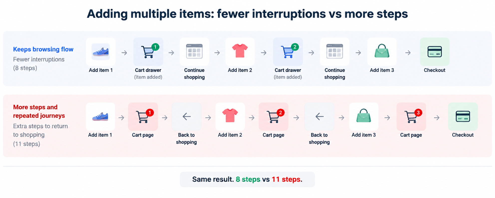
The third is where multi-item stores lose money quietly. A shopper building a five-item basket makes five round trips, and each return journey is a chance to decide they’re finished.
The deciding test
How many items does a typical order contain, and where do your shoppers browse from?
Multi-item, mostly desktop; grocery, fashion, consumables, anything with accessories. A drawer earns its place. It confirms the add, shows progress toward a free-shipping threshold, and leaves the shopper exactly where they were.
Multi-item, mostly mobile; be careful. On a phone a full-height drawer covers the entire screen, hides your navigation, and can only be dismissed by finding a small close control. At that point it’s a cart page with fewer options and no back button. A brief confirmation, with the cart reachable from the header, often serves better.
Usually single-item, furniture, electronics, jewelry, made-to-order. Navigating to the cart is defensible and sometimes better. The shopper has finished choosing, and a focused page carrying delivery, returns and a clear next step beats a panel.
Check your actual average items per order before deciding. Most stores guess higher than the truth.
A note on the evidence
Much of the published data comparing drawers and pages comes from companies that sell drawer apps, and it is uniformly favorable to drawers. Treat the specific percentages with caution.
What does hold up across independent sources is narrower and more useful: removing an unnecessary page load between browsing and continuing helps, and taking over a small screen hurts. Which of those dominates depends on your device split, which is exactly why the honest recommendation is a hybrid rather than a rule.
The default
A drawer on desktop, a brief confirmation on mobile, and a full cart page always reachable from the header.
If your theme only offers one behavior for both, choose based on where the majority of your traffic actually is, not where you do your own testing.
If you use a drawer, it needs six things
A drawer that only says “added to cart” is a notification wearing a cart’s clothes.
- What was added; image, name, and the variant they chose. Not just a count.
- The subtotal, updating live.
- Quantity editing, so a mistake is fixed without leaving.
- Continue shopping as a real control, not only an X in the corner.
- Checkout as the clear primary action.
- A link to the full cart page, for anyone who wants room to think.
Progress toward free shipping belongs here if you offer it. “Add $5 more for free delivery” at the moment someone has just added something is the single most effective thing a drawer can carry, and it’s the one genuine advantage a drawer has over a confirmation message.
Keep recommendations restrained. A drawer is a good moment for one complementary item. Three turns a confirmation into an advert, and the shopper closes it.
The mobile problem, specifically
On a phone, a full-height drawer and a real page are almost indistinguishable to the shopper, except the drawer has no back button, and back is what they will reach for.
Three ways out, in order of preference:
Make the drawer partial height, so the page stays visible behind it and the relationship is obvious.
Wire the back gesture to close it, so the instinct works.
Use a confirmation instead on mobile, with the cart icon showing the count.
A full-screen drawer that back-gestures out of the store entirely is the worst version of this pattern, and it is common. Test it before launch, on a real phone.
Whatever you choose, the cart page still matters
Because shoppers return to it. Because it’s where codes get applied and delivery gets calculated. Because express payment buttons sit well there. And because a persistent cart that survives a closed browser is one of the cheapest retention mechanisms you have.
A drawer is an addition to a good cart page, never a replacement for one.
How to do it in ZenBasket
This is the one decision on this page where the theme does most of the deciding. Your work splits into what you control directly and what you choose by choosing a theme.
| What you decided | What it becomes |
|---|---|
| Shoppers should stay in the flow after adding | A theme whose drawer behaves well, check before committing to it |
| A confirmation is enough | A clearly visible cart icon with a live count in the header |
| The cart page needs room to work | Laying out the prebuilt cart page like any other page |
| Shoppers should be able to come back to it | A cart link always visible in the header, not only after adding |
| Abandoned baskets are worth recovering | Abandoned cart recovery, switched on |
Do it in this order. Test the drawer behavior on your shortlisted themes before you pick one; it’s the part you can’t change later without changing theme. Then lay out the cart page, because it’s the destination whatever else happens. Then make the cart icon and count unmistakable in the header. Recovery last, once the basics work.
Then check three things, all on a phone. Add two items in a row and count how many taps it takes. From an open drawer, use the phone’s back gesture and confirm you land back in the store rather than out of it. And confirm the cart page shows the delivery cost before the pay button, not after.
Read next in the Help Center
- Add & Switch Pages — the prebuilt cart page, and switching to it to edit.
- Header Customization — the cart icon and its count, which is what makes a confirmation work.
- Abandoned Cart — recovering the shoppers who leave one behind.
Foundation · 7 min
Static hero, slider or video hero?
What the homepage as a whole should do is the homepage guide. This page decides one thing: what occupies the top of it.
If you’re choosing between these because you have three messages and one slot, the format isn’t the problem. Nobody decided which message matters, and a slider is where that decision goes to be avoided.
Who does what
| The builder gives you | All three; a static image, a slider element, and video as a section or a background. |
| You provide | The photography or footage. This is most of the real cost. |
| You decide | How many messages compete for the top of your homepage. |
| You pay in | Page weight. The hero is usually the largest thing a visitor downloads. |
What the data actually says about sliders
The most-cited measurement of carousel interaction tracked real click behavior across five sites. The headline numbers:
- On the largest site, only about 1% of visitors clicked a slide at all
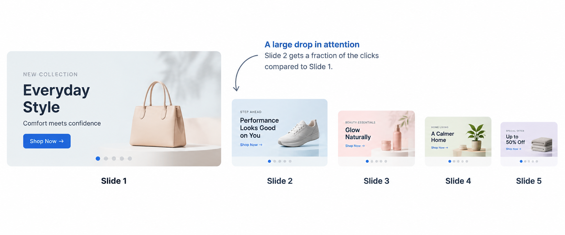
- Of those who did, roughly 84% clicked the first slide. Everything else split the remainder
- On four smaller, more targeted sites, click rates were higher, but the first slot still took between 48% and 62% of all clicks
- The site with the fewest slides had the most even distribution of clicks
Two honest caveats, because this study gets over-quoted. It was conducted on university websites rather than ecommerce stores, and it’s over a decade old. And one finding cuts against the simple conclusion: the single auto-rotating site in the set had the highest overall click rate, though its audience differed too.
What has been replicated consistently since, in ecommerce and elsewhere, is the shape rather than the exact figures: the first slide takes most of the attention, later slides take very little, and fewer slides distribute attention more evenly.
There are two reasons, and both are worth understanding because they explain when a slider can work.
Rotation interrupts reading. A shopper part-way through slide one has it replaced. Some read faster than the rotation; most disengage.
It looks like an advert. People have learned that a large rotating banner at the top of a page is promotional, and their eyes skip the region the same way they skip display advertising. Once that pattern-match happens, better design inside the banner doesn’t help.
The comparison
| Static | Slider | Video | |
|---|---|---|---|
| Messages carried | One, clearly | One, plus several that aren’t seen | One, with atmosphere |
| Page weight | Lightest | Multiplied by slide count | Heaviest by a wide margin |
| Production cost | One strong image | Several images, consistently art-directed | Footage, editing, and a poster image |
| First impression speed | Immediate | Immediate, then interrupted | Slowest unless a poster image is set |
| Reduced motion | Fine as-is | Needs rotation to stop | Needs a static fallback |
| Main risk | Bland, if the image is weak | Nobody reads past slide one | Slow first load, especially on mobile data |
The deciding test
Do you have one message, or several?
One; a season, a proposition, a category you want to lead with. Use a static hero. It loads fastest, it reads clearly, and every visitor sees the whole of it.
Several; that’s an organizational problem in a design costume. Three teams each wanting the top slot doesn’t make a slider the answer; it makes the slider the place where two of those messages go to be ignored.
The better resolution, and it’s available to you today: one static hero for the message that matters, the others as their own sections further down the page, and short-lived news in a rotating announcement strip above the header. Both of those get seen more often than slides two and three ever will, and the announcement strip is designed for exactly the job people misuse sliders for.
When video earns its place: when the product’s behavior is the selling point and a still can’t show it, fabric moving, a mechanism opening, scale in a real room. Atmosphere alone isn’t a reason. That’s what a well-shot static image is for, at a fraction of the weight.
The default
Static. Then measure.
If the hero underperforms, the answer is almost always a better image or a clearer message, not more slides. Adding a slide has never fixed a weak first slide.
The rule that matters most, whichever you choose
Never make a slide the only route to something.
Usability testing has repeatedly found shoppers unable to locate a feature that existed solely as a homepage carousel slide, actively looking for it, and not finding it. If a category, a sale or a tool matters, it needs a permanent home in your navigation or a section of its own. The hero can point at it. It can’t be the only door.
If you use a slider
Three slides at most. Past that you’re producing content for nobody, and the evidence suggests fewer slides spread attention more evenly across the ones you have.
Put the real message first and treat the rest as bonus.
Slow the rotation or remove it. Seven seconds minimum, most people can’t finish reading a hero in five. Better still, let people advance it themselves and leave it still.
Give it a pause control, and make sure rotation stops when the device’s reduce-motion setting is on.
Keep every slide the same shape. One slide with a headline and another with a paragraph reads as unfinished, and the layout shifting between slides is genuinely disorienting.
If you use video
Muted, always. Anything with audio needs a deliberate press, never autoplay.
Set a poster image. Without one, the top of your homepage is blank until the video downloads, and the hero is usually the element that determines how fast your page feels. A poster means the hero exists immediately.
Keep it short and loop it. Ten to twenty seconds. Nobody watches a two-minute hero.
Give mobile a static fallback. Video over mobile data is the most expensive thing you can put on a homepage, and phones are where most of your traffic is.
Check it against reduced motion. An auto-playing video hero is precisely the content that setting exists to stop.
Don’t put text over it that only works on one frame. Video moves. Text legible over the opening frame can become unreadable four seconds in. Use a consistent overlay, or put the text beside the video rather than on it.
How to do it in ZenBasket
Every outcome of this decision is a different element, and the secondary messages have a home that isn’t a slide.
| What you decided | What it becomes |
|---|---|
| One message, told clearly | A section with an image background, and text placed over it |
| The product needs to be seen moving | A video background, or a video element with a poster image |
| Up to three messages, shopper-controlled | A slider, with rotation slowed or switched off |
| Short-lived news, delivery cutoffs, a sale ending | An attention banner above the header, not a slide |
| A second and third message that aren’t urgent | Their own sections further down the page |
| Movement should stop for people who need it to | The reduce-motion behavior in your animation settings |
Do it in this order. Decide the one message first, on paper, before opening the builder, that’s the actual work and everything else follows from it. Build the static hero. Then place the secondary messages: announcement strip for anything short-lived, full sections for anything that isn’t. Only add a slider if you finish that exercise and still have two messages that genuinely belong at the top.
Then check three things. Load the homepage on a phone on mobile data and count the seconds until the hero appears, if you used video, confirm a still image shows immediately rather than a blank space. Turn on reduce motion in your device settings and reload, and confirm nothing rotates or moves. And confirm nothing in your hero is the only way to reach a category or a sale.
Read next in the Help Center
- Adding Image as Background — the static hero, and the default recommendation.
- Slider — adding a slider, slide count, and rotation settings.
- Video — adding a video as a page element.
- Adding Video as Background — full-width video heroes.
- Attention Banners — where your secondary messages go instead of extra slides.
- Effects & Animations — motion settings, including how reduced motion is handled.