# Featured Products
> Design a featured products section that keeps your store feeling current: five patterns, how to choose the products, and mobile and accessibility rules.
- Type: Pattern guide
- Level: Intermediate
- Reading time: About 22 minutes
- Audience: Written for store owners, builders, and designers refining high-performance ecommerce stores.
- Last updated: 2026-11-02
- Canonical page: https://academy.getzenbasket.com/patterns/featured-products/
- Part of: [Pattern library](https://academy.getzenbasket.com/patterns/) on ZenBasket Academy
---
## What a featured products section is for
A featured products section has one honest job: **make the store feel current and give a browser something to click without asking them to decide anything yet.** A visitor who lands on the homepage has not chosen a category. A short, well-labelled row of products lets them engage with the store immediately, at almost no cost to them.
It is easy to confuse this with three neighbouring things, and confusing them is the most common reason these sections underperform:
| This section | Is for | Not this one — see |
| --- | --- | --- |
| A product **grid** | Showing every product in a category so a shopper can compare and filter | The card system, filters and sorting belong to the product listing page, not here |
| A **category** section | Routing a shopper into a department of the catalogue | Featured category sections send people to a category; this guide sends them to a product |
| A **single-product** story | Giving one product enough room to answer a specific objection | One product, one narrative — the opposite of a short row of several equal items |
| A **shop-the-look** or set | Selling several items together as one purchasable combination | The items in a featured row are alternatives to browse, not a bundle to buy as one |
A featured products section is the one where each product is an independent option, shown with equal or near-equal weight, and the row's only claim is "these are worth a look right now" — not "these go together" and not "this one product is right for you".
"Bestsellers" should be your best-selling products, not the four you personally like. "New in" should be genuinely recent. A label that does not match its contents is discovered quickly by returning visitors, and it costs more trust than the section was worth building for.
---
## 2. Five featured products patterns
### 2.1 The single labelled row
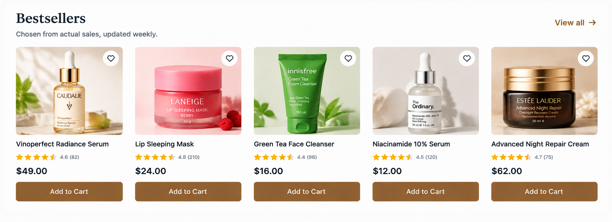
One row, one honest label such as "Bestsellers", "New in" or "Under ₹999", four to eight product cards, and a "View all" link at the end.
**Wins when**
You have one clearly true claim to make and want it to be scannable in a few seconds. This is the default, and most stores need nothing more elaborate than this once.
**Fails when**
The label is vague ("You may like") or unverifiable. A vague label gets skipped the same way a vague hero headline does.
### 2.2 The tabbed multi-row
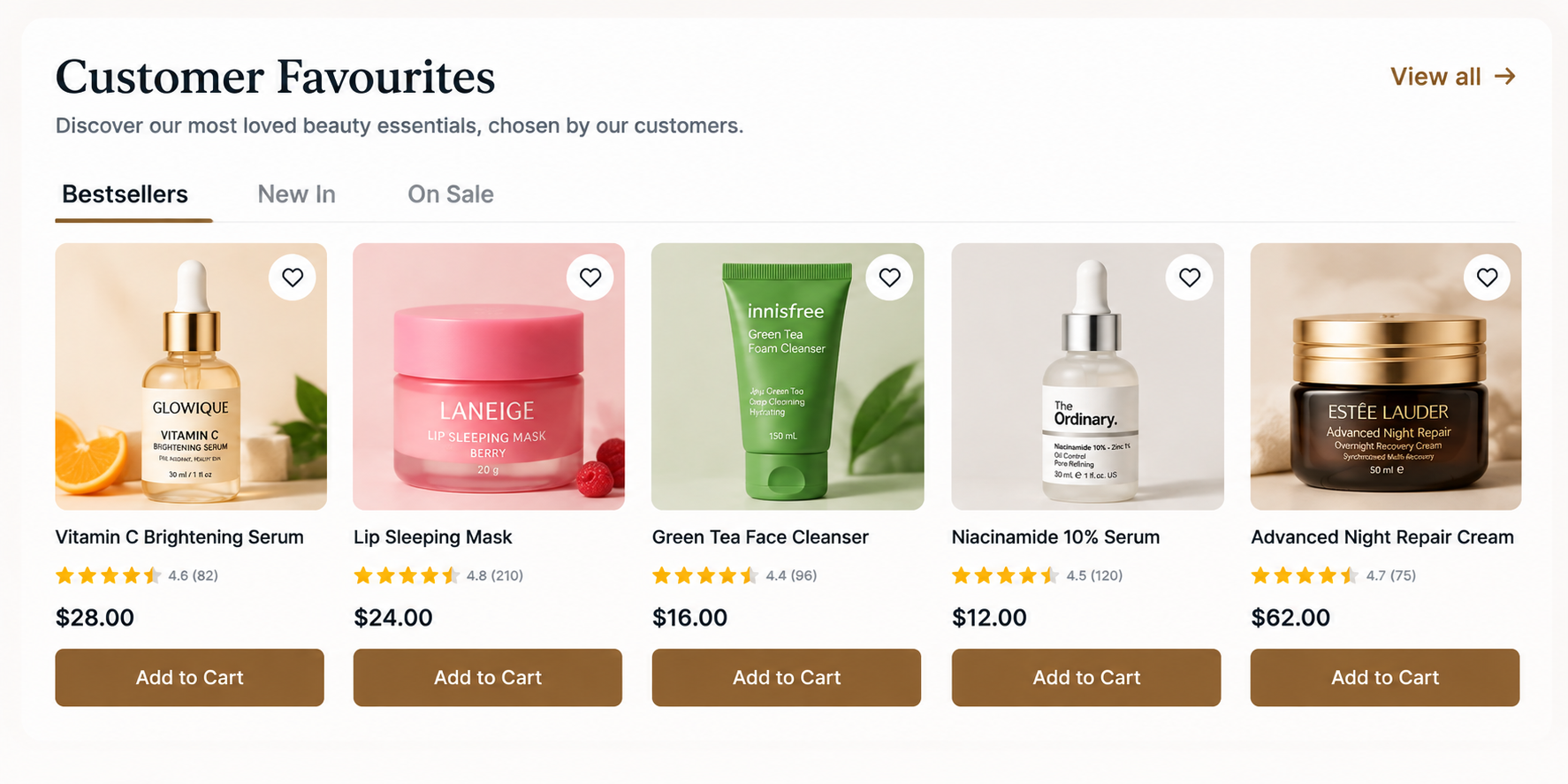
Several labelled rows behind tabs like Bestsellers / New in / On sale in one section. So more than one claim fits in the same vertical space.
**Wins when**
You genuinely have two or three distinct, true claims worth making and limited homepage real estate to make them in.
**Fails when**
It becomes a fourth or fifth tab. Past two or three, nobody clicks past the first tab, and you have built rows nobody sees — see the featured category guide's "duplication test" for the same failure in a different shape.
### 2.3 The data-driven automatic row
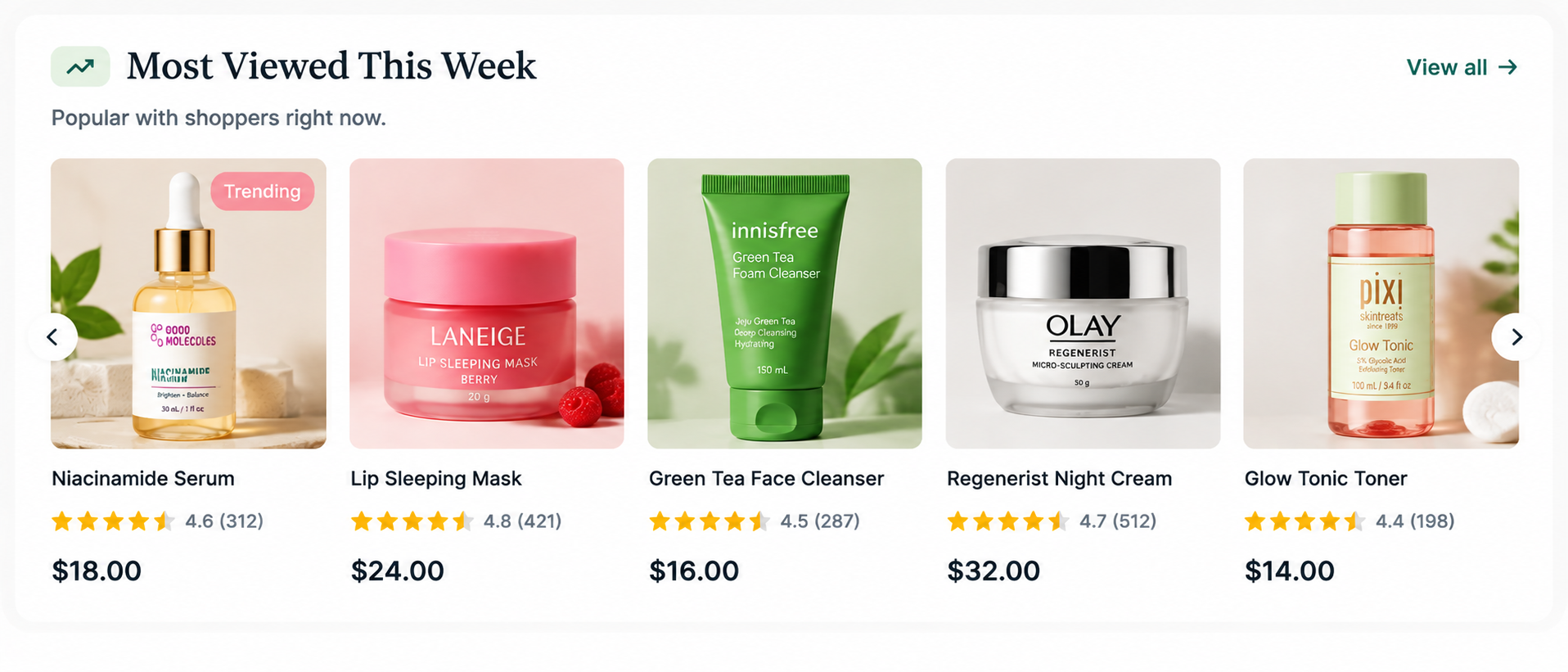
A row generated from a rule rather than picked by hand: best-selling this month, most-viewed this week, highest-rated. Refreshes itself as the underlying numbers change.
**Wins when**
Nobody owns manual merchandising, or the catalogue changes fast enough that a hand-picked row goes stale between updates. It is also the most defensible version of "Bestsellers", because the label is probably true.
**Fails when**
The rule is naive — "most added to cart" can surface something everyone abandons, and "newest" can surface a product with zero reviews and thin data ahead of something genuinely popular. Sense-check the rule before trusting it unattended.
### 2.4 The editorial pick, with a reason
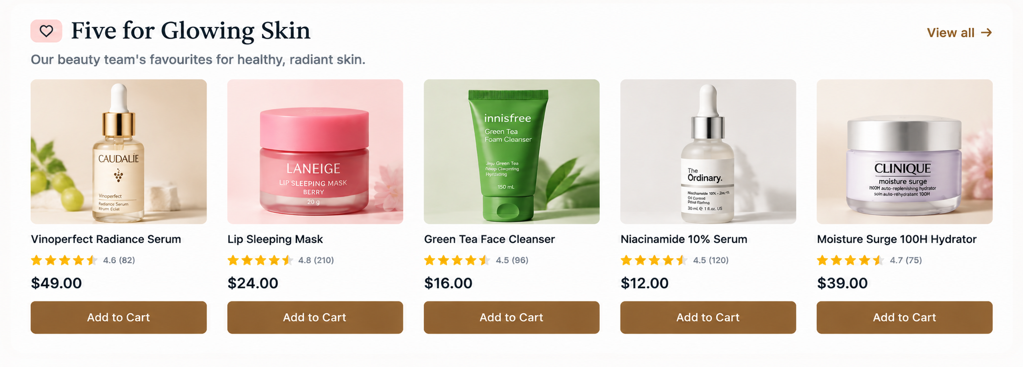
A small hand-picked set with one short line under the section heading explaining the criteria — "Five we'd buy again this monsoon" — so the curation itself is part of the pitch.
**Wins when**
You have a real point of view and are willing to state it. The reason line is what makes this different from an unlabelled row of favourites, and it is what an AI assistant or a search engine has something to quote.
**Fails when**
It is curation with no stated reason — that is just "Bestsellers" without the data to back the label, which is the least defensible version of this pattern.
### 2.5 The seasonal or campaign row
A time-bound set tied to a real event like a festival, a season, a launch, with an explicit end date built in from the start.
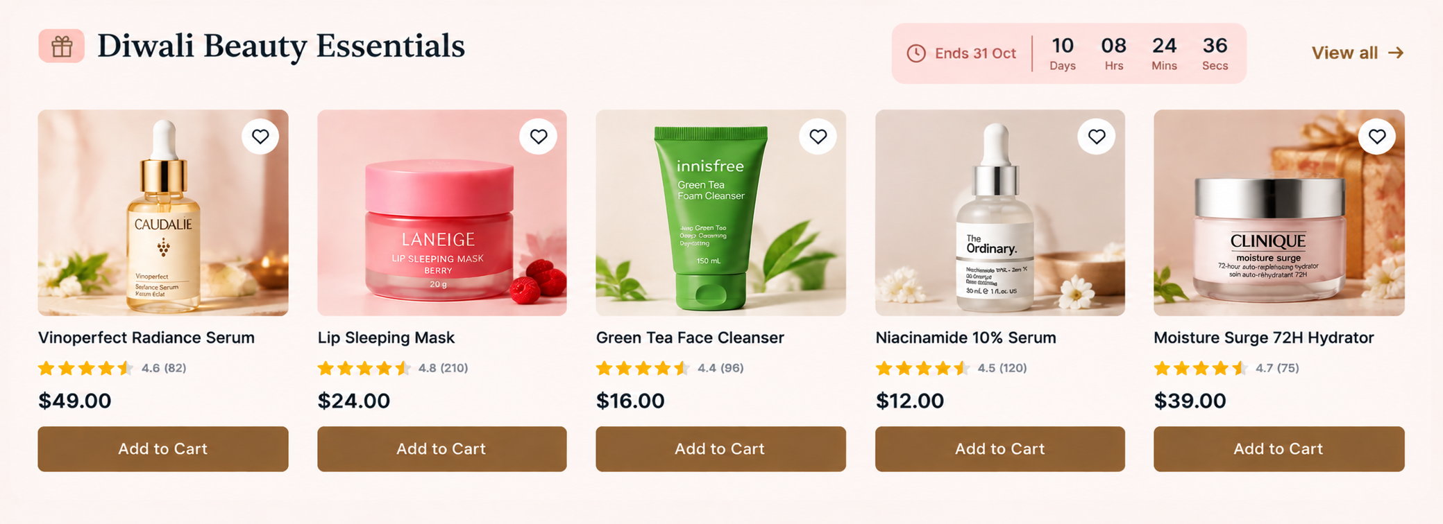
**Wins when**
The occasion is real and the products genuinely suit it. It also gives you a natural reason to refresh the homepage on a schedule, which most stores otherwise never do.
**Fails when**
Nobody takes it down. A Diwali row live in March is one of the fastest ways to signal an abandoned store — see the [time-limited promotions guide](https://academy.getzenbasket.com/patterns/time-limited-promotions/) for the same discipline applied to countdown-style urgency.
---
## Choosing your pattern
| If this is true of your store | Start with |
| --- | --- |
| You have not built one of these before | The single labelled row |
| You have real sales or view data and nobody to merchandise by hand | The data-driven automatic row |
| You have two or three genuinely different true claims to make | The tabbed multi-row |
| You have a point of view and are willing to state your reasoning | The editorial pick, with a reason |
| A real occasion is coming up and someone will own taking it down afterwards | The seasonal or campaign row |
They combine well. A common, sturdy homepage shape is one data-driven row ("Bestsellers") plus one editorial row with a stated reason lower down — the first is defensible with no ongoing effort, the second is where your judgement actually shows.
---
## Choosing which products go in it
The single biggest quality gap between a good featured row and a bad one is not layout, it is whether the products were chosen from evidence or from preference.
- **Prefer data over taste.** Sales volume, view-to-purchase rate, or rating and review count are all more defensible than "the products the merchandising team likes best".
- **Span the catalogue, don't cluster.** A row of four near-identical products wastes the slot; pick across categories or price points so the row also does a little of a category section's job of showing breadth.
- **Only feature what's in stock.** A featured out-of-stock product is worse than an empty slot — it is a promise the page cannot keep the moment someone clicks.
- **Rotate on a schedule you can actually sustain.** A stale row is more damaging than no row. If nobody has capacity to refresh it monthly, prefer the automatic data-driven pattern, which refreshes itself.
- **Cap it at four to eight.** A featured section that shows twenty products has stopped being featured — that is a grid wearing a featured section's heading. See the [featured category guide's](https://academy.getzenbasket.com/patterns/featured-category-section-patterns/) parallel argument about category tiles; the same logic applies to products.
---
## What the section and each card need
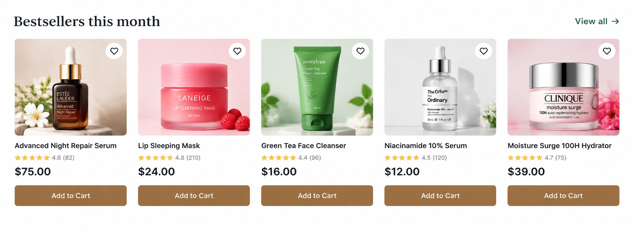
Heading, an optional one-line reason, equal cards, and a way out to the full range.
| Element | Rule |
| --- | --- |
| **Heading** | States exactly what the section is; no vague phrases like "You might like". |
| **Reason line (optional)** | One sentence, only if the curation has a stated logic worth sharing. |
| **Product cards** | Same rules as any product grid — one image ratio, consistent attributes, equal card heights. Don't re-invent the card here; reuse the one from your [product grid](https://academy.getzenbasket.com/patterns/design-product-grids/). |
| **Count** | Four to eight. Fewer feels thin; more turns the row into an unstyled grid. |
| **"View all" link** | Goes to the category or collection that the row is drawn from, not to the homepage or a dead end. |
| **Loading behaviour** | The first row of images loads eagerly; anything below the fold lazy-loads. |
---
## Do and don't
| Don't | Do instead | Why |
| --- | --- | --- |
| Label a row "Bestsellers" and hand-pick it from favourites | Either source it from real sales data, or give it an honest editorial label instead | A false label is discovered by anyone who checks, and it costs more trust than the row earns |
| Feature a product that's out of stock | Filter the source query by availability | A featured dead end costs more than showing one fewer product |
| Show twenty products in a "featured" row | Cap it at four to eight and link to "View all" | Past eight it reads as an unstyled grid, not a curated set |
| Let a seasonal row run past its season | Set an end date when you publish it | A stale campaign row signals an abandoned store faster than almost anything else |
| Mix card styles or image ratios inside one row | Use the exact same card everywhere else in the store | Inconsistent cards slow comparison even in a row this short |
| Bury the heading in a slogan ("Just for you") | Say exactly what the row is | A vague heading gives a shopper no reason to look closer |
---
## Mobile and accessibility
- **Horizontal scroll on mobile** works well for this pattern specifically, because the set is small and finite — unlike a full grid, a shopper isn't expected to see everything at once. Show a partially cut-off card at the edge so the row visibly continues.
- **Two columns** is the alternative if you'd rather not scroll; either is fine, but pick one rather than a cramped row of five squeezed onto a phone screen.
- **Every card is a real link** with the product name as its accessible name, not "View product" repeated five times.
- **Ratings conveyed in text** as well as stars, so a screen reader user gets "4.6 out of 5, 82 reviews" rather than five ambiguous icons.
- **Keyboard and scroll-snap** — if you use a horizontally scrolling row, make sure it's reachable and operable by keyboard, not only by touch or drag.
---
## Building it in ZenBasket
| What this guide asks for | What to use |
| --- | --- |
| A data-driven row (bestsellers, single/pick product) | A [data-driven slider](https://help.getzenbasket.com/zenbasket-builder/slider/) mapped to Products → Featured Products or Pick Product, with fields for image, name, price and rating |
| A tabbed multi-row | [Switchable panels](https://help.getzenbasket.com/zenbasket-builder/tab/), one data-driven slider per tab |
| An editorial or seasonal pick | Products / Pick Product mapping with **Choose Specific Product(s)** selected by hand, plus a heading and reason-line text element |
| Hover image swap on cards | Enable other-angle images in Data Mapping, then the standard hover-swap interaction (see the ZenBasket Builder mechanics reference) |
| Seasonal row cut-off | A [timer](https://help.getzenbasket.com/zenbasket-builder/timer/) or a calendar reminder tied to a real end date, not a countdown gimmick |
New to the builder? Start with [Getting started](https://help.getzenbasket.com/zenbasket-builder/getting-started/) and [adding a new section](https://help.getzenbasket.com/zenbasket-builder/adding-new-section/).
---
## Frequently asked questions
**What is a featured products section?**
A short, curated row of individual products — such as "Bestsellers" or "New in" — placed on a homepage or landing page to give a browsing visitor something concrete to click before they have chosen a category. It differs from a product grid, a featured category section, a single-product story and a shop-the-look set, each of which solves a different merchandising problem.
**How many products should a featured section show?**
Four to eight. Fewer feels thin; more and the row stops reading as curated and becomes an unstyled grid. Link to "View all" for anyone who wants to see the full set the row was drawn from.
**Should "Bestsellers" actually be my real bestsellers?**
Yes. A label that doesn't match its contents is discovered quickly, especially by returning customers, and it costs more trust than the section gains. Source it from real sales or view data where you can; if you want to hand-pick instead, give the section an honest editorial label and say why the products were chosen.
**Should featured products be chosen by hand or generated automatically?**
Both are legitimate. Automatic, data-driven rows are more defensible and need no ongoing effort, which suits stores without a dedicated merchandiser. Hand-picked rows let you make a genuine editorial argument, but only earn that trust if you state the reasoning rather than presenting curation as data.
**Can a featured products section include out-of-stock items?**
No. A featured out-of-stock product is worse than showing one fewer product, because it is a promise the page breaks the moment someone clicks. Filter the source by availability, whether the row is manual or automatic.
**How is this different from a featured category section?**
A featured category section routes a shopper into a department of the catalogue; a featured products section puts individual, purchasable items in front of them directly. Both are selective merchandising blocks, and a homepage often benefits from one of each — see the [featured category guide](https://academy.getzenbasket.com/patterns/featured-category-section-patterns/) for the parallel pattern.
---
## 12. Where to go next
- [How to design product grids](https://academy.getzenbasket.com/patterns/design-product-grids/) — the card system this section's cards should reuse
- [Featured category section patterns](https://academy.getzenbasket.com/patterns/featured-category-section-patterns/) — the same merchandising problem, for categories instead of products
- [Single-product storytelling sections](https://academy.getzenbasket.com/learning-paths/master-advanced-techniques/#interactive-product-storytelling) — when one product deserves a whole section instead of a row
- [Shop-the-look and complete-the-set sections](https://academy.getzenbasket.com/patterns/shop-the-look-section/) — when the products should be sold as one combination
- [Homepage design guide](https://academy.getzenbasket.com/store-pages/ecommerce-homepage/) — where this section sits in the overall zone order